vanessa
mooney
Fashion Ecommerce

An Overview
Vanessa Mooney is a fashion brand established in 2009 by designer Vanessa Mooney. It is a product of Mooney's inspiration; derived from travel, culture and her perception of the world.
Mooney describes her brand as one designed for every type of woman. They source all fabrics from deadstock vintage or vintage-inspired fabrics that have been discarded by other larger fashion houses, which are then reused with no carbon-footprint - a way to honour mother nature and our planet, a strong theme with Vanessa Mooney.
It was this eco-concious mindset plus her aestheticly pleasing, well-crafted brand that really drew me into this project and into the brand in general. The clothes look great, the vision is clear and the attention to being ethically responsible is incredibly important.
Flexible Templating
As the site will be built as a Shopify theme, it was important to consider how each product would fit into a small amount of templates. We needed to maintain a high level of consistency and familiarity whilst allowing flexibility for products that hold a smaller presence than others - by this, I mean products (such as the examples shown here) that have less photos, less features / specifications etc.
The need for consistency and familiarity was met by utilising a consistent grid across the site. This allowed for each product to be displayed in a structured way across the site, regardless of the amount of images a product has, title length, availability of data, etc.
The designs below show how different products are arranged within the same structure.


The Checkout Process
As this site is powered by Shopify (and has been so for several years), I didn't want to stray too far from the familiarity of it's checkout process. The original version was bland and somewhat generic (as is normally the case with Shopify stores) and lacked any strong visual link to the main site outside of the checkout process.
Whilst this is normally a good thing for conversion, I prefer to include a semblance of similarity to the main site design, otherwise I feel they can sometimes feel too disconnected and erode trust.
By applying our new typographic choices + new design elements to the checkout process, as well as repositioning all elements into our grid, we present a familiar checkout experience that retains it's connection to the Vanessa Mooney brand - something that was missing in the original site.
As seen in the design to the right, areas that require attention (but are not critical) are displayed with a pink background - adhering to the brand's image whilst drawing focus to the area of concern.
I decided against the use of red due to it's similarity to the brand's pink - the contrast of which would have been far too strong and distracting, something that we do not wish to include during this critical stage of transaction.


Lookbook Stories
In the world of Vanessa Mooney, stories are incredibly important. Much like a lookbook, each story portrays a different collection through the means of a photographic journey. Each story is different and this design was crafted to to bolster it's individuality.
In this example, we see the Neon Lights High Summer story for 2020. The layout is obviously different from previous pages. The abstract format was devised to bring attention to the story; this is not meant to be something that simply blends in - it needed to stand out.
Each section within these story pages is slightly different from the section that came before it - the abstract nature of the layout may seem almost random but is actually confined within the grid system, following a few simple rules. By adhering to these rules, it allows for a simple and pleasant user experience without sacrificing too much creative freedom.
Each product connects the user to it's relevant product page, allowing for another entryway to conversion and making a sale.


Other Elements
Menu
The client requested that we keep the menu looking as true to the original version as possible. The reason stemming from worry that a major redesign would discourage / hinder existing customers from purchasing items from the store (especially from the newer, upcoming ranges).
To satisfy this request, I took the existing structure of the mega-menu layout and adapted it to fit into the new grid system, amending the typography to adhere to the new style.
In the near future, we aim to split test a completely new menu and track how conversion is affected.

Input Validation
As the image shows, elements that haven't passed validation recieve a thick red(ish) border. This colour was derived from the client's pink brand color and adapted for it's purpose.
Error labels / notifications are always to be positioned below the input element that requires attention.

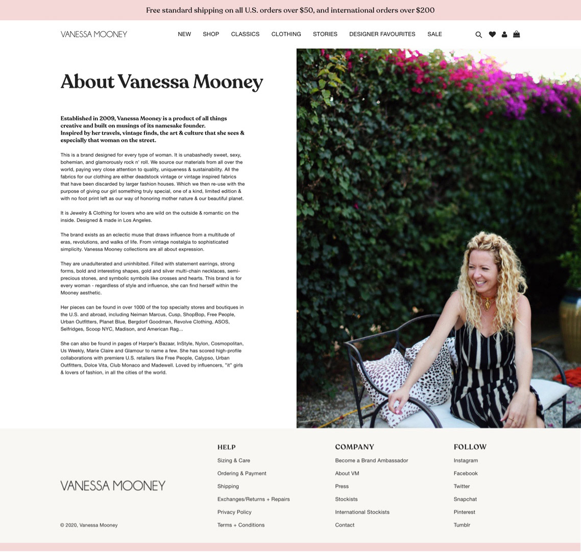
Other pages
As well as the core features of the site, there were also several other supplementary pages to design. The majority of these pages (as shown below) adhere to a simple two-column layout. One image occupies a half of the territory, whilst supporting information / functionality exists in the remaining half of the page.
In an effort to combat spam and encourage using separate channels for different requests, it was decided that a contact form would not be included on the contact page (or the site at all). Instead, contact information for each relevant party (ie: Corporate information, internship opportunities etc) was displayed. This will hopefully allow for a more pleasant user experience and promote trust between the customer and brand.
Account log-in pages were also laid out in the same two-column arrangement, with each page having a unique image accompanying it - each image displaying the wares on offer by Vanessa Mooney.