This project has been modified to comply with an NDA.
Names, branding and other identifiable assets have been changed.
About the Project
Sandy Socials is a social network for anyone living in Dubai. The population in Dubai is currently in excess of 3 million, and 80% (approx 2.5mil) of these people are ex-patriates, in 10 years time it is estimated that the population will double.
In recognition of this huge figure and it's future potential, I was given the opportunity to collaborate with a private client to help facilitate the creation of a dedicated social network solely for those living and working in Dubai.
Competitor analysis showed that there were already several similar ventures in Dubai or the United Arab Emirates, none of these however had managed to gain a substantial market share (other than Facebook, of course) or had ceased to operate in the past few years. None of these competitors fully encompassed the vision we shared for Sandy Socials either, so we were confident that there was a definite space to fill in the area.
Objective
Developing a social network product that will facilitate those living in Dubai to connect with others, local businesses and form stronger bonds in their community.
Challenge
Establishing the product as something useful enough that it will become their main social networking platform. Competing against giants such as Facebook and other established ventures will prove difficult but by narrowing our focus to only those living in Dubai, we hope to overcome this hurdle.
My Role
As the main UX/UI designer, I was involved in all phases of the project, from mapping out problems to delivering final designs. I worked with a small team consisting of a UX researcher / designer, one QA, two developers, head of product and the founder.
Tools
Sketch, Principal, Illustrator, Photoshop, InVision
Quick Links

With a population already over 3 million and 80% of them being ex-patriates, it was a no-brainer to use our existing expertise within Social Media to create an entirely new and personal social network for Dubai and it's people.
CEO, Sandy Socials
The Client & Past Experience
The client was based in the UK but had strong business ties within the United Arab Emirates, more specifically Dubai. They would be my initial point of contact for research into cultural differences and requirements in an Arab market. I've personally designed a couple of products for Arab markets before, so my understanding of the major UX differences wasn't completely hollow but there were still many factors left to be considered. This was a social network for people in Dubai, a country I had never visited full of people I'd never meet.
Prior to taking on this project, I had worked with the client on the design and development of a social network for communities in the UK - we'd been working together on this project for a couple of years and so, had an understanding of how we wanted the social network to behave as well as the knowledge of what has worked and what hasn't so far.
That being said, this wasn't going to be a simple reskin project - it would be modified greatly and would be arrogant to assume that our existing UX decisions from the UK product would be entirely applicable in the UAE.
Project Details
The Team
Our team consisted of several members from the existing UK social media product that the client owned and operated. This included one UX designer, one QA, two developers (for the initial stages), head of Product and of course the client / founder. As I was leading the project alongside the founder, I oversaw the progression from initial research to handing off to our developers and would be responsible for the entire UI design process. We also had several contacts in Dubai to help assist with any questions we had. The first week was set around learning more about Dubai, it's history and geographical layout, Arab culture and our potential users; the team members in Dubai were very helpful in this regard.
Scaling the Project
Although the app was targeted for the Dubai market, our long-term strategy included expansion to other countries in the UAE, therefore it had to serve local habits and user behavior as well as simultaneously being exportable. Due to this, how to scale efficiently was something constantly considered throughout the entire process.
Holding this at the forefront of our minds, we decided to gather as many insights as possible whilst prioritising features for the long-term strategy.

We spent 2 years building [our existing product] in the UK, refining best practices with constant feedback loops.
We carried out in-depth split-testing across several demographics as well as multiple focus groups to optimise user interactions and experience.
Over time, this resulted in an exceptionally user-friendly product, which is constantly evolving.
Everything is developed in-house with the latest technologies, with scalability remaining a constant priority.
Excerpt from our pitch deck
Design Thinking
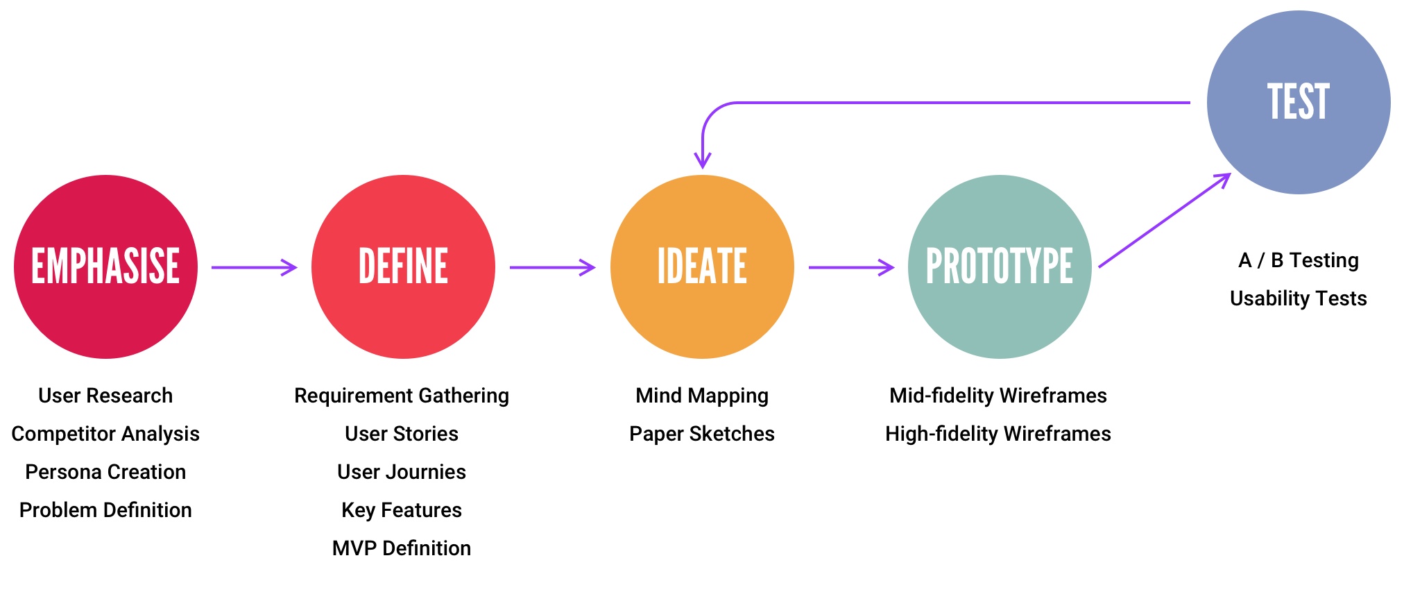
The design and development process of Sandy Socials was greatly influenced by the principles of design thinking methodology. It aided in keeping a solution and action-focused mindset during each phase of the design process.
Emphasise
Who are we Building this for?
Defining our Target Audience
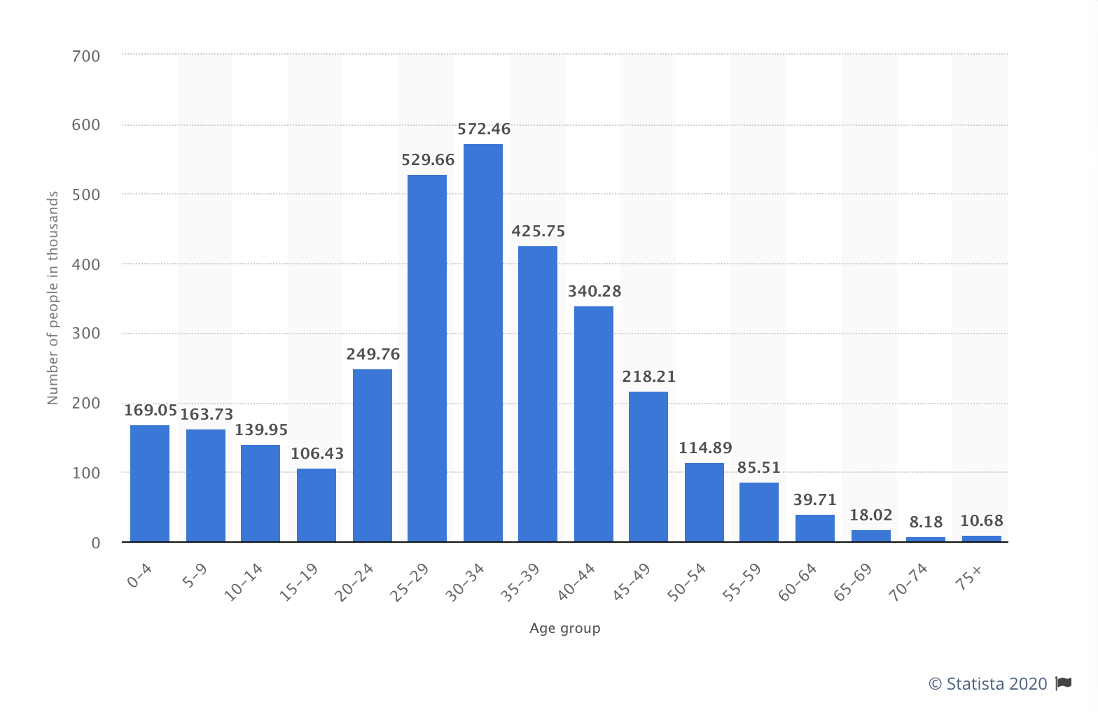
As previously mentioned, approximately 2.5 million people in Dubai are ex-patriates. It would be impossible to get a fully realised picture of who this group consists of, so we researched it's population and their demographics.
As you can see from this chart, the largest age range was those in the 30-34 group, followed by 25-29 and then 35-39. We decided to focus our efforts on those between the ages of 25-39.
Through our research and understanding of ex-pats, it became clear that most ex-pats in Dubai did indeed fall inside of this age bracket.
Through our research, we soon discovered a huge gender imbalance. The Dubai Statistics Center states that towards the end of the Q1 2019, there were 2.3 males for each female in Dubai.
Dubai's population numbers have always weighed heavier towards men due to the high population of male ex-pats (especially those from Asian countries involved in the construction sector), but it would seem that Dubai's gender balance is slowing evening out - this is assumedly due to a vast majority of construction projects being finalised, metropolitan areas becoming more developed and different workers being required outside of construction, as well as the general image of Dubai improving over time, becoming more attractive to westerners and new ex-pats.
Foreign workers and ex-pats greatly outnumber Dubai's indigenous population. It is estimated that 1.1 million people in the United Arab Emirates are nationals of their country.
Key Points
- Expatriates greatly outnumber the indigenous population.
- The amount of Men in Dubai greatly outweigh women but the gender gap is closing with each year passing.
- Highest population densities are in the 25-39 range, with the highest levels being between the ages of 30-34.
- Most ex-pats would naturally fall into the aforementioned age range.
So... who is our Target Audience?
- Expatriates form the bulk of our target audience.
- We will be primarily focussing on the 30-34 age range.
- Despite the gender imbalance, we will cater equally to both men and women. The gender gap is closing each year, so to cap ourselves now and potentially hinder future development would be silly. The product will be gender neutral.
- Most ex-pats are working professionals and made the decision to move to Dubai themselves (as opposed to moving with family etc).
Competitor Analysis
The idea of creating a social network solely for people in Dubai isn't new, neither is creating a platform solely for ex-pats in the UAE. Several companies in the space already exist including giants such as Facebook and Meetup.
How could we position ourselves in a way that will help us stand above those that have come before us?
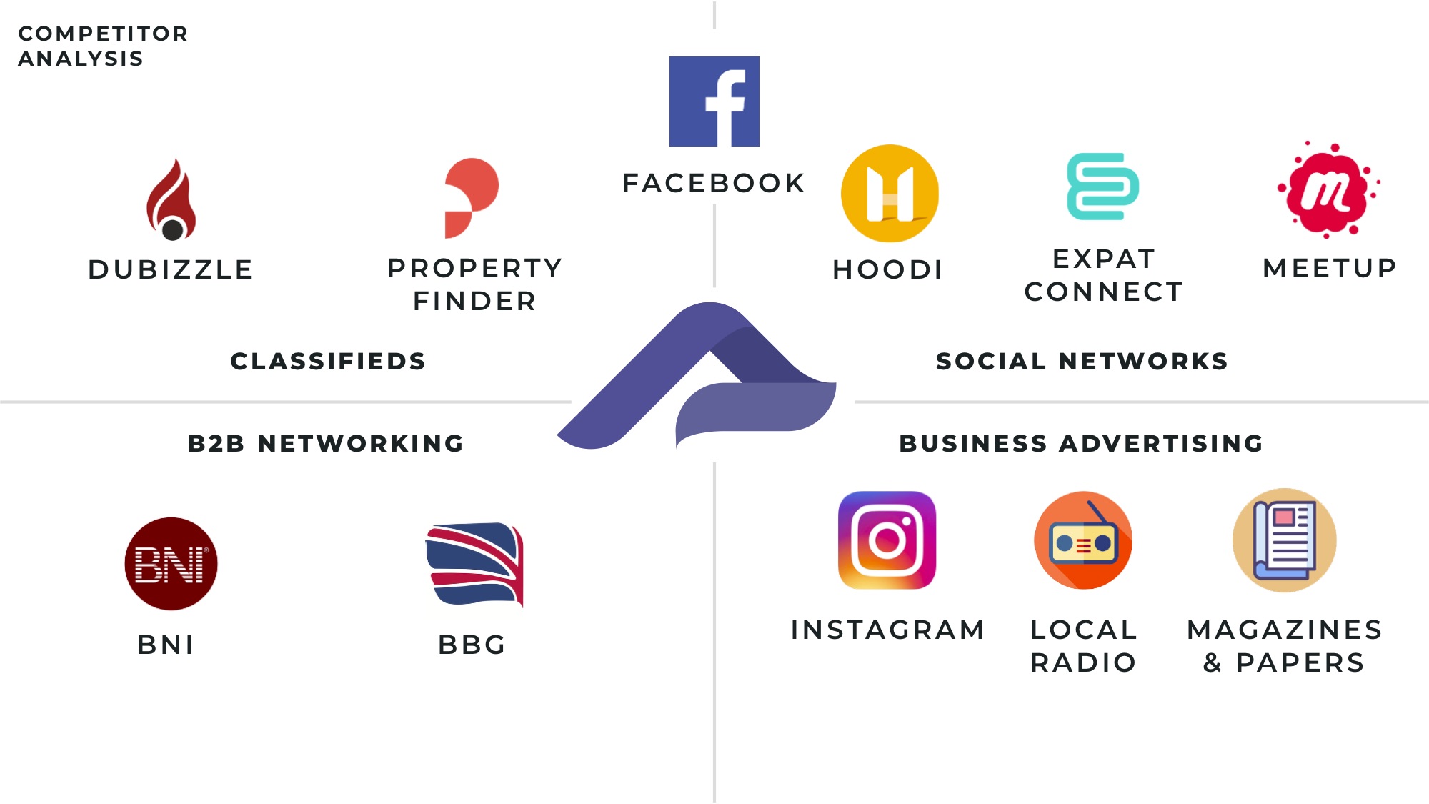
As you can see from the chart here, we decided on four factors that will make up the bulk of our product.
- Classified Adverts
- Social Networking
- B2B Networking
- Business Advertising
We positioned ourselves directly in the middle as we aim to combine all these factors into one cohesive product. Facebook was without a doubt the closest competitor to what we were trying to achieve but as it's a global product and not specifically for those in Dubai, we felt this could be enough of a USP to succeed there.

Combining our acquired knowledge and experienced team, we are confident of producing Dubai’s first real local social network.
CEO, Sandy Socials
User Personas
Let's get to know our users
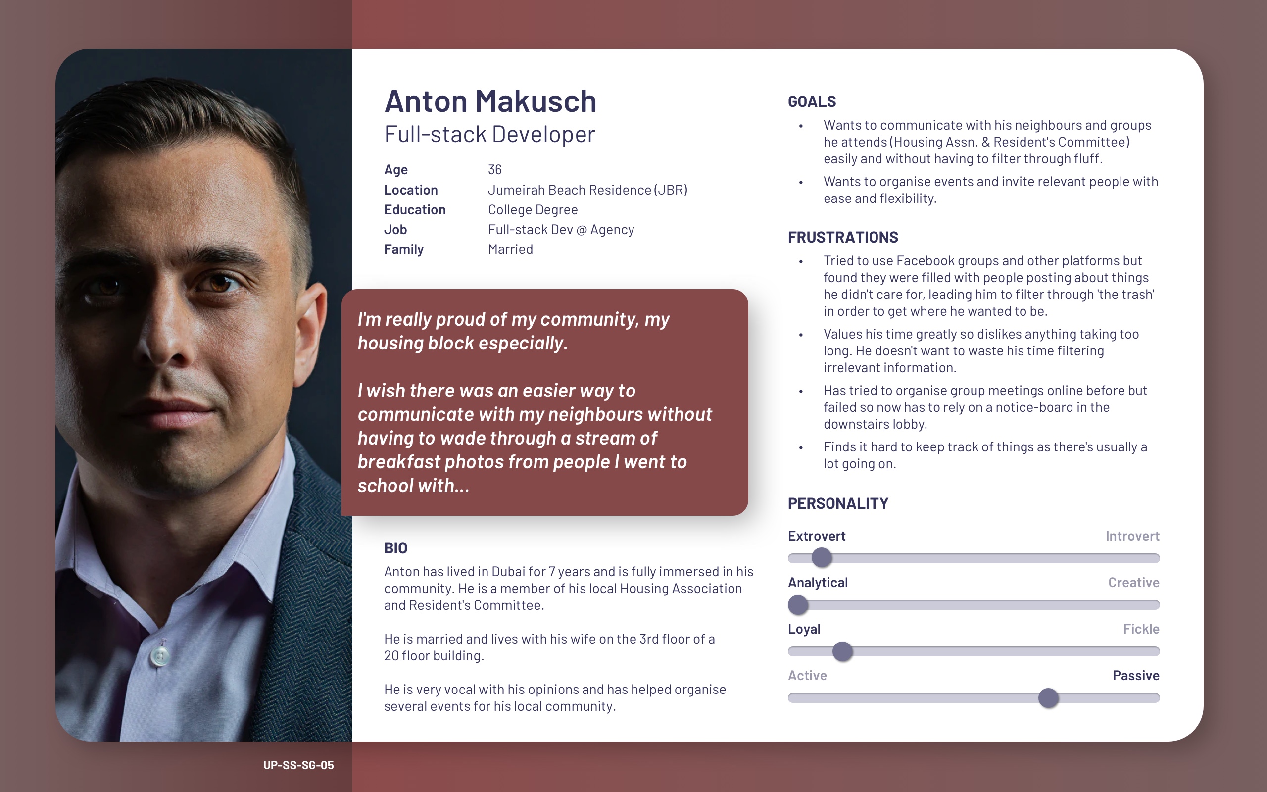
After our initial research phases, our UX researcher conducted nearly 20 interviews with ex-patriates living in Dubai. They then took the results and then distilled it into several key points that served as discussion topics.
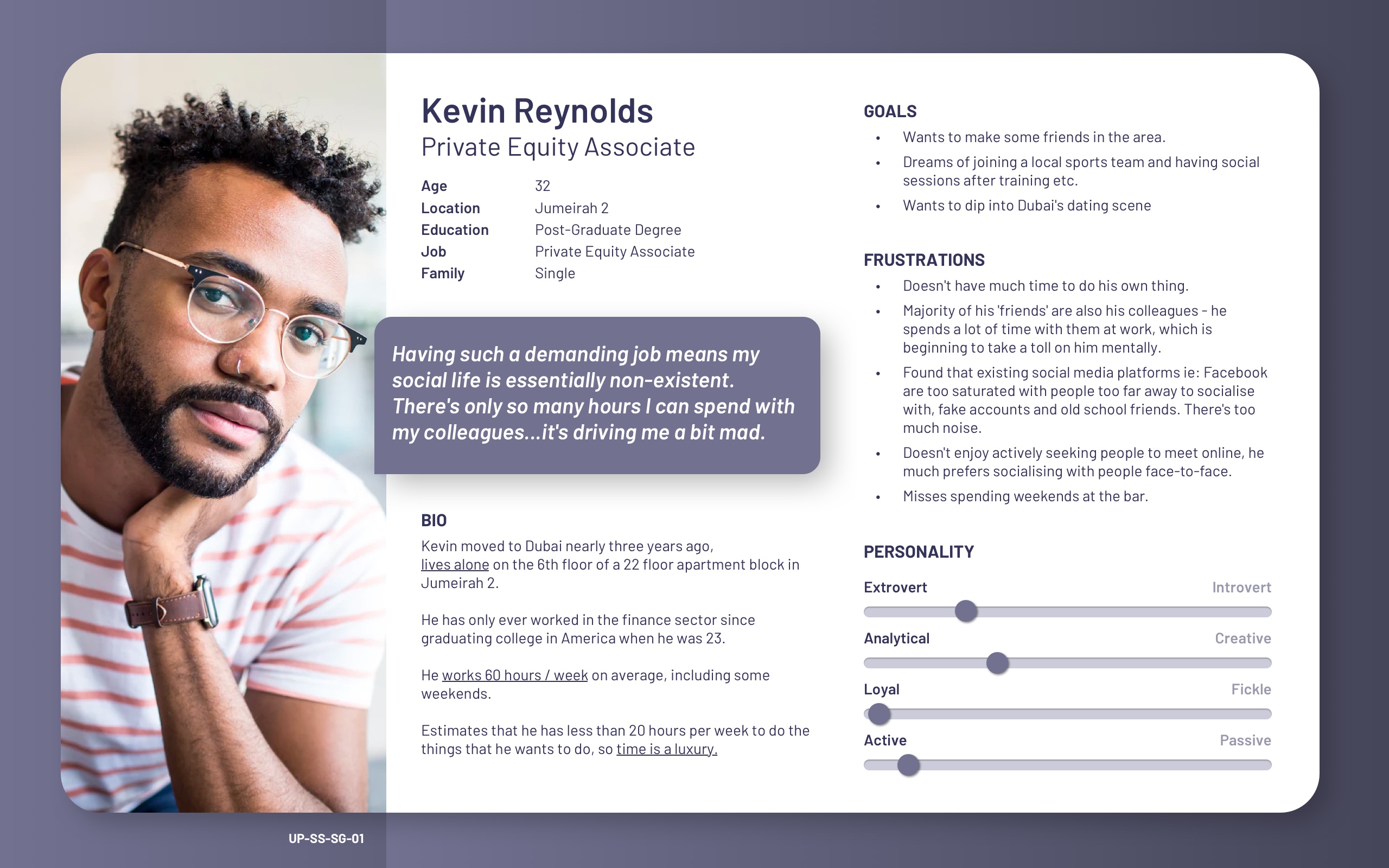
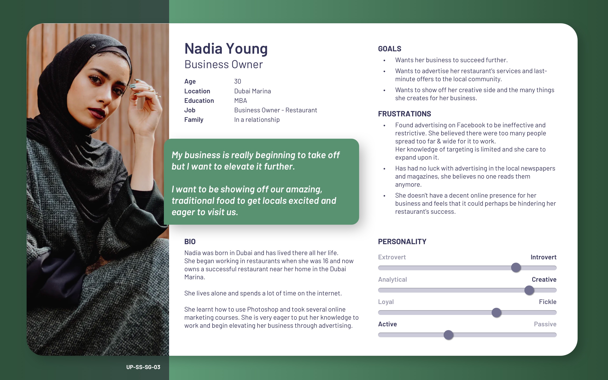
After consolidating the gathered research into expatriates, Dubai and other important factors, we soon devised several user personas that would best describe the demographics and characteristics of Sandy Social's target market. These will help guide us through the next stages of this project.
These personas allowed both myself and the entire team to be consistently reminded of the people we're creating the product for, their needs and wants, as well as pain points.
If you hadn't realised already, you can click on the images to see larger versions (just in case you want to read them).
Sidenote: I'm not overly keen on user personas as I believe that they usually reflect the bias of those creating them and provide ineffective insights into the true behaviours and needs of a user. That being said, in this case we devised them based on recurring statements discovered through our UX researcher's findings and formed them using that gathered information. I believe they serve a purpose in humanising users and offering a more relatable way to understand their needs, but if they're formed without research, they're simply useless.
Define
User Stories
Putting ourselves in their shoes
For this stage of the design process, we moved into forming user stories based on our existing expectations of the product and the needs of our users as defined through our initial research and reflected in the user personas..
These were devised in the following format:
- As a {user/role/who}...
- I want to {task/action/what}...
- So that {objective/purpose/why}.
Key User Stories
These were the user stories that stood out the most to us and seemed to hold the most value moving forward.
- As a user, I want to meet new people, so that I can spend less time with my colleagues and more time doing things that interest me.
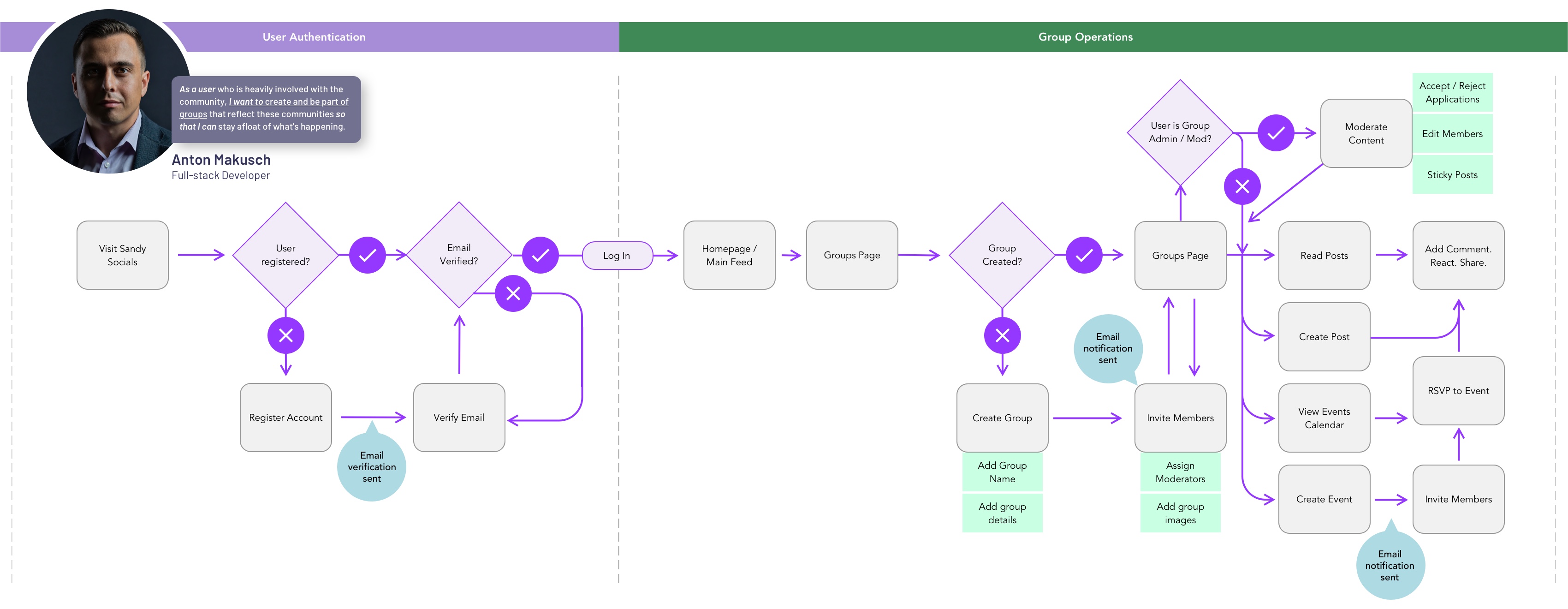
- As a user who is heavily involved with the community, I want to create and be part of groups that reflect these communities so that I can stay afloat of what's happening.
- As a business owner, I want to be showing off our amazing, traditional food to get locals excited and eager to visit us so that my business can prosper further.
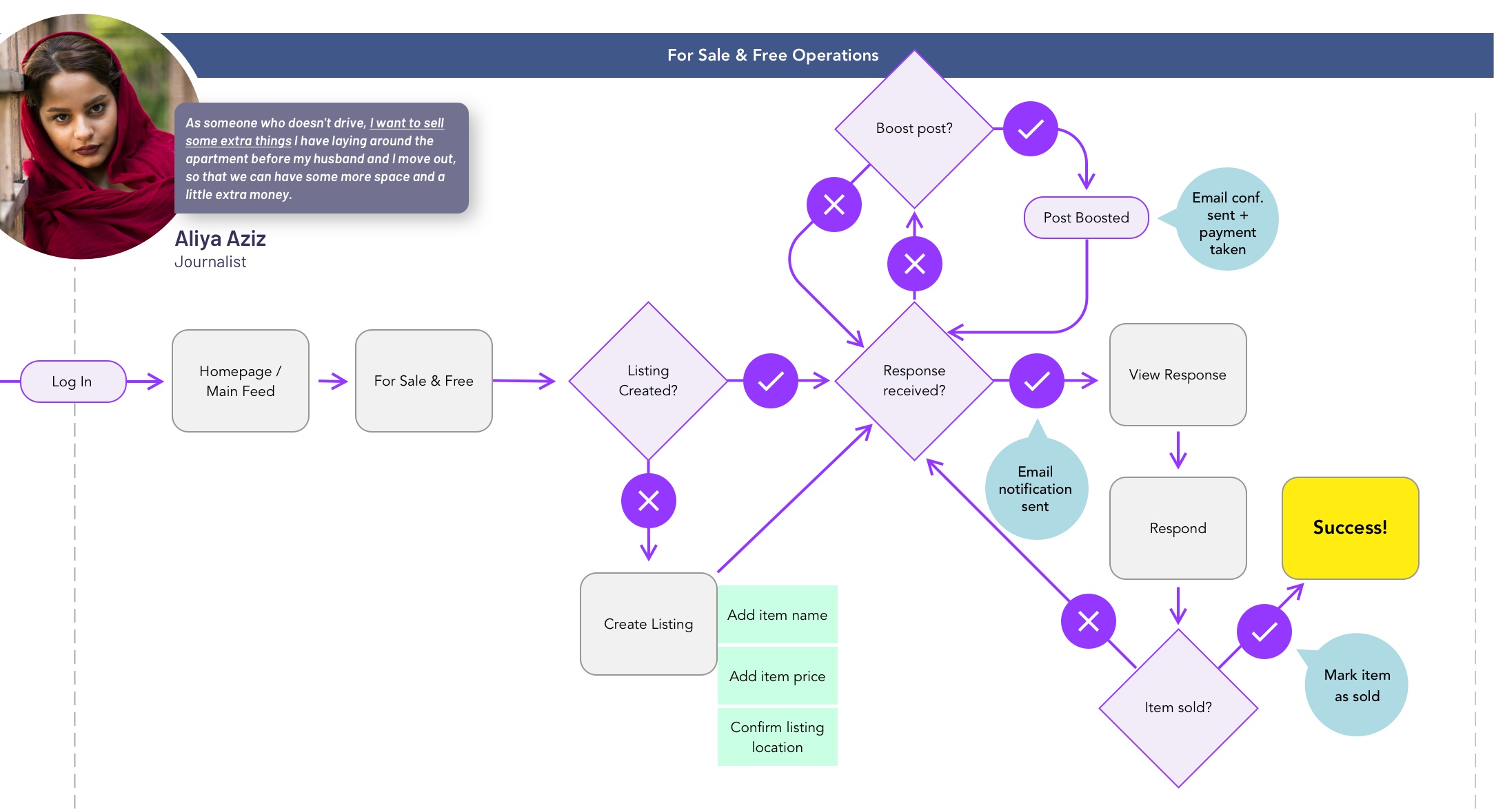
- As someone who doesn't drive, I want to sell some extra things I have laying around the apartment before my husband and I move out, so that we can have some more space and a little extra money.
User Journeys
Let's go somewhere together
After establishing our user stories, I began to map out the journey a user would undertake in order to achieve their specific goal.
At this stage, we decided to get the technical team involved (our developers) as they would be able to shed some light on processes occurring behind the scenes and gain a better understanding of how we envision the product to work.
I found a lot of value in creating these user journies as it opened up a discussion that ultimately led to making better decisions, more efficient routes to achieving goals and allowed us to simplify several different processes, ie: Creating a group and inviting members.
Key Objectives
What do we actually want to achieve?
By week three, through our research, competitor analysis, user personas, plentiful discussions and much more, we'd figured out quite a lot.
We decided it was now time to actually nail down a concise and precise target to work towards.
Value Proposition
We aim to be a key figure in strengthening communities in Dubai, fostering personal one-to-one connections. To help people form close friendships and build trust and empathy amongst each other and their community.
Basically, we want to bring people together and provide an opportunity to extend their social circles in a personal way.
Differentiation
We will be targeting adults in the 30-34 range, as well as those above and below by ~4 years. We aim to connect them with people outside of their regular social circle who share similar interests and goals.
We will be mainly targeting expatriates living and working in Dubai.
Drawing on our existing social media product, we will incorporate existing features such as classified listings, business directories and live messaging features to help form a more useful, well-rounded product.
What will our MVP consist of?
Sandy Socials is a social network, so will perform most expected duties of a social network ie: allow users to post status updates, share media, upload images and curate their own image galleries on their profile, connect with others, control what information they share, chat with friends etc.
For the sake of producing an MVP, we decided on the following key points:
- Connect the user with others who are interested in similar activities.
- Allows the user to create a personal profile to help connect with others.
- Make communication simpler by allowing connections to chat with each other on a safe platform, without having to share personal contact information.
- Form groups with people holding similar interests / goals.
Key Features
After multiple discussions and a great deal of planning, it was decided that the product's main features would be:
- The ability to talk with your neighbors & people in nearby communities
- Share events and activities
- Join groups
- Buy and sell items
- Lend a hand with local projects and recommend local businesses
- Classified listings - Jobs, automotive, real estate etc
Ideate
Wireframes
Sketches on Paper
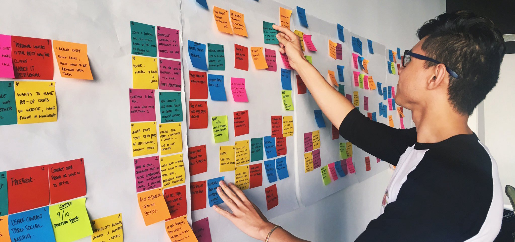
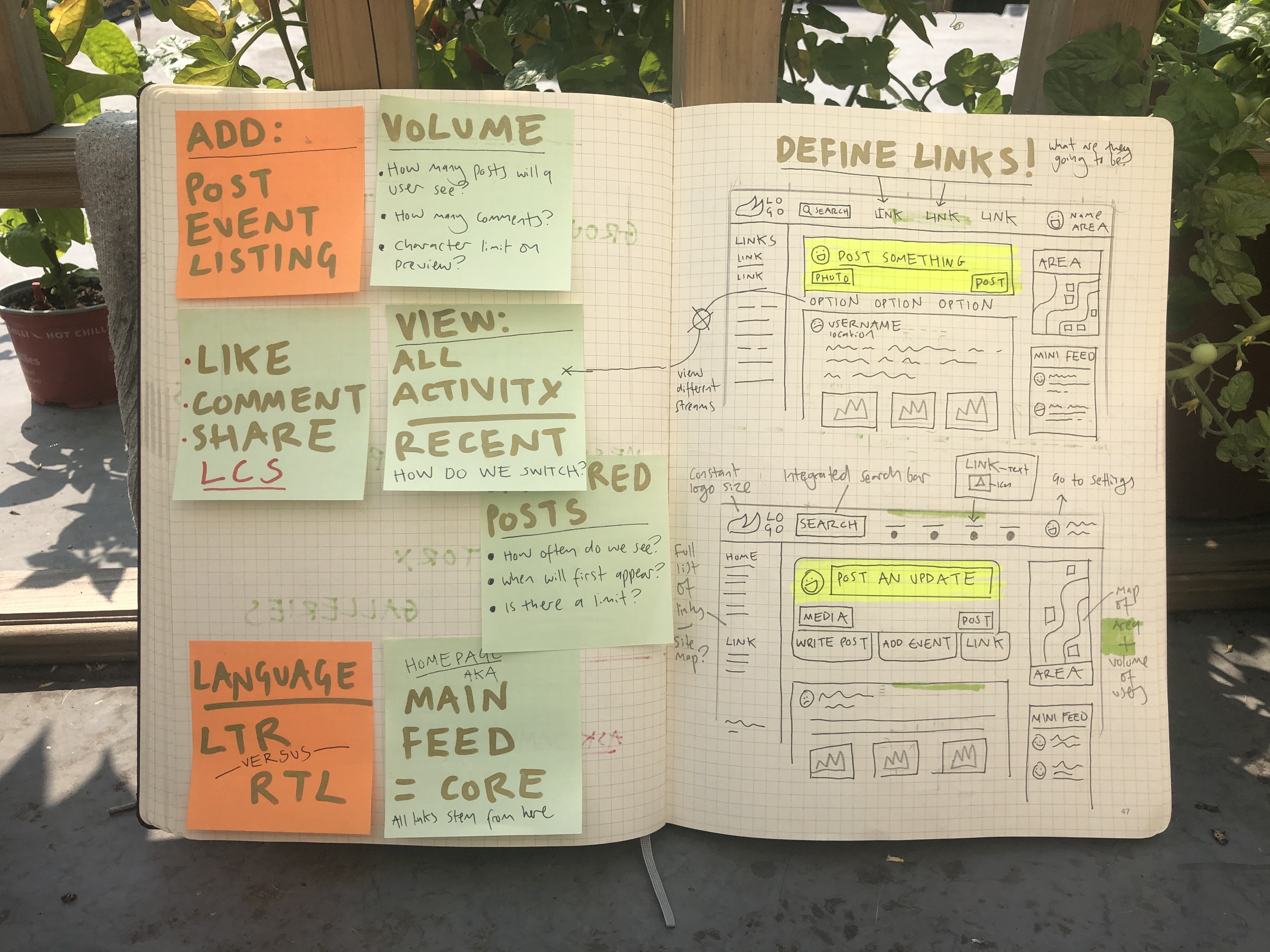
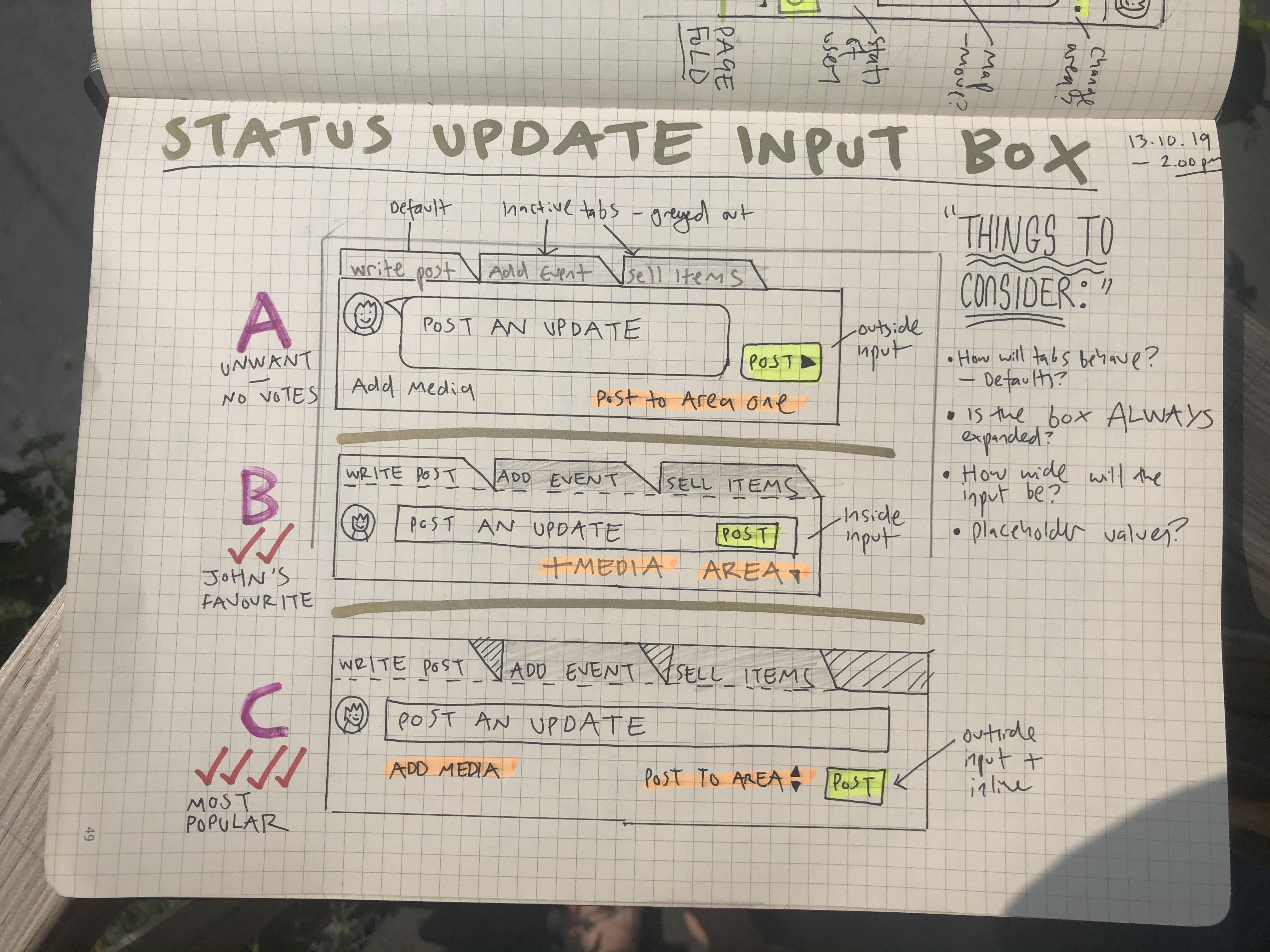
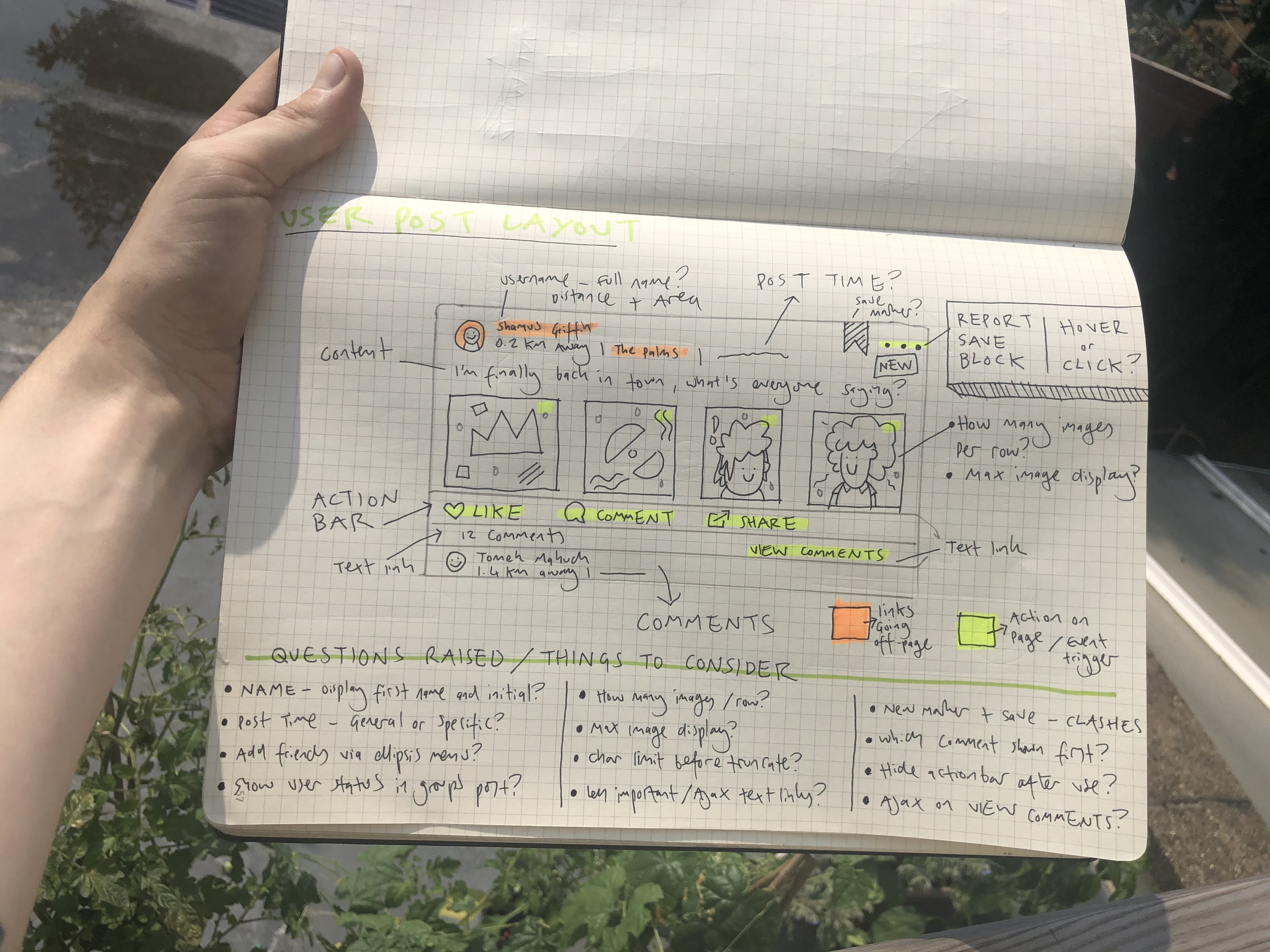
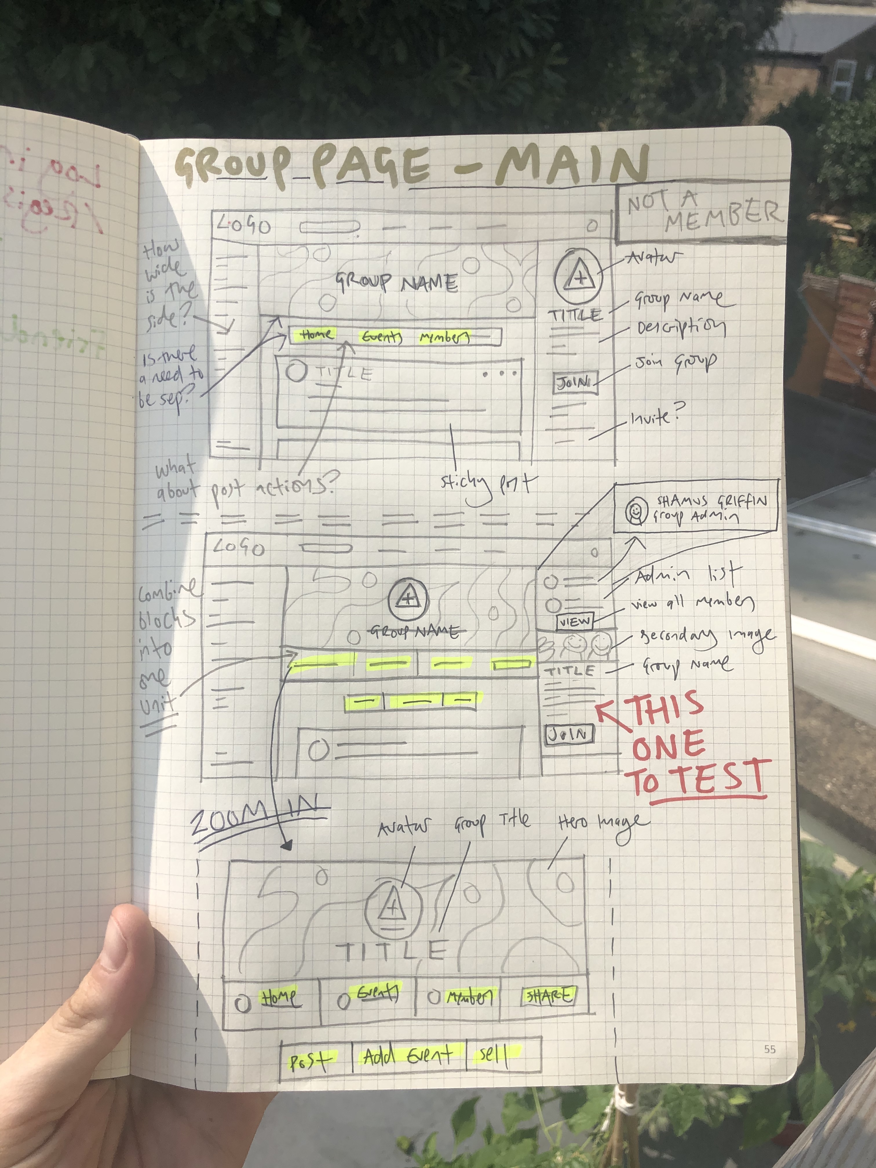
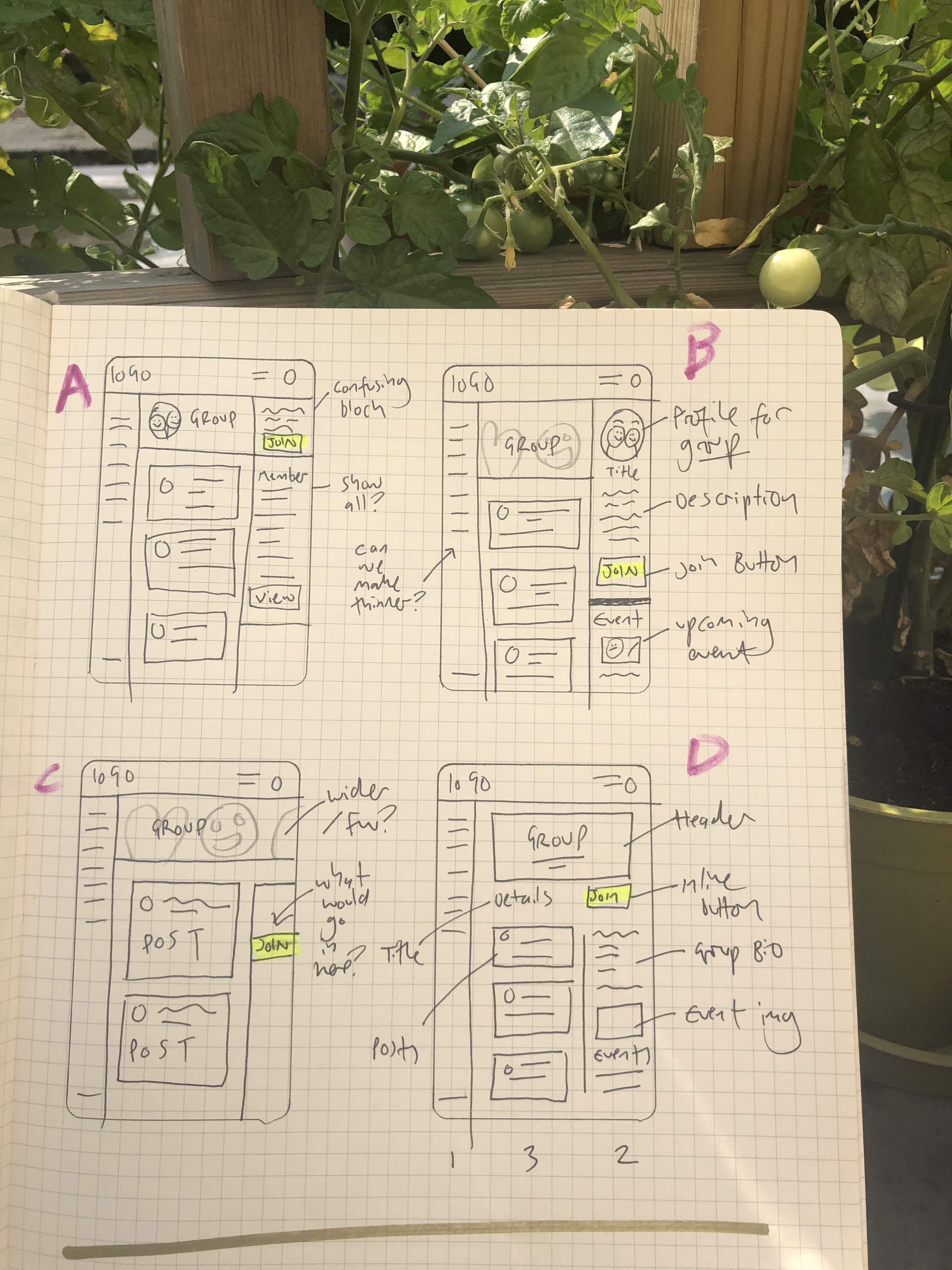
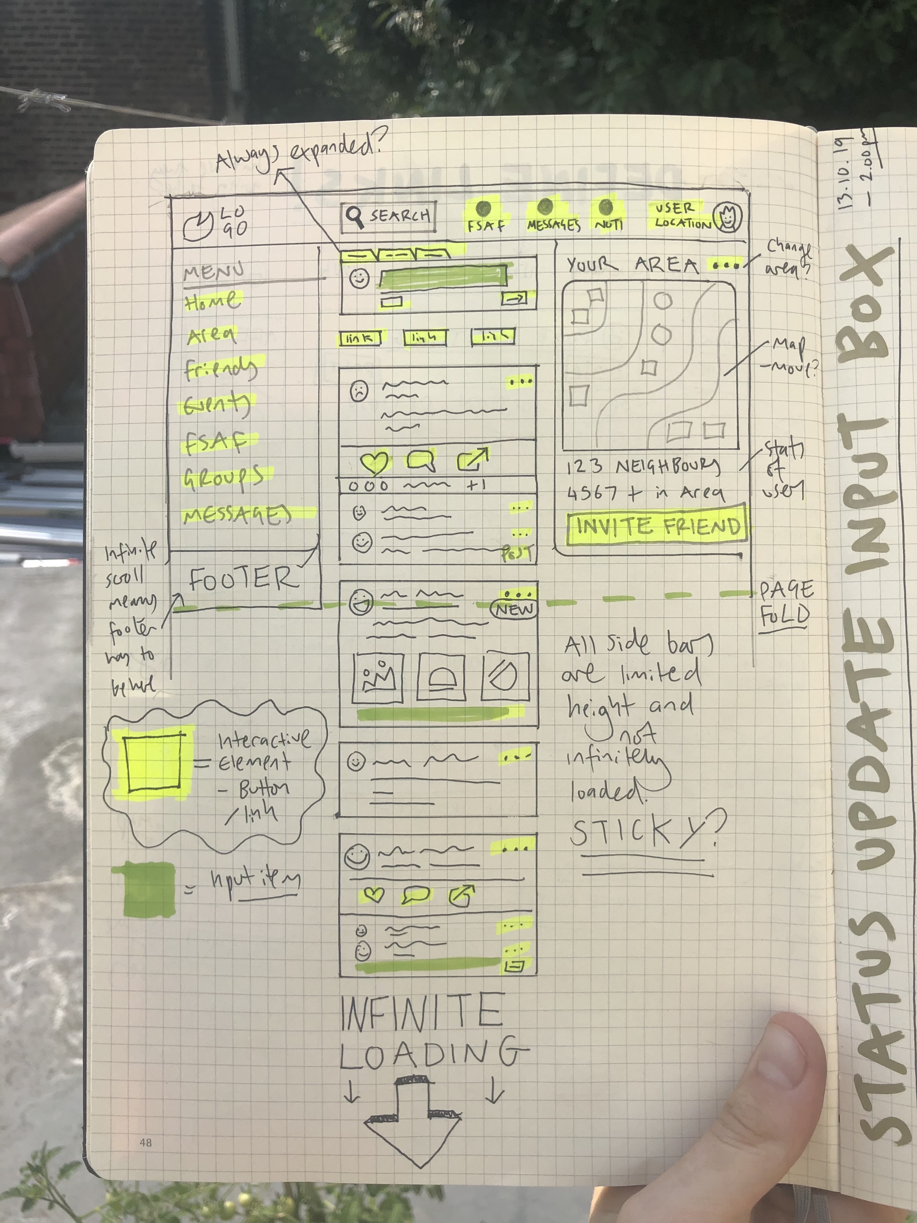
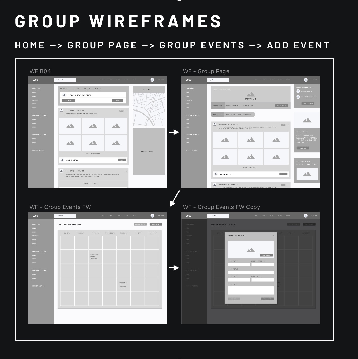
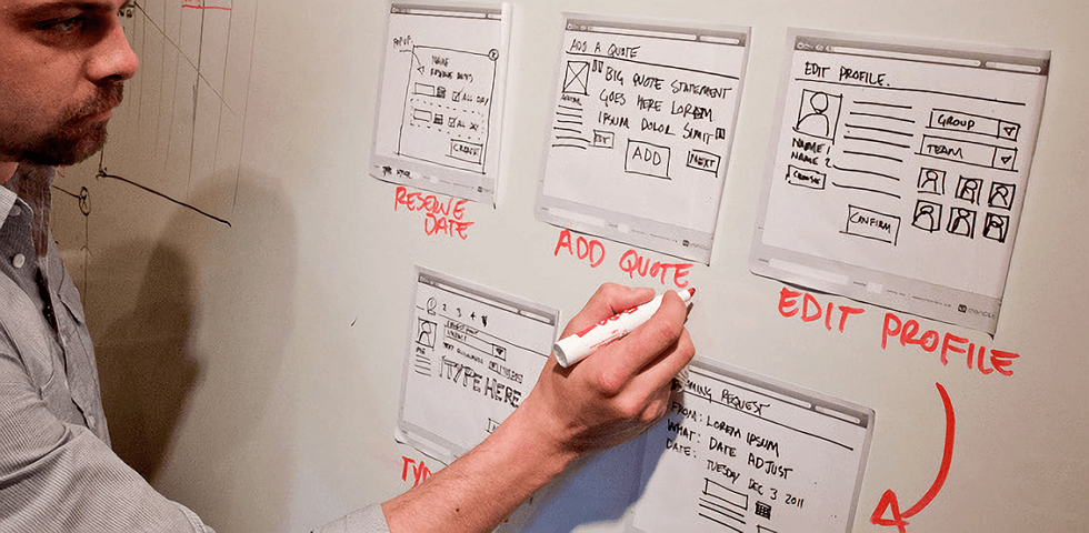
As per usual, the first stage of designing was creating a wealth of wireframes to quickly lay down our ideas onto paper and begin evaluating user flows and to make sure all parties involved were on the same page.
These images show a few of the wireframes created during workshops and discussions as well as some of the reclaimed post-it notes that posed questions to consider when designing these wireframes and composing the layout.
Prototype
More Wireframes
Sketches in Sketch
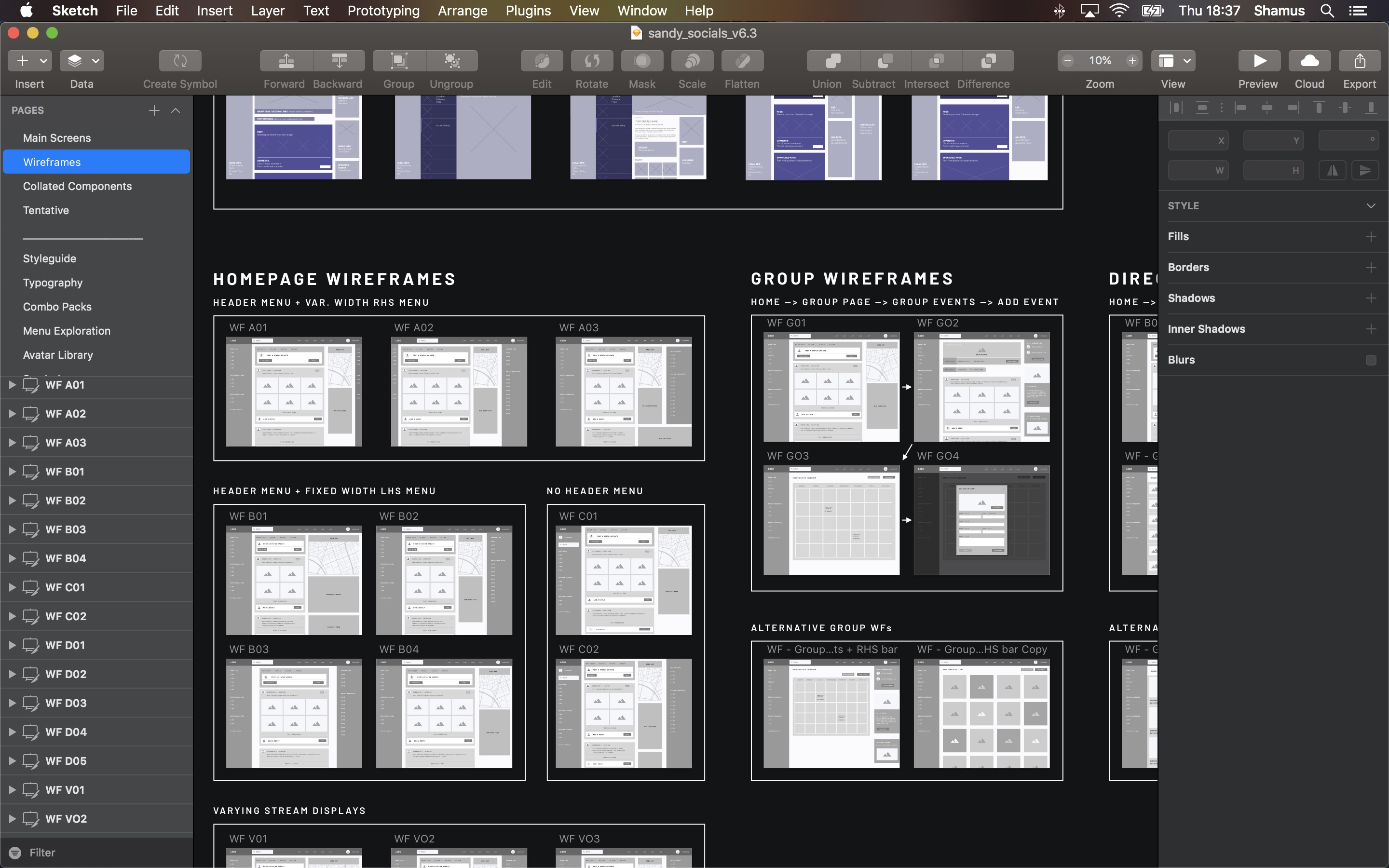
After sorting through the initial pen 'n' paper wireframes, we spent some time discussing which ones we felt held the most weight and were worthy of continued exploration. I opened up Sketch and began to put together digital versions of our paper-bound visions.
I chose to use Sketch as opposed to Balsamic or Axure simply because I'm very comfortable with the software and had several pre-built wireframe resources to help speed up the process. The quicker I got these second-wave wireframes down, the sooner we could begin refining them.
The image here partially shows a zoomed-out overview of our collated digital wireframes. I'd grouped them according to context and began to link associated boards together. This gives me a better idea of how pages would work together and how the user's journey might be.
Figuring it out
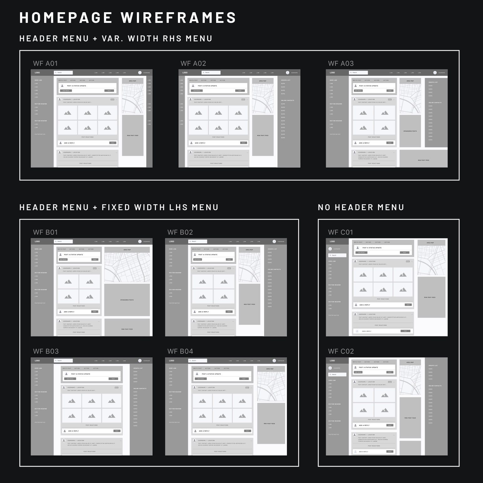
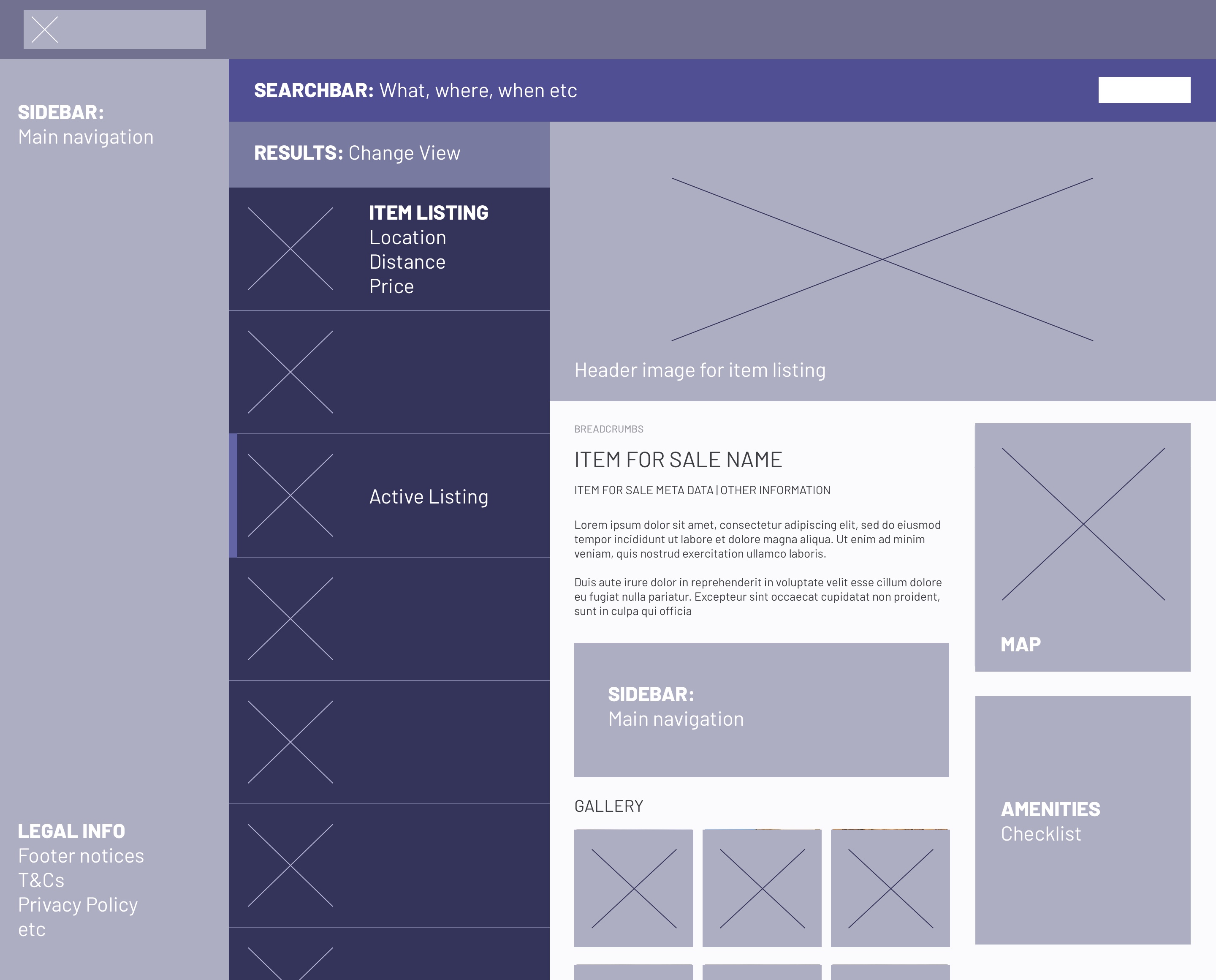
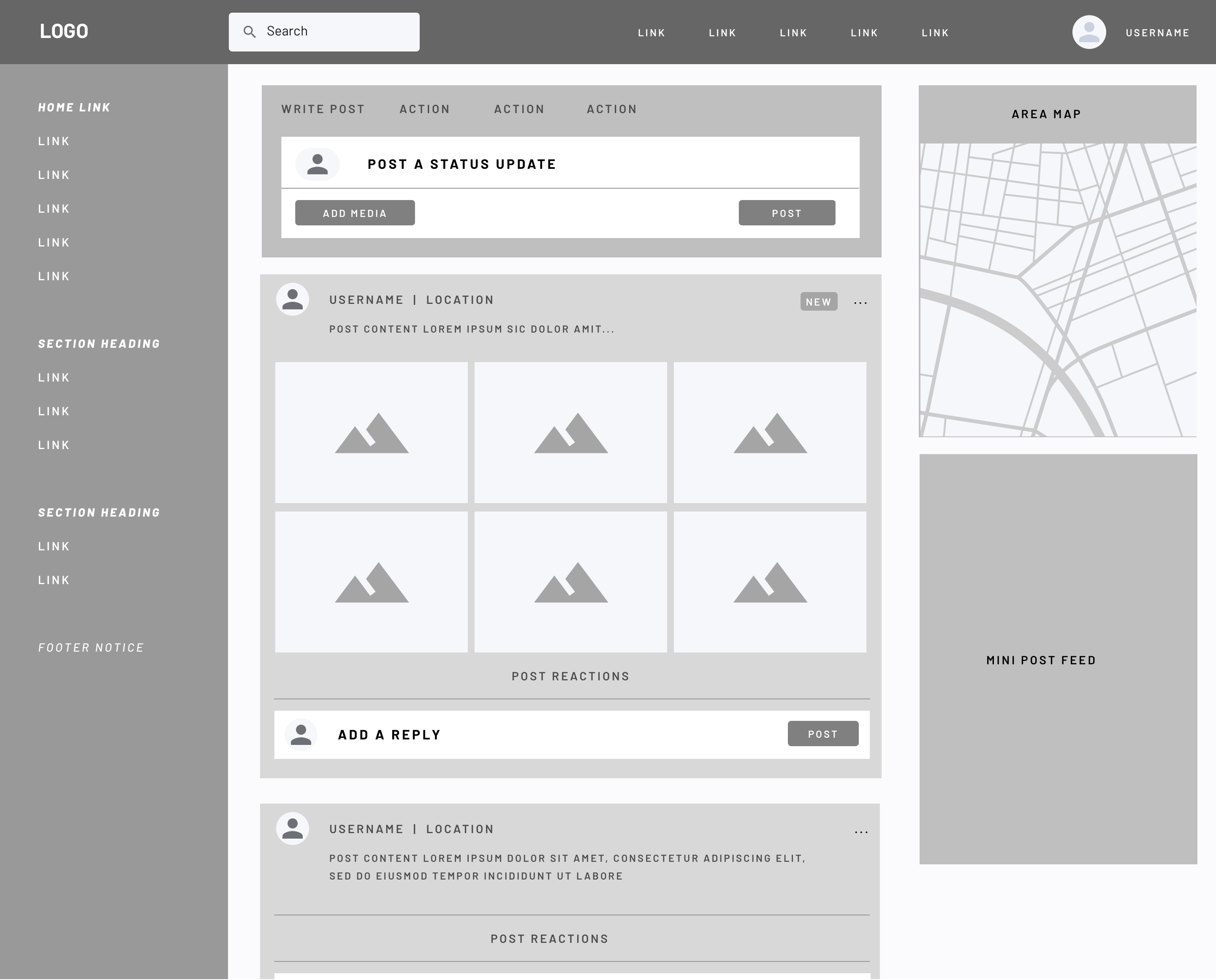
As you can see here, I've created several variants of the main homepage / activity feed. This page would 'set the standard' for the rest of the product in terms of layout as it will be the most visited area, so it was imperative that we explore as many options as we could.
Through our discussions and explorations in the ideate phase, we knew exactly what components we wanted to include and decided to look at everything as modular. We knew a grid system would aid in this (more on that later), so this part of our exploration really focussed on fitting our required parts together and seeing how they worked alongside one another.
Even at such an early stage, we could see there was a potential for some severe sensory overload. With a constant stream of information in one channel and pockets of information to the sides, a user could become overwhelmed, potentially eroding their perception of the product and ultimately making it harder for them to use.
Much the same as before but now for the rest...
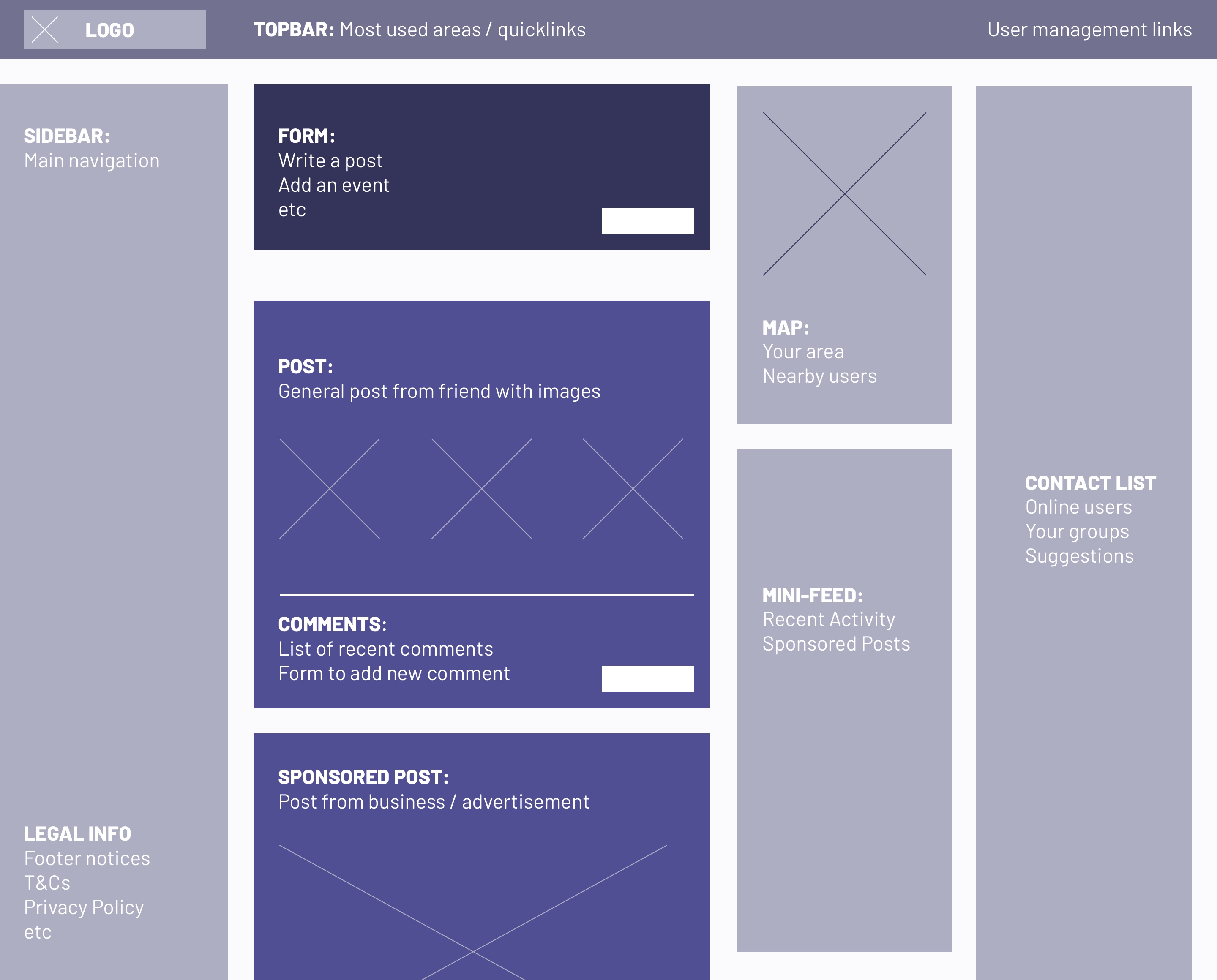
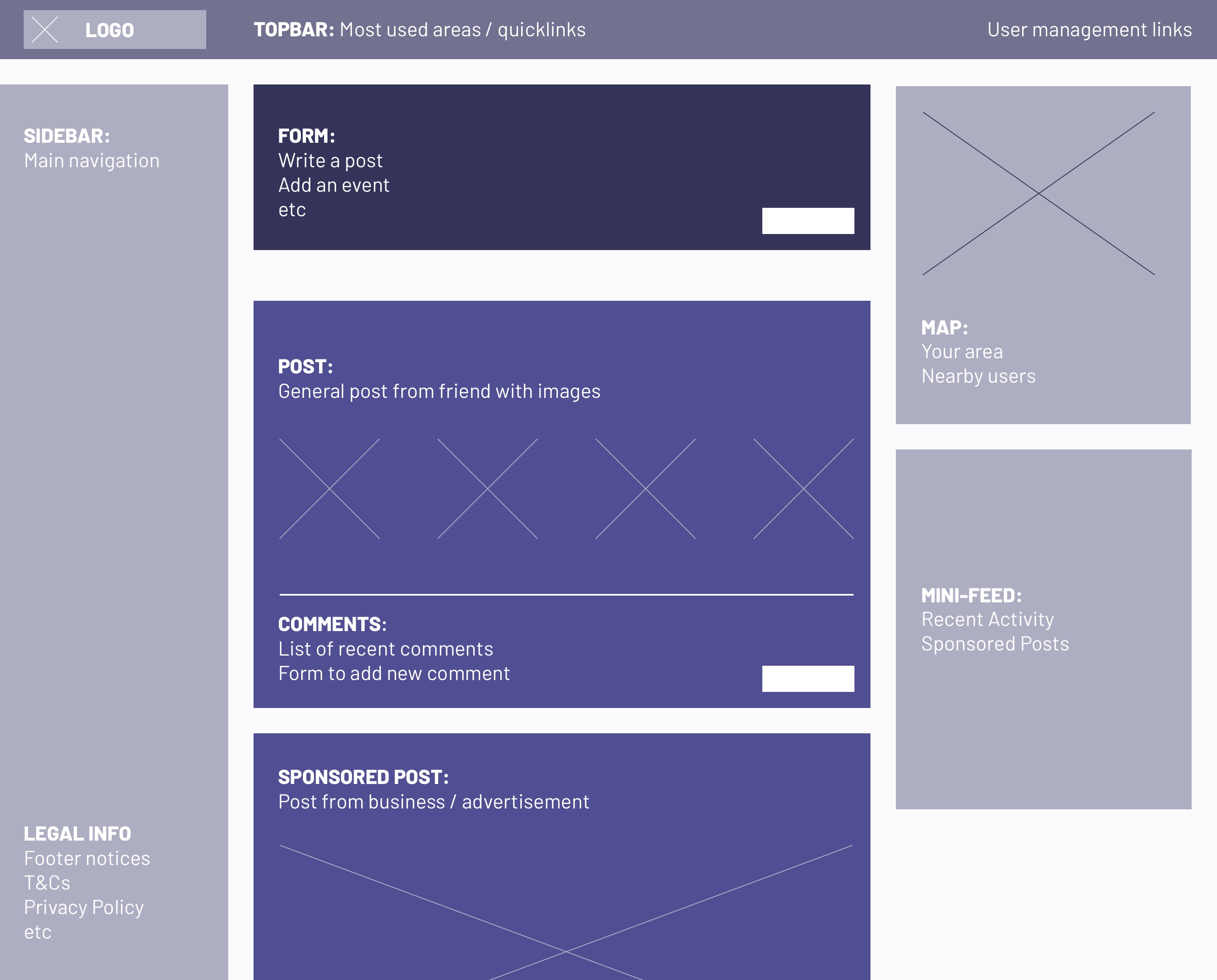
We had soon made some key decisions in terms of layout at this stage. We would have a horizontal navbar and static left-hand side 'extended' menu. The activity feed would always be the largest element on the page and the right-hand side sidebar will be used as a utility area to support the content in the main area.
The LHS menu will be a constant in all designs whereas the RHS items will vary in accordance to page content, being removed if need be.
I also began to piece together basic wireframe-to-wireframe user journies to help illustrate how the pages would flow together. This would of course also be done later during testing phases, but I tend to do them earlier for my own mind as it sometimes helps to shed lights on issues we might not have forseen otherwise.
The fruit of another session
These wireframes were created during an impromptu session in which we boiled everything down to it's bare essentials and took a step back to see each unit as a seperate block. We wanted to make sure focus was in the areas that required it the most and each block existed in harmony with it's neighbours.
The Wireframes are evolving...
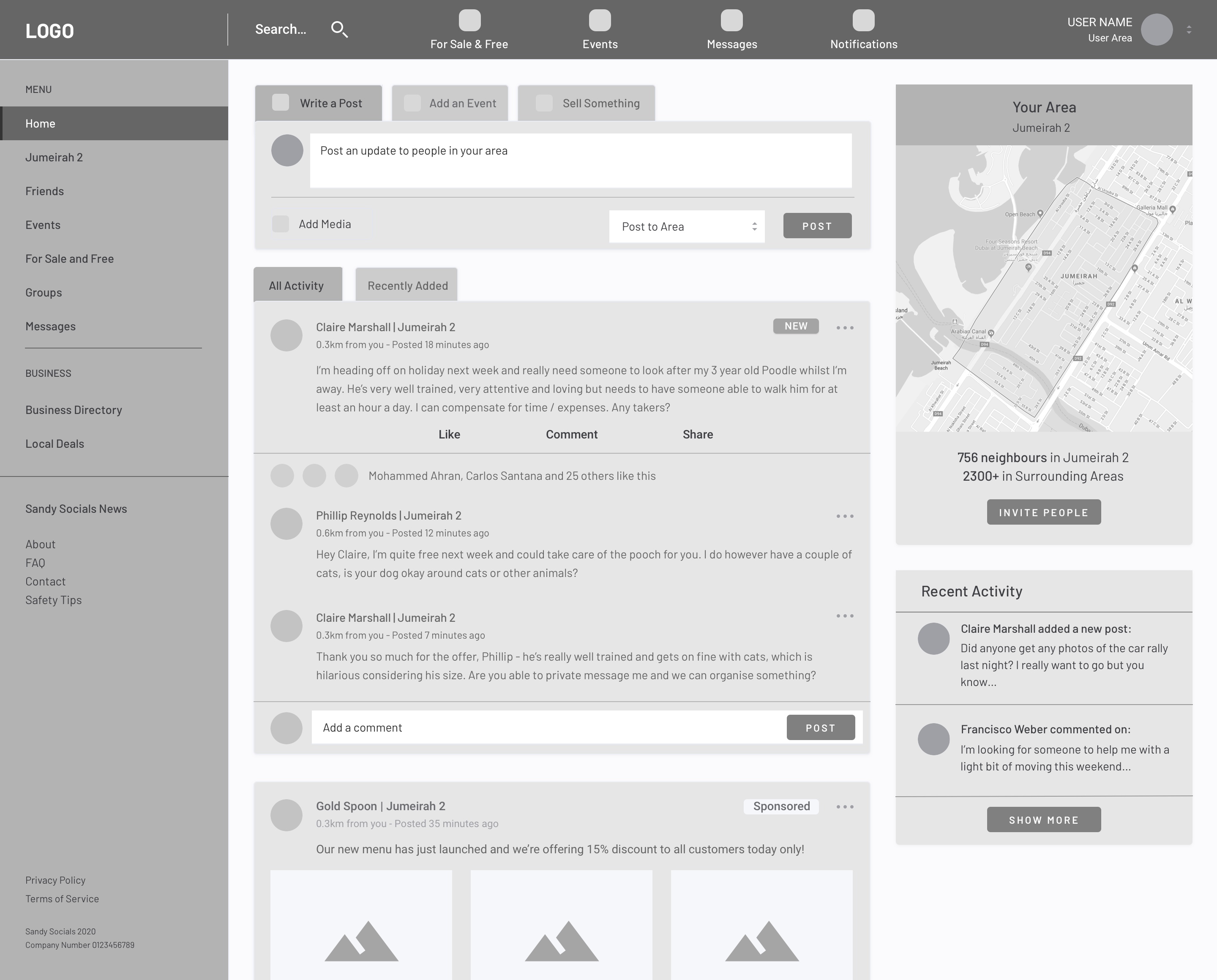
Once we had succeeded in creating several low-fidelity wireframes, our team's UX researcher began testing very basic clickable prototypes with some of the other workers in our shared office space. As she gathered feedback, we made slight adjustments to the wireframes each time, re-iterating our testing and gradually improving the designs over time.
I wasn't majorly involved at this stage as I was beginning to establish the visual language for the product and the creation of our style guide.
I reiterated each design and refined it further, increasing it's fidelity and adding more detail. I had written content to populate these designs (goodbye Lorem Ipsum) and we soon established what content would fill each section ie: links in the LHS bar versus links in the upper horizontal navbar. During this time, I felt very glad that we had taken the time to devise an in-depth and accurate sitemap as we could ascertain hierarchy and importance for each link / section.
Approaching the next stage...
By this point, we had moved onto much higher fidelity wireframes and improved upon the design enough times that we were ready to move onto creating the final designs.
At this stage, I had begun to already experiment with typography and began to embellish the designs with iconography (we decided to use Font Awesome) and imagery, so it felt natural to proceed onto the next stage.
Final Designs
Finalised Designs
Home, where the Heart is...
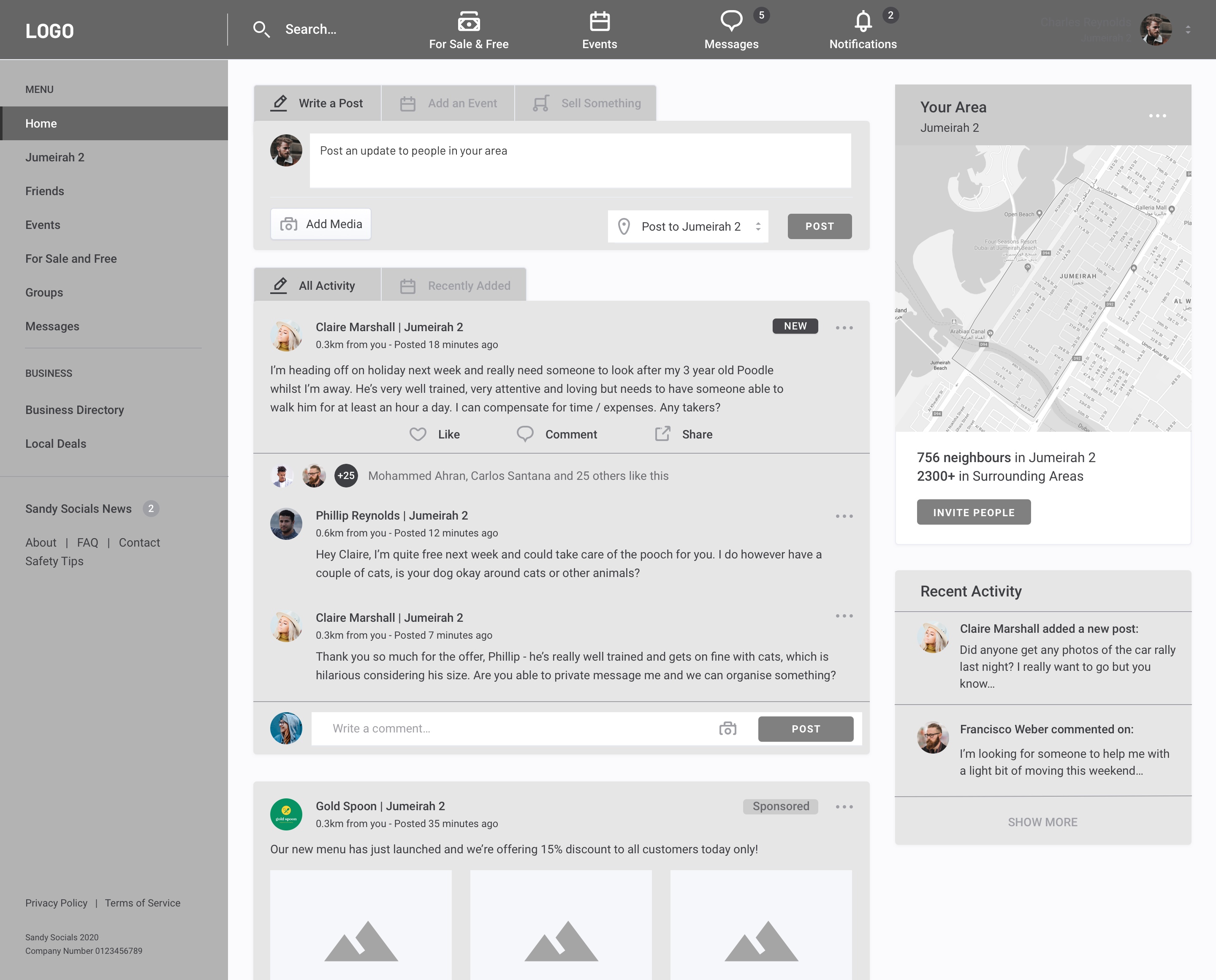
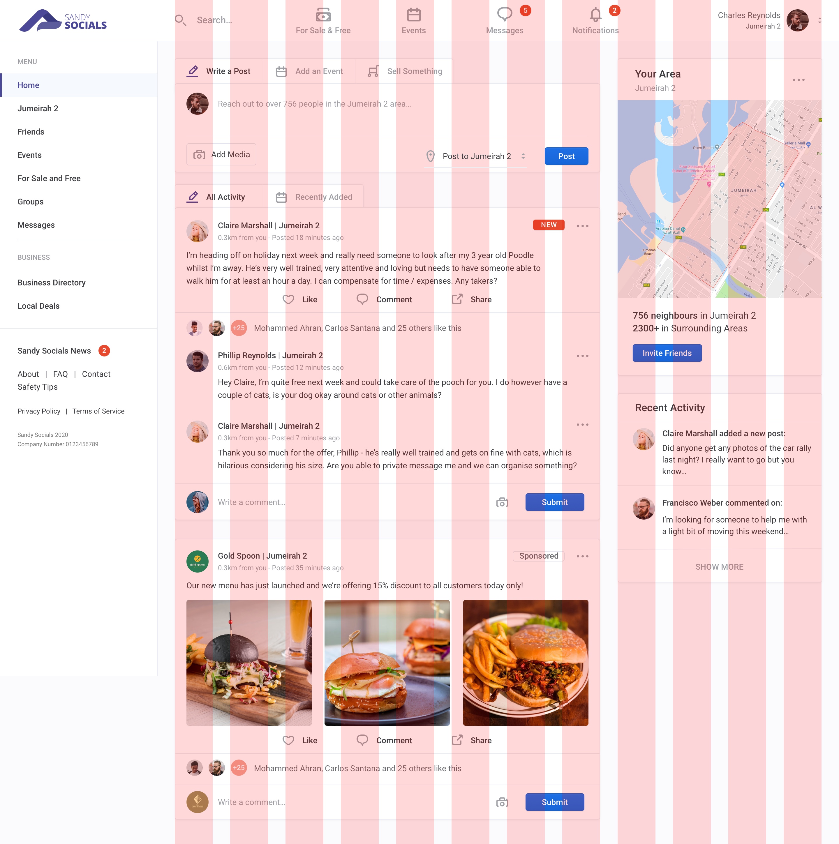
As you can see through comparing the previous wireframe, our sweet child has matured into a blossoming beauty. As the following sections are less UX focussed and more UI, I'll take the opportunity to explain features of the site in slightly more detail than before.
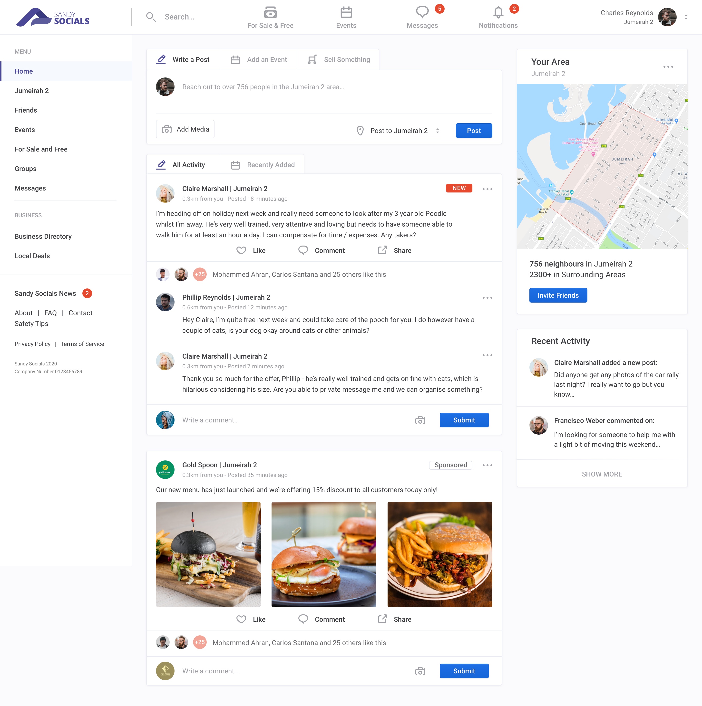
Upon signing up for the first time or logging in for the 3000th time (that would be a great metric for success!), the user would always be greeted with the homepage; a conglomerate of news, updates and information from people within the user's area.
Areas were established within major community blocks, ie: Jumeirah 2 (I mispelled this name approx. 250 times during this project). These areas were not custom defined, but instead extracted from accepted areas and zones most likely dictated by the rapidly growing real-estate market over there.
Much like most social networks, the status updates and posts of your friends would be displayed in a main feed with the option to respond in a variety of ways (reactions, comments, replies etc).
Business posts (usually sponsored) would also be peppered into the feed by means of sponsored posts, one of the many revenue streams to be incorporated into the product.
Grid System
Within the first few weeks of creating wireframes and initial concepts for this project, it soon became clear just how vast it could potentially be. With an ever-expanding amount of information being added to the site, it was imperative to define a robust layout solution that could be applied to the entire site. This would not only aid in creating a more user-friendly product but also dramatically decrease the amount of development time as we could create structured templates that allowed the content to flow logically and clearly.
We settled on a 12 column grid offset to the right, allowing for a static navigation bar to be persistent and provide ample room for a variety of unit combinations.
- Total Width:
- Columns:
- Column width:
- Gutter width:
- Offset:
- 1140px
- 12
- 60px
- 30px
- 285px
Typography
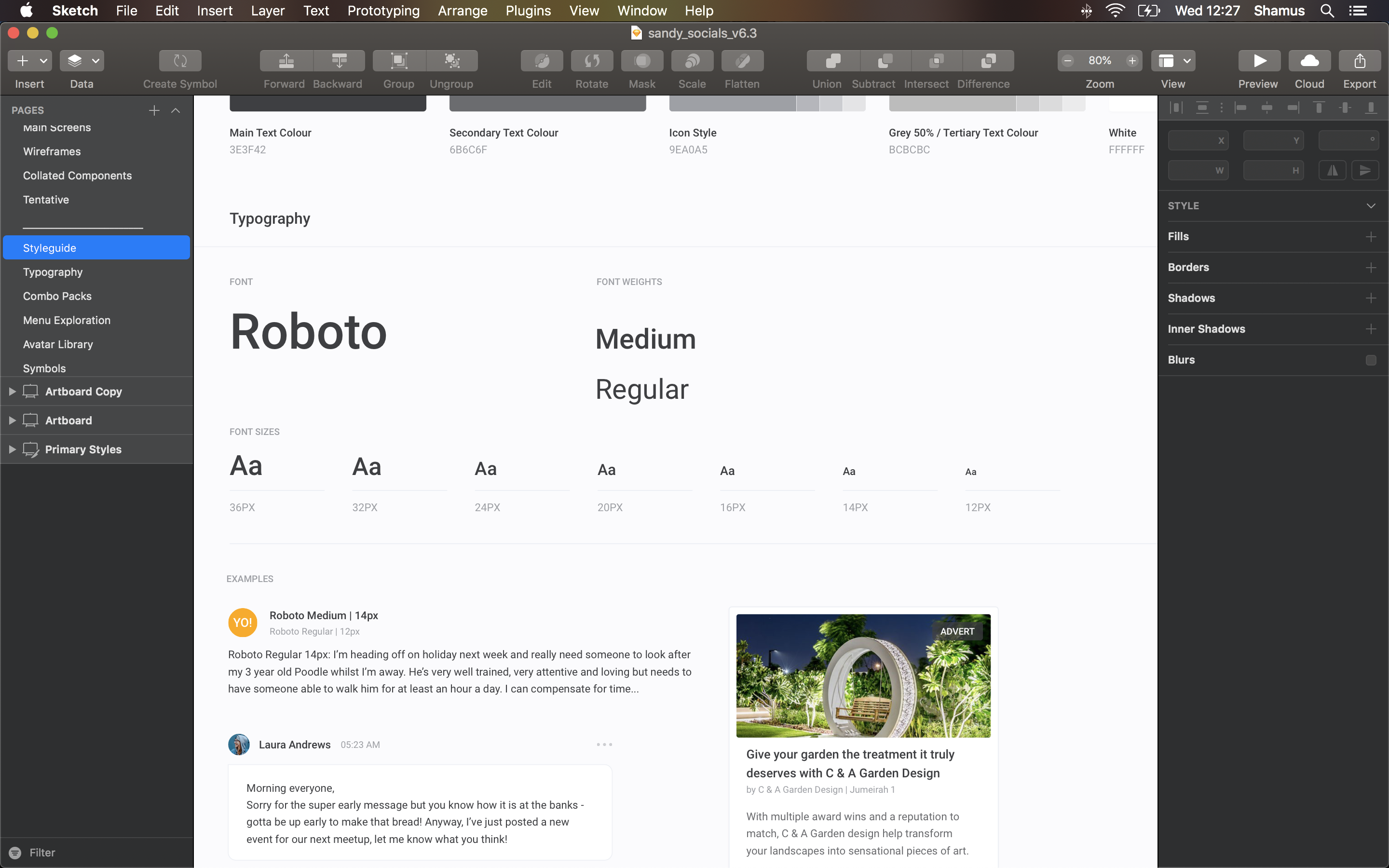
Having worked extensively on a previous social network based in the UK, we already had an established visual language. As we were working tirelessly to provide a working concept to pitch with, I decided to draw inspiration from our previous choices (which had been crafted after months of testing) and modify it slightly to fit with our current style and layout.
The screenshot to the right shows an overview of the styleguide (Client requested that I only show a small part of this due to the project still being in progress).
User Posts
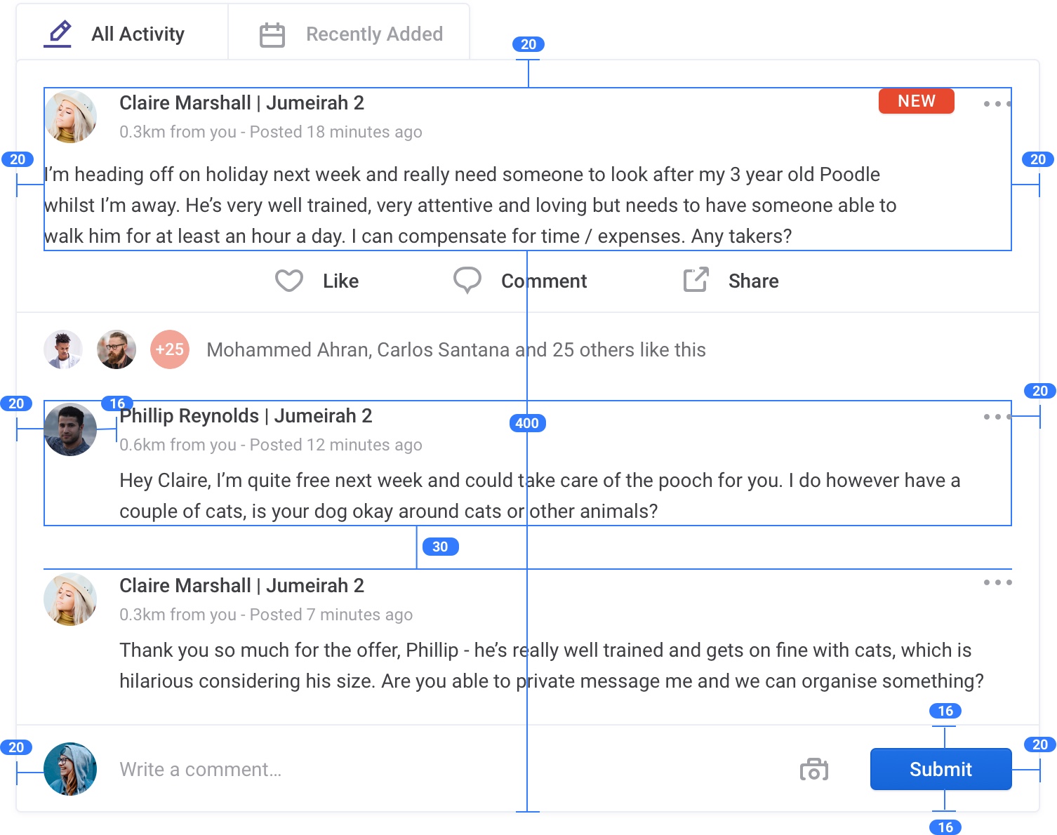
It wouldn't be much of a social network without users contributing content. Here you'll see an annotated version of a typical user's post and it's dimensions on screen. These precise sizings were established fairly early on and were victim to rigorous testing, evaluation and amendments, ultimately leading to what you see here.
Giving each element a wide breadth of space was vital as each element is very text-heavy, so when placed alongside 20 other posts of similar bulk, there was a risk of all the information blurring into one messy chunk. A clearly established hierarchy formed through positioning, whitespace, type and color helped avoid this pitfall and allows the user to quickly scan relevant content without being overloaded.
This hierarchy is applied throughout the entire product so as to allow for a smooth and pleasant user experience.
Sponsored Posts
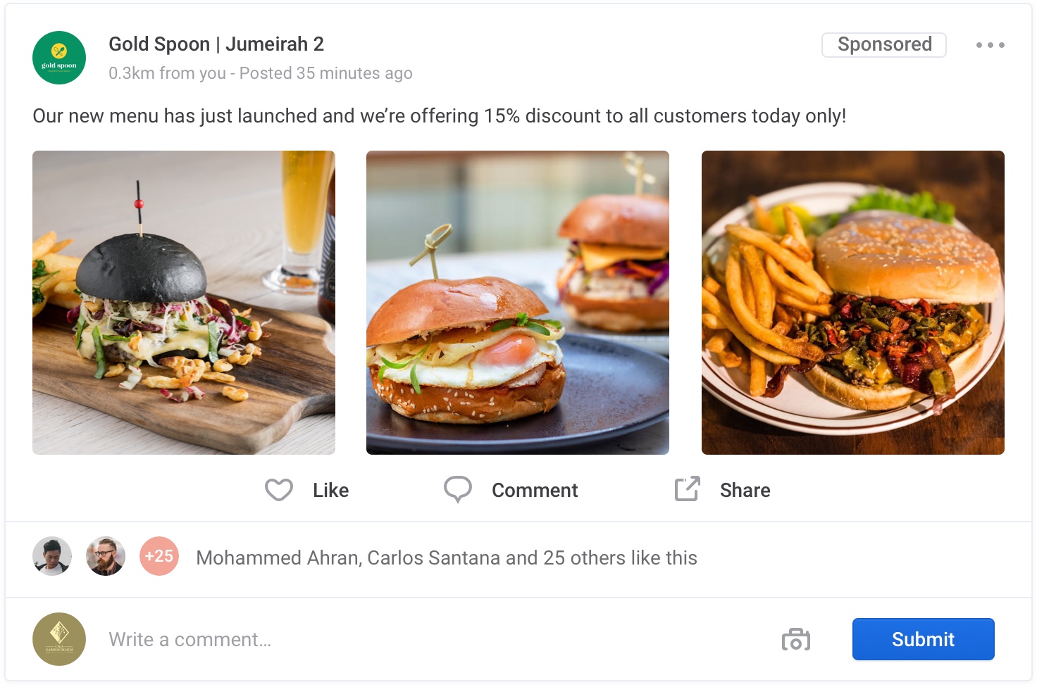
Much like the user posts above, sponsored posts via businesses are arranged in the exact same way, allowing them to naturally be a part of the user feed without being overly obtrusive. A 'sponsored' label is clearly shown in the top-right corner to indicate that this post has been paid for by the business and aids in informing the user why they're seeing this post.
During testing, several users mentioned that they didn't understand why they were seeing these posts as they hadn't followed the business. Simply by adding the sponsored label and making it more prominent than it was (originally a small text label besides the post creation time) it immediately cleared up any level of confusion.
Groups
Getting Everyone Together
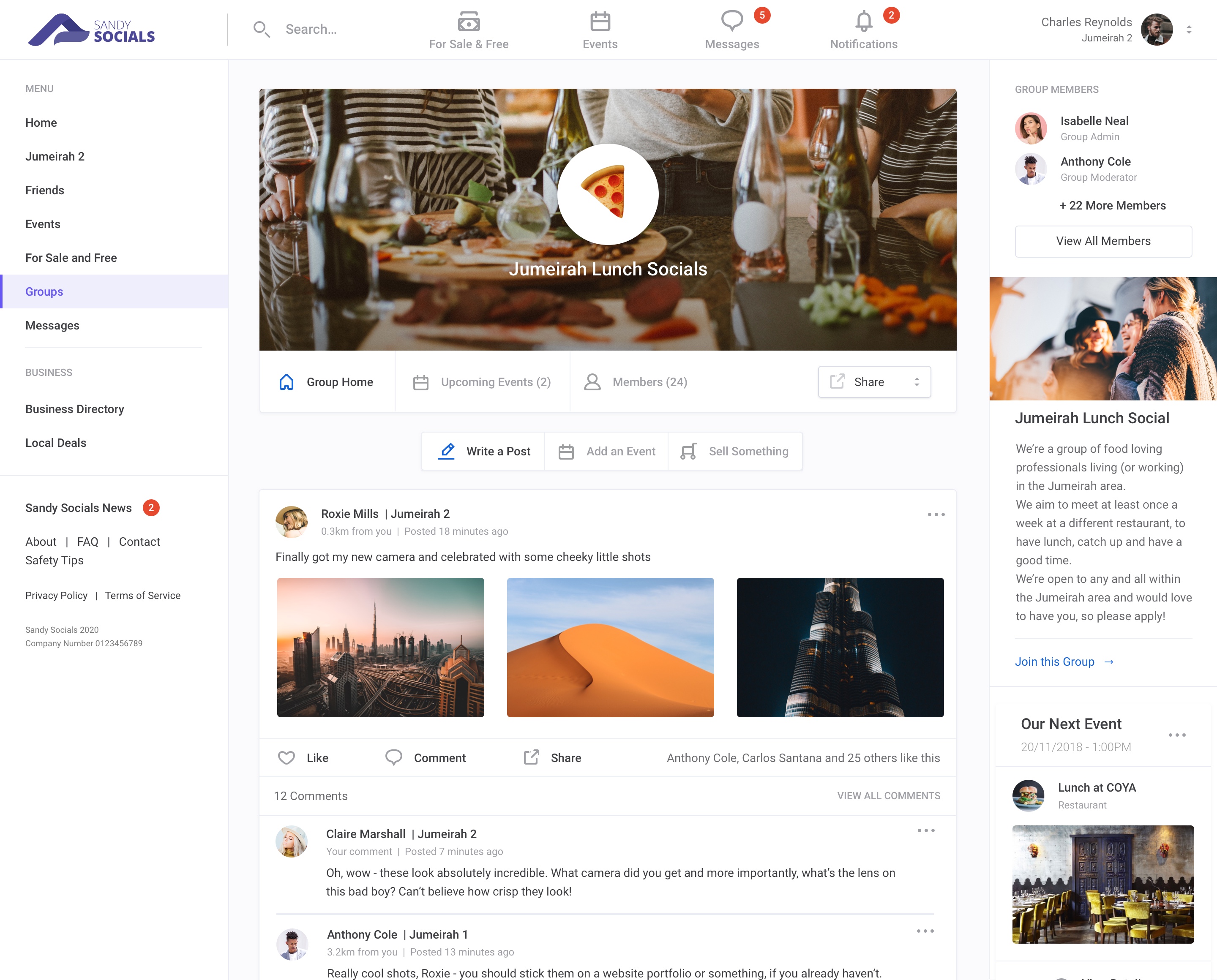
A major part of the Sandy Social's platform was the option to create private and public groups to cater to those with shared interests and ambitions. Community engagement and coming together is a key part of what we were trying to achieve, so this was something we were adamant to nail very early on and hopefully allow it to grow into one of the most used features of the site.
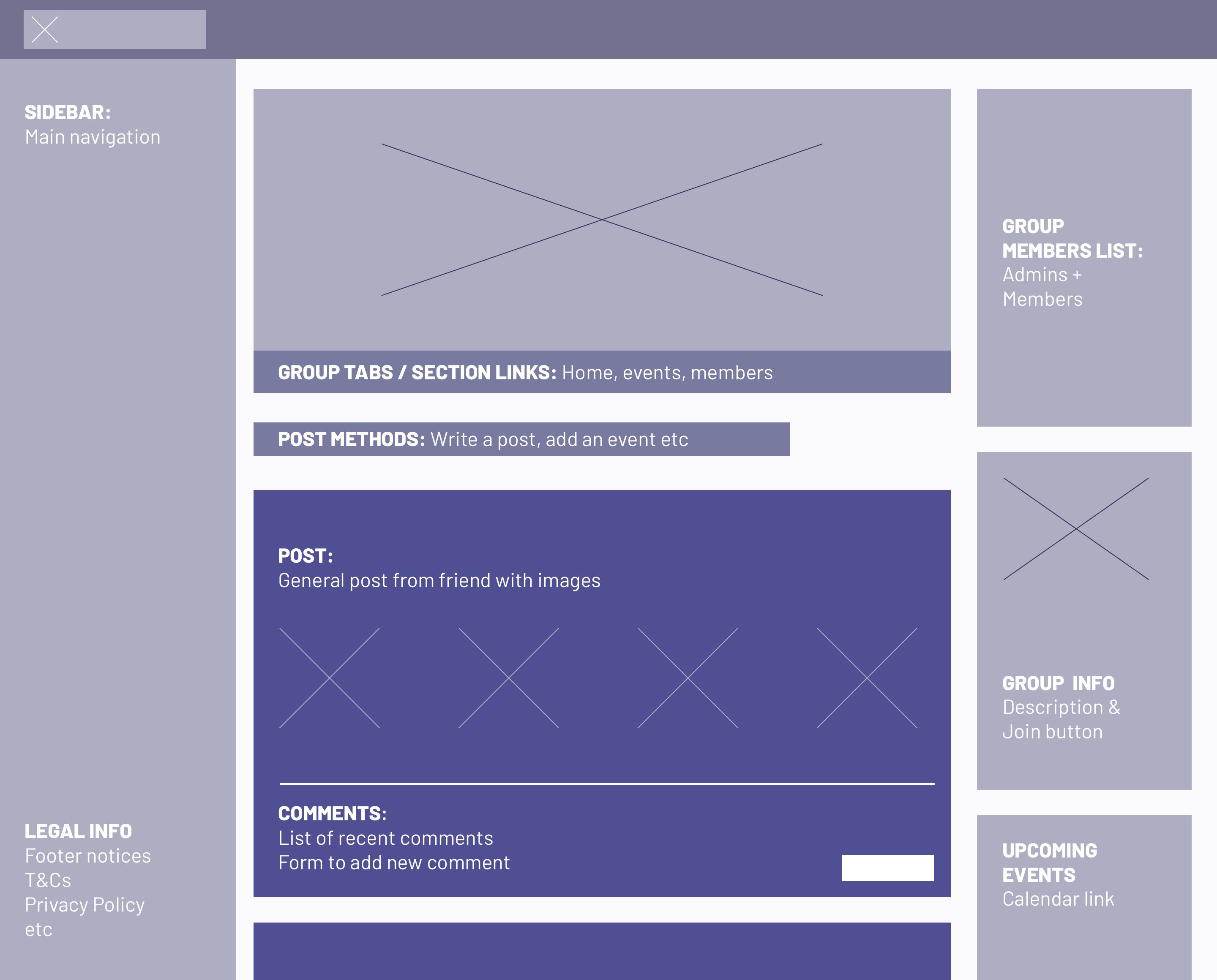
As you can see, this layout conforms to the previously discussed grid system, but utilises a larger 'main area' and ushers the right-hand section into two columns as information here is less integral to the section once a user has gotten used to the site and is familiar with what's being displayed.
These group pages act as seperate feeds and can be displayed within the main home-feed if the user wishes to do so. As with most community-based group products, users can be assigned administrator and moderator privileges to moderate and monitor their group's activity. These sections would soon become thriving hubs for relevant discussions and organising events, meetings or simply providing a safe and private space for like-minded users to communicate.
Sharing content
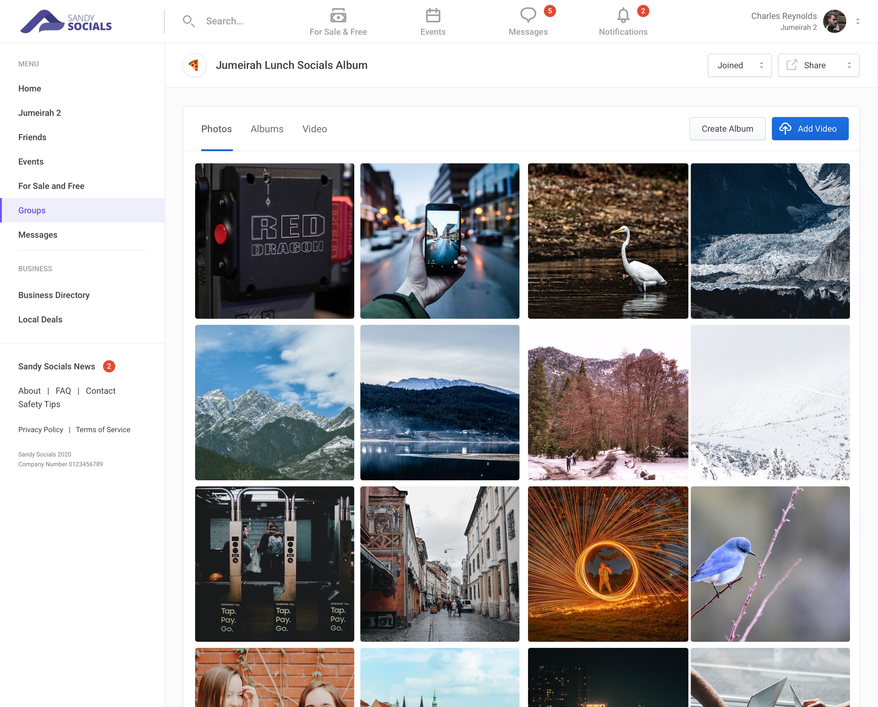
We wanted group pages to feel as relevant and engaging as possible. User's are able to add to communal galleries of photos and videos (at the whim of group moderators) that exist solely within the group's private area (groups also have the option to be visible and joinable by the public, but during testing it seemed that very few were willing to do so - hats off for internet privacy).
The layout here was kept simple and easy to use whilst still adhering to the pre-defined grid structure. Images would automatically be cropped into a standard thumbnail format, expanding to it's intrinsic proportions in a lightbox once clicked.
Messaging
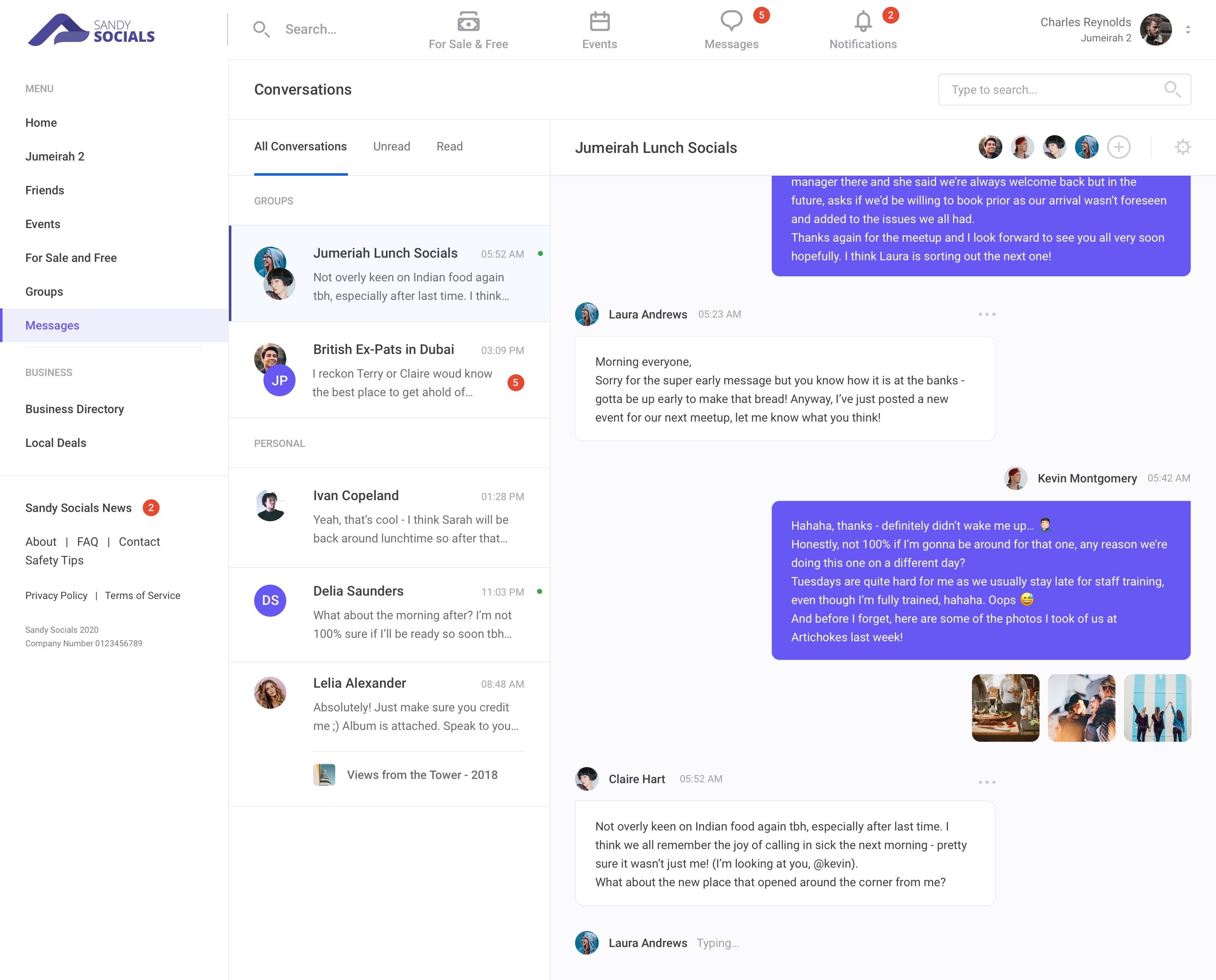
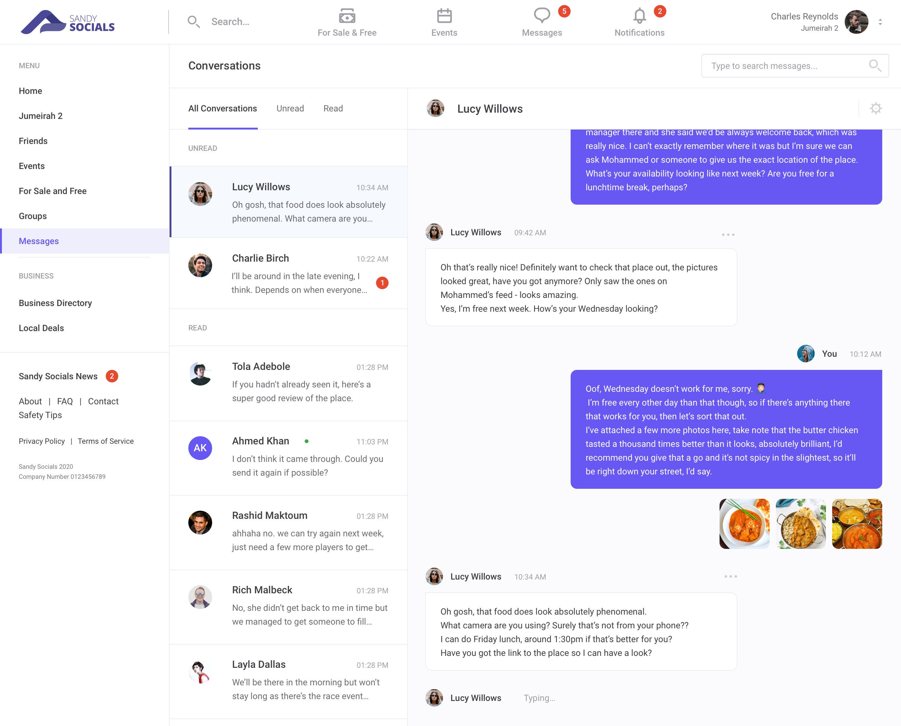
What social network would be complete without a messaging platform to instantly communicate with other users across the site? Here you'll see two examples of the messaging page (in a 2-part slideshow - way to break page format...).
Groups and personal messages are seperated for ease of navigation and have the option to mute conversations should notifications become too much - we've all been in a group chat with some overly zealous people banging on non-stop, so the option to silence such an assault was deemed important.
Events
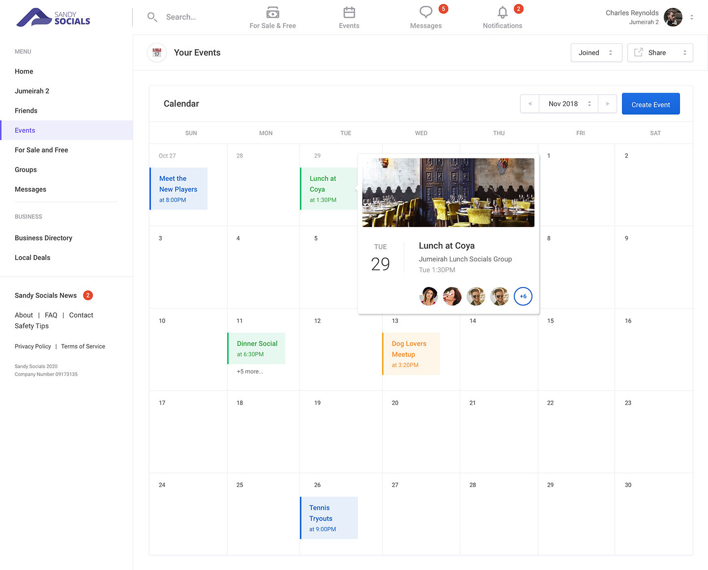
Something is always happening somewhere. It's here that users can view their own personal event calendars and view further details, amend attendance or to simply check out who else is going.
Users can assign events to their own calendar via posts on their feed by simply selecting weather they wish to attend or are considering doing so. Group events would also be pushed to the calendar with the option to accept or reject there and then, so that the chances of missing an invite are minimised.
Events are color-coded according to the user's preference to allow for easier page-scannng and mental filtering.
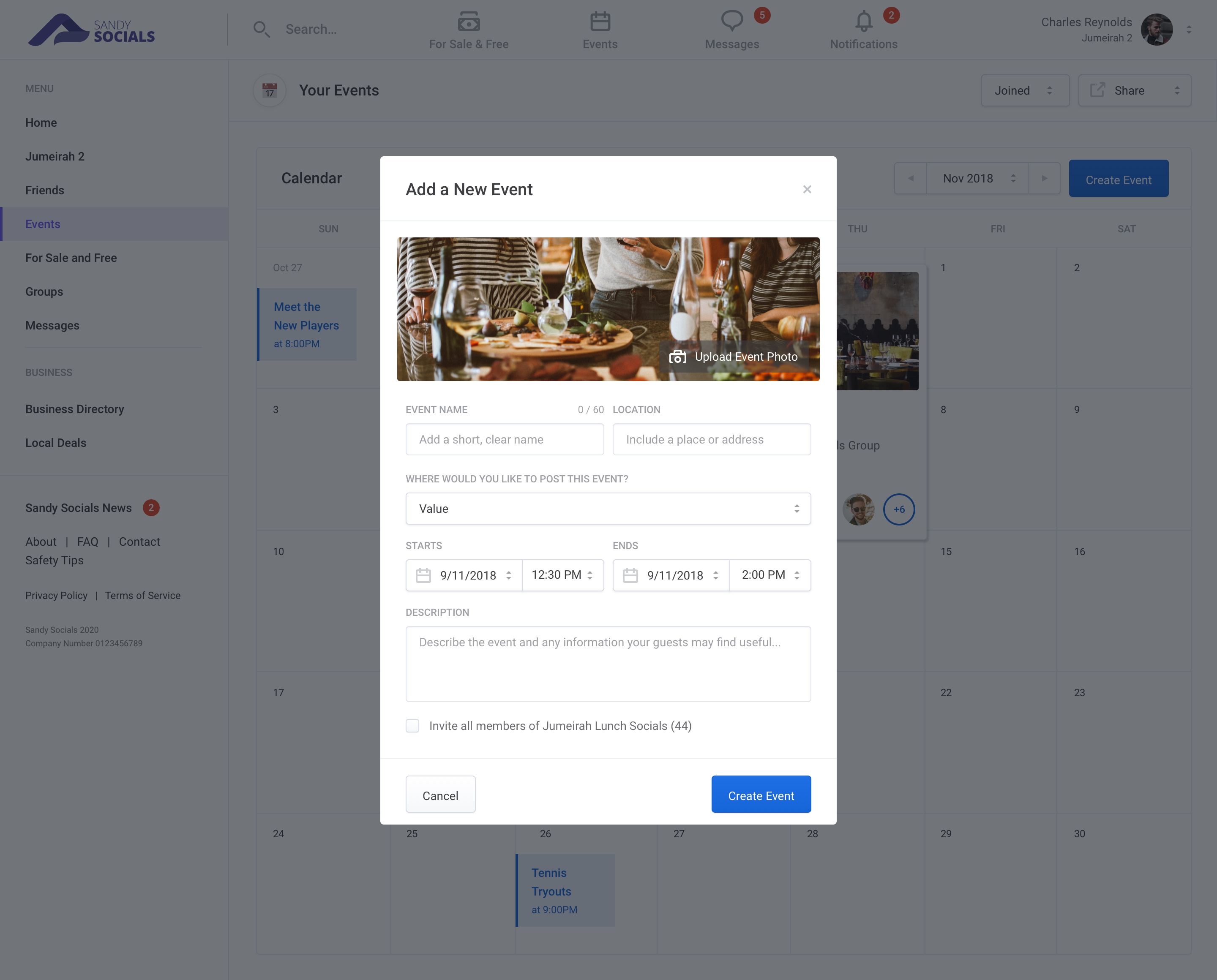
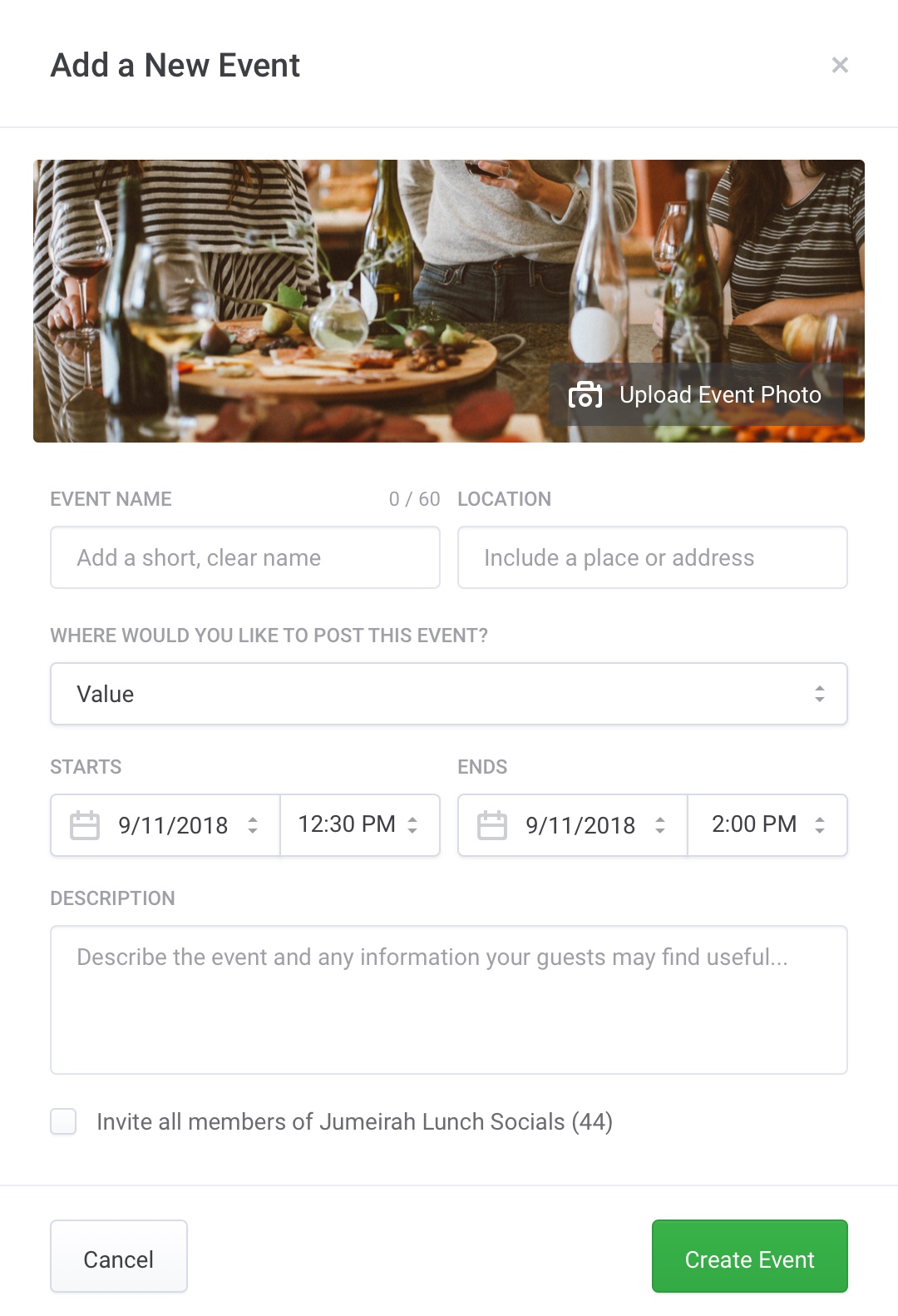
Adding Events
For a user to add a new event, they simply fill out the form shown below. Options to invite members of certain groups or to only display the event for users in certains areas are present here.
Group Information
On the right-hand column of group pages, the user is shown who the group admin and moderators are, as well as the option to see all other members. Private groups will only show the admin's details until a user joins said group. A group description and upcoming events are also shown.
For Sale & Free
Selling and buying
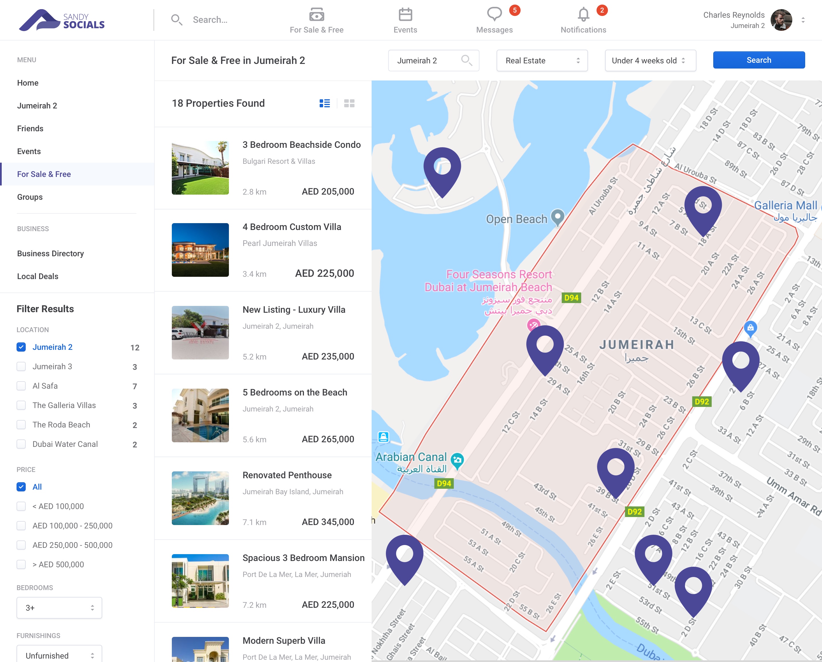
There's a lot to be traded in Dubai and several industrys are booming. Real-estate and automobile sales are two such industries and so, it was deemed appropriate to faciliate a space for anyone to advertise what they've got to sell in the local area.
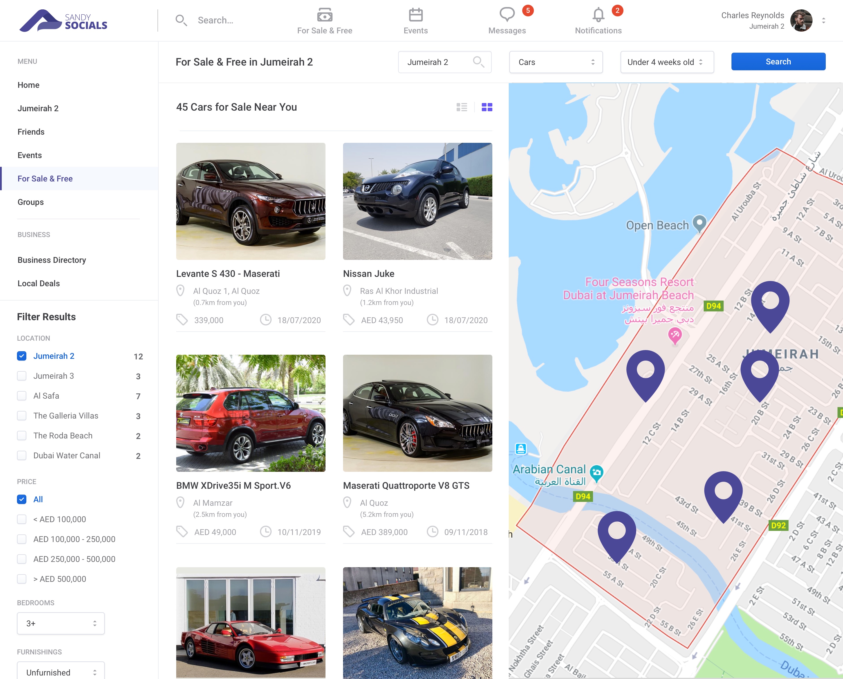
Users are given the ability to search through a wealth of categories and find local offers, deals and goods for sale near them. In this example, you'll see several real-estate properties across the Jumierah region. Each pin represents the location at which the item is for sale and users can filter through varying options to fine-tune their search.
Further information can be seen by simply choosing which link to view. Here you'll see a listing for a 4 bedroom custom villa and all of it's relevant information.
These listings are added by individual users or businesses and provide a direct link to the vendor (in this case, the real estate agent). Image galleries are included as well as a local map and an overview of amenities.
Much the Same for Everything Else
Here you'll see how the same For Sale & Free layout is applicable to other things, in this instance, automobiles. Each listing shows the item's name, location, distance from the user, price and when the item was posted.
This design shows an alternative view, which is toggleable by the user. Instead of a stacked list, items are displayed in a 2 column grid - this would be the default presentation method for items such as cars, which are more attractive and easier to navigate as the image is larger and one can see the specifics of the item clearer at a glance.
Sponsored Content
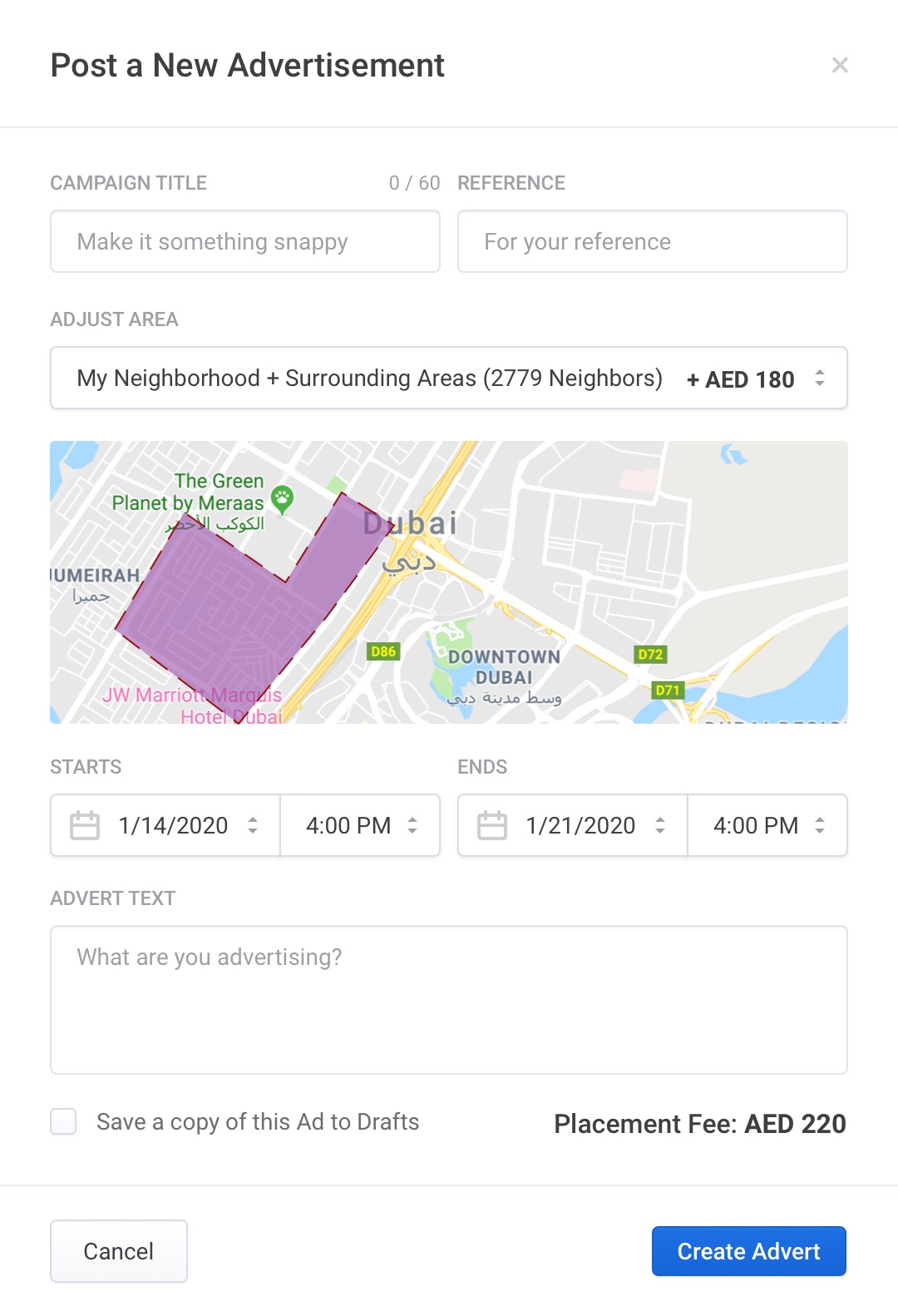
Businesses and willing individuals are given the opportunity to create adverts and provide sponsored content for the site, which as mentioned at the start of this case study, are integrated into the feeds of users that fit the relevant criteria - usually distance, area lived in, age and other demographics.
The eagle eyed amongst you may have noticed that the form is very similar to that of the 'Add an Event' form, which is of course purposeful and part of creating a consistent and fluid user experience. The only major differences are that a price to place the advert is displayed and one is able to target certain areas viewable on the map.
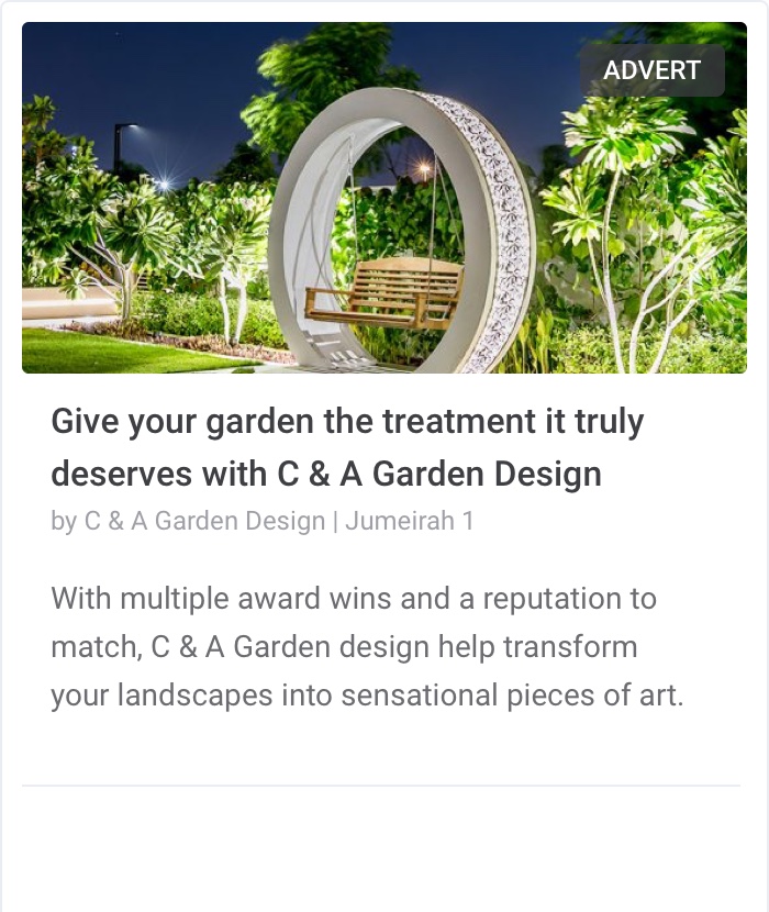
To the right of this page you'll see how an advert would look. All adverts, much like sponsored posts (essentially the same thing but in the guise of a post from a business / individual) are labeled as an advert.
Responsive views
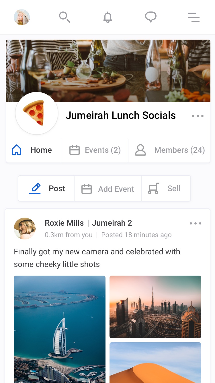
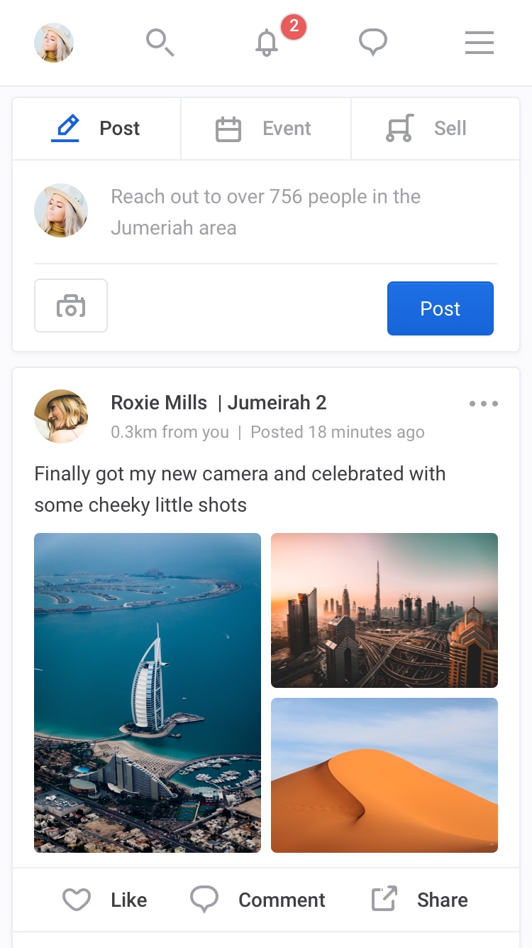
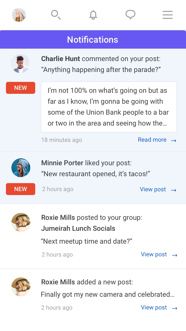
These screens show how the layout adjusts according to screen size, a mobile phone in this case. All features and functionality remain present across all devices.
Congratulations
You've made it to the end of this case study.
This project is still a work-in-progress and is yet to be completed so metrics for success are somewhat limited. I can say however that I thoroughly enjoyed working on this project and am eagerly anticipating it's release (even though I'm not the target audience) and hopefully, especially in a post-Covid-19 world, it'll help bring people together safely and foster stronger communities, which is what the project was ultimately all about.
All designs were created in Sketch by myself over the course of several months. Thanks for reading and get in touch with me if you'd like to discuss future collaborations together.
