Leeroy Jenkins
Portfolio Site Design
This project has been modified to comply with an NDA.
Names, brand colors, identifiable assets and other minor details have been changed.
Leeroy Jenkins is a semi-fictional character, this design is not.
An Overview
I was commissioned by Jenkins, a full-stack developer, to create a portfolio site that reflected their current brand aesthetic and communicated their skills and professional experience.
I had previously designed Jenkin's print design collateral and established their visual identity. This meant that I was already au fait with the brand and visual identity, so creating a digital presence came quite naturally.
During early discussion and exploration phases, I agreed with Jenkins that the following factors were 'must-haves' for their site:
- Load time for the site must be as low as possible. Rapid load times and minimal bandwidth usage are key. Jenkins is hosting the site on their own server, which means bandwidth usage must be minimised.
- Information must be clear to read and easy to access.
- The visual language must reflect that which has already been established previously.
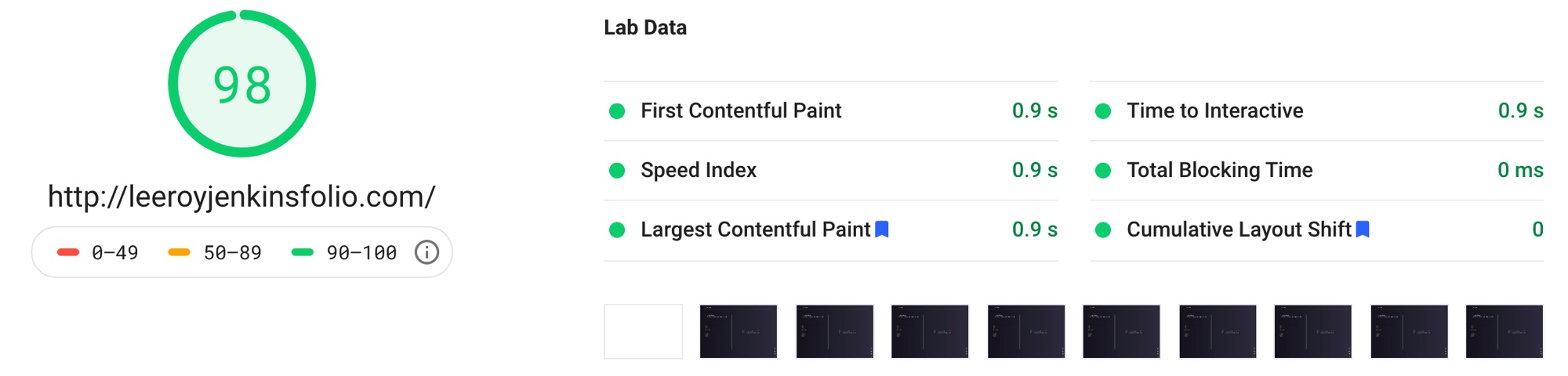
As well as designing the site, I assisted with part of the development; specifically responsive styling and optimisation. Upon completion, this site received a 98/100 for speed via Google PageSpeed Insights and was received by the client very well.
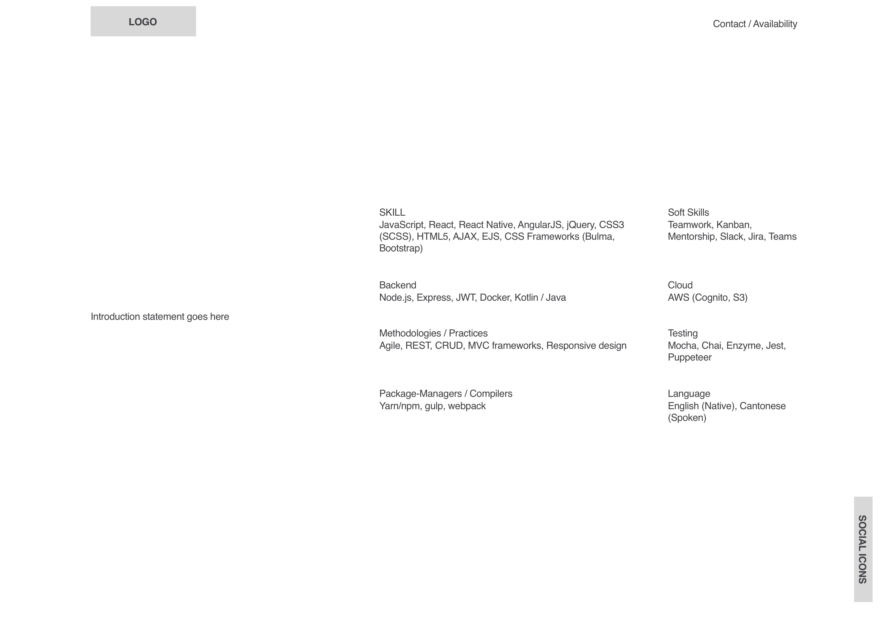
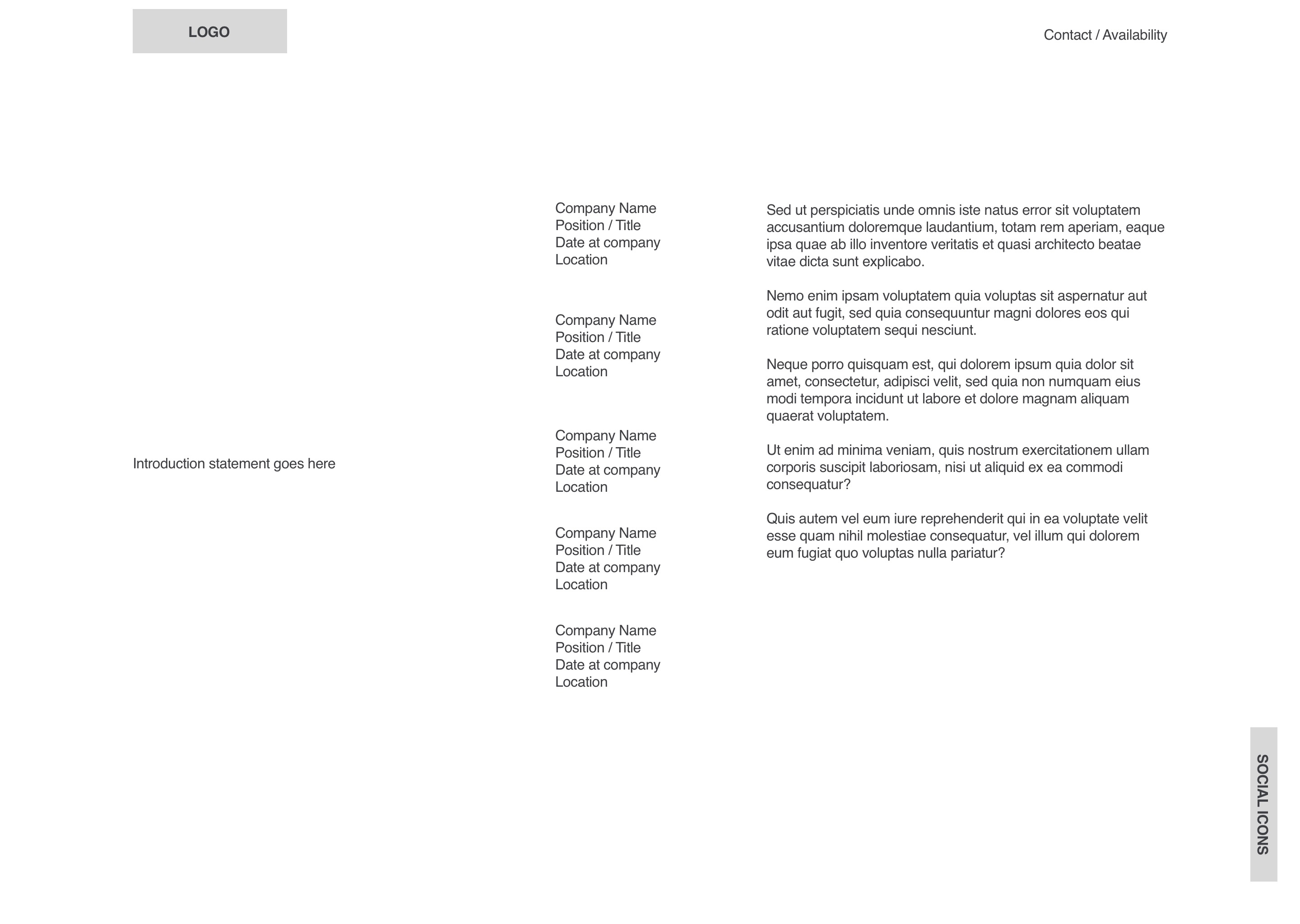
Initial Wireframes
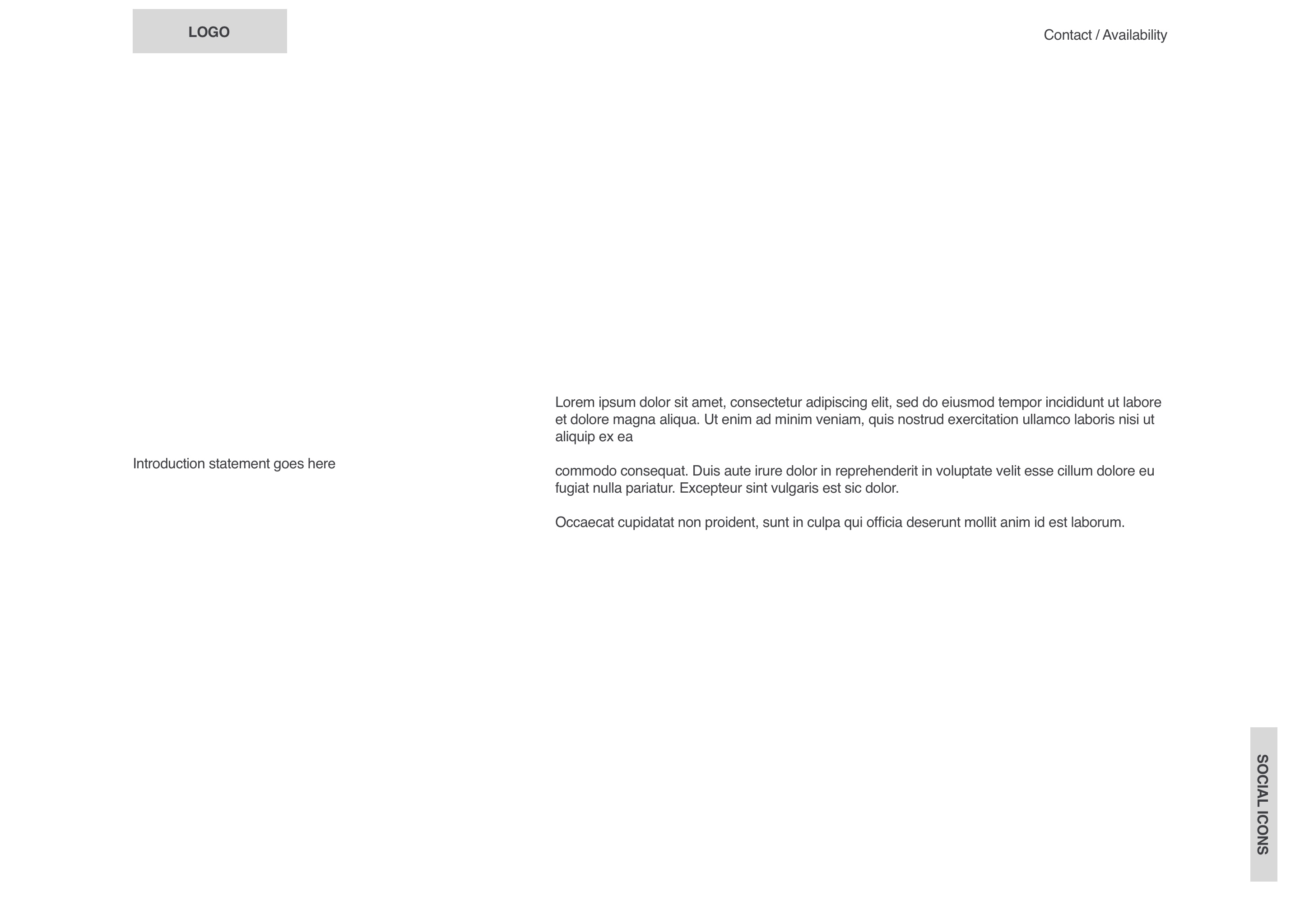
Jenkins had graciously provided me with content for the entire site before I'd even sat down to consider the wireframes. This bounty of information made for a smooth design process as things such as container height and space occupied was no longer a mystery.
The first wave of wireframes (1.0) were very simple layouts that displayed three sections at any one given time. Jenkins was quick to understand my reasoning behind this arrangement and approved it's further progression.
Early on, I had envisioned the left column remaining static and perhaps acting as the navigation itself. (at this point, navigation was still being discussed, so remains absent from this stage). The remaining columns would then be occupied by the relevant content.
The 2.0 versions of the wireframes communicated my vision well. We agreed to further this layout and apply Jenkins' visual identity to it.
Design Elements
Typography
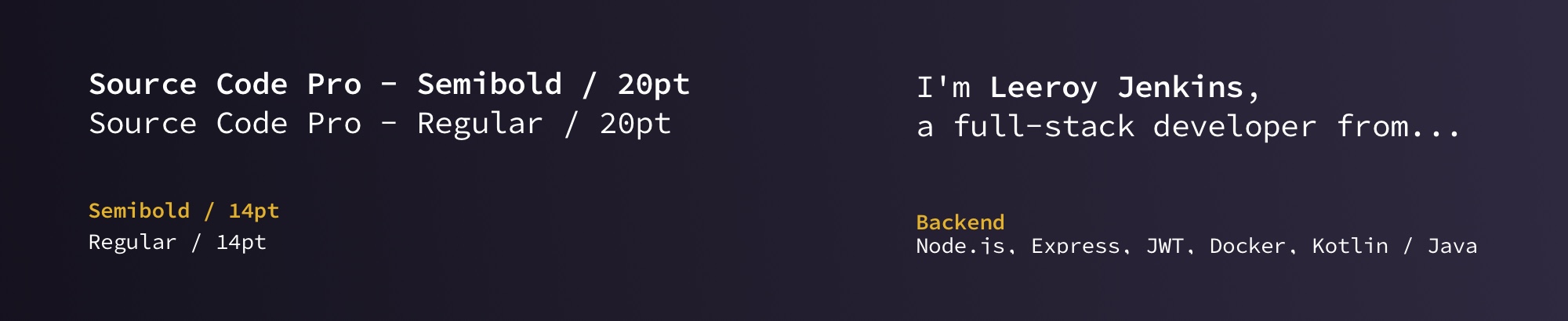
Initially, we were considering using Barlow as the main font but soon decided to use a monospace font, as that is a typical and standard choice for IDEs in development. After much consideration, we settled on Source Code Pro.
By utilising a monospace font, I aimed for users to be able to tell that this was the portfolio of a developer without reading a single line, simply through association alone. Granted, this wouldn't apply to everyone, but the target audience (people in the IT industry) would have a better chance at recognising and associating a monospaced font with their profession.
Colors
As I had established Jenkins' brand identity a few years ago, there wasn't much extra thought behind selecting the colors. Initially all collateral was solely print-based, so no gradients were utilised, simply solid spot colors. The reason being most printers I've used are terrible at printing smooth, consistent gradients across all items of print.
However, as we now place Jenkin's brand into digital realms, I deemed adding a subtle gradient appropriate. The gradient stemmed from the brand's existing dark purple and soon ascends into a slightly lighter version. This aided in adding a slight variation for the background, resulting in a less 'flat' looking design.

Grid System
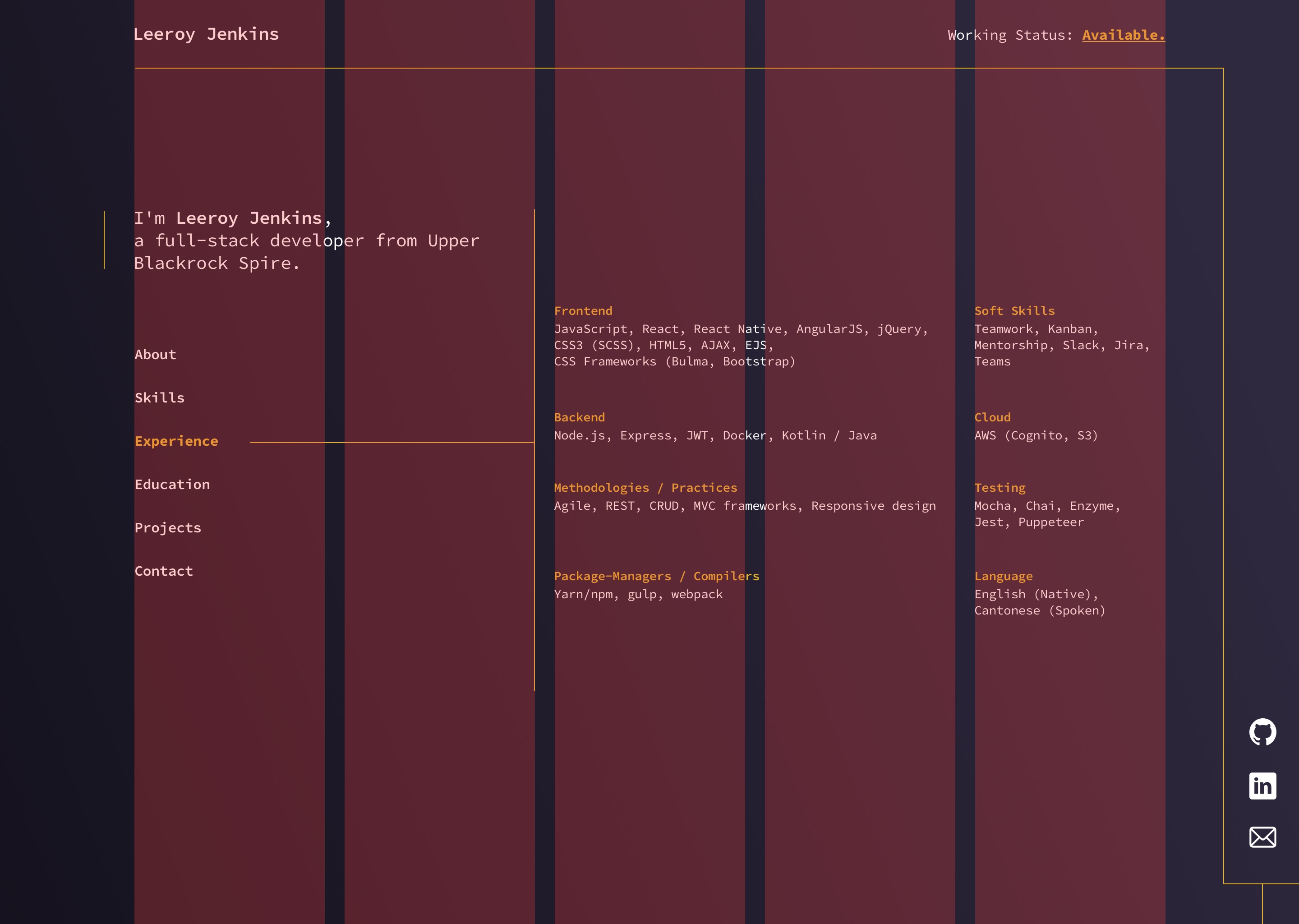
Using a five column grid, I was able to dedicated areas of the page to certain functions and content. The content within the first two columns would never change, which is why we placed the navigation and introduction in this part (consistency is key, positive UX always). The remaining three columns would hold varying information for each section.
It should be quite obvious how I've used the grid, so explaining it further seems slightly redundant. If it isn't too obvious, then what on earth am I doing with my life?
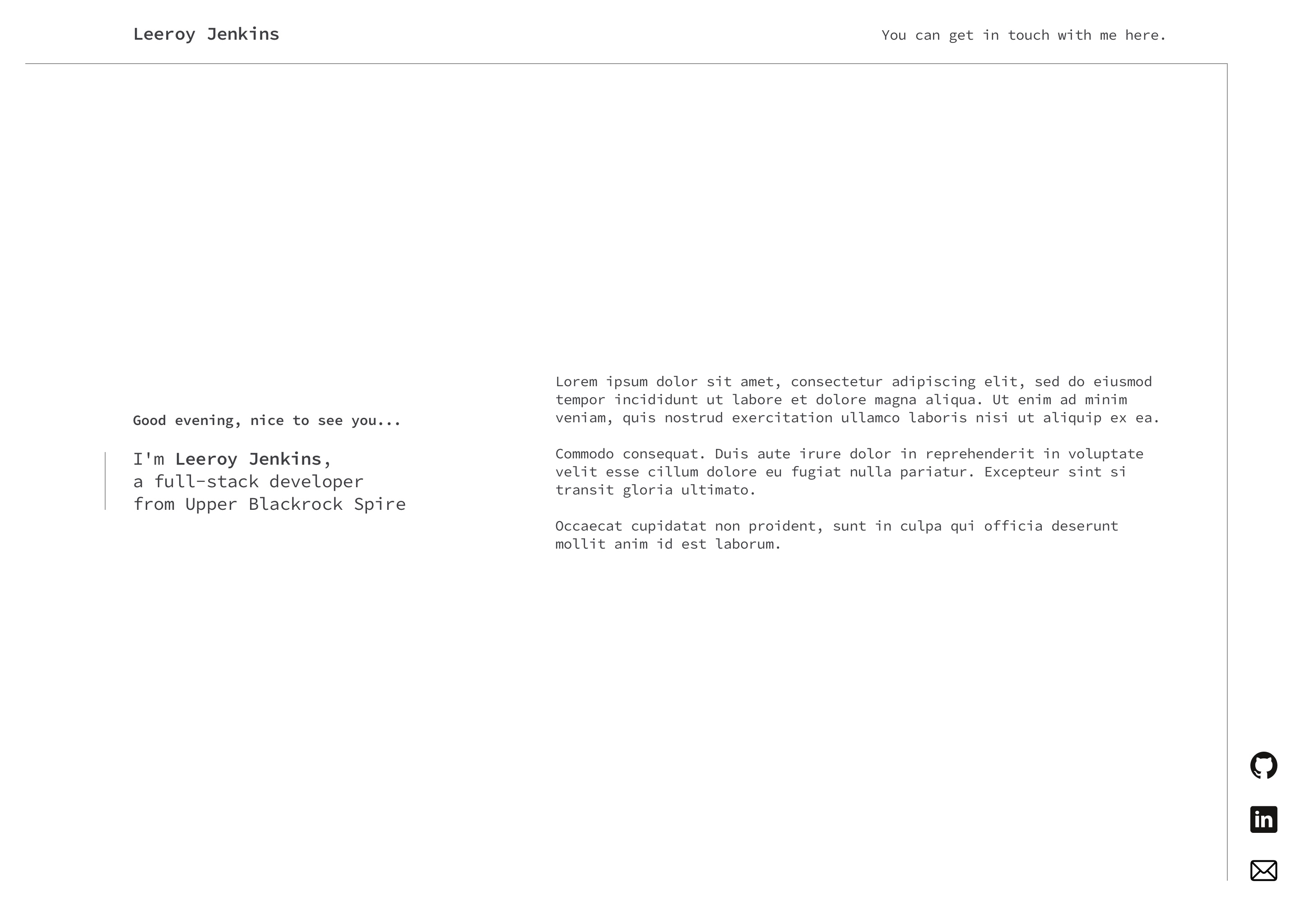
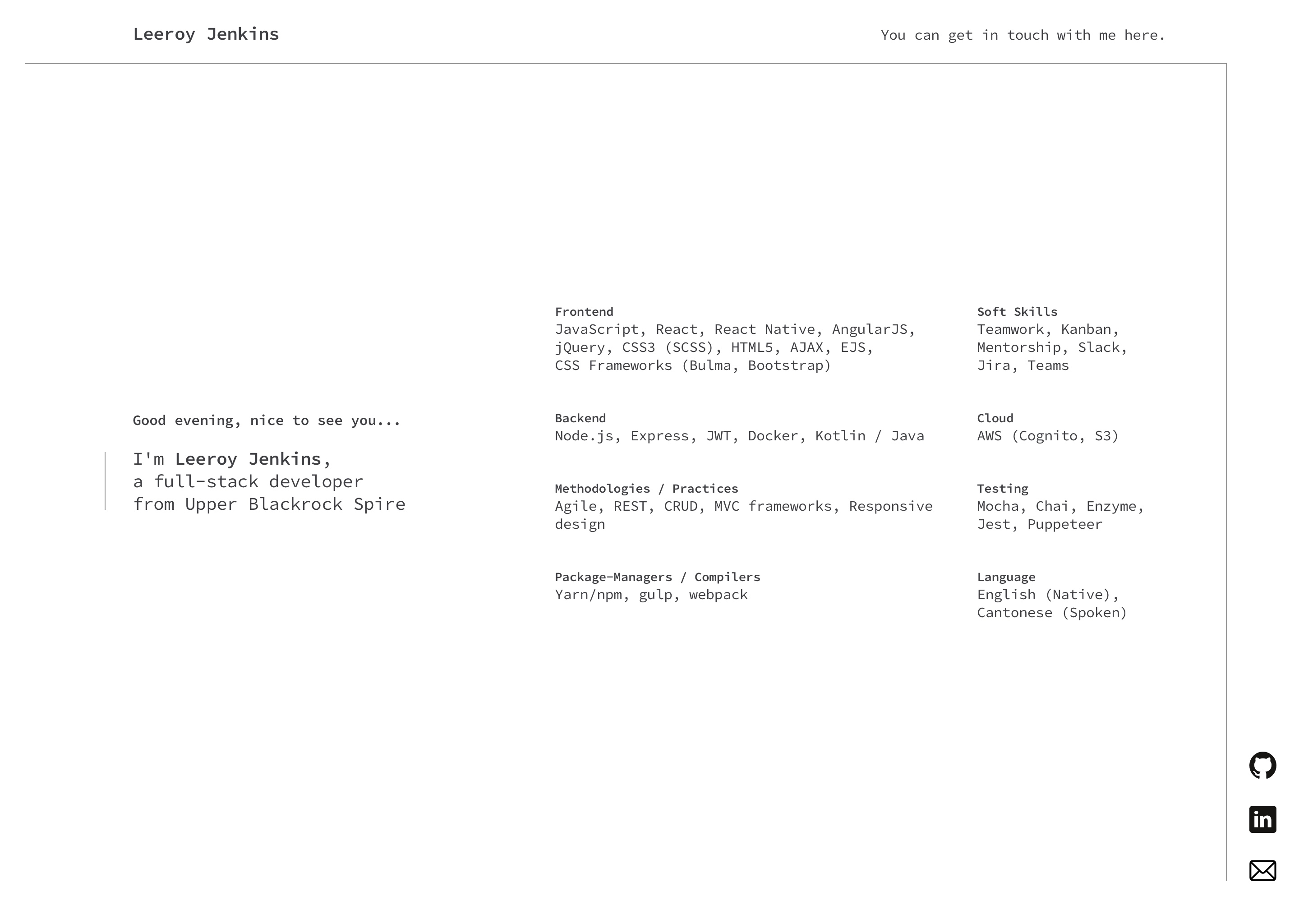
Final Pages
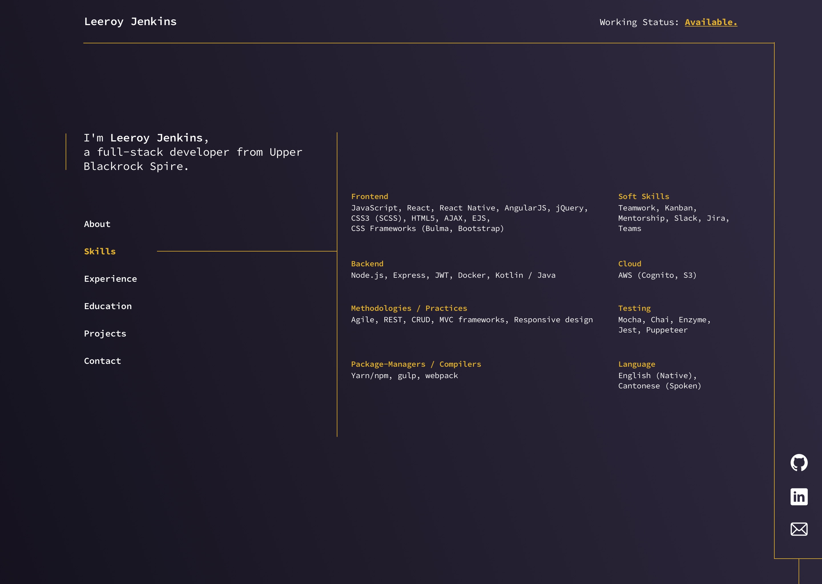
Skills
Comparing this design to the previous wireframes, the eagle eyed amongst you may notice the addition of navigation in the left-most column. The original proposal for the navigation was to have an off-canvas drawer, triggered by a hamburger icon. We soon decided however that such a feature seemed unnecessary for a site of this size.
The likelihood of return visits to this type of site is quite low. It is because of this, that it was of the utmost importance that user's are able to understand what is being offered by the site and how to get there. A simple, consistent navigation was key.
By utilising a 5 column grid, I was able to distribute all items across the page with sufficient space and appropriate hierarchy. This brings about an attractive offering that is easy to operate and extract information from.
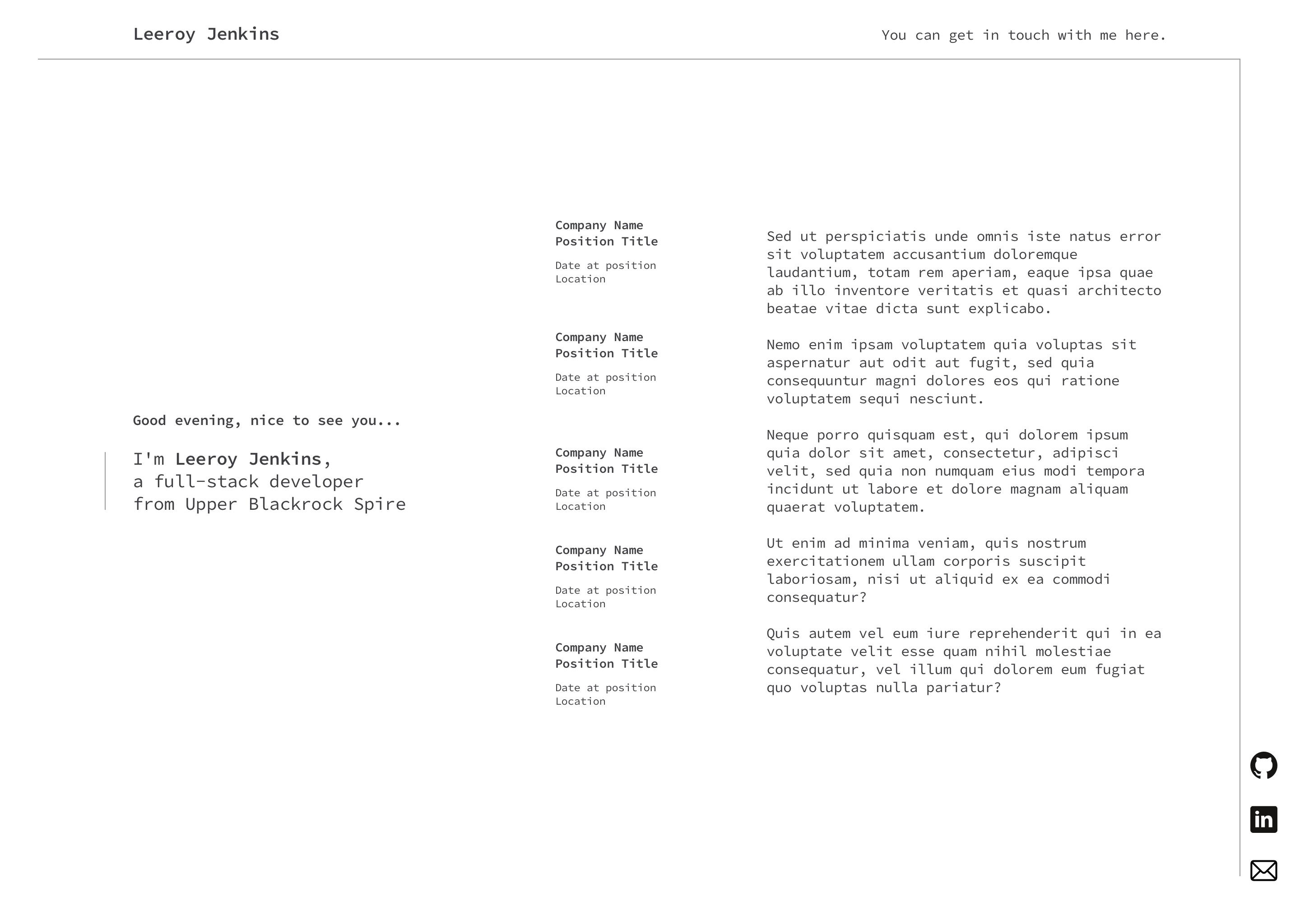
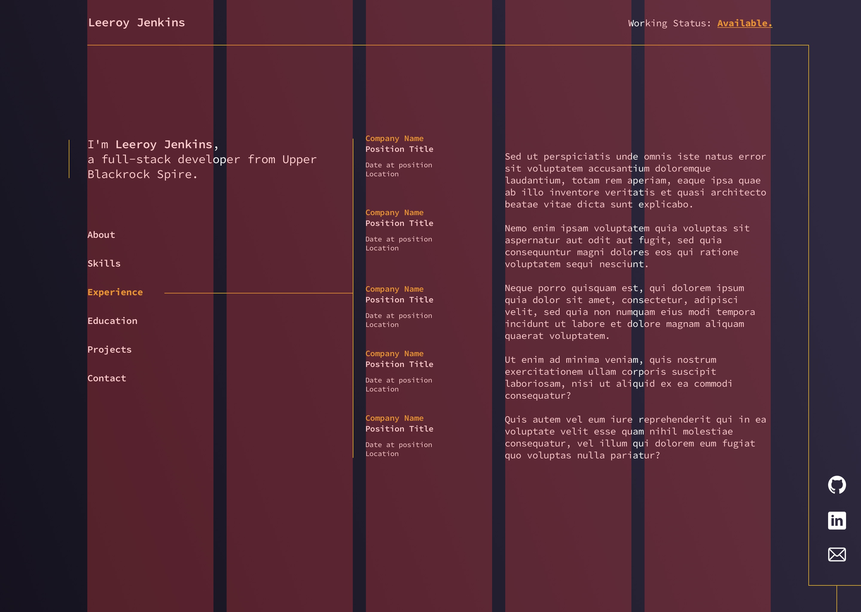
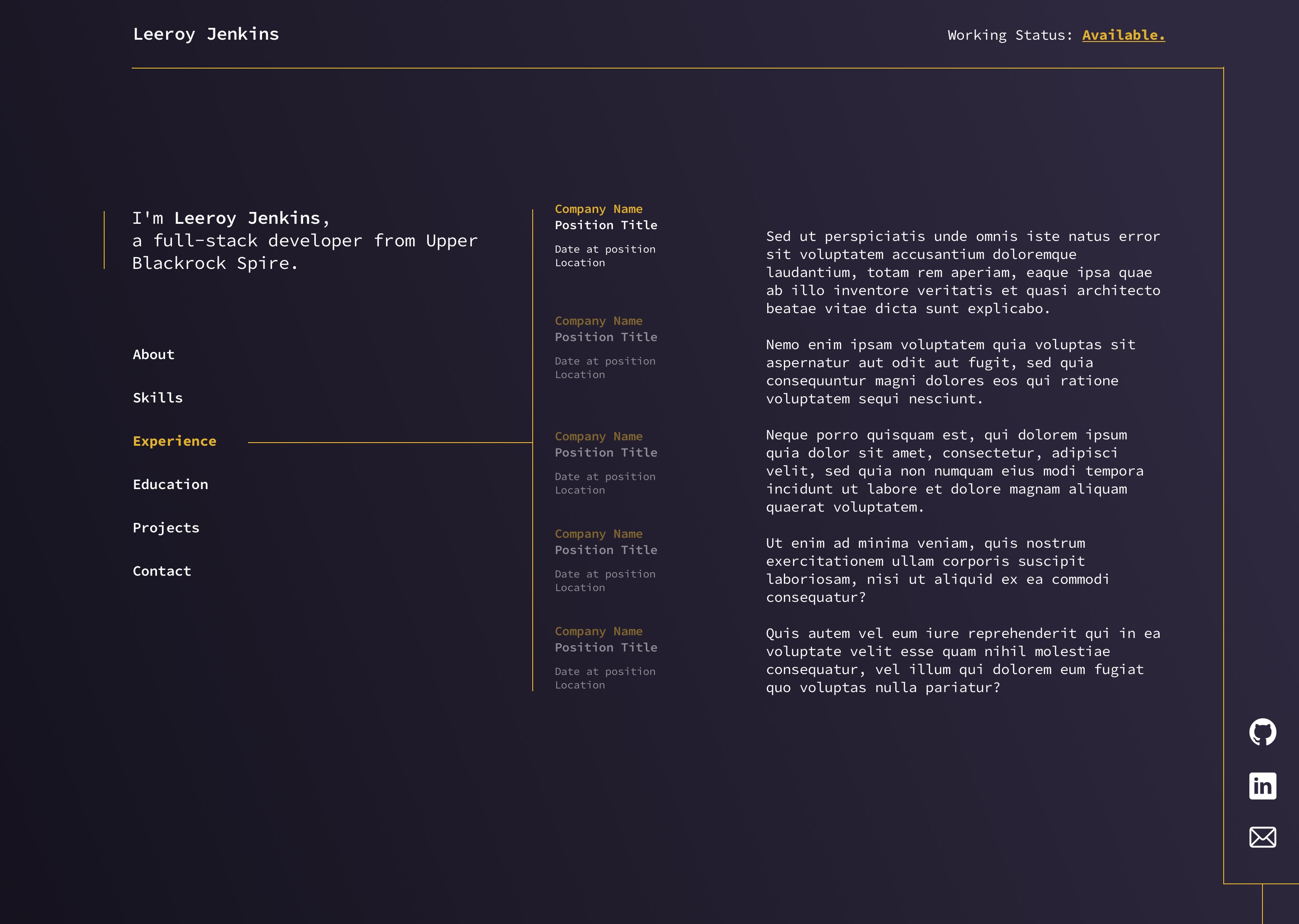
Experience
Much like the previous page, this design utilises our established design patterns but operates slightly differently. Additional links (imagine them as tabs) are stacked in the center column. Non-active links are slightly lower in opacity, providing enough contrast to communicate that they're not active. Upon clicking such a link, the body copy to it's right would change to the relevant part. This navigation works in the same way as the main navigation, but by placing it in another column, it creates an obvious divide for it's subsections.
The section links and body copy on this page are all aligned on the absolute center of the page's Y-axis. This way, regardless of section height, there is consistency and balance.
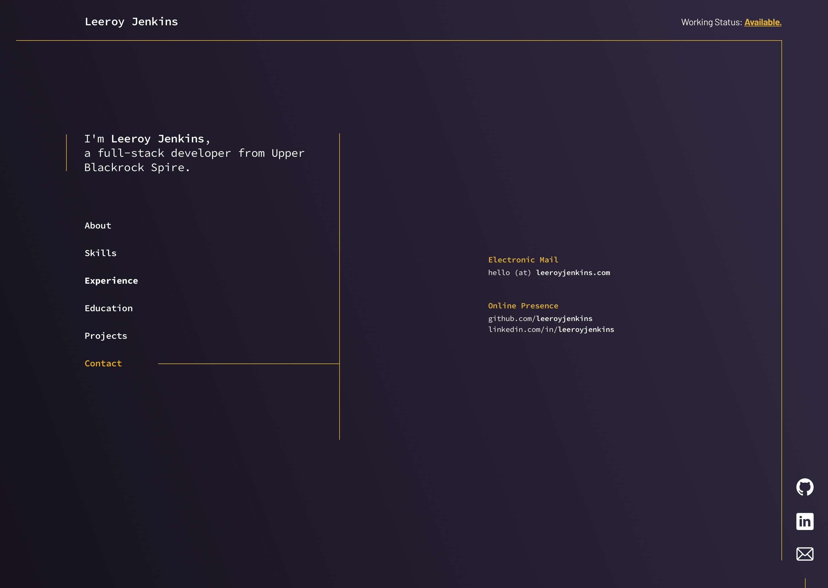
Contact
As this part contains very little information, it was necessary to leave the center column empty and place the text to begin in the 4th column, giving it plenty of space either side.
One of the site's reasons for existence is to generate interest in Jenkins' work and to create opportunities for future freelance work. Therefore, the contact information had to be clear and easily accessible.
By removing all superfluous items from this section, it allows the contact information to stand out and be readily available for all those who seek it. Also, by removing the @ from the email address and purposefully omitting a contact form, it greatly reduces the risk of spam, being targeted by email bots or sent unsolicited emails from scrapers and other pieces of human garbage.