Big Tex Trailers
website redesign
An Overview & an Issue
For over 20 years, Big Tex Trailers have been selling and servicing trailers. As the leading trailer vendor in the United States, Big Tex Trailers is working towards creating a thoroughly modern, customer-focused approach to selling and servicing trailers.
During our initial conversations, I was made aware of Big Tex Trailer's attitude towards issues and how they deal with them: "We're not just about selling trailers. We're about solving problems - and we're in it for the long haul".
This mindset translated across the whole Big Tex Trailers operation, including within it's design, UX and online presence, which was great to work with.
Big Tex Trailers had recently undergone a huge redesign of their website (I wasn't involved at this stage due to other commitments) and had already seen success for several metrics. However, it was soon discovered that an integral section of the site wasn't performing well at all. This is where I came in.
As part of their growth plan, they offer those with existing dealerships (or those considering opening one in the near future) to become a Big Tex Trailer dealership. To begin this journey, potential dealers are asked to fill in a simple form via the Big Tex website. These new dealership arrangements are a vital part of Big Tex Trailers' roadmap for growth, so when a considerable drop in applications was noticed, it became apparent that something needed to be done with the form.
TL;DR
Big Tex Trailer's recently redesigned their entire site.
A reduction in sign ups to become dealership partners was noticed.
A poorly designed form was to blame.
The solution is to redesign the form to provide a better user experience, leading to higher levels of conversion.

We're not just about selling trailers.
We're about solving problems - and we're in it for the long haul.
Greg M.
Director of Store Development, Big Tex Trailers
Analysing the Existing Site
This project, in it's most basic state, is a redesign of a form that already exists as part of the Big Tex Trailer's online offering. Before I began making any major design decisions, I analysed the existing 'Become a Dealer' page and form.
As you can see from the screenshots below, all information, FAQs and the form itself are displayed on one single page, which has become long and somewhat overwhelming, overloading the user or posing a large task to complete. One of the earliest decisions made was to break this page into different sections to ease the user's mental load.
Prior to the redesign, this page was 5670px tall - this was far too large and excessive. At this point, it was safe to assume that the negative outcomes affecting this page were most likely due to this gargantuan display of information and input fields.
I decided to separate the introduction, characteristics list and FAQs from the form itself. The form would then be split into several sections (chosen according to common content ie: personal details in one section, business details in the next). This would make the form seem less intimidating as it immediately takes up less room on the screen and the user is fully aware of how many stages are involved.
It was agreed with all stakeholders involved that the introduction and FAQs were to always be displayed in their entirety and not placed in toggle-able items (expandable accordions etc) - this was to encourage all potential dealers to read through the introduction, FAQs and other information before being able to apply to become a Big Tex Trailer dealership.
Because of this need, it was more integral than ever to reduce cognitive load and visual fatigue during the form completion process.
Design Choices
Typographic Considerations
Typography had already been established as part of the brand's visual identity during their recent redesign. I decided (after approval from stakeholders) to extend the typographic guidelines slightly when it came to form input elements.

Colour
As part of Big Tex Trailer's visual identity, they had firmly established their own colour palette, so there were no major decisions to be made here other than to utilise them.
Grid System
Despite having a recent redesign, a consistent solution for layout was missing. Several pages simply utilise a one column layout, items following one another sequentially to the very end.
I decided to implement a 16 column grid system that would allow for ease of development, ease of use and to look clear. Reducing mental load was a key point during this project, so getting this right would be paramount. In my experience, I've found that consistent structure for sections that require user input is a major contributor to success for a majority of metrics.
- Total Width:
- Columns:
- Column width:
- Gutter width:
- 1140px
- 16
- 60px
- 12px
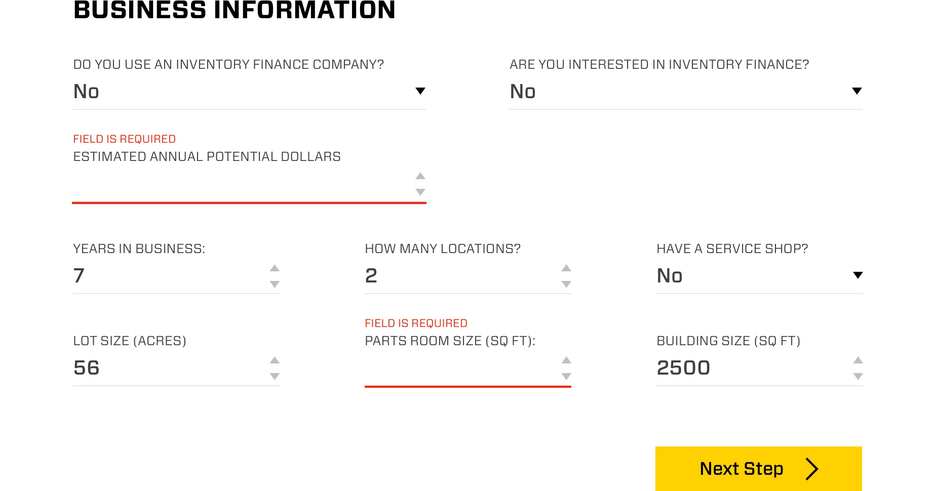
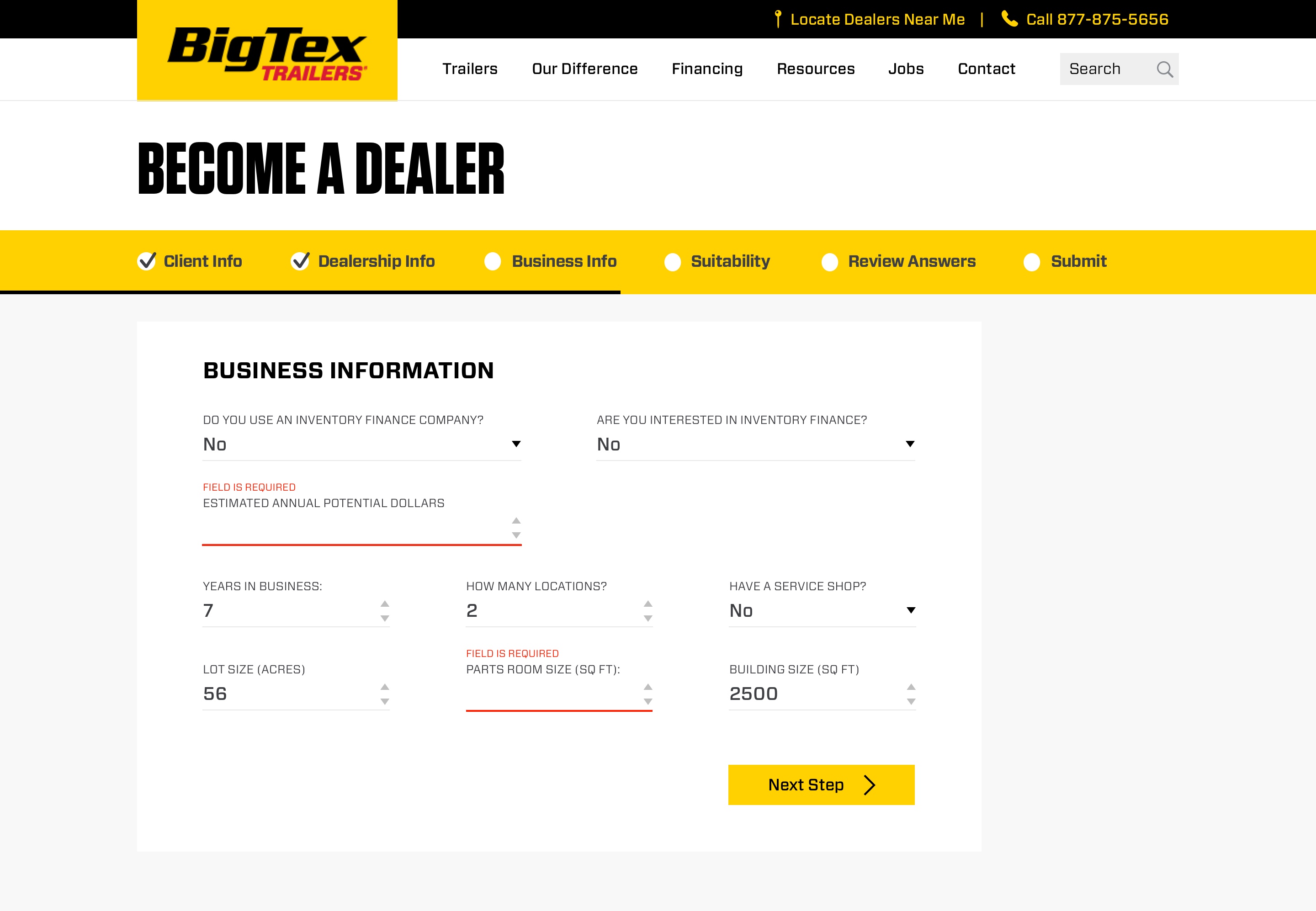
Input Elements
Here you can see the form's input elements.
Error / validation highlighting is displayed atop each affected field, communicating that the field is required and has a strong underline to draw the user's eye to the field in question.
Validating the form after each step of the journey provides a more positive experience for the user; less errors appearing at one given time decreases cognitive load.
Required fields are not denoted by anything. Instead, optional fields are given a marker. If this wasn't the case, then 90% of the form's inputs would be accompanied by red 'required' markers - completely unneccesary.
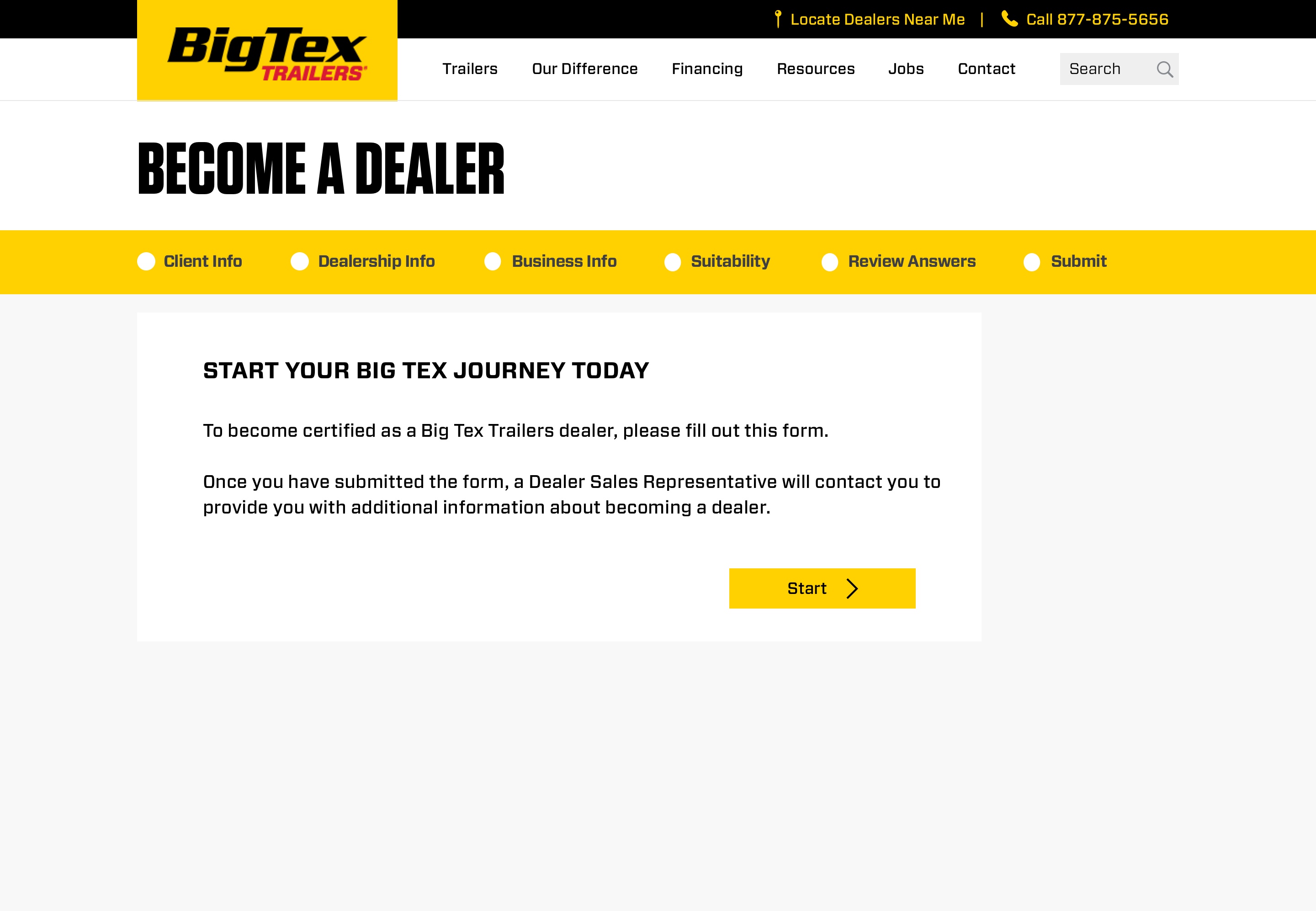
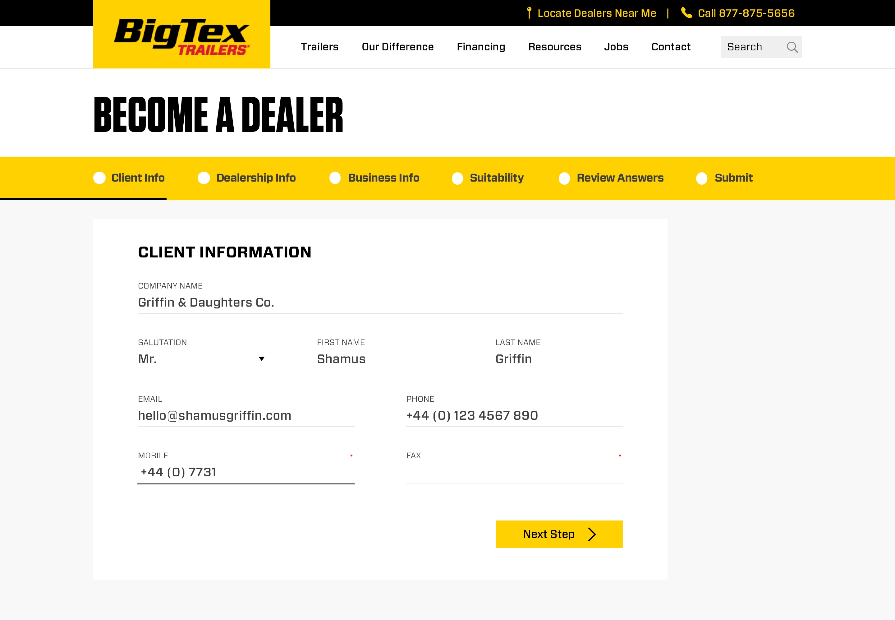
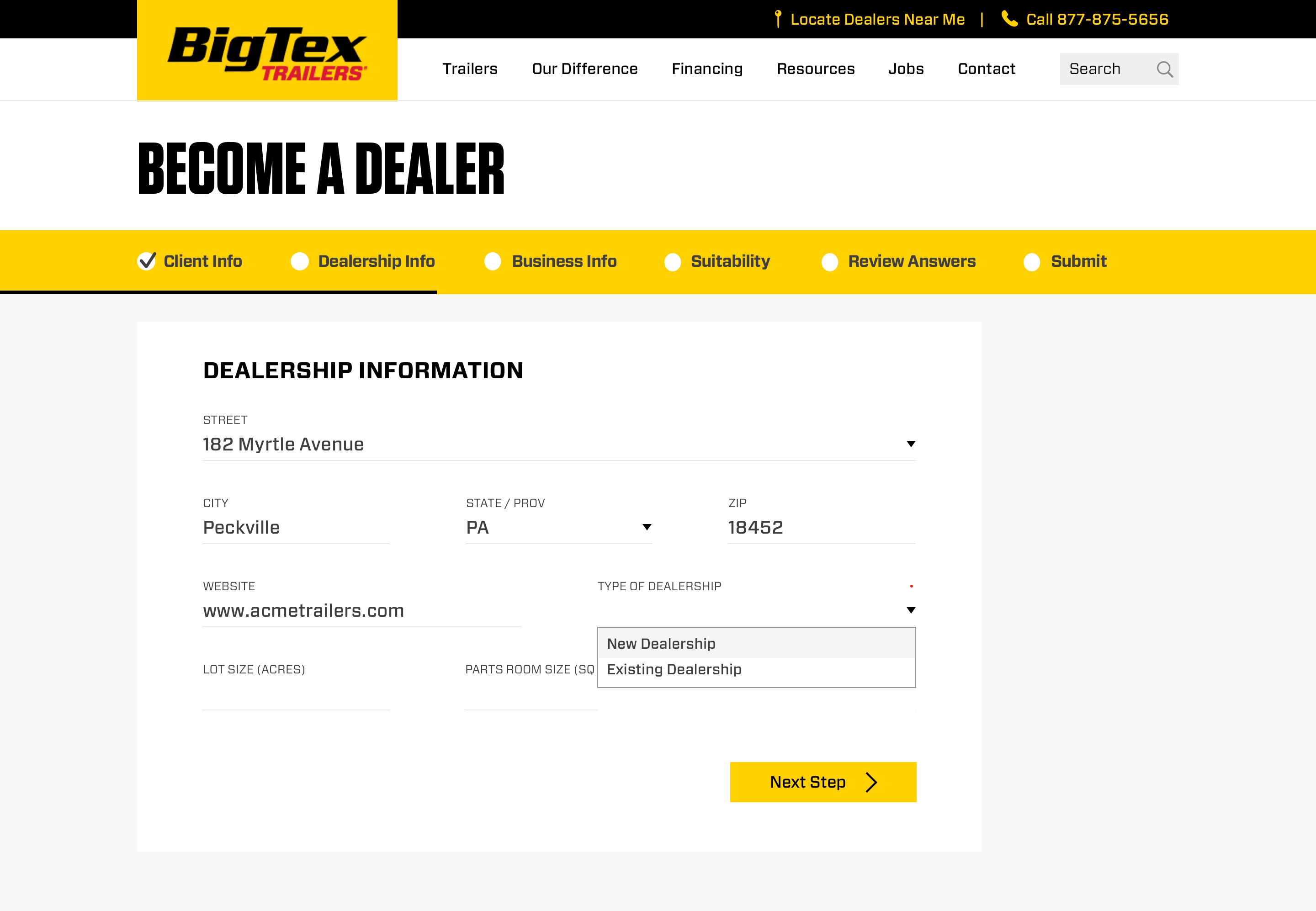
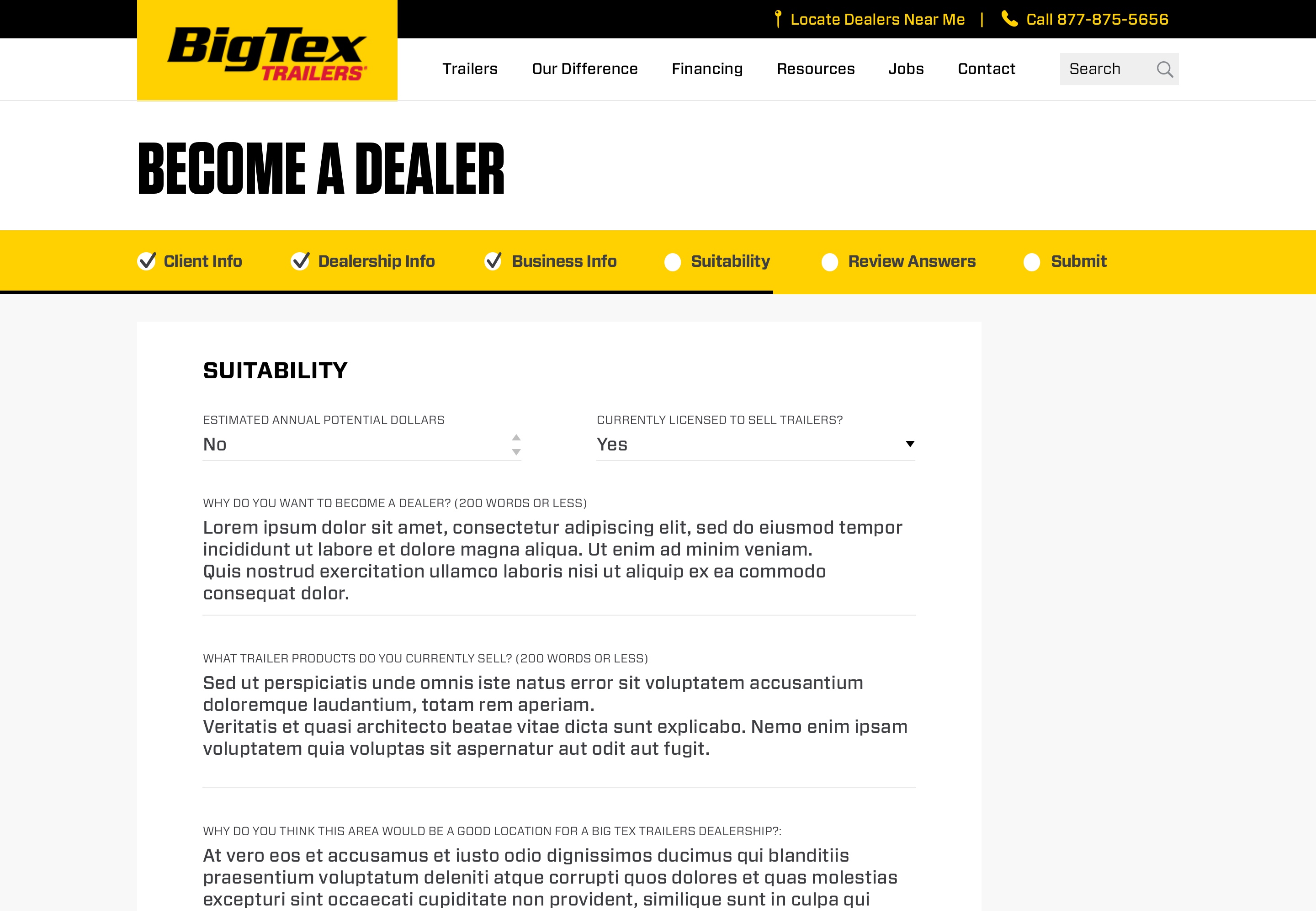
Progress Status
The form was broken up into six sections, four of which require data entry pertaining to the relevant stage. The remaining two stages are to review the answers given and then confirm their submission. Users wouldn't be able to edit the form post-submission, so this review stage is an important part of the process.

Final Form
Here you can see the final designs for the 'Become a Dealer' form.
Having split the form into relevant sections and detached it from the initial introduction page, the result is a form that seems less intimidating, has a clear structure and in terms of UX, improved massively.
Initial tests have shown promising results and the design was very well received by Big Tex Trailers and the stakeholders involved with this project.
Final Intro Page + FAQs
This is the final design of the 'Become a Dealer - Introduction & FAQs' page, which acts as the gateway for the 'Become a Dealer' form.
As mentioned before, stakeholders requested that no accordions or toggle-able elements be employed here. The reason being that they wished to improve the rate of users reading and comprehending the entirety of the introduction and FAQs. They believed that this helps to reduce the amount of unsuitable applications.
Comparing this design with the rest of the site, I am confident that it would integrate seamlessly and be more effective than the existing version of the form.