A.G. Barr
Website Redesign
An Overview
A.G. Barr are a UK based branded consumer goods business focused on growth and have been part of the UK's soft drink landscape since 1975.
If you've ever spent time in the UK, you've more than likely encountered an A.G. Barr product before. Such delights include Rubicon, Rockstar Energy, Ka, Snapple, Strathmore and of course, the legendary Scottish icon, Irn Bru. Currently, they own and operate 18 brands under the A.G. Barr banner.
Their existing website, whilst functional and arguably suitable for purpose, had been deemed outdated and so, I was asked through an agency to assist in the design of a new A.G. Barr website.
The new offering was to be modern, cleaner, brighter and easier to use. As well as this, it was crucial that each page looked 'finished' - this was a statement that was mentioned several times by different people during the discovery phase. Through exploration of this statement, I concluded that users of the site and employees of the company could see there was a loose structure to the existing site but misalignment, missing images and mismatched design choices all aided in presenting a haggard and less-than-ideal offering.
My challenge would be to create a design solution that can be applied across the entire site and provide a cohesive product that looks modern, clean and provides a positive experience for the user.
Analysing the Existing Site
At it's core, this project was a redesign, so the next logical step (after initial discussions and exploration into the issue) would be to analyse the existing site.
Simply from viewing the four screenshots below, one can see that consistency between pages is greatly lacking. Essential elements such as typography and basic positioning are present, but it was evident that a clear structure was lacking.
Design Elements
Color Colour
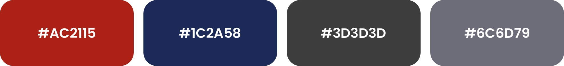
The colors used for the original site seemed to be pulled from thin air. Whilst these colors worked to an extent, they didn't feel as if they belonged to the brand.
I decided to extract the core color palette from the A.G. Barr logo itself and ended with the set shown here.
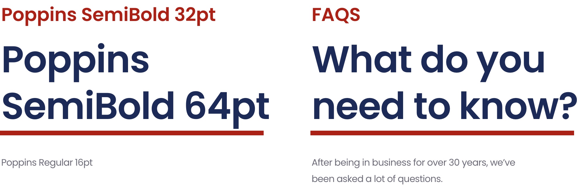
Typography
Seeing as I'd extracted the colors from the logo, drawing inspiration for the typography seemed like a natural direction to take.
By utilising the logo as a base for the typographic treatment, it led me to the layout shown here. By laying out the type in such a way that reflects the logo, it reinforces the brand whilst displaying information clearly and in a visually appeasing way.
Previously, A.G Barr utilised a handful of fonts across their site, including Calluna, Clerkenwell and Georgia. Whilst these were suitable for purpose, they didn't reflect the aesthetic I was aiming to acheive. Pair this feeling with the logotype being a sans-serif, I deemed it necessary to choose a sans-serif font that was clean & clear, with the flexibility of existing as both a display and body font.
After a few exploration sessions, I settled on Poppins. Structurally, it's similar (at first glance at least...) to the logotype, remains legible at a wide range of sizes and was also available for free.

Navbar
The original navbar looked messy and misaligned. The searchbar and news link sit above the main navigation links, adding height unnecessarily to the element.
The redesigned version places all links in one row, aligned through the horizontal center and equipped with sufficient padding above and below. The search bar has been given a stronger outline so that it can stand out slightly more, active links are highlighted in the brand's red color and type size reduced to cohesively exist with the rest of the site.


Products
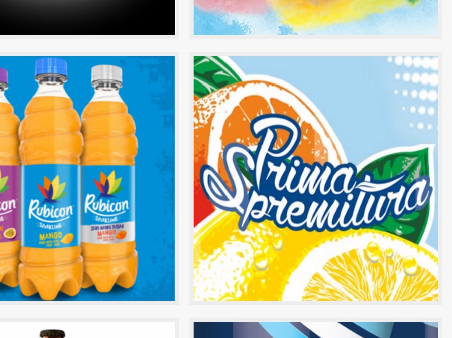
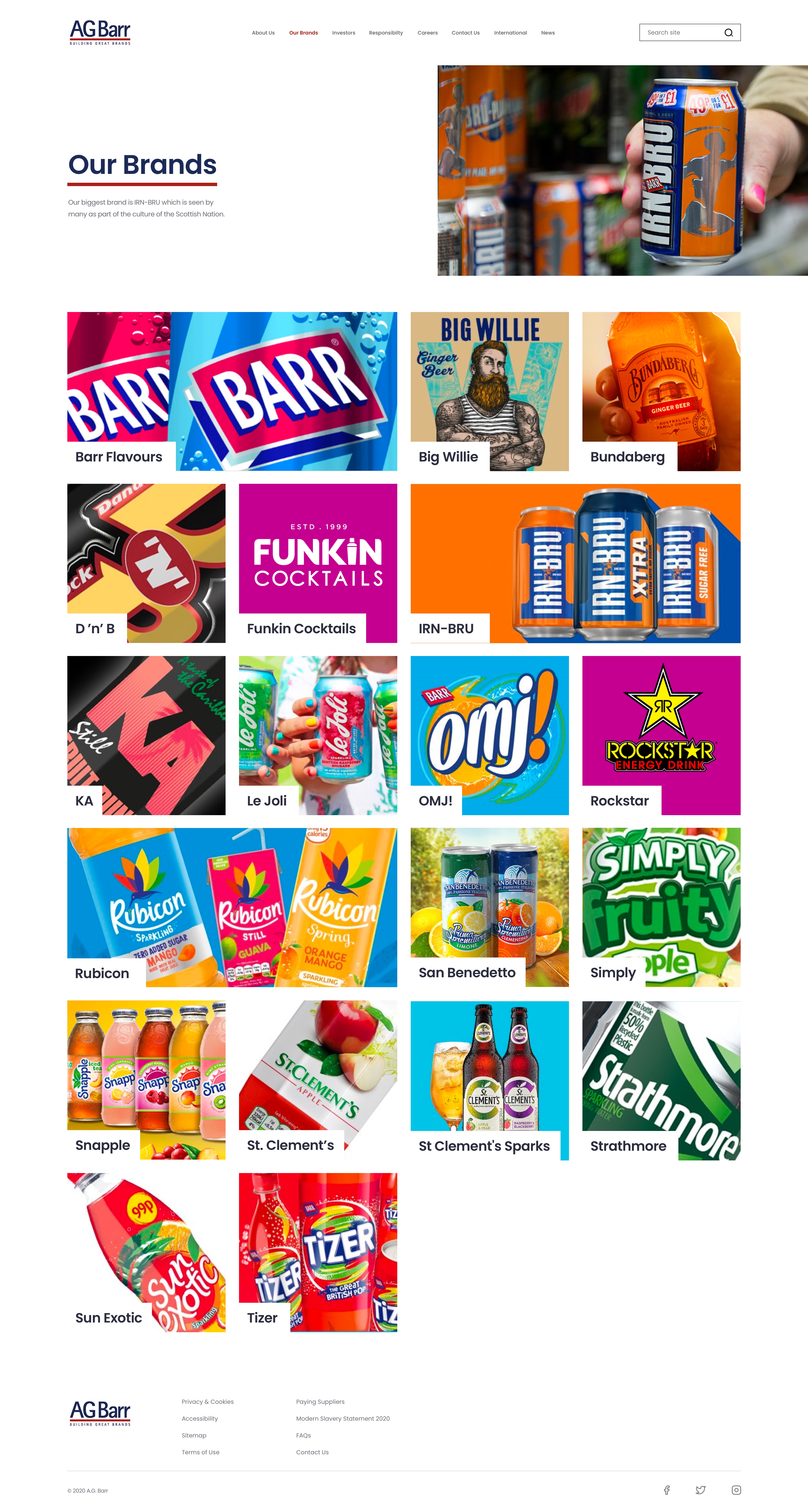
Our Brands page
Having so many brands under their belt, when they're all laid out on one page, you're met with a wash of color and styles. Whilst looking attractive and very vibrant, it would be very easy to lose control of the user's focus, leading the page to descend into a chaotic mess - somewhat similar to some sections on their original site design.
Underneath this design is a simple 4 column grid that has aided in creating order amidst the brand thumbnails. The more established, popular brands take up 2 columns in the grid, whereas the rest occupy one. Products are displayed in alphabetical order to improve usability.
I endeavoured to make the thumbnails appear as dynamic and unique as possible, utilising tight crops of product shots or extracting elements from their existing print media campaigns. Previously, some of the thumbs looked uninspired and abstracted from the collective whole.
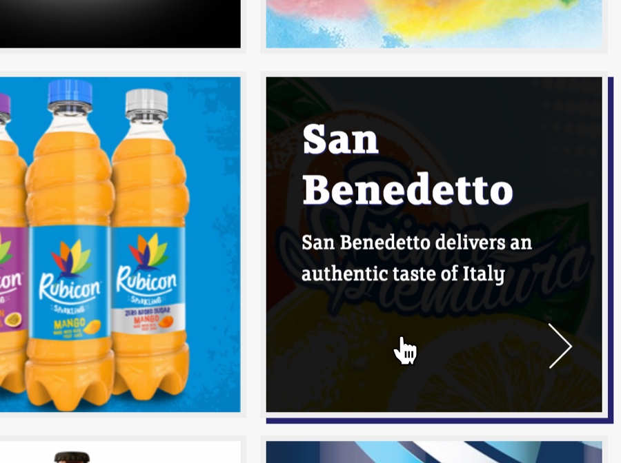
Text labels were added in the bottom left corner to assist the user in navigating to a section of interest and not rely solely on the imagery. The previous design had only shown the titles on hover, this method is not very accessible or very cool.
An example of this behaviour is shown below.
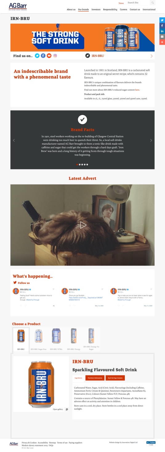
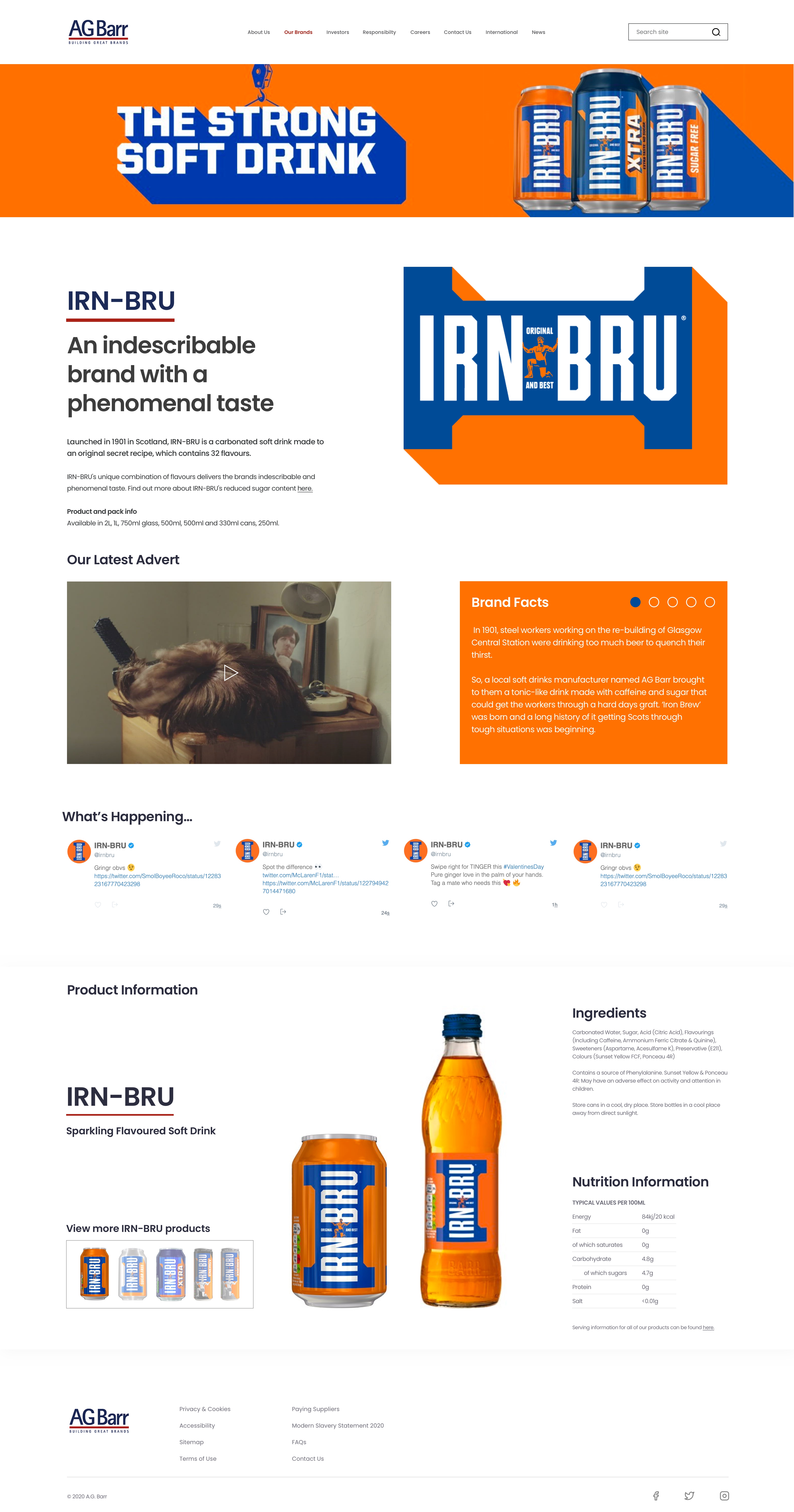
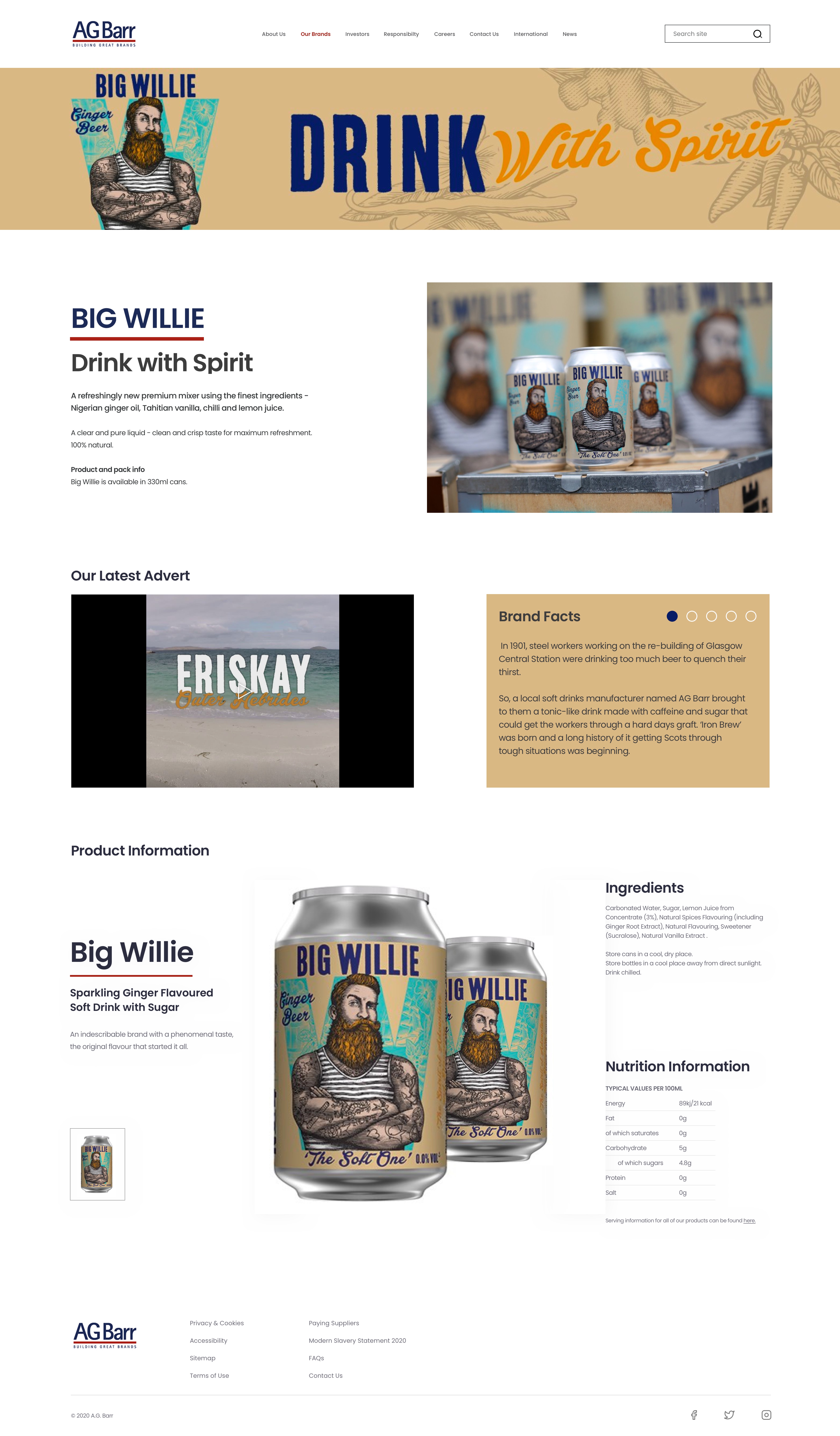
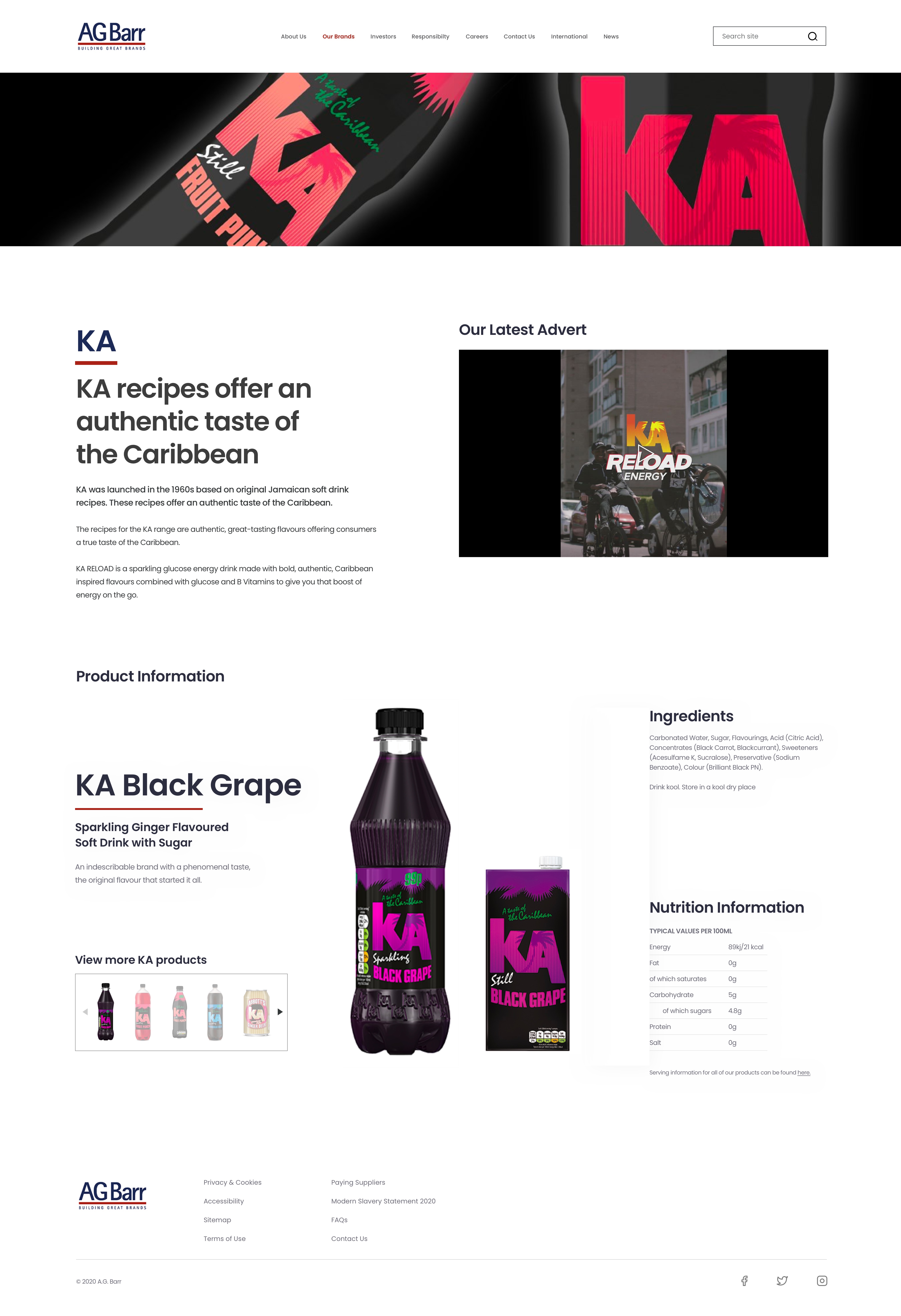
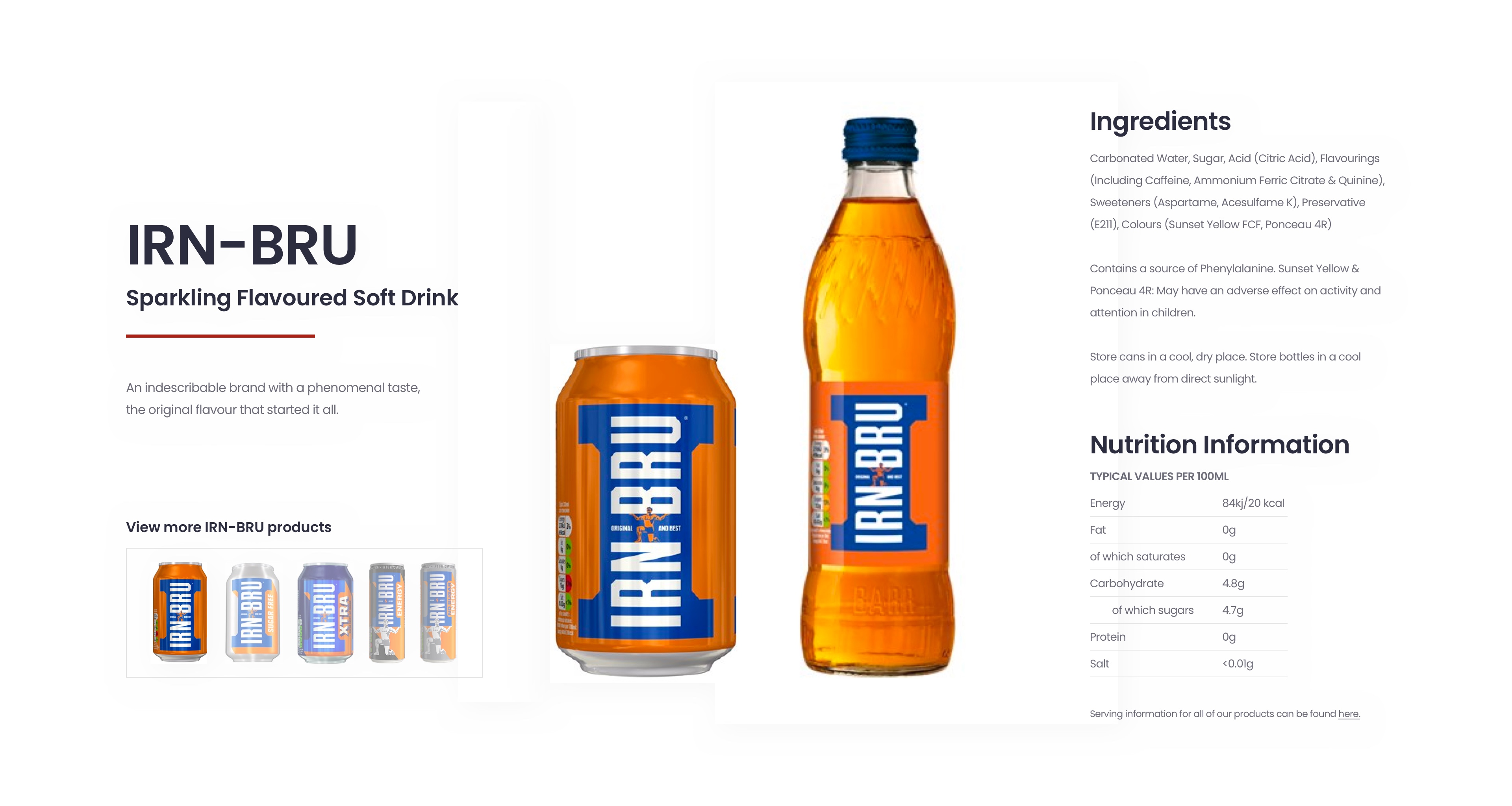
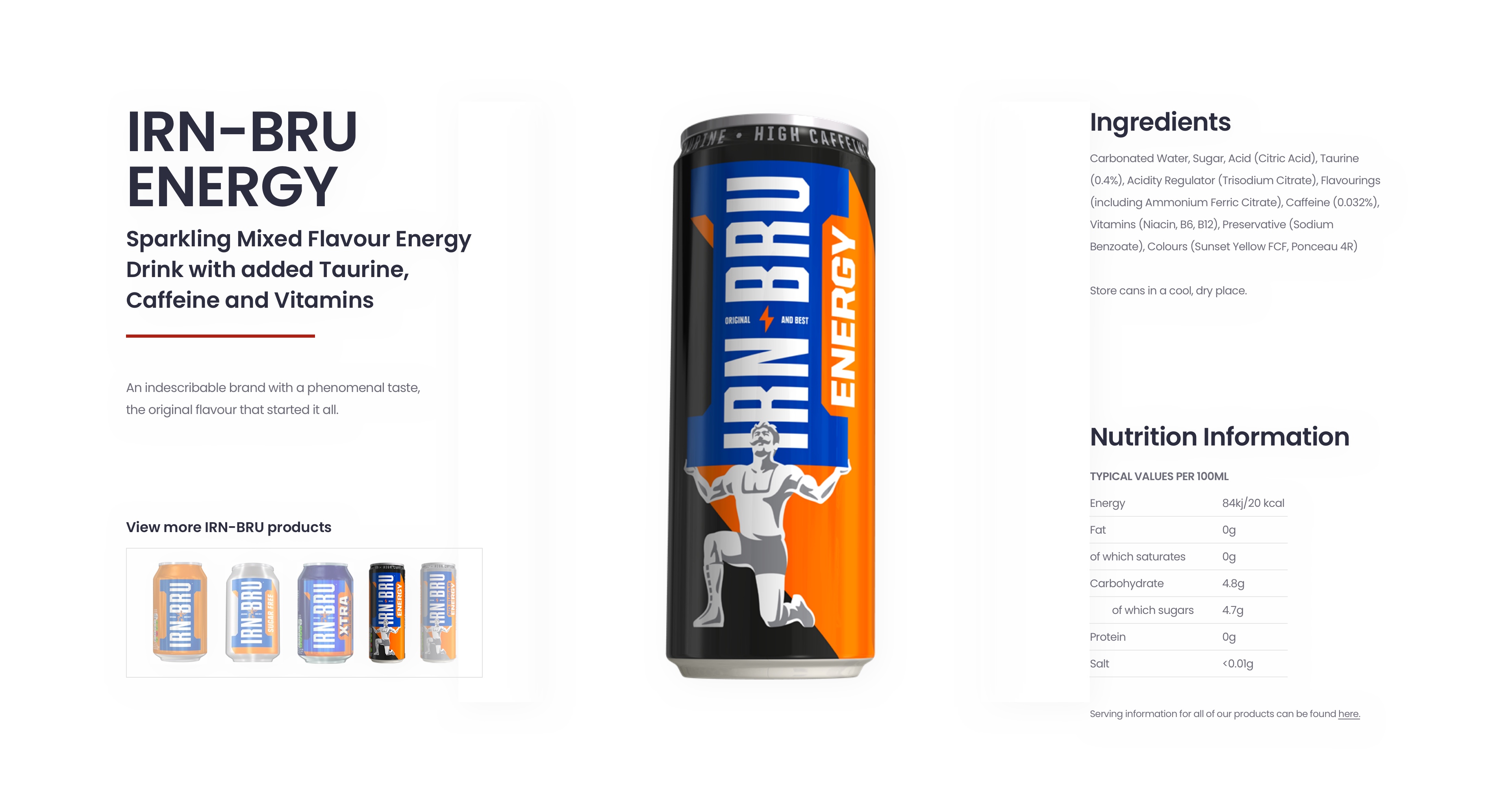
Product Highlight Pages
These pages are of high importance as they contain a wealth of information pertaining to each brand. Most pages are equipped with a product description, pack shots, videos showing recent advertisments, brand facts, twitter feed as well as nutritional information, product usage guidance, ingredients and size variants.
This page template operates in modular and flexible blocks. The benefit being that if a product was missing something, ie: Brand Facts in the KA page, it would occupy another space and allow the elements around / underneath to rearrange in a similar fashion to the other pages.
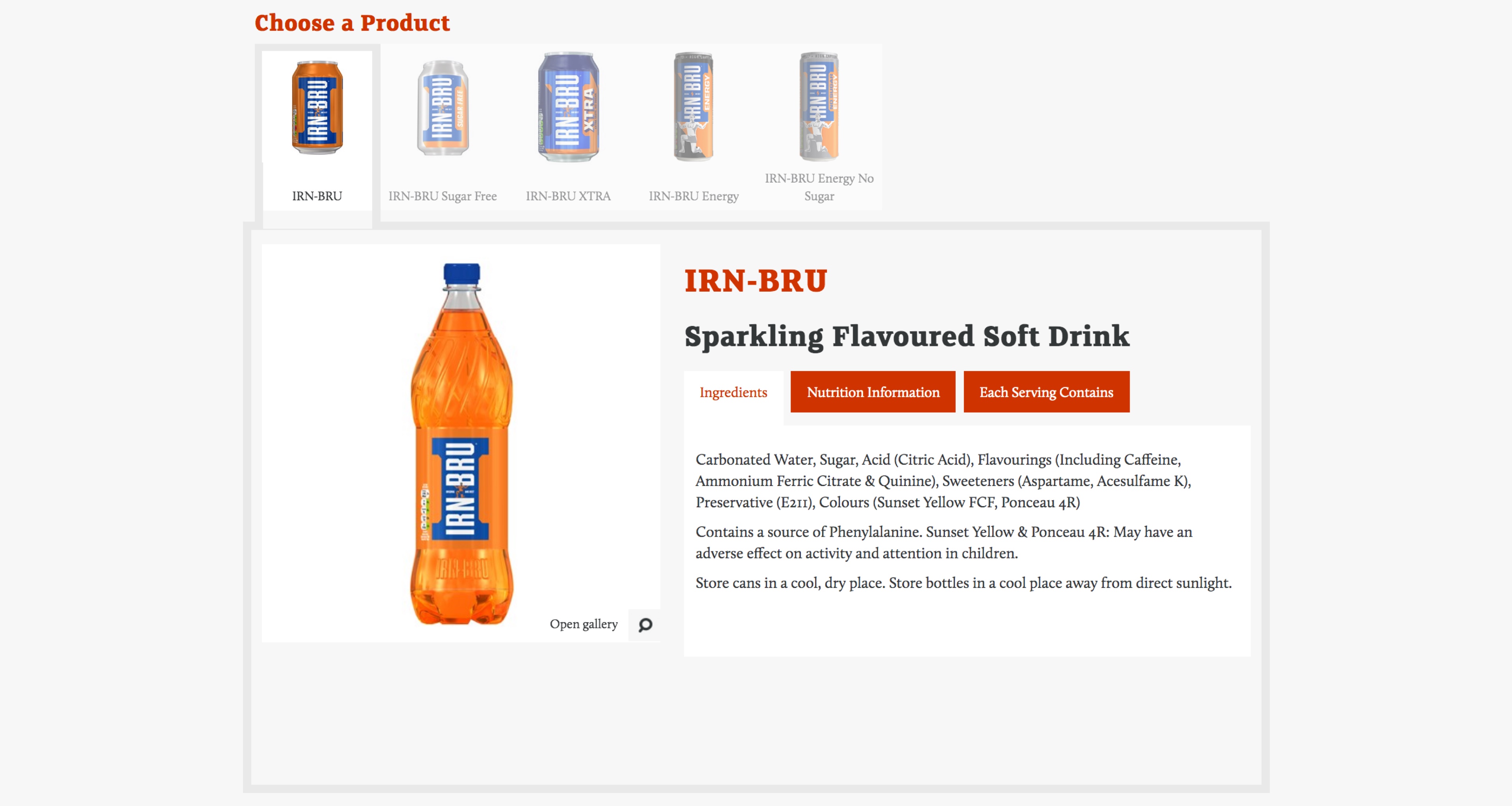
Product Information Units
Analysing the existing product information units, I concluded that there was a great deal of room for improvement. Instead of holding information behind tabs, I decided to display all points at once and utilise the space a lot more (there was SO much wasted space).
By harnessing the powers of flex (or CSS grid), I proposed the layout shown below.
By anchoring the product thumbnail links and nutritional information to the bottom of the page, it allowed for the items above them occupy a greater deal of space and limit the amount of vacant space that could potentially disturb the rhythm of the section. These were chosen to be anchored at the bottom as the heights would remain the same across all products, whereas other units can vary greatly.
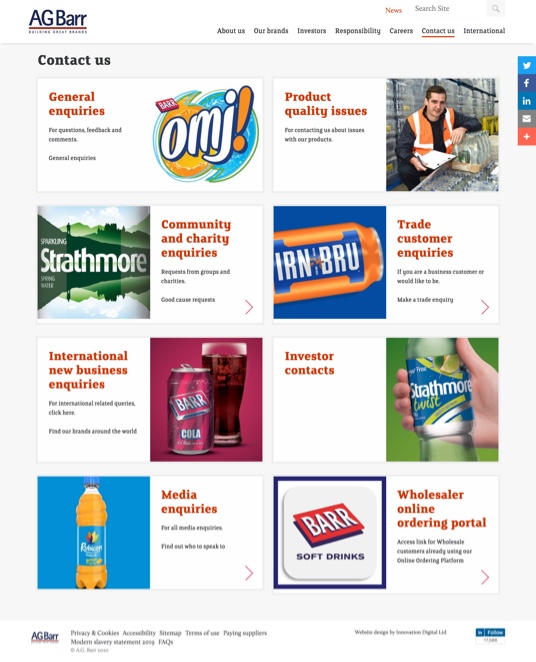
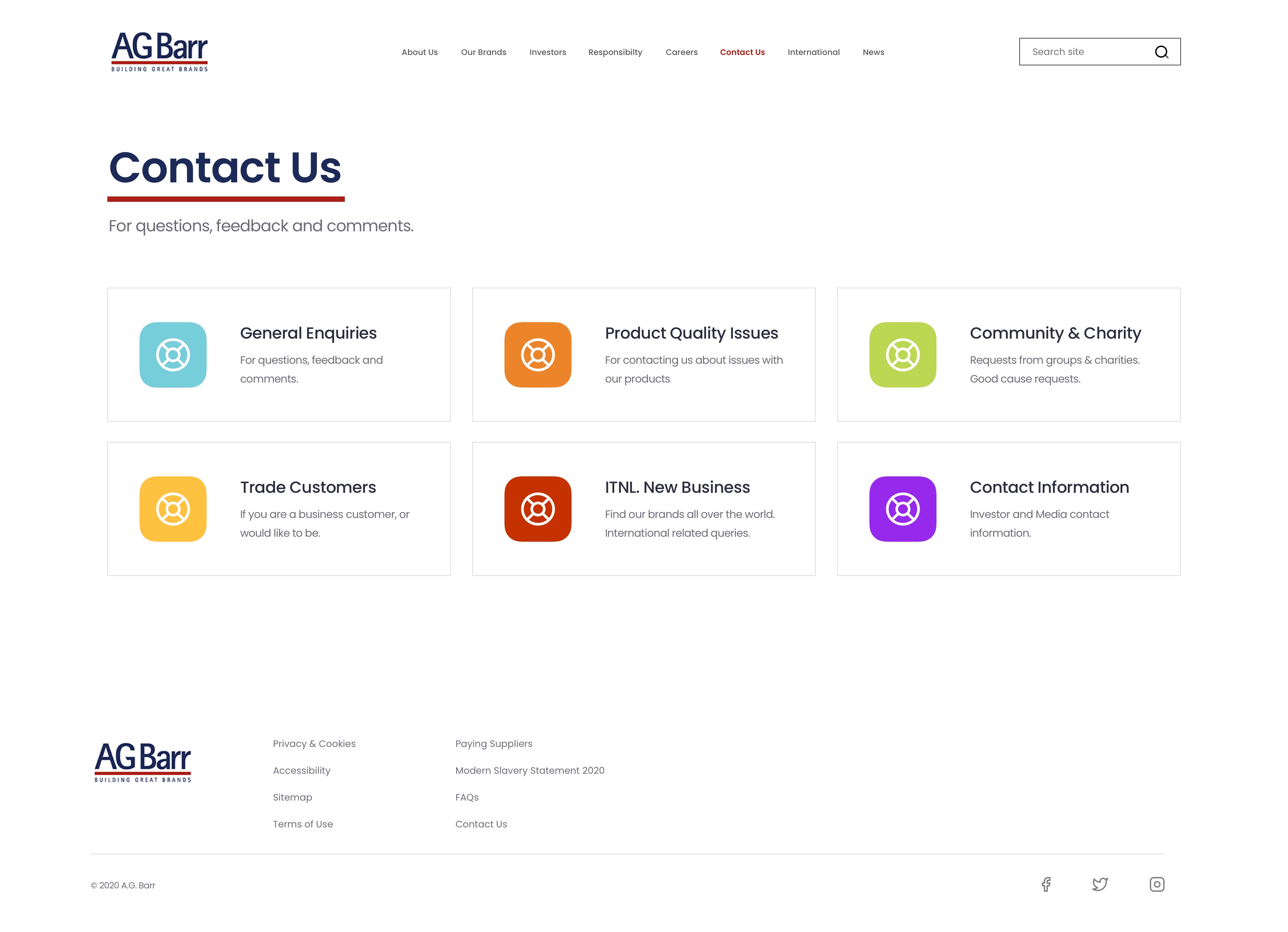
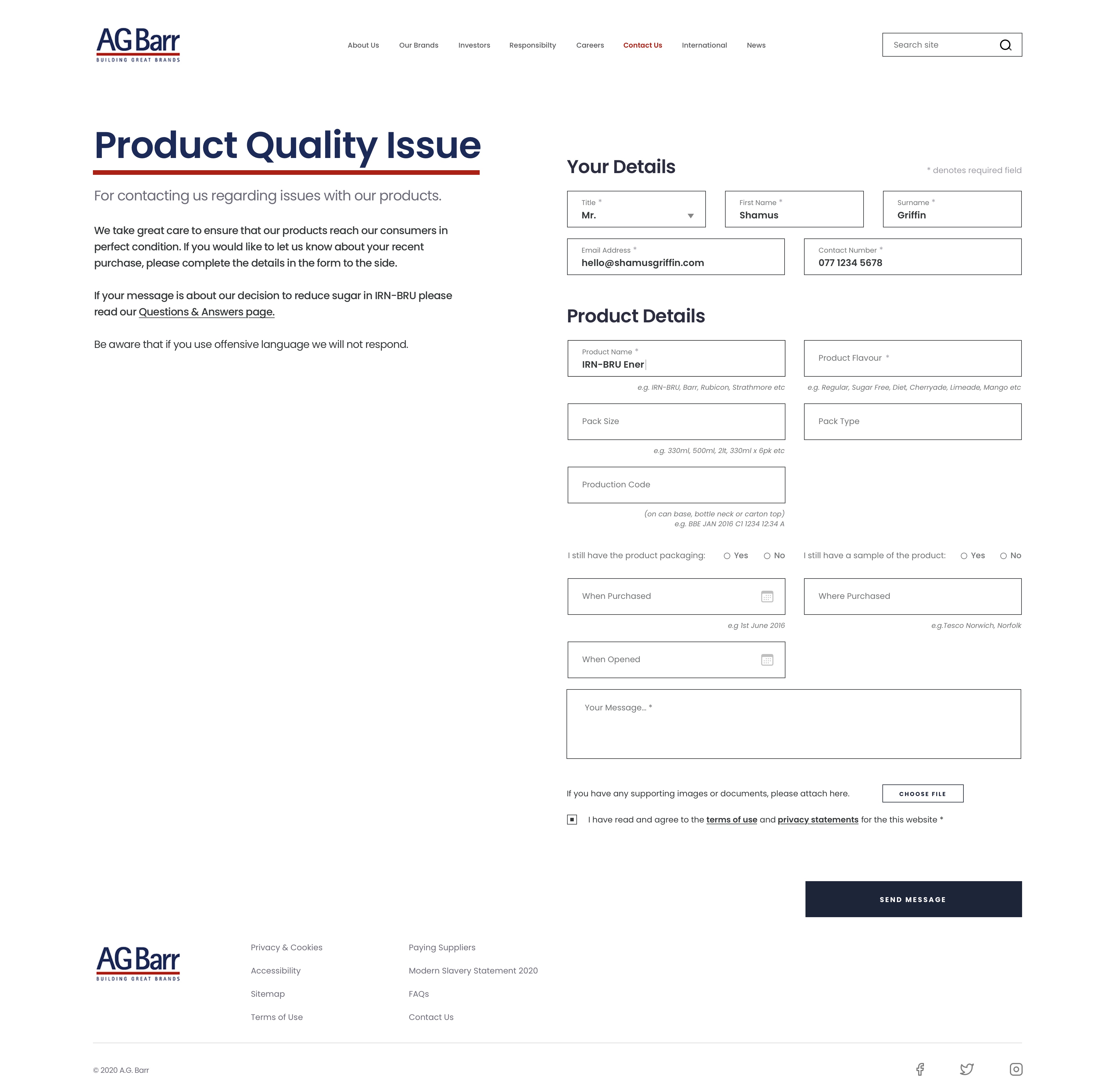
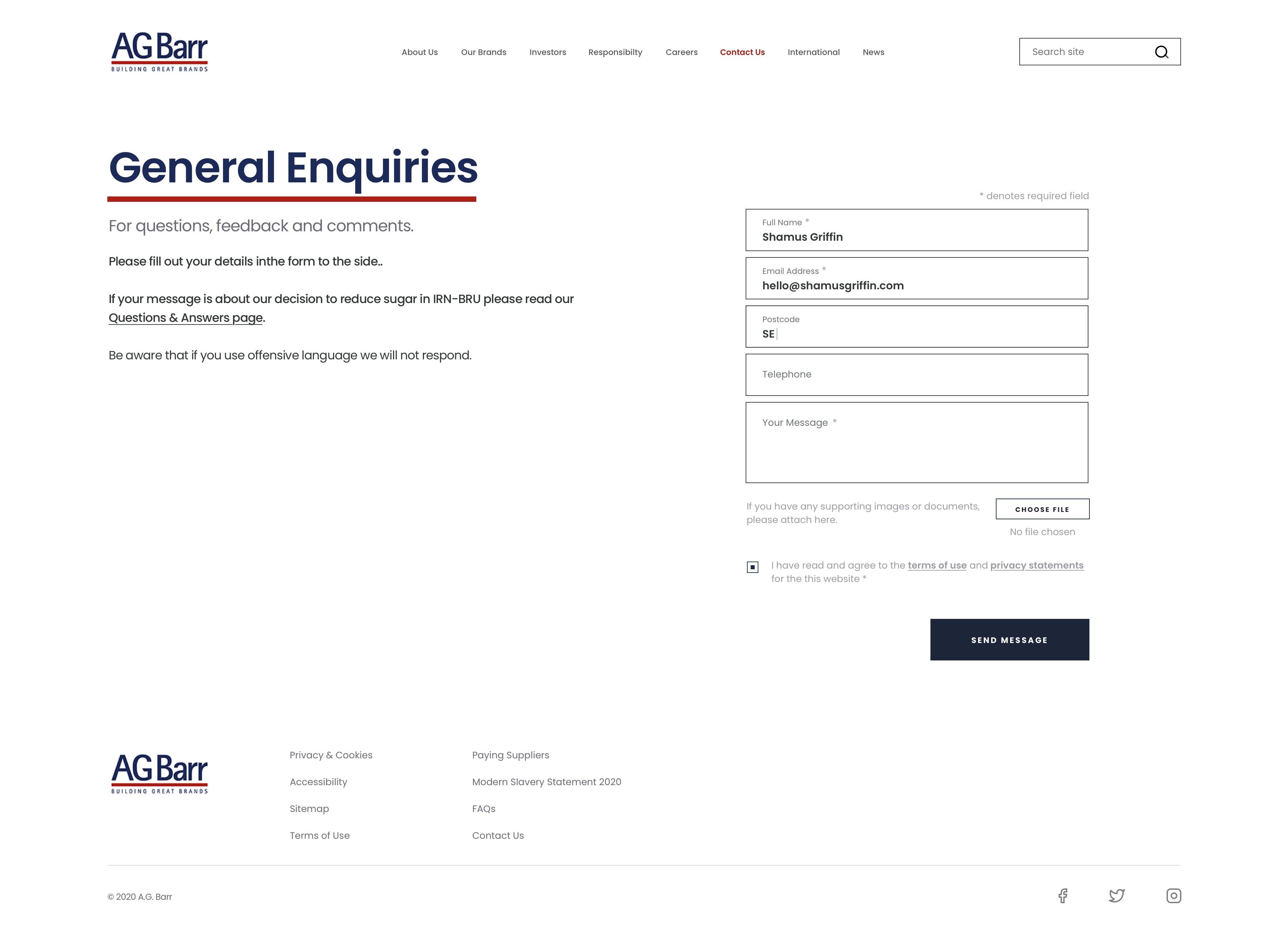
Contact Pages
The original design displayed 8 different entry points to various contact information, depending on whom you'd like to get in touch with.
See the original design here..
As you can see, the existing design was a long page with the majority of images being unrelated to the service they correlated with. I decided to distil the sections into 6 blocks and have them displayed entirely on one page, so there is no need for scrolling or deciphering which section is which. The icons shown here are yet to be finalised.
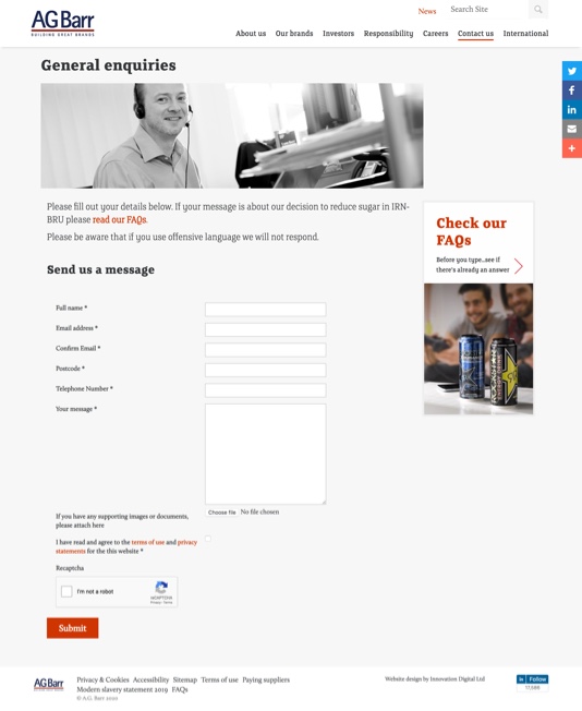
Behind each contact link is an explanation of whom one is attempting to contact, as well as a contact form. These forms vary depending on which department you're trying to contact. 'General enquiries' has less fields than 'Product quality issue' as there is less information to communicate.
Related fields are chunked together to allow for ease of processing for the user.
Search Results
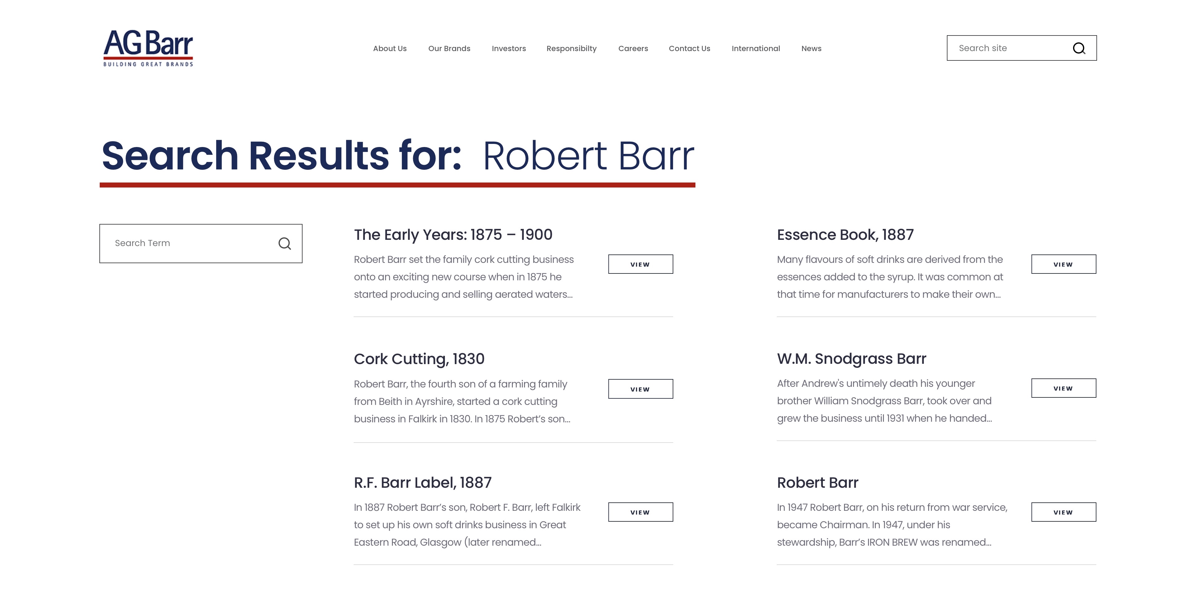
The site contains a lot of information, especially that pertaining to A.G. Barr's rich history, so a clear output for search results was needed.
The search term is displayed prominently to serve as a strong notification of the user's query. Below it lay another search input field, whilst this is technically a duplicate of the search box already placed in the header, it affords the user an alternative method to search the site and analyse the results at a glance.
Each result item displays the page title, a three line snippet (on a large display) and link to the relevant section. This small insight into the page's content would serve as am indication of how relevant the search result is to the user's request.
FAQs Page
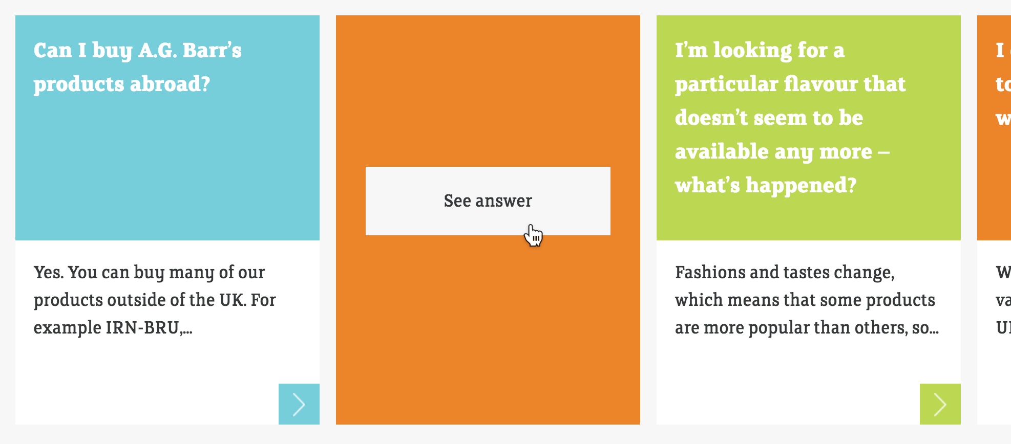
My personal opinion on the existing design of this page was very, very low. FAQ pages are meant to serve as portals of information to aid a user who is seeking a solution to their issue or an answer to their query. The current method of displaying each question and answer on the A.G. Barr site is ridiculously inefficient.
The colors pertain to nothing, the amount of wasted space for each question is immense and the full answer to each FAQ is displayed on the other side of the 'card' and requires another click to 'See Answer' - this is displayed below.
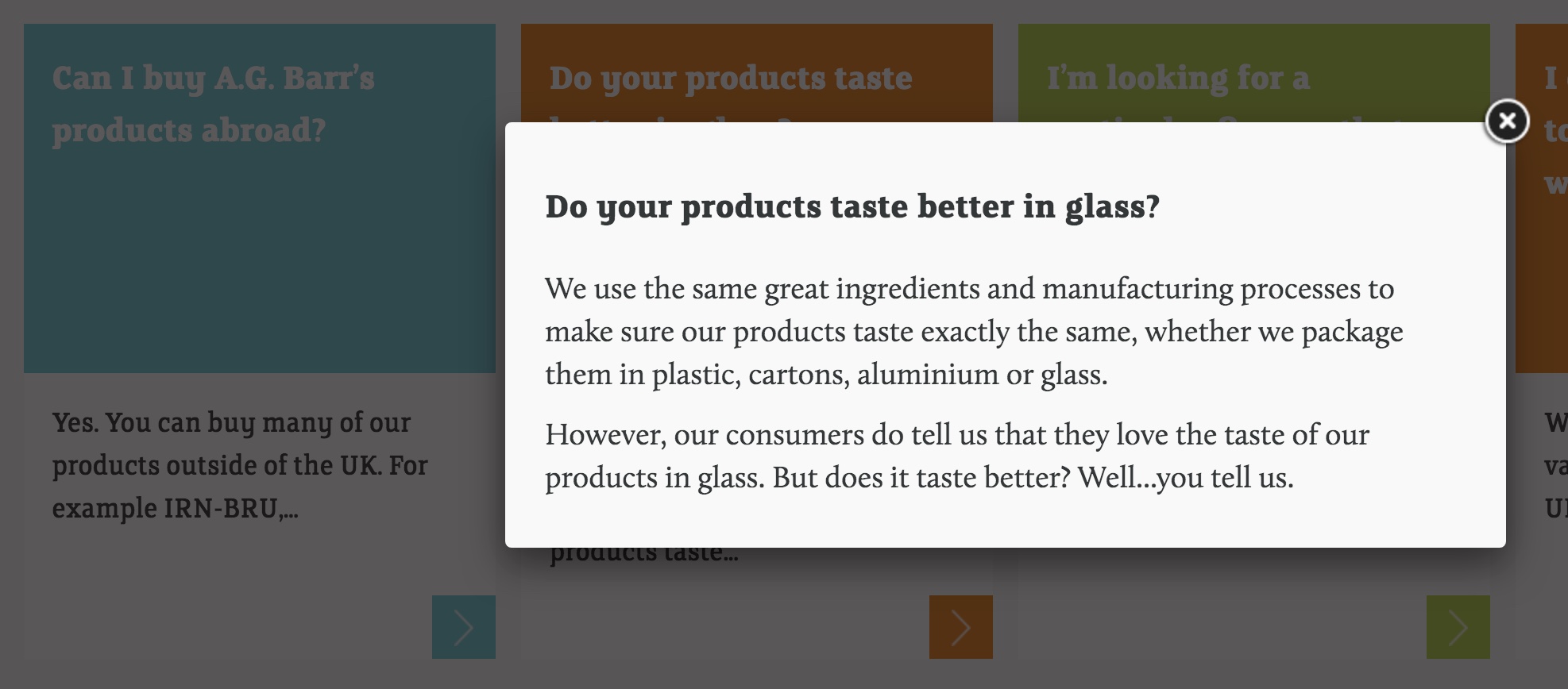
My solution was to display only the question titles in expandable accordions across two columns. Quick-links were added as opposed to filters and answers are displayed in their entirety below the question. By moving away from displaying the answer in a lightbox, the page remains brighter and clearer without any intrusions upon the screen. I find lightboxes on FAQs to be heavy handed. I prefer to allow the user to view the information they're seeking in a clear and easy manner with minimal clicks along the way.
As well as this, I included an FAQ specific search bar underneath the H1 to allow for another method to navigate this section.