RVCA
Ecommerce Redesign
An Overview
This project came as a result of my previous work with Billabong, previously the parent company of RVCA (now owned by Boardriders). I was asked to work alongside a small team to devise a redesign concept with the sole objective of increasing revenue through the site.
During our initial conversations, I was told that Netflix was soon to release a docu-series entitled 'Down to Earth' starring Zac Efron and that he would be wearing several RVCA pieces throughout the show. It was hypothesised that this 'endorsement' (as far as I'm aware, an official sponsorship deal was never made, Efron just loves RVCA) would lead to elevated levels of traffic, so site optimisation would be highly beneficial.
Who are RVCA?
In their own words, RVCA is a design-driven lifestyle brand free from passing trends. Appearing as natural on the shelves of boutiques as on those of a local skate shop, RVCA is brought together by a group of like-minded individuals from various subcultures, a collaboration of sorts, a lifestyle within itself.
Objective
To provide a robust concept for a redesign of the RVCA online store that will improve the customer's experience, facilitating a smooth journey from start to end.
Metrics for Success
Increased average order value (AOV), increased revenue, higher sales volumes and lower cart abandonment rates.
Challenge
Other than time being drastically against us, one of the greater challenges would be refining a site that wasn't actually that bad to begin with. Usually with redesign projects, I work with sites that have been victims of time and neglect or misunderstandings. The RVCA site however actually looked good and worked fairly well, so improving something that wasn't underperforming was an interesting challenge I hadn't faced too often in that past.
The Team & My Role
I worked alongside a UX designer and another UX/UI designer who would provide an alternative concept once we had progressed past initial UX stages. In this case study, all UI work shown was created by myself.
Deliverables
As well as a design guide and full documentation, it was agreed that we would provide at a minimum the following pages: Home, category, product, contact, customer service, account settings, logins and the account registration form as well as variants should they be applicable (search results page, hero-less areas etc) as well as responsive versions of the aforementioned pages.
Tools
Sketch, Principal, Illustrator, Photoshop, InVision
Design Method
After considering several design thinking processes, we decided to base our process on an adapted version of the ‘Double Diamond’ model (as defined by The Design Council).
This method was chosen mainly because of the first phase being that of ‘Discover’, which is a broad categorisation allowing for a wider scope of research compared to other design processes that usually begin with ‘Empathise’ - something that is limited to user-related research.
Discover
Competitor Analysis
The first thing we did here was simply ask RVCA who they deemed their competitors.
The quote shown revealed a wealth of considered competitors, so we took seven to analyse and establish where RVCA stood amonsgt them in terms of usability, functionality and design aesthetic. Each company was chosen according to it's approximate networth, taking a few from different ranges ie: high, mid and low revenue.

Any brand who sits next to us in a retail environment is ultimately who we compete against as while many of these brands may not be anything like us, essentially they are taking away valuable retail expenditure from us.
As a overall global analysis, we compete directly with the likes of brands such as Quiksilver, Stussy, Obey, Krew, Dakine, Ripcurl, WE, Burton, Paul Frank, Fenchurch, Neff, Altamont, Atwater, Gonz, Analog, Volcom, Hurley, Fourstar etc.This competition is measured from the fact that these brands are also entrenched within art culture and are trying to give a voice to artists through their brands. The way in which they offer a voice for artists differs from us, but the fact that they offer a similar platform ultimately forms the basis of who we compete against within the global marketplace.
PM Tenore - Founder, RVCA
The image here shows one of our competitor analysis charts, defining common elements to gain further insight into how we could optimise key areas of the site.
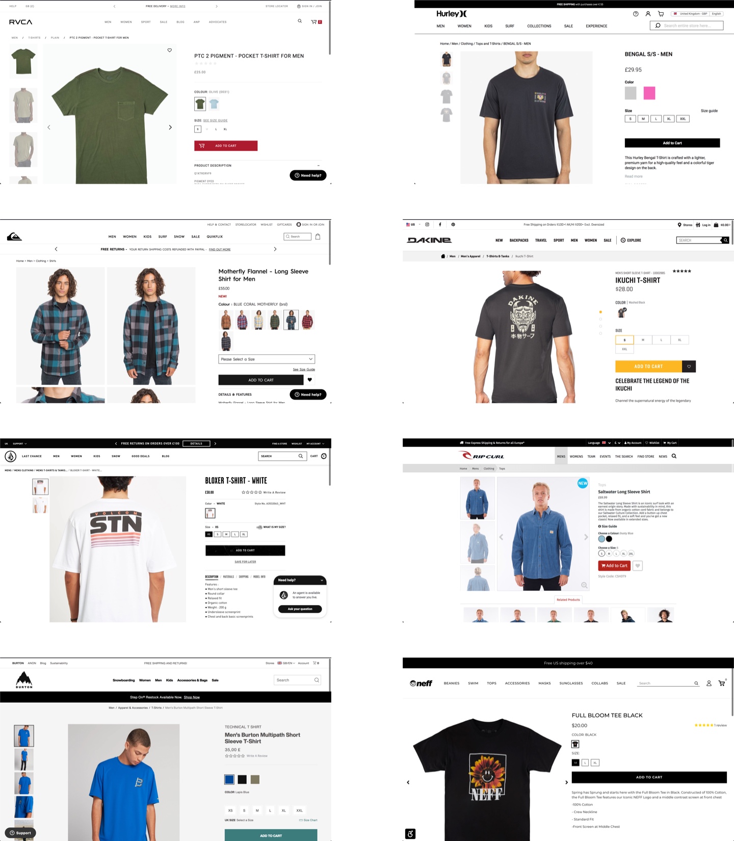
Competitor Site Analysis
Having established who we would analyse, we took to gathering screenshots of each competitor's online stores and viewing them both individually and as a collective. As you can see, all sites employed very similar design patterns with interestingly similar layouts and methods of operation.
RVCA's existing offering also employed similar patterns, giving us ample room to test alternative methods of display in hope of fulfilling our defined objectives. In other words, this part gave us much greater insight into how we can stand out amidst the crowd and potentially increase revenue.
User Feedback
Existing User Surveys
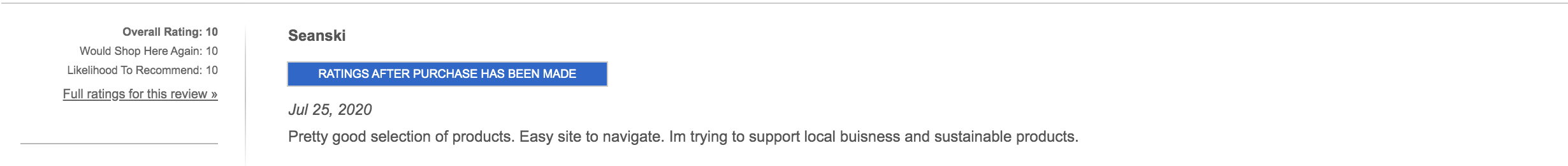
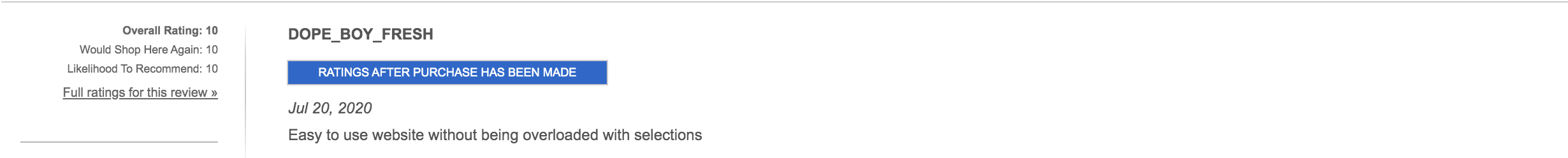
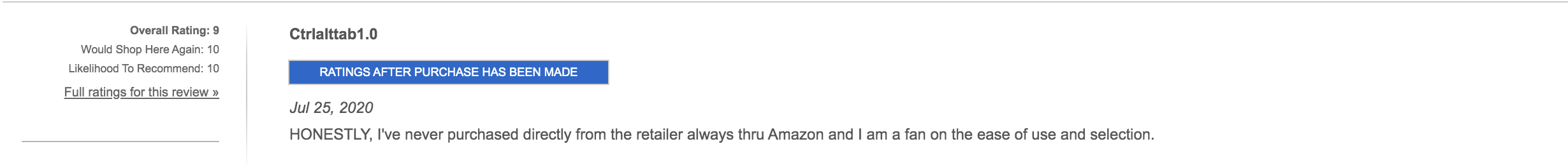
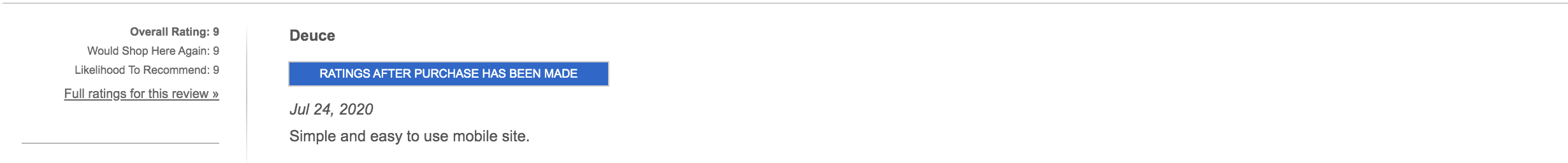
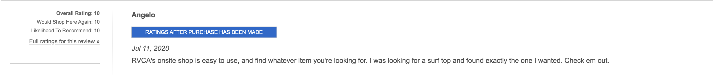
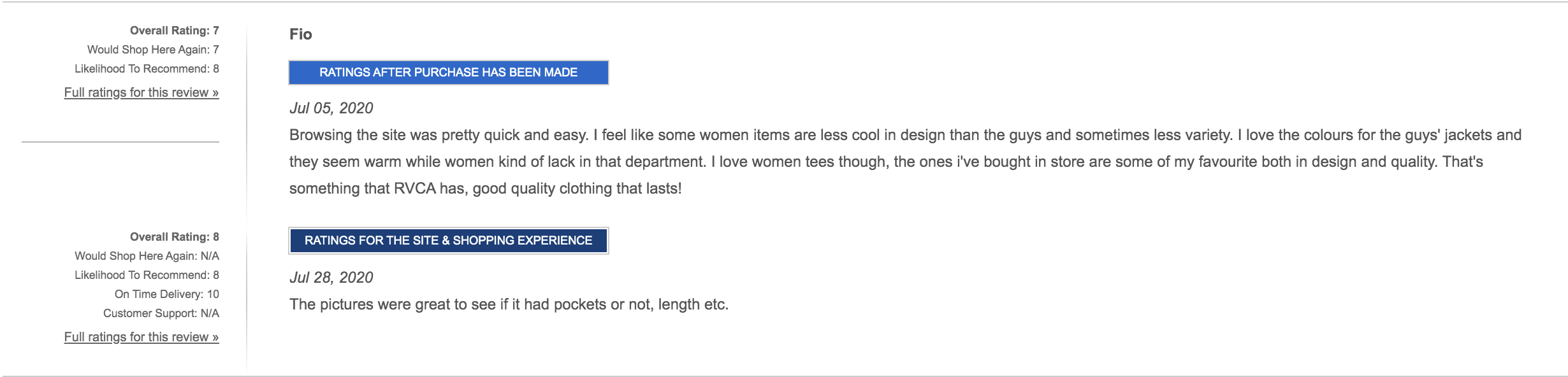
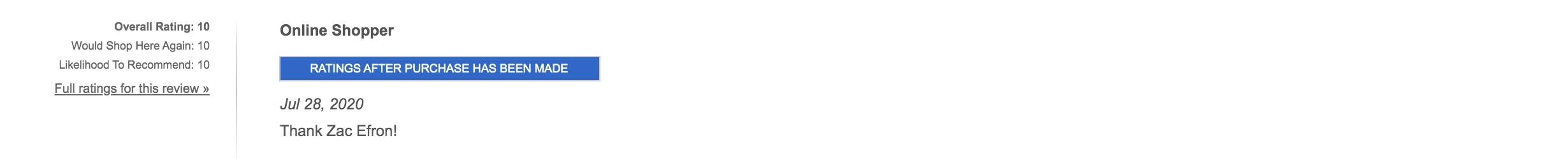
Having been an established brand for several years, RVCA had a wealth of data to provide us (most of which cannot be shared here, understandably). One such source of data was via their BizRateSurveys page.
Combing through the plethora of user reviews, we collated those that referenced user experience, pain points and opinions relating to design and ease of use etc. A handful of these are shown here.
As you can see, the general consensus (as we had already established) was that the design and experience of the site was good - this meant that we didn't want to interfere with parts that already functioned well ie: site structure, methods of navigation and general layout. Ultimately we would refine some of these parts to sit inline with newly formed design choices but maintained the general functionality of each part.
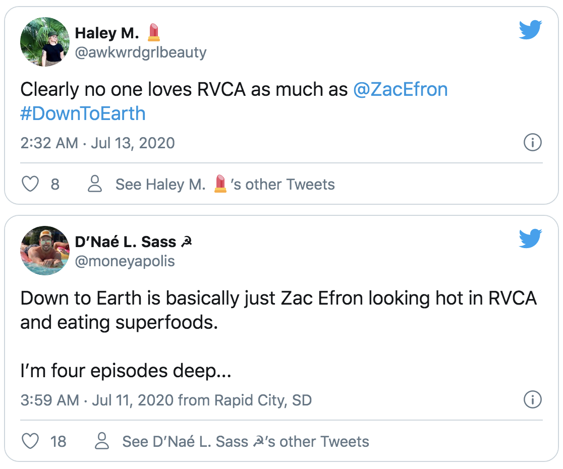
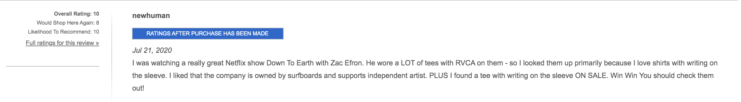
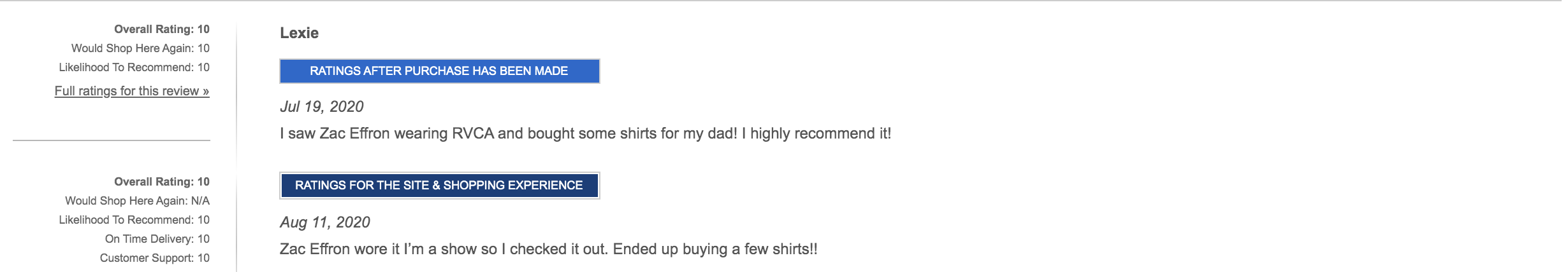
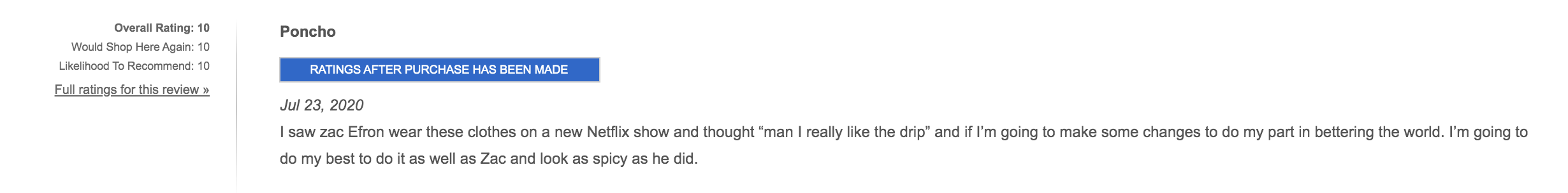
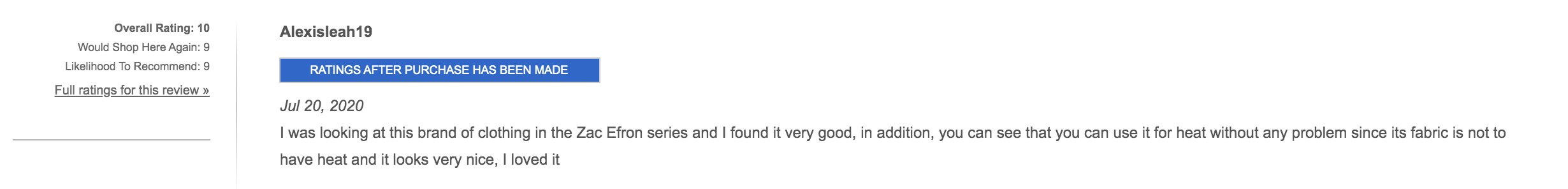
Zac Efron's Influence
As previously mentioned, the release of Netflix's 'Down to Earth' saw Zac Efron sport RVCA attire throughout and the prediction of this forming a positive impact for the brand was becoming more apparent as time went on.
These images were just a fraction of the positive mentions of Zac Efron and RVCA - it would seem the prediction was correct.
User Research
The next step was to interview users of RVCA's current website to find out what they thought about it. I spoke with 8 individuals consisting of three 'loyal' customers (big supporters of the RVCA lifestyle & brand), three who've purchased from the store less than three times total and two who had heard of RVCA but never purchased from them. These were sourced either by direct contact or via social media and gender was an even split. Due to the Covid-19 situation, these interviews were conducted online.
During these interviews, I asked them to have a look through the site, operating as they normally would and simply tell me their thoughts as they progressed; a stream of consciousness if you will.
Key Findings
- Three users mentioned they noticed a lack of reviews for several products. The 'ZERO REVIEWS' and large empty space was noticed. When asked about reviews, only two said they'd be interested in reading them - these were the 'new' customers. This implied that a lot of brand trust is already instilled in existing users - preserving this trust would be a good decision.
- Two users stated the fonts were quite thin and hard to read on their device. (One used a non-retina screen, the other a 13" Dell - both were Windows based.)
- Four users pointed out that there is a lot of unnecessary information on the screen at once. When asked to expand on this, one user said they felt it hard to find out the things they wanted to discover.
- Two of the previous customer users highlighted a lack of suggestions, adding that they're not entirely confident with shopping for themselves especially online.
- One of the die-hard fans told me that they often shop through the lookbook, gaining inspiration from story shoots. They mentioned that they'd like to see more curated collections like that.
- All users attested to not reading product descriptions, instead basing their decision solely on the provided images.
- All users found the site to look visually pleasing but not memorable. When asked if 'being memorable' was a factor in their decision making process, all said no.
- All agreed that the design emboldened trust and that trust would go a long way when making a purchase on the site.
- Only one user mentioned the RVCA Insider scheme despite three already having accounts.
- Talking to those who had previously made a purchase, two of them had made an attempt to complete a transaction but abandoned their cart at the latter stage. When asked why this was, no concrete answer was given other than distractions from elsewhere and the want to compare products and prices.
- All users agreed that the brand was strong and would recommend it to friends and family.
- No one had ever left a review on the site, when asked why that was, one participant mentioned that they felt it unnecessary to leave a review on clothing, feeling it a pointless endeavour. This was highlighted as something for us to follow up on later or investigate further.
Usability Testing
After interviewing the users, I gave 2 tasks for them to carry out, which I screen-recorded for further analysis. All users were asked to use a desktop computer with the browser of their choice. Below are some of the key findings that helped us gain a better understanding of our users.
Buy an outfit in your size that you would wear in a casual situation with friends.
- All users managed to fulfil this task with very little trouble.
- Average time for completion was 9m 30s. This encompassed the whole user journey.
- Most users used the dropdown menu to reach their desired section immediately, ie: Women's Shirts.
- 75% of the users utilised the browser's tab feature to open several items at once and add them to their cart accordingly. When later asked if they realised there was a wishlist feature, only one user claimed to be aware of it.
- When viewing the product page, most users used the image zoom feature on the main product image to get a better look at the product. This was especially true with products that featured a pattern.
- Two users expanded and read the product details section.
- One user used the 'Recommended for You' feature, ultimately adding one recommended product to their cart.
- No one used the footer / footer links, most barely saw it.
- Two users tried to use the 'Quick Shop' feature (opens the product page in a lightbox). It didn't render properly for one user (using Edge browser).
- One user made use of the filters and commented that it was 'a bit low, barely saw it'.
Buy something as a gift for someone of the opposite sex with a budget of £90.
- This task proved to be more difficult than before with an average completion time of 13 minutes. The reason is likely linked to having to use one's imagination more and buy for someone who wasn't themselves or of the same sex - a purposeful decision as the previous task would've exposed them to several products already. This method allowed for the user to venture into other parts of the site where they would ultimately be less confident.
- One frequent user as well as one new user both used the lookbooks to find product inspiration.
- Three users used the 'Recommended for you' section. When asked if they would find other versions of this useful (Complete the Look etc), all agreed.
- Five users made use of the filter section on the category pages - usually this was only to select a certain size.
- Four users added several items to the cart and then proceeded to prune it before checking out.
- Only one user utilised the Wishlist feature. When later asked, several users explained that they saw no indication of it's presence on the site but would find it a welcome feature.
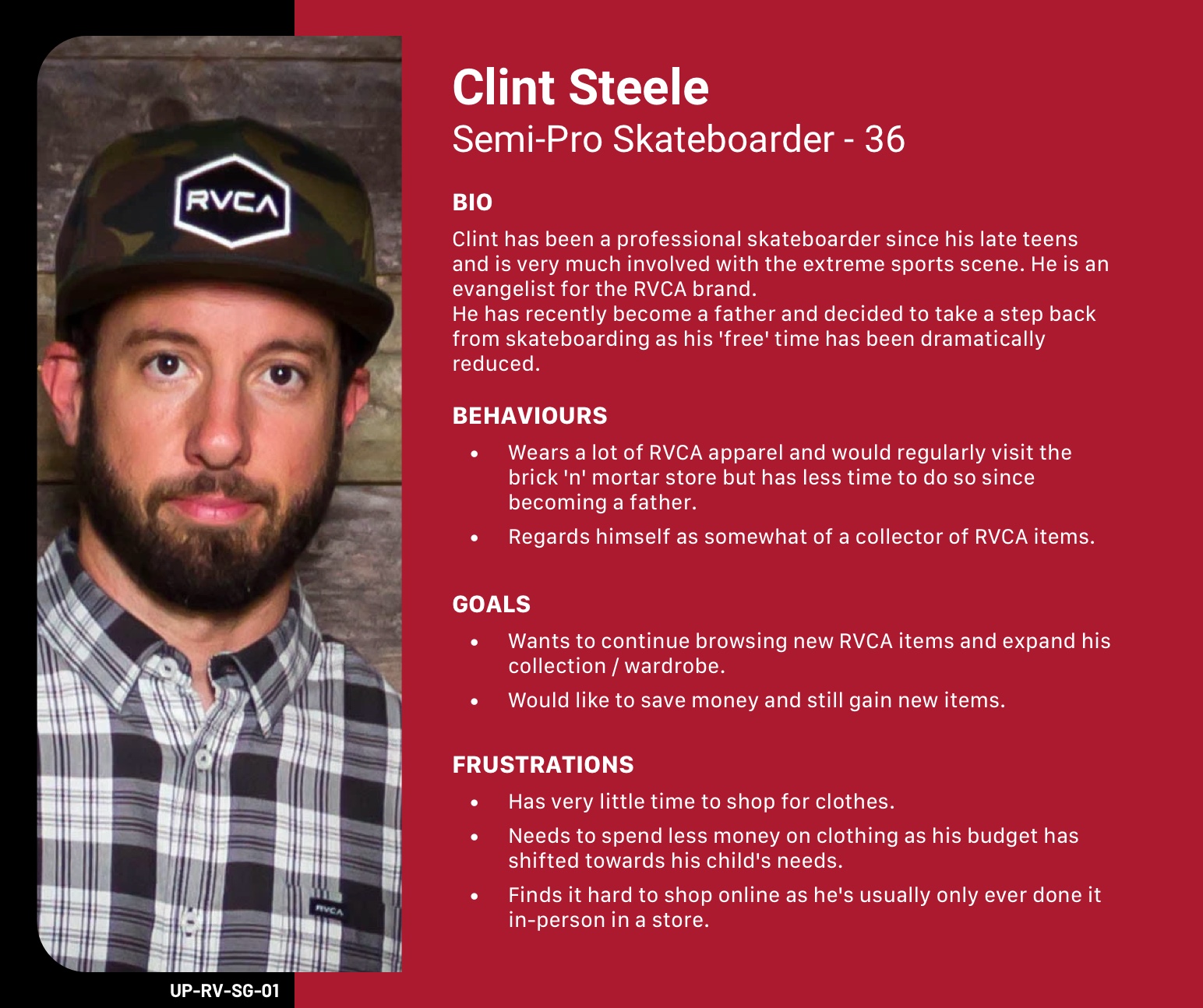
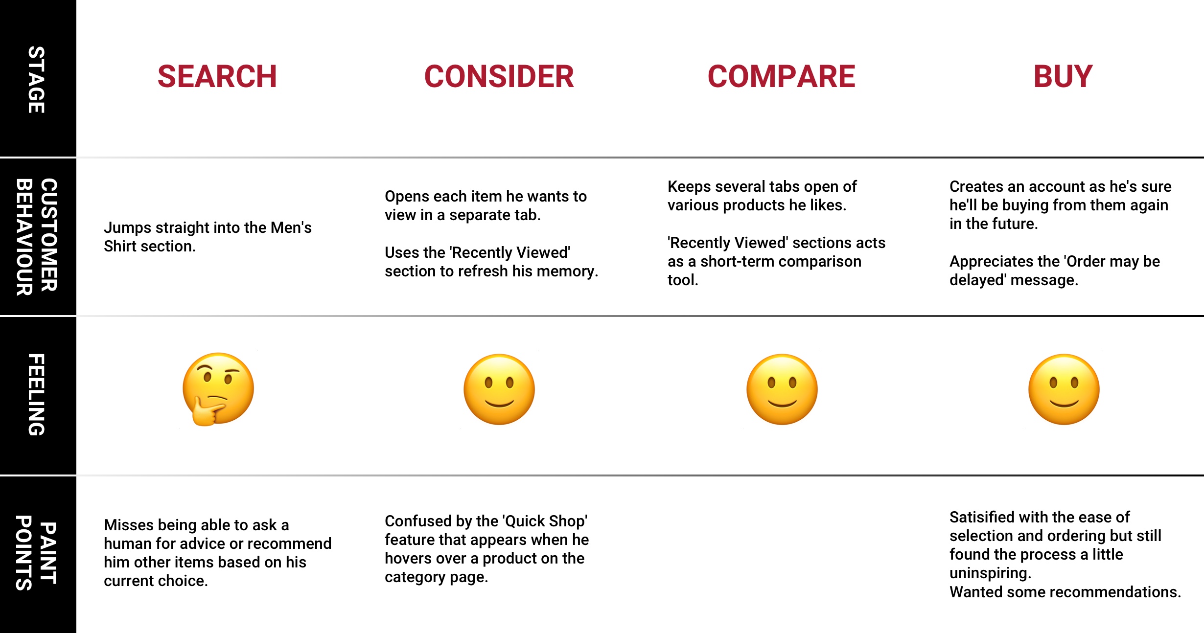
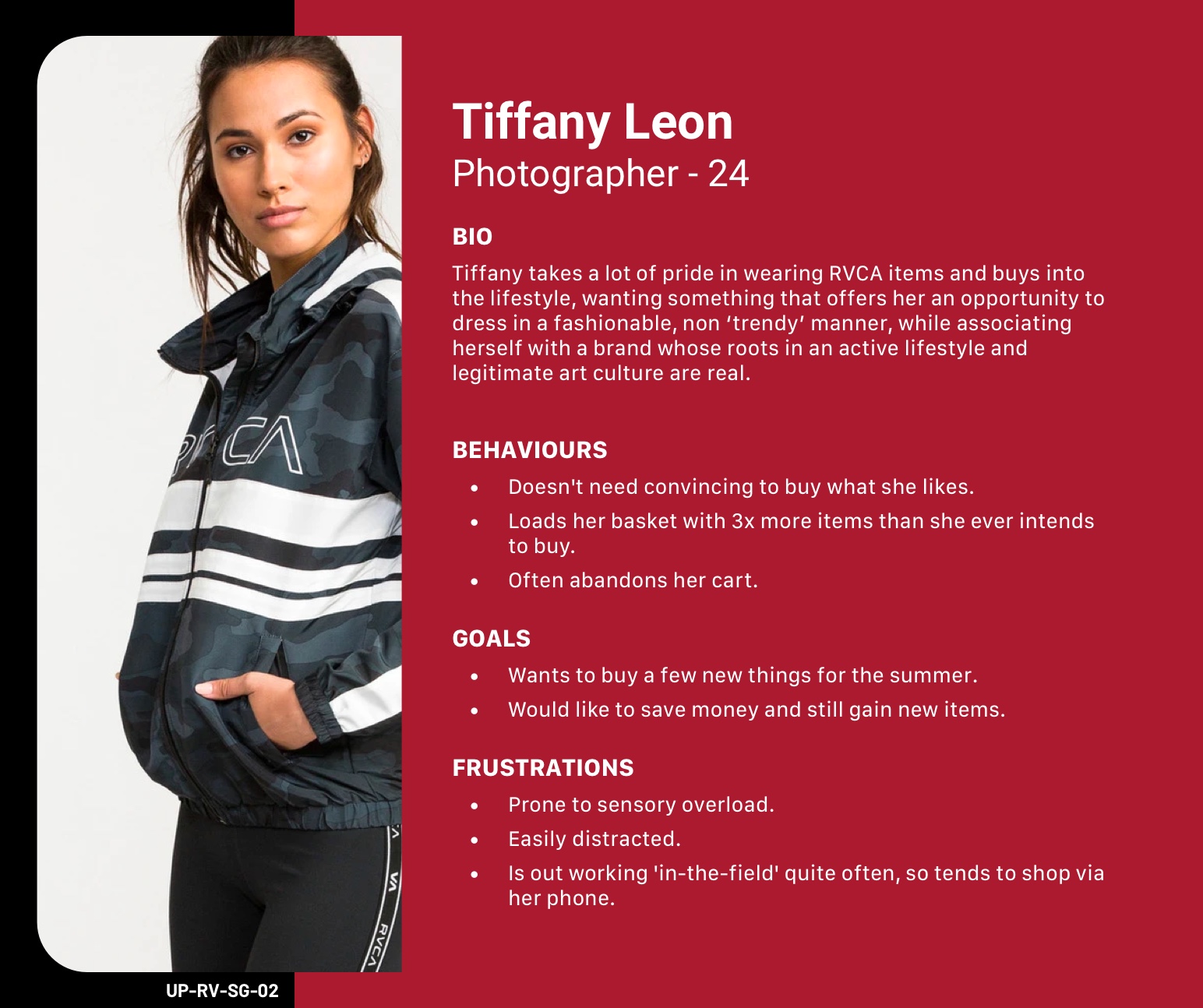
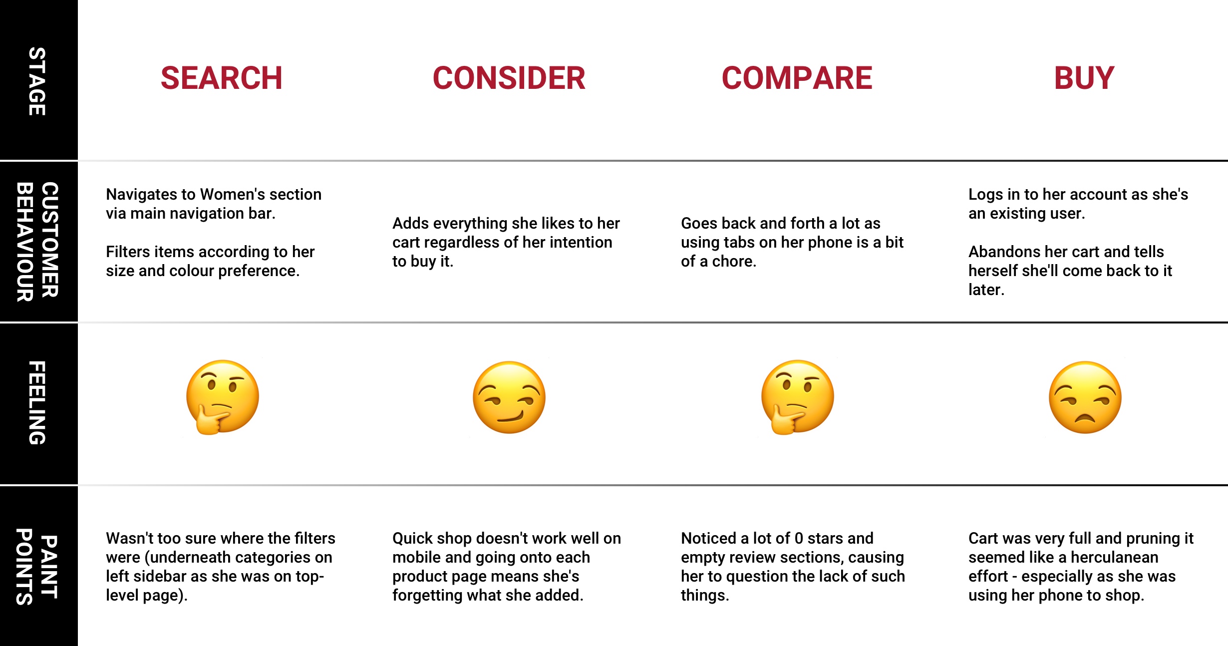
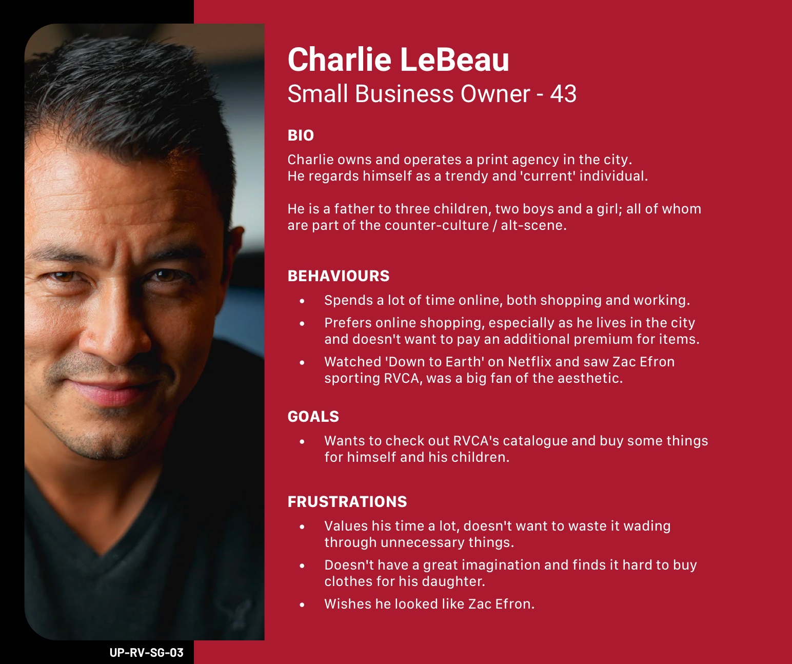
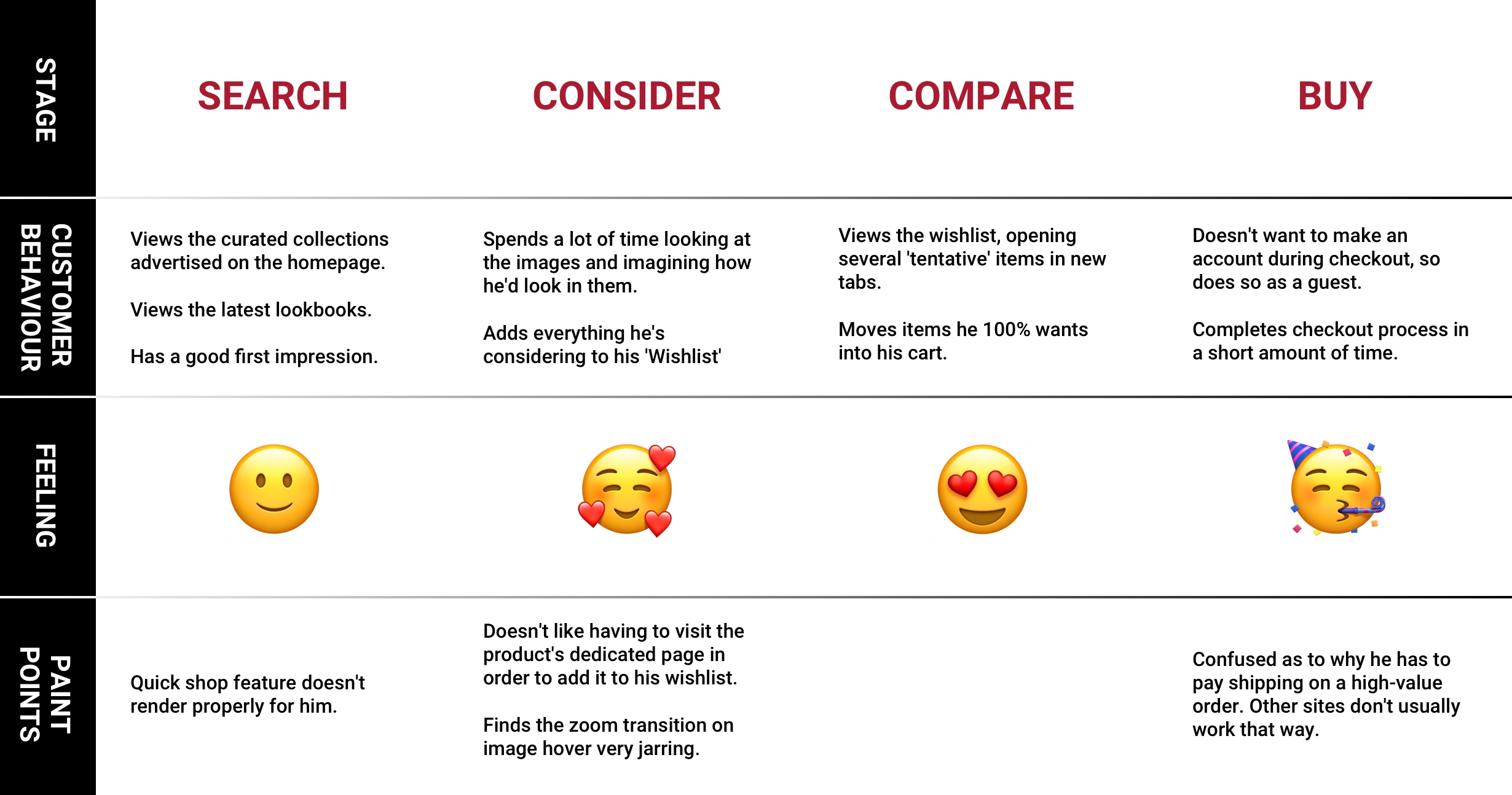
Personas and Journey Mapping
Based on the key findings and research on the app, I created 3 personas depicting the user’s behaviour, sentiment and pain-points throughout their stages of using the app.
Ultimately, these personas helped gain a deeper insight into our user and help provide clarification on how to proceed.
Develop
Wireframes
Pen and Paper
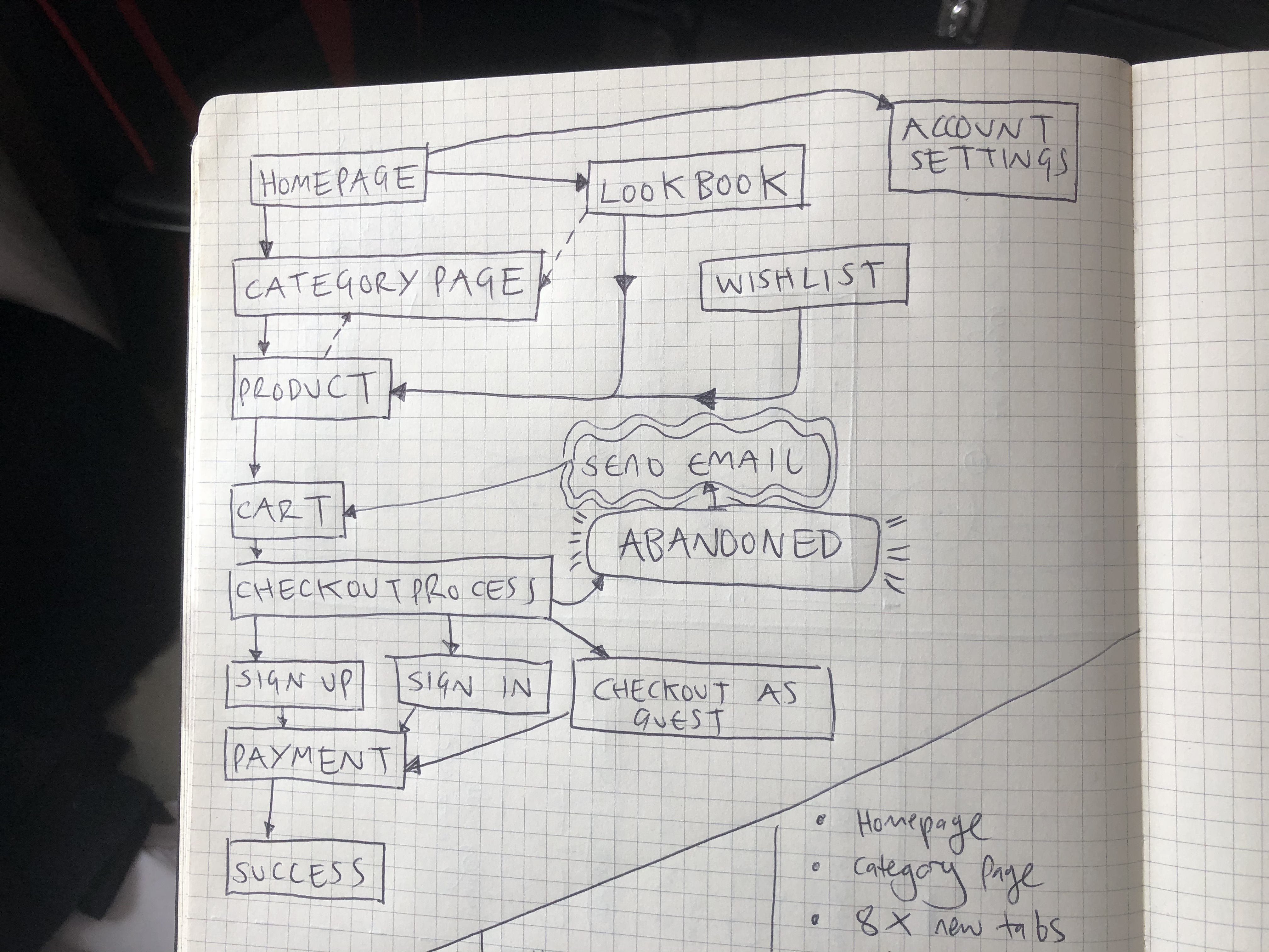
Having delved deeper into the psyche of our users through interviews and analysis, we began to put our inital design thoughts down. After card sorting and a quick chat, we began with low-fi wireframes, laying out several compositions and user flows, discussing each one along the way.
Through these discussions and testing the low-fi wireframes on one another, we began to garner a clearer idea as to where we were heading. We picked several concepts and I was tasked with upgrading these basic scrawlings into slightly higher quality digital versions.

Mid-fi Wireframes
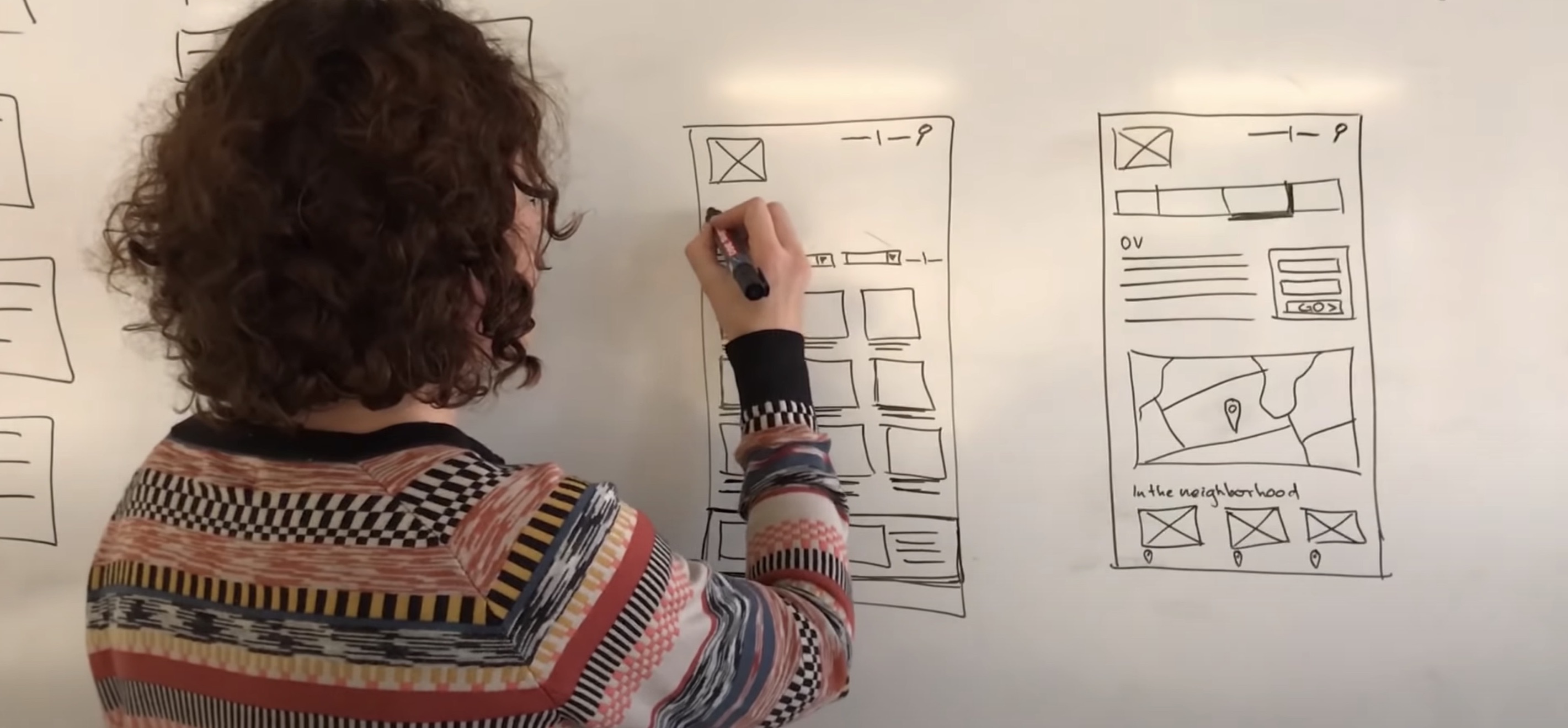
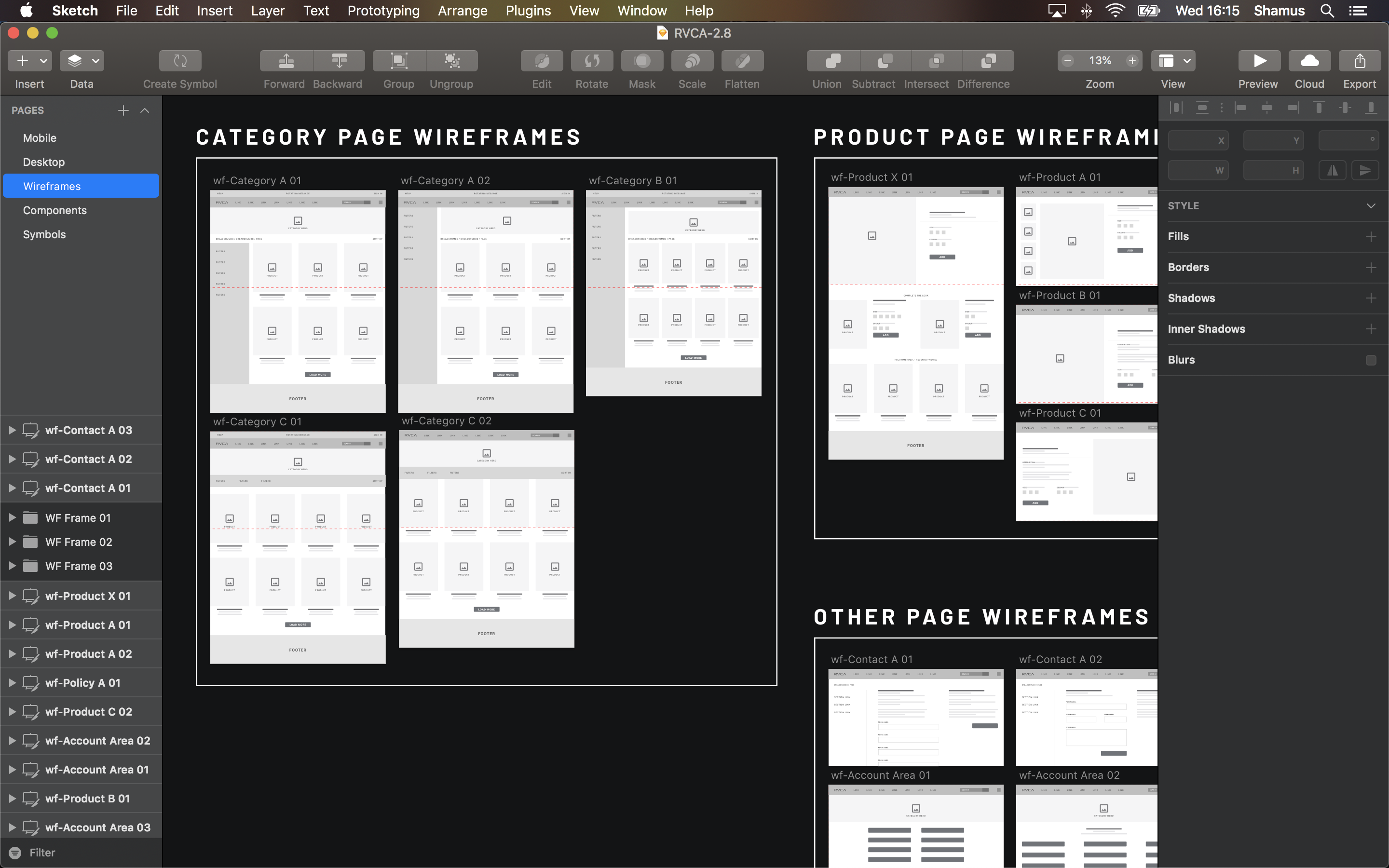
Having selected several of the pencil wireframe compositions, I upgraded them into mid-fi wireframes, making them slightly clearer and easier to communicate design intent.
Here you'll see an overview of some of the wireframes at this point. Working in this manner made it easier to create very basic prototypes within Sketch to further validate ideas and check that the journey feels fluid and consistent.
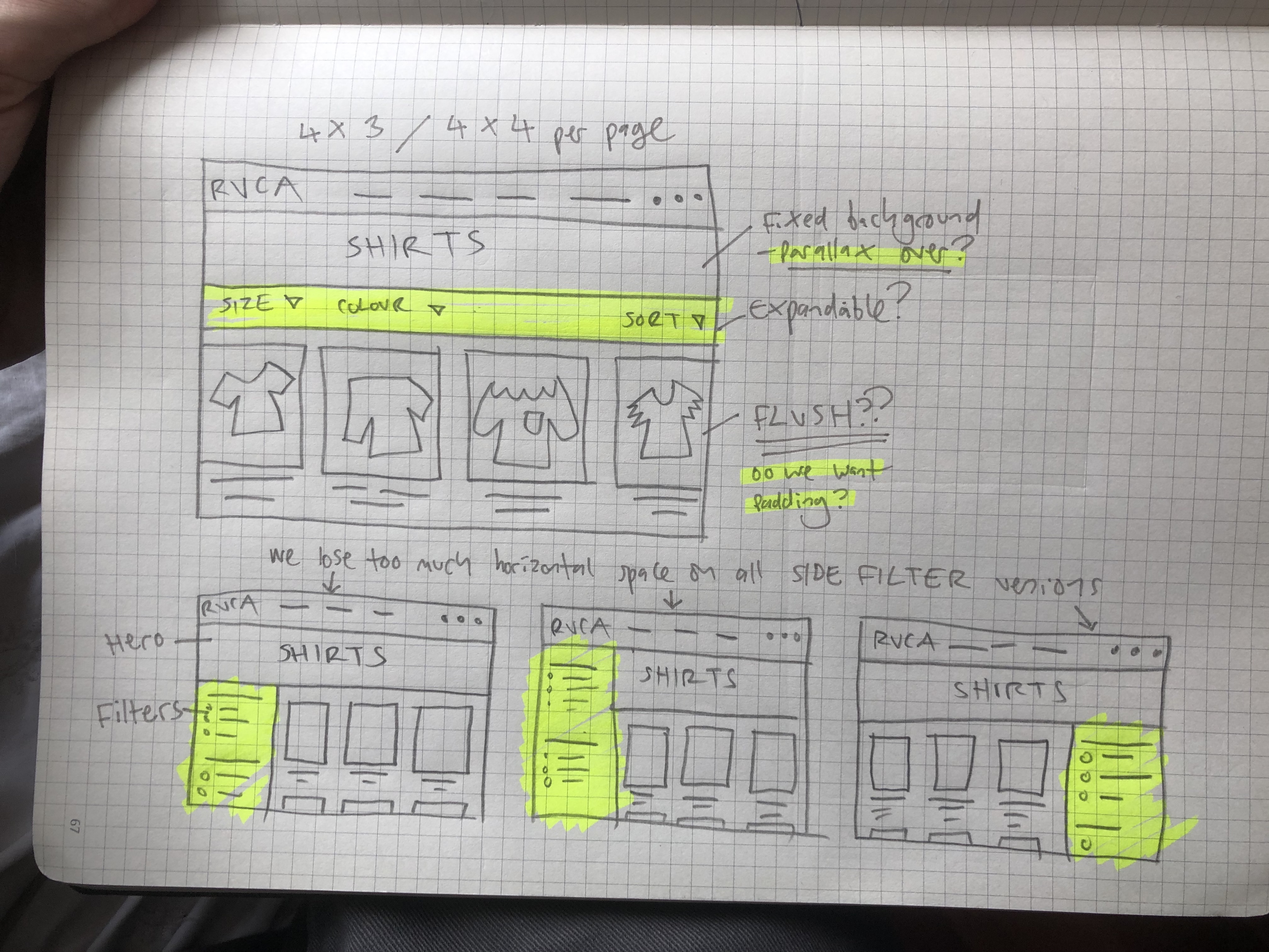
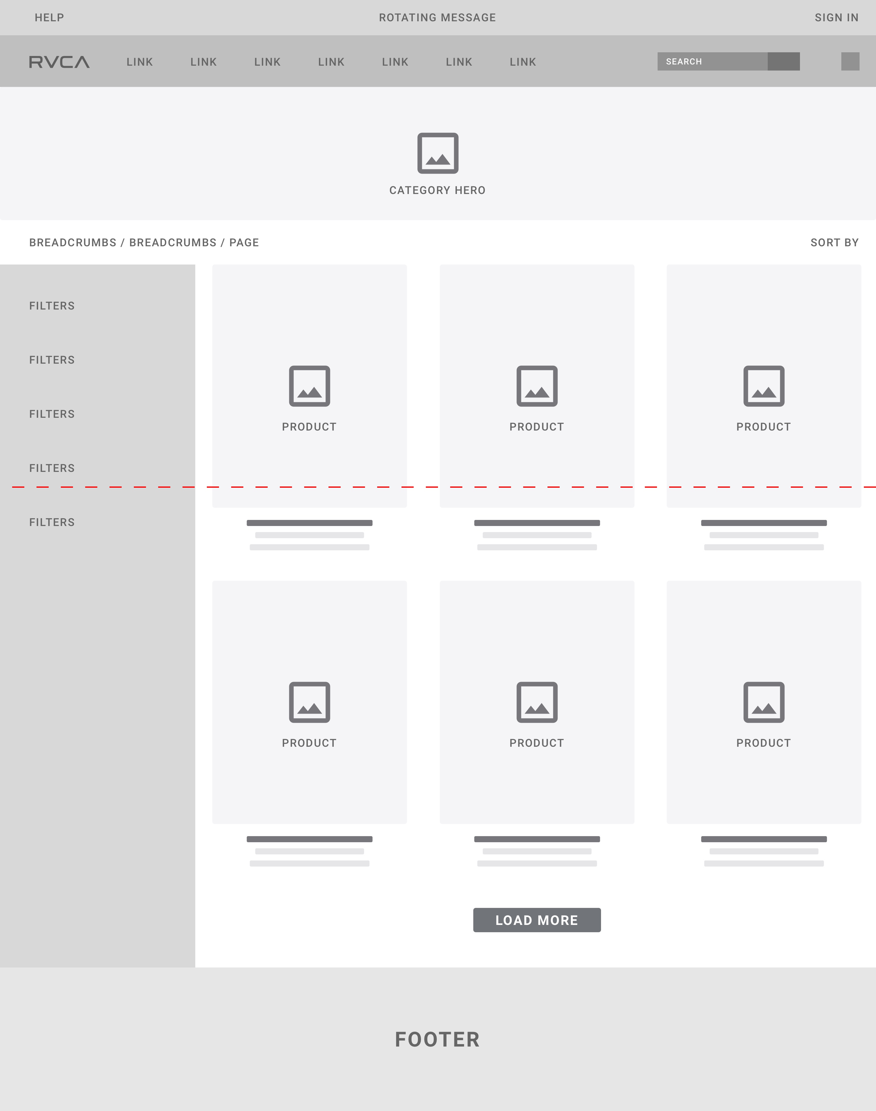
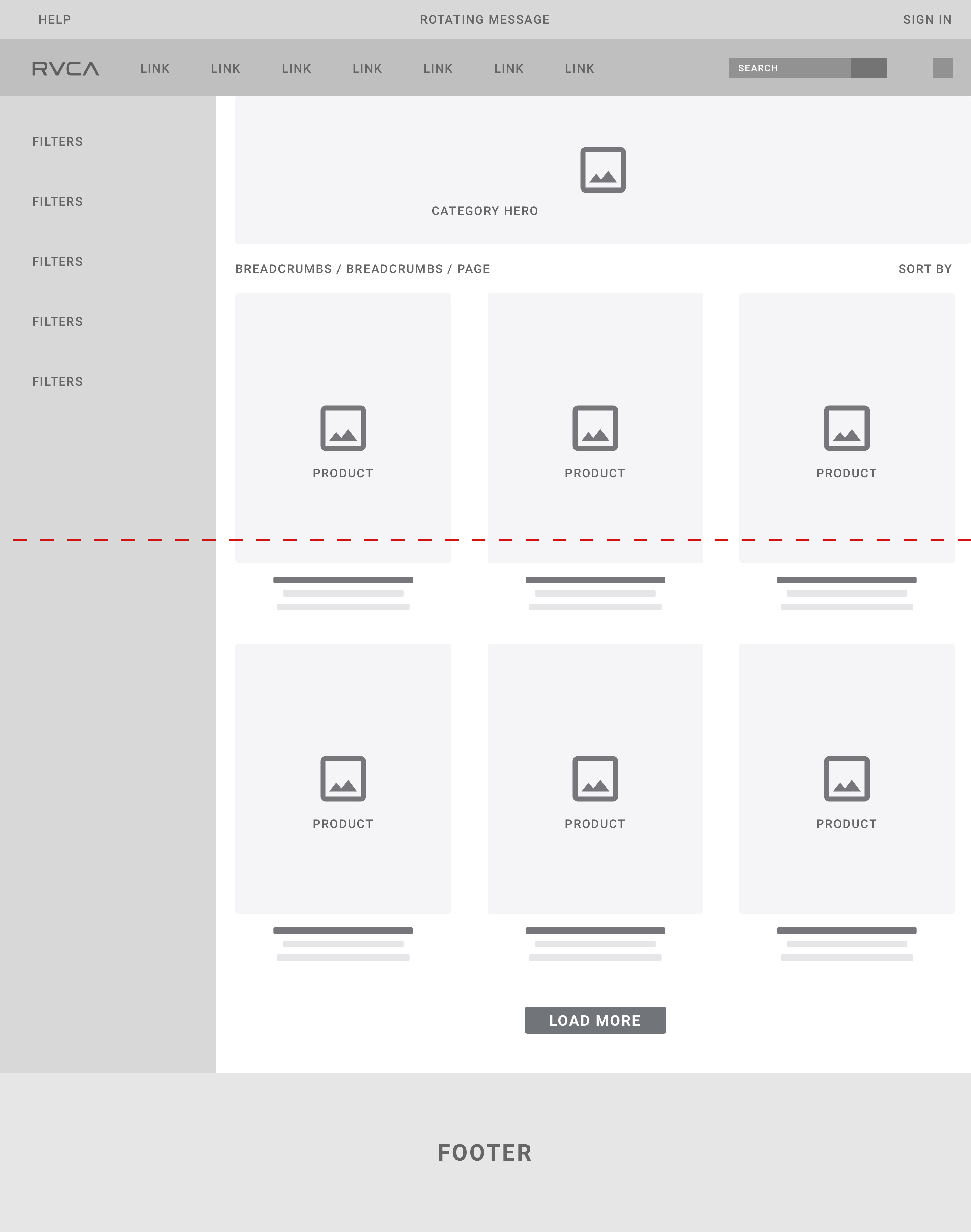
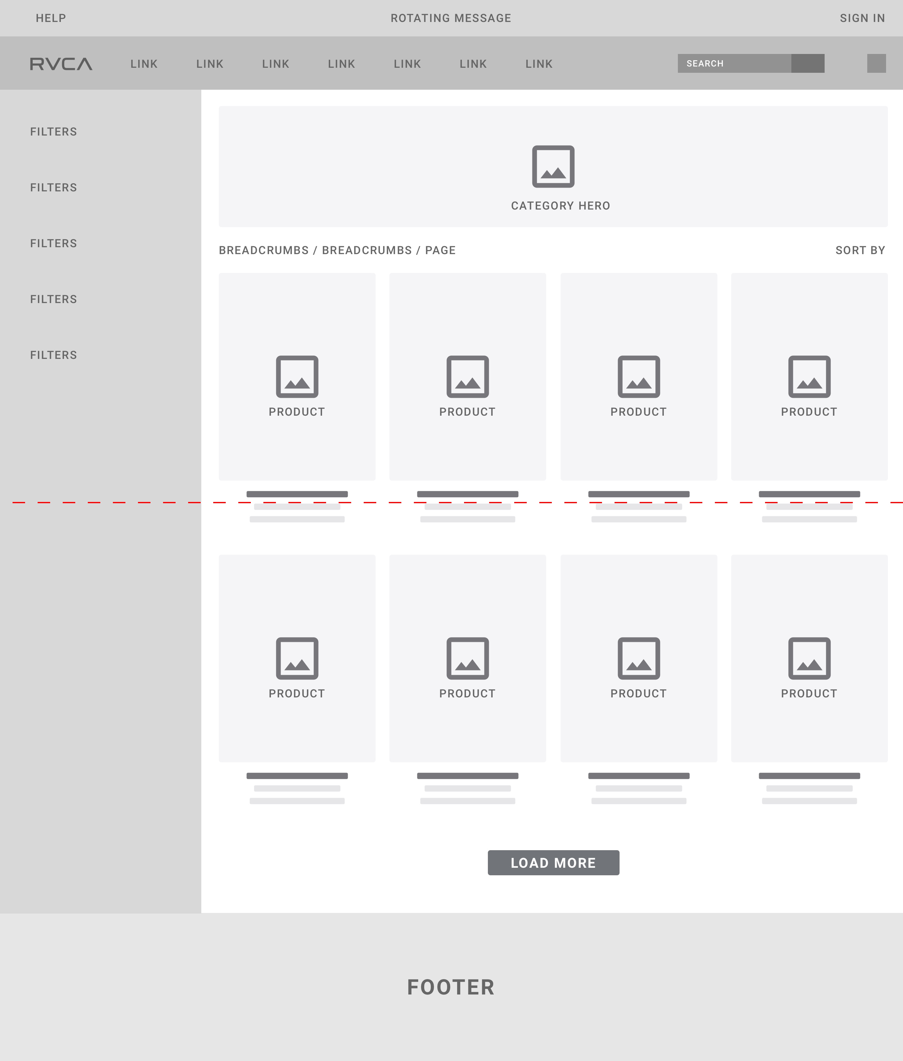
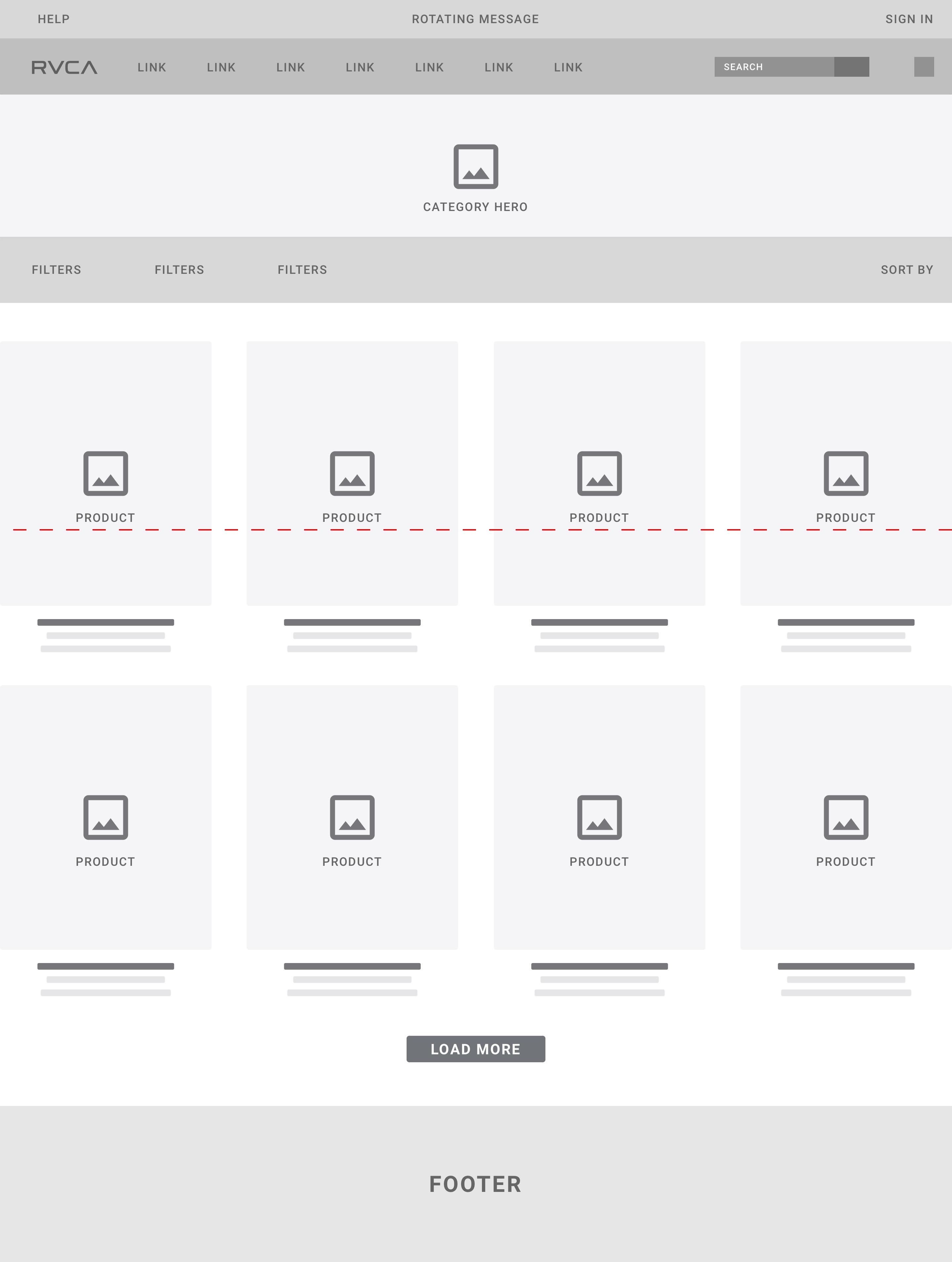
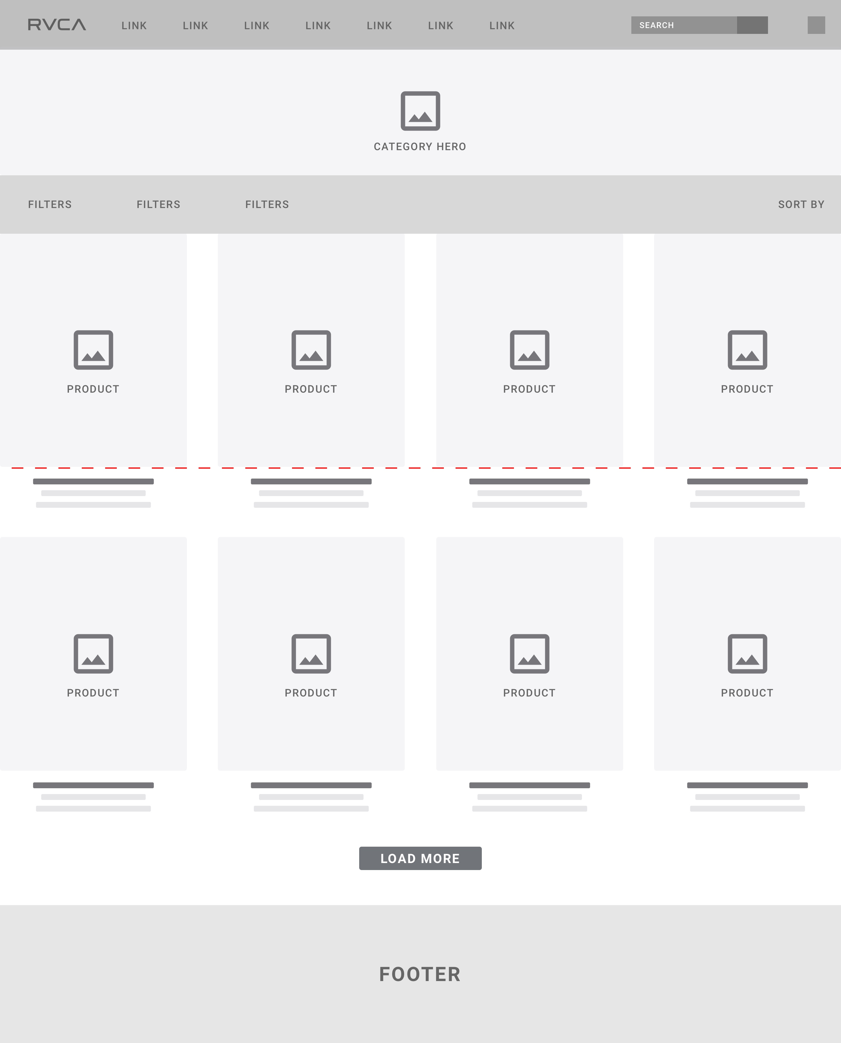
Category Pages
At this stage we were considering three routes; Two of which involved keeping the filter bar on the left hand side and one which involved creating a horizontal filter bar that spanned across the top of the products.
The latter option is ultimately the one we chose to proceed with as moving the filter bar freed up another column in the body of the page. The red lines in the images represent the 'fold', moving the filters didn't detract from what was displayed above the fold, more images were now being shown and the filters would hopefully be more obvious.
Making full use of the screen's real estate was vital to our success in this project.
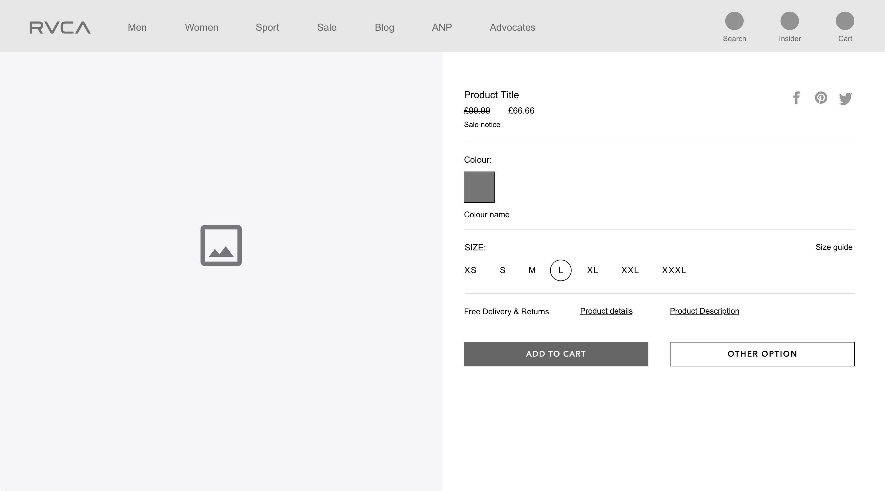
Product Pages
I spent a lot of time going back on forth on the product page, mainly because every idea we had didn't feel strong enough or just too similar to our competitors. I wanted something more, to push the envelope a little further (didn't want to become TOO abstract or OTT) and deliver something that was visually astounding as well as commercially effective.
The key words we had to remember during this design stage were SIMPLE, CLEAR and MINIMAL. We wanted to really push the imagery and product, keeping extra information to the side (but still available to read / view etc), so that the user is less distracted and has a clearer idea of how to proceed. Trying to strike a balance between these concepts whilst still being visually appealing was a great challenge and one that I feel we rose to.
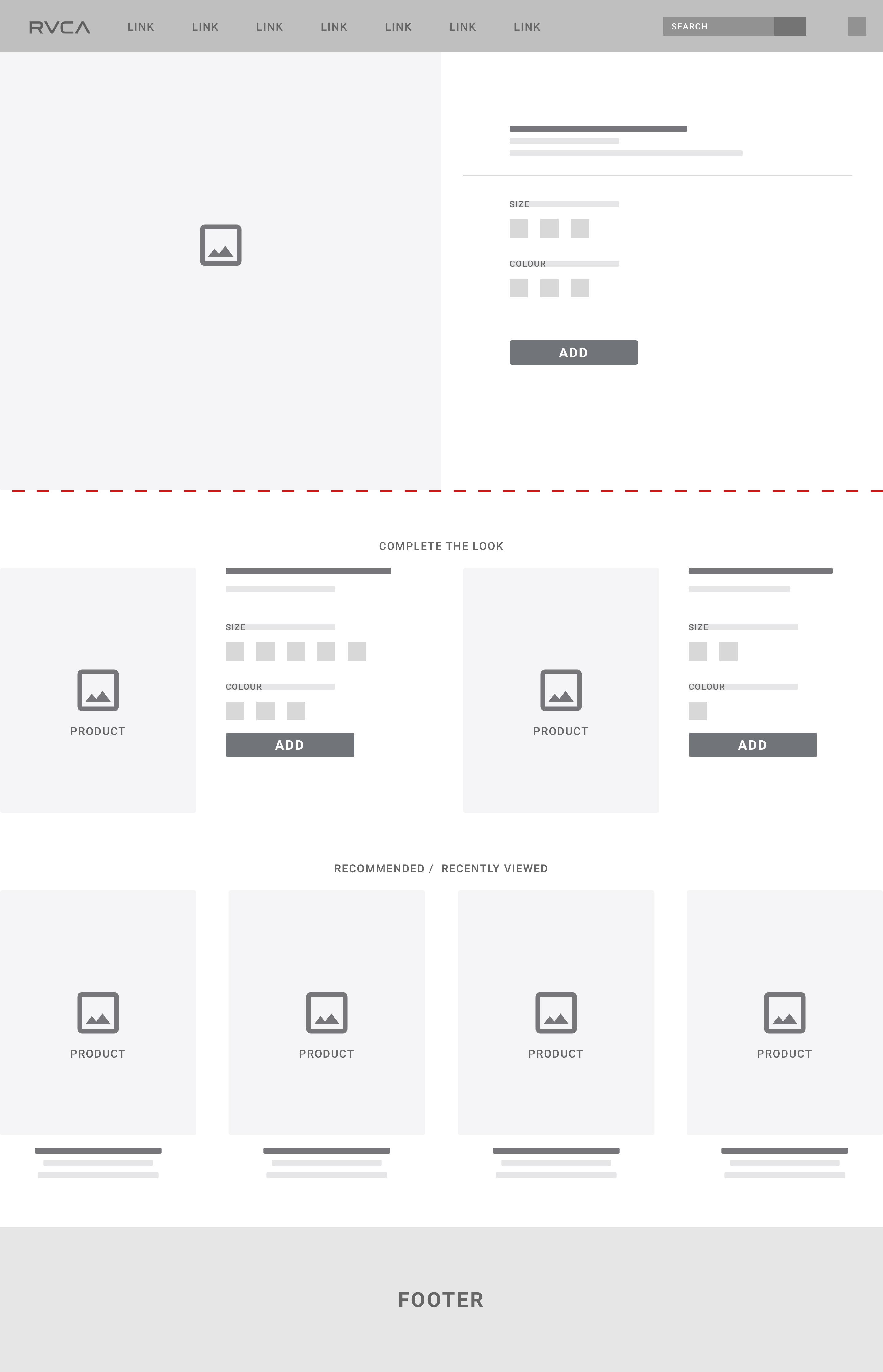
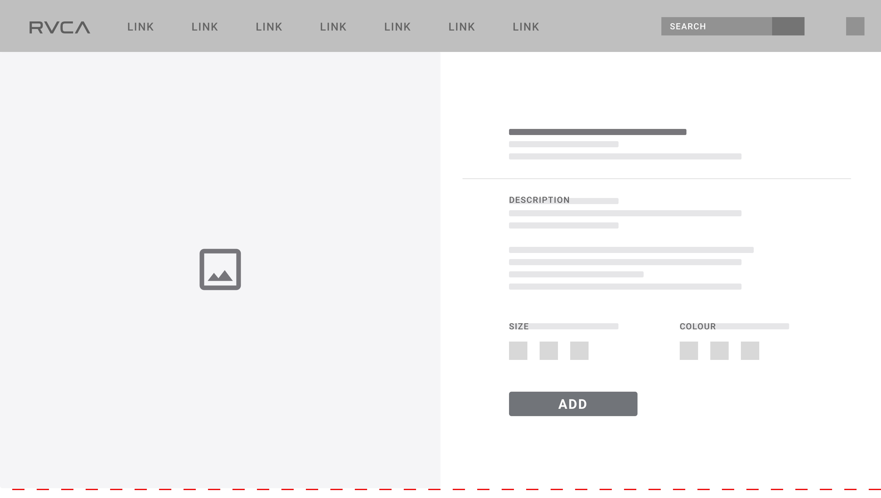
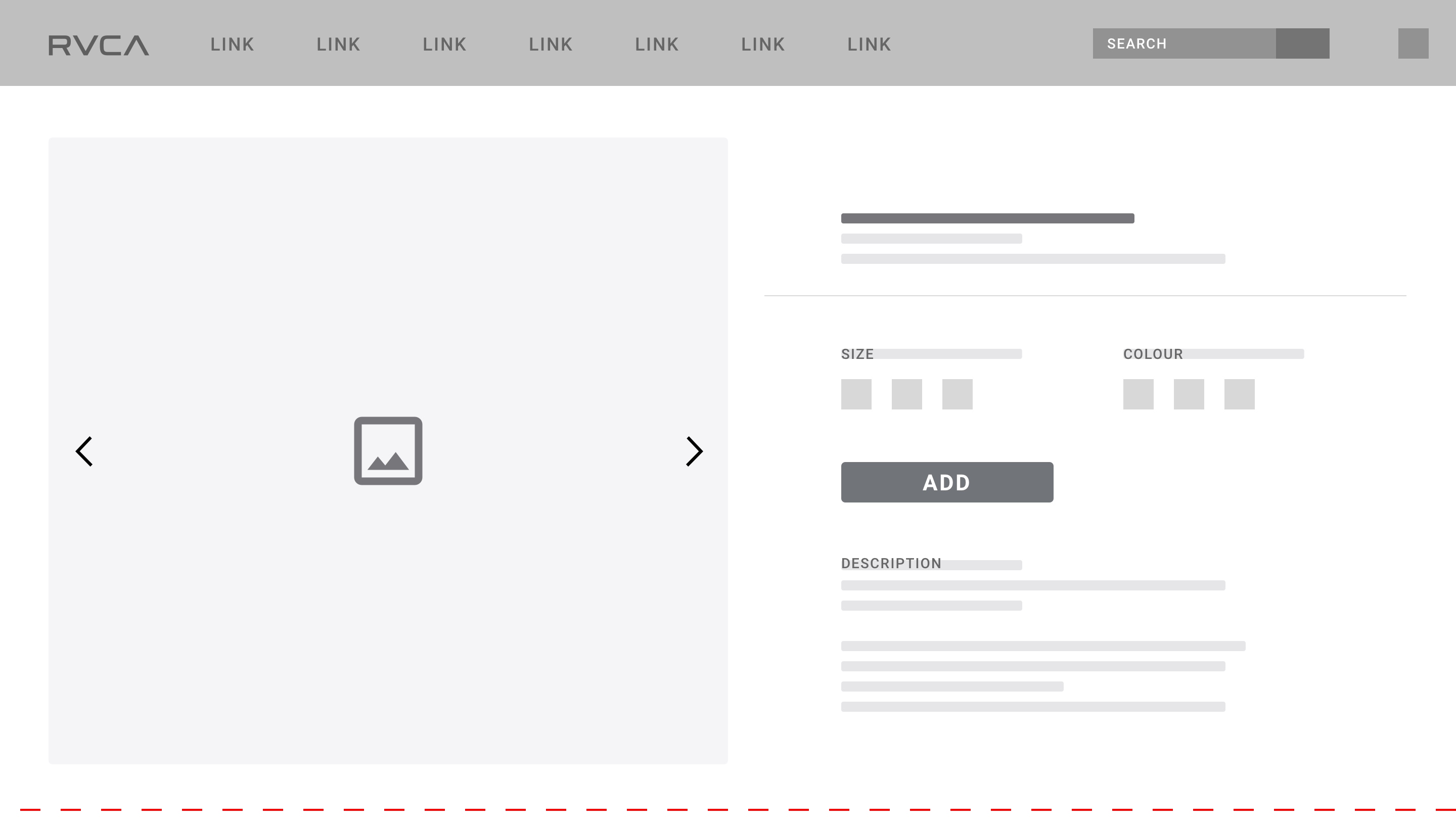
Higher Fidelity Versions
Once we established the content and general layout of the product page, we began improving them, trying new things, adjusting position of elements etc. With each iteration, the fidelity of the wireframe increased until we were at the point when creating a high-fidelity final design was the next logical step.
The images here show the wireframes at various stages and the adjustments made to reach our end-goal.
An original goal was to increase average order value and make the user's journey easier. One new feature, which can be seen here, that we added was the 'Complete the Look' section. This would always follow the product's main section (existing completely above the fold).
Styleguide & Components
The Styleguide
Having established the wireframes for our core pages, I began to work on the styleguide. This would act as a single source of truth for design assets across the RVCA site. Excluding typography, all elements shown below are in alphabetical order.
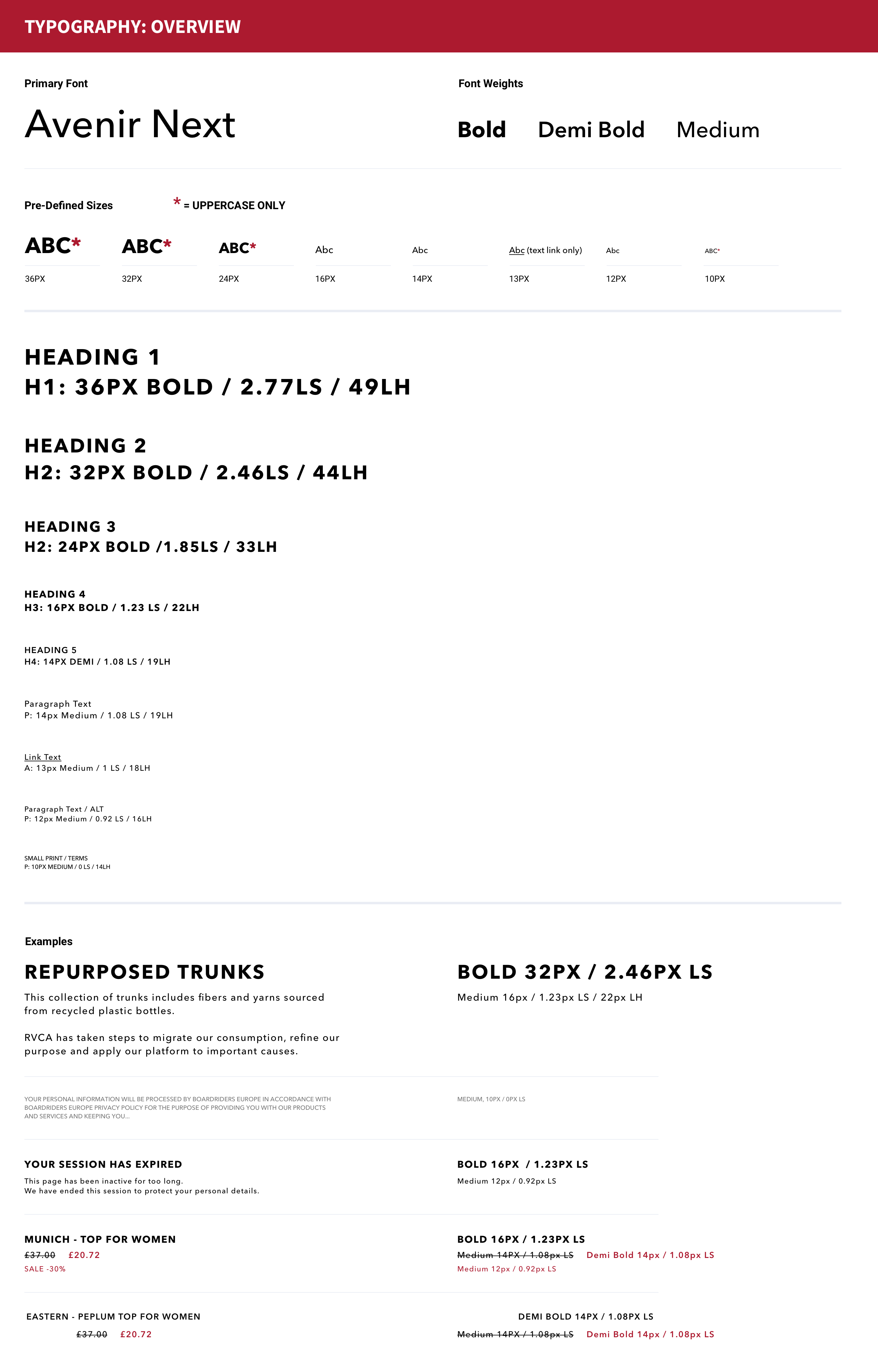
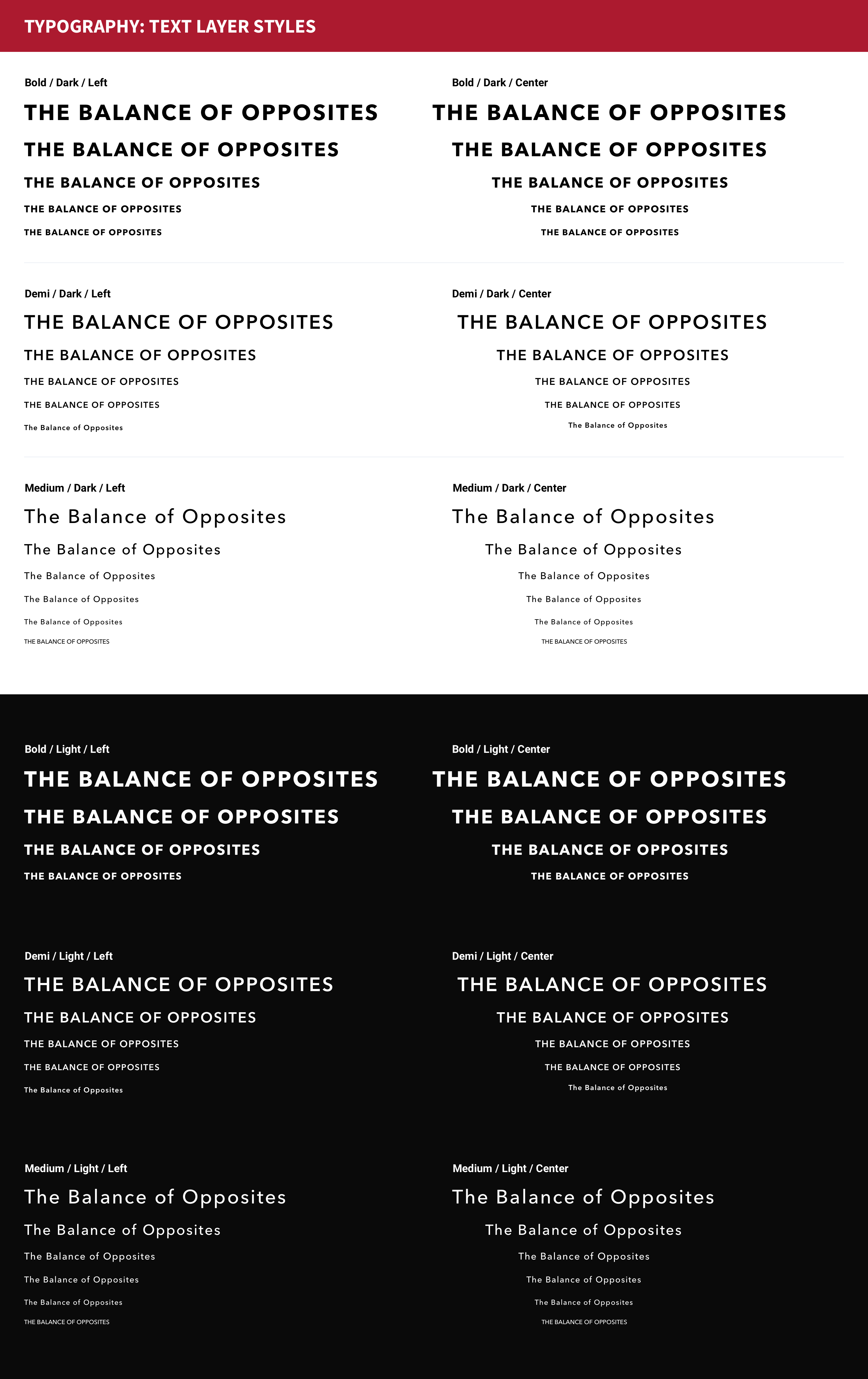
Typography
Previously the site had simply used Roboto. Whilst this was fine in itself, it didn't exactly scream personality. We also had received a few pieces of feedback during the earlier testing phases that some users found it hard to read the thinner versions of the font (especially when coloured grey - ie: the header nav links).
I wanted something big, bold and clear. My initial urge was to go with Futura due to it's geometric forms and legibility but knew the uppercase format might come across too strong - the caps on N's are particulary 'pointed'.
After much deliberation and application of various fonts to our wireframes, we reached a decision on Avenir Next.
I included several layout examples for this font and found it to be very legible and flexible. It's high clarity retained at both small and large type sizes, solidifying my choice to proceed with it.
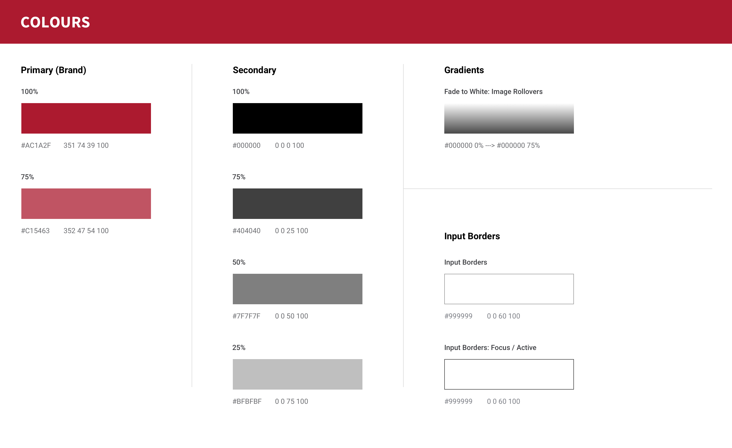
Colours
As RVCA is an already established brand and this was by no means a rebranding project, we knew what colours we had to work with. We simply had to decide on the best way to apply them.
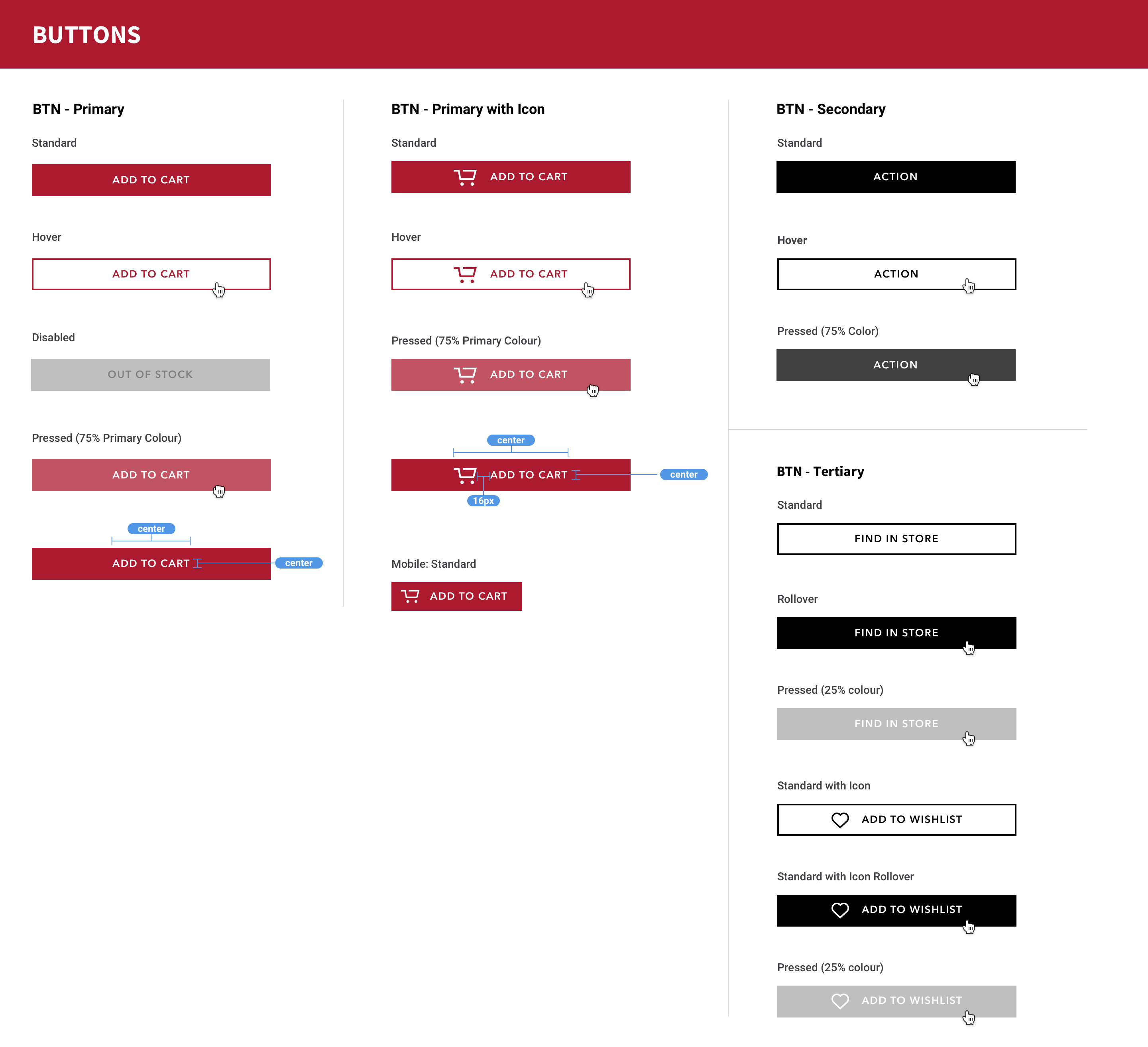
Buttons
Striving for simplicity, all buttons were composed in the same way. Colour would dictate urgency and importance, icons would be used when appropriate (a cart icon for Add to Cart, a heart icon for Add to Wishlist etc).
Width would be variable but the core composition was always the same. Centered text, Demi Bold, high contrast to background colour and no shadows, sheens or highlights - simple blocks to communicate simply.
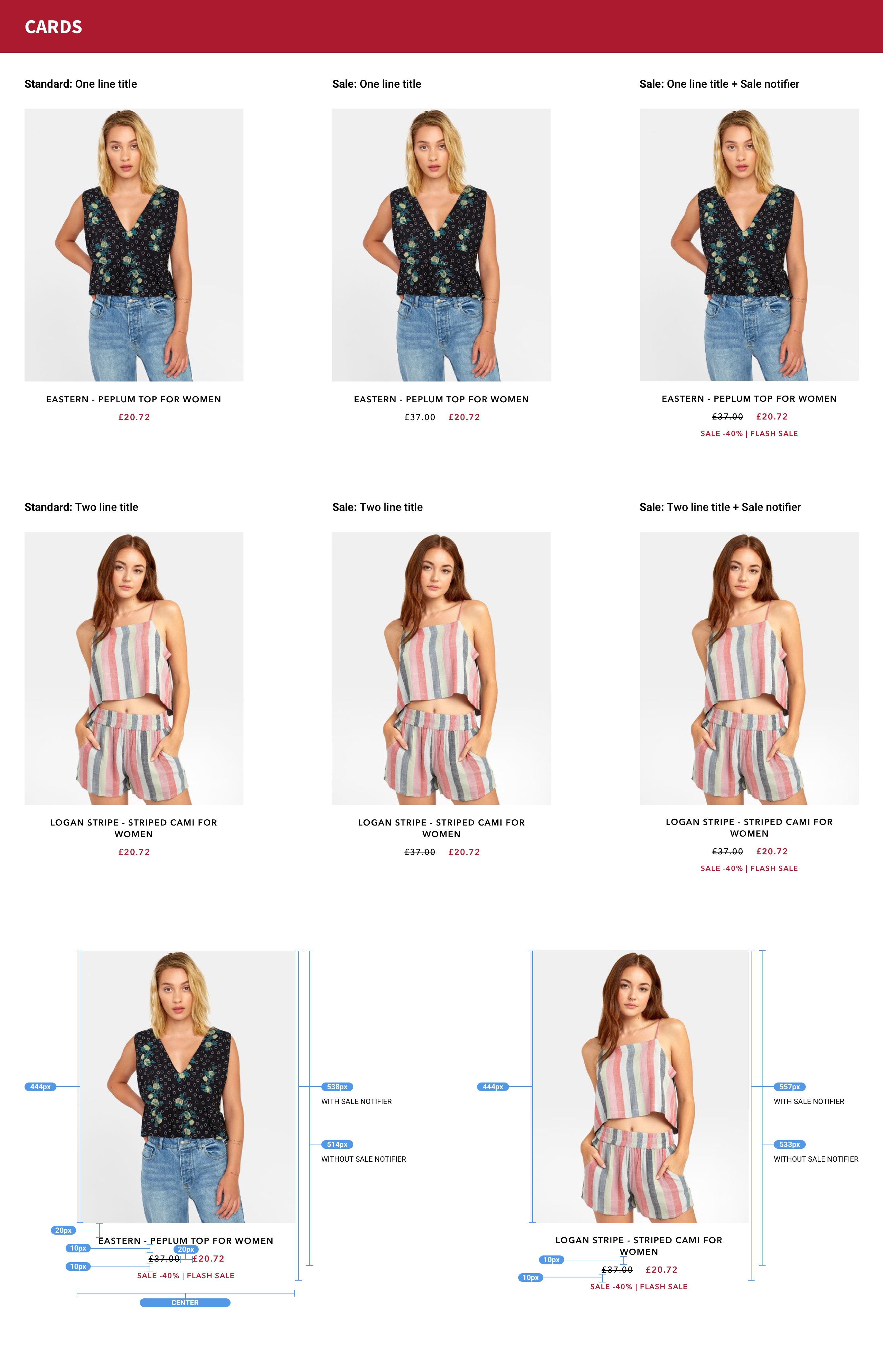
Cards
These cards would serve as the primary unit for all products displayed in categories and widgets (Recommended for you etc). Each card shows a very slight variant in design according to content, something that could potentially upset the rhythm of the page. These examples would serve to keep the page layout looking consistent and balanced, therefore reducing the mental load on the user.
Sale prices, title length, sale notifications and unique feature badges were but a few of the variables that could affect each product card.
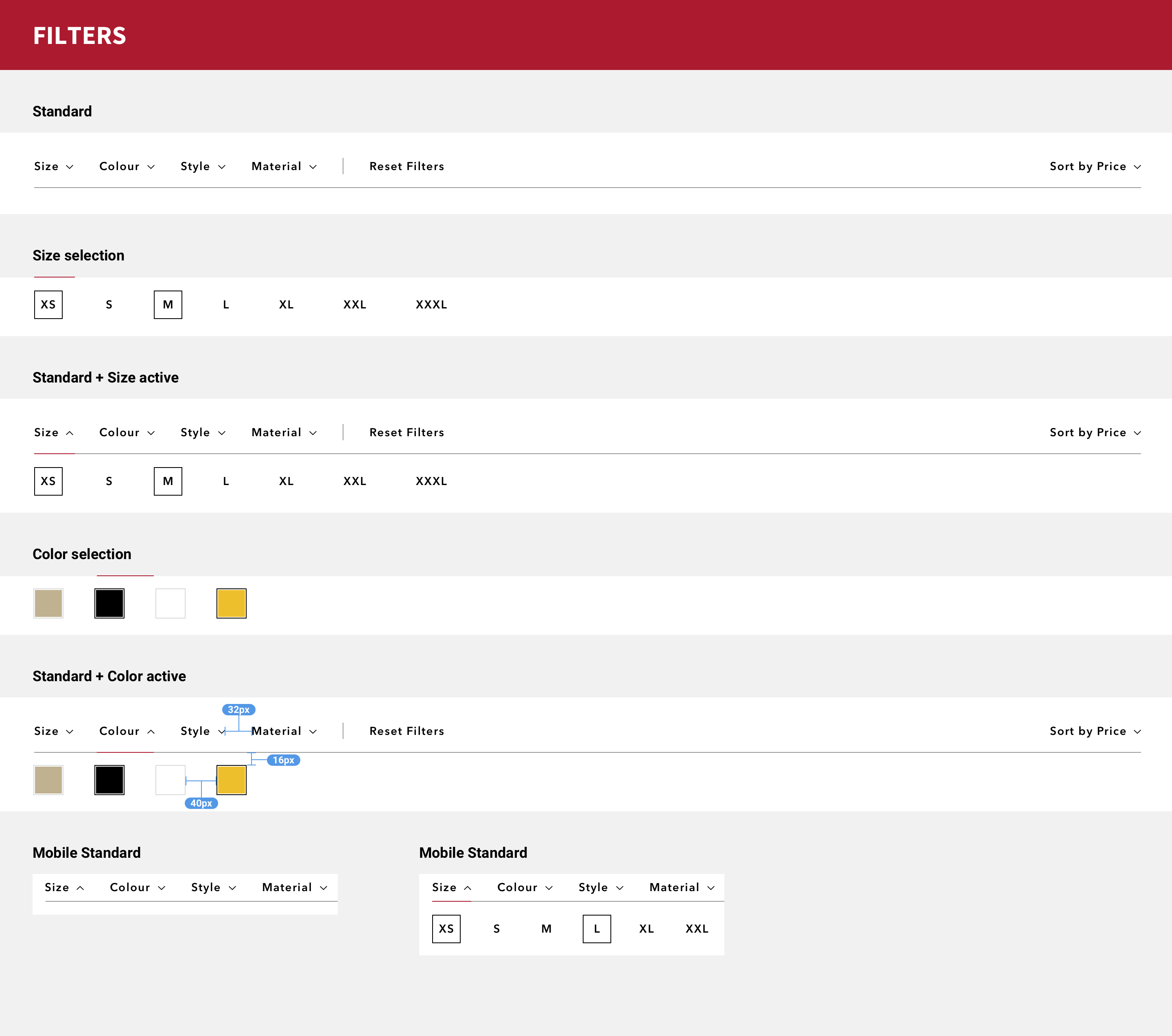
Filters
As explained in the wireframes section, I wanted to remove filters from the sidebar and free up a lot of space to allow the product listings to occupy as much space as possible. Feedback also provided the insight that some users struggled to find the filters initially, so this blatant positioning should help remedy such things.
These examples show the filters for colour and size as well as the default horizontal bar.
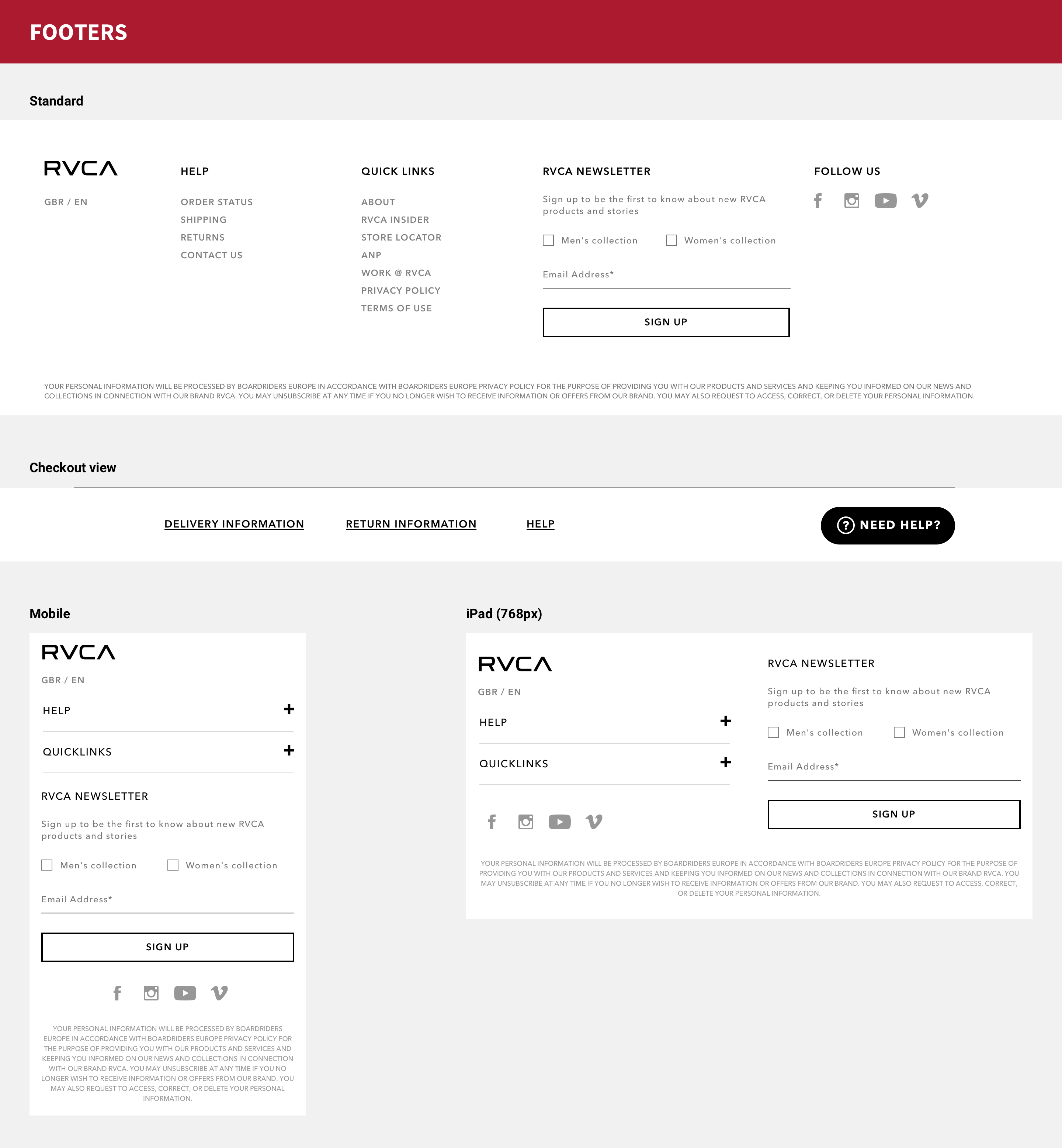
Footers
It was requested that we not adjust the footer too much as it had recently been optimised by RVCA's in-house team. These examples show the three different footers used (desktop, cart-view and mobile) with our new typography added and layout slightly adjusted to match the rest of the site and it's new design.
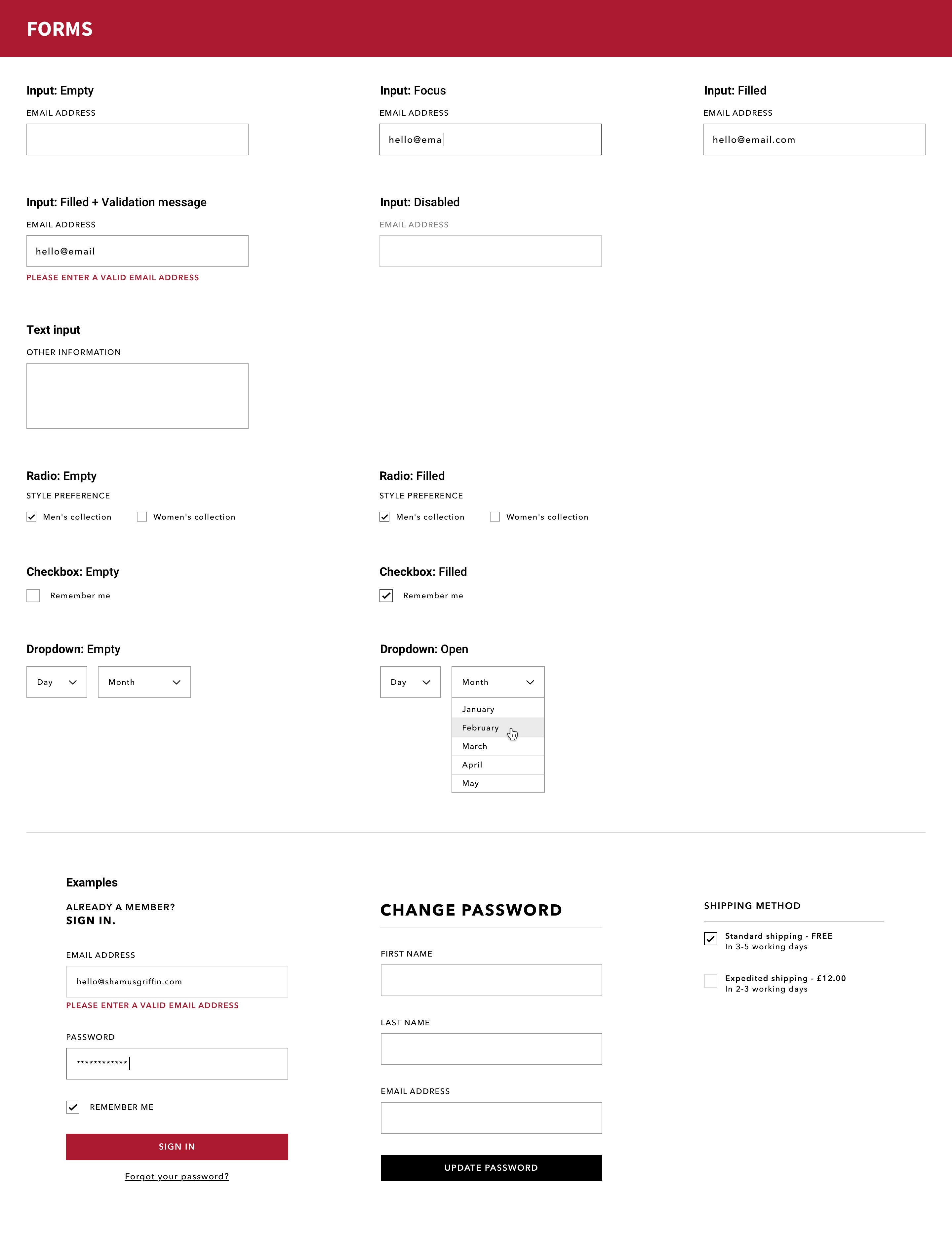
Forms
I wanted to mirror the simplicity of the buttons across the site, so form elements were a great opportunity to further this. Simple, geometric shapes that are clear and easy to use.
Iconography
These icons existed prior to our involvement with the project. I standardised each one and converted them into a font, so that they can be applied with ease throughout the site.
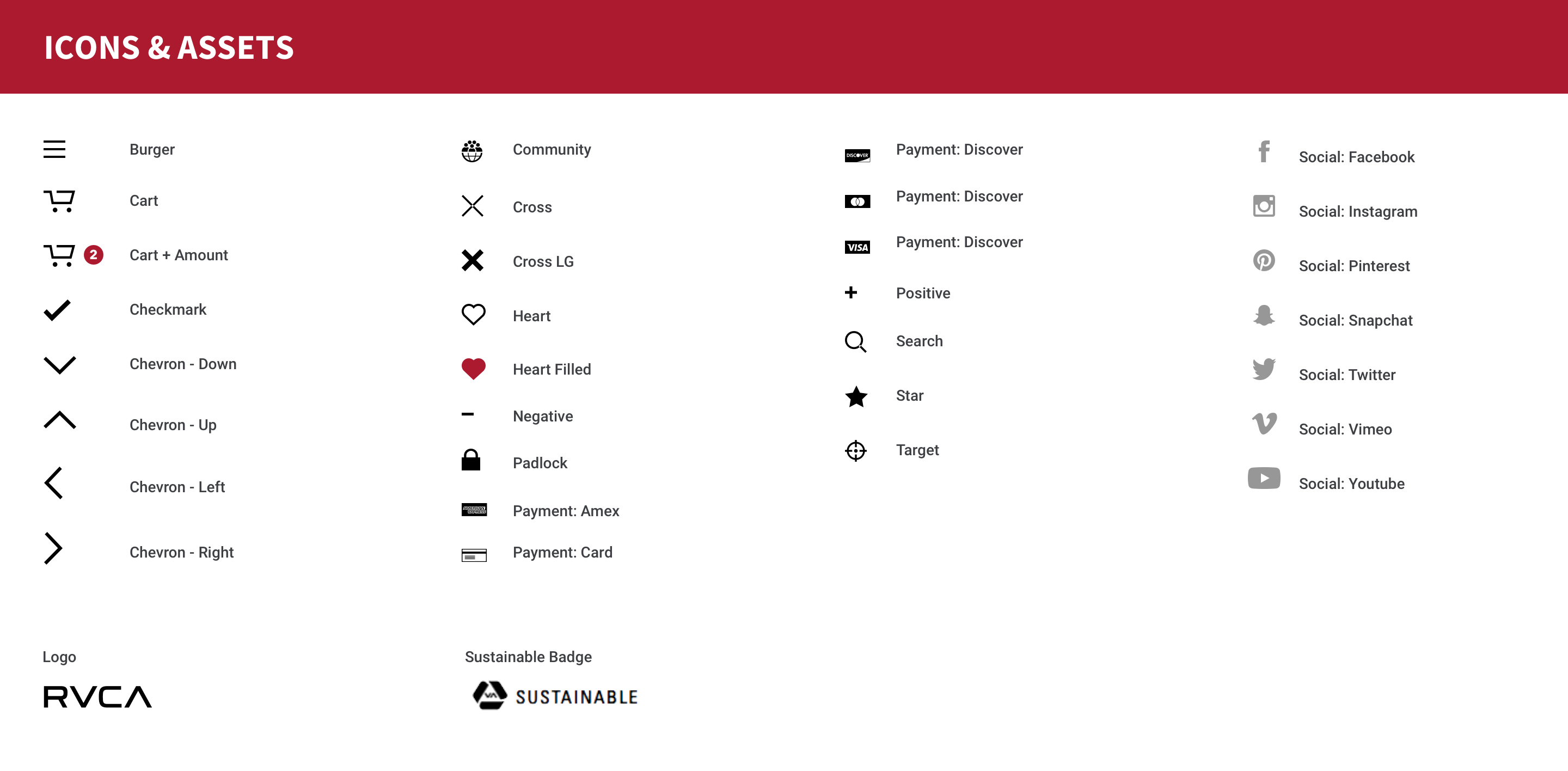
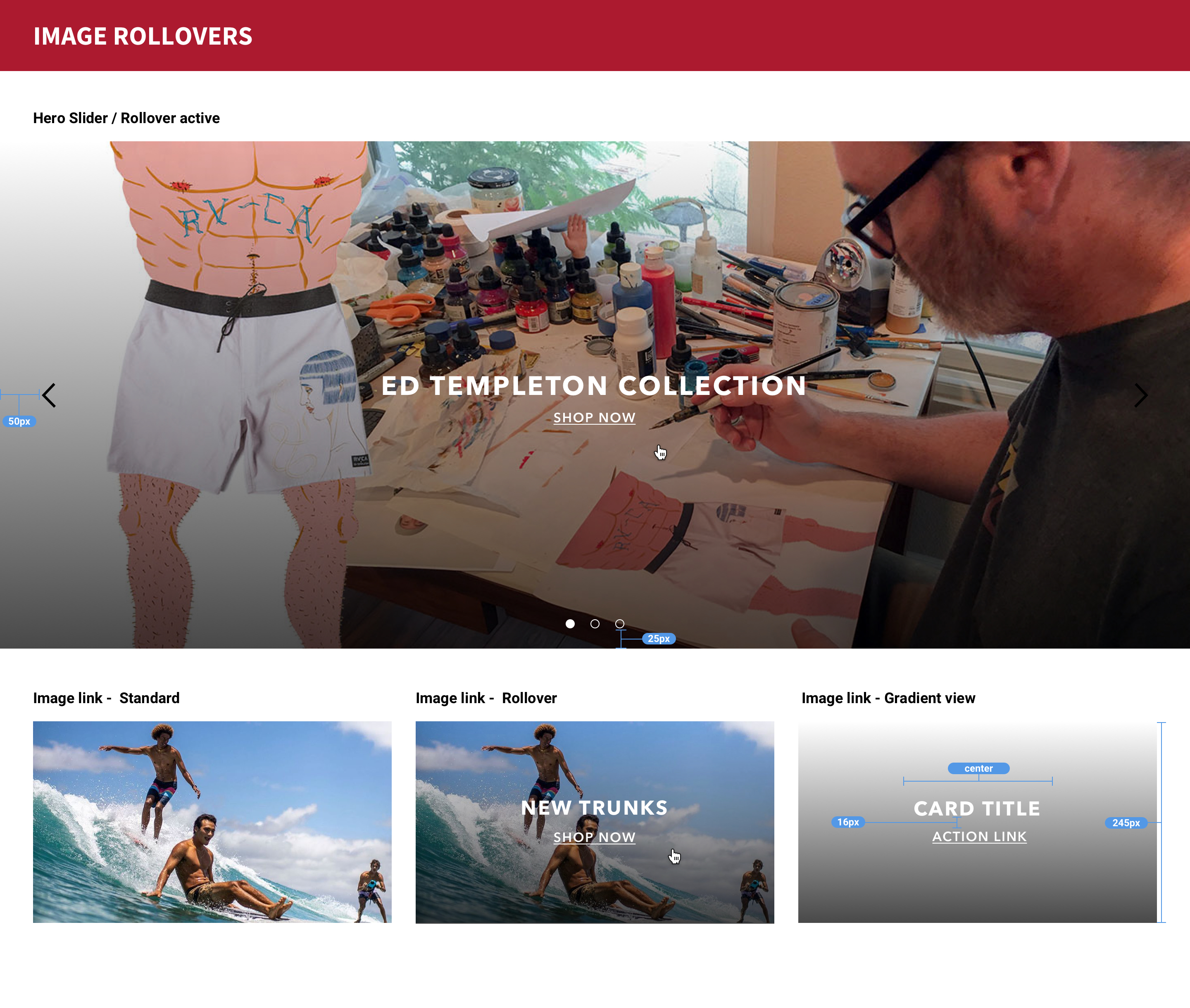
Image Rollovers
RVCA is rich with imagery, which means that a universal solution for image overlays had to be created otherwise legibility and aesthetics could be greatly affected (light text on a light background etc).
My solution was to add a dark gradient that starts with a low opacity and gradually darkens up as it proceeds. This allowed for white text and links to be overlaid onto the gradient and still allow the user to see the image behind and not darken it too much.
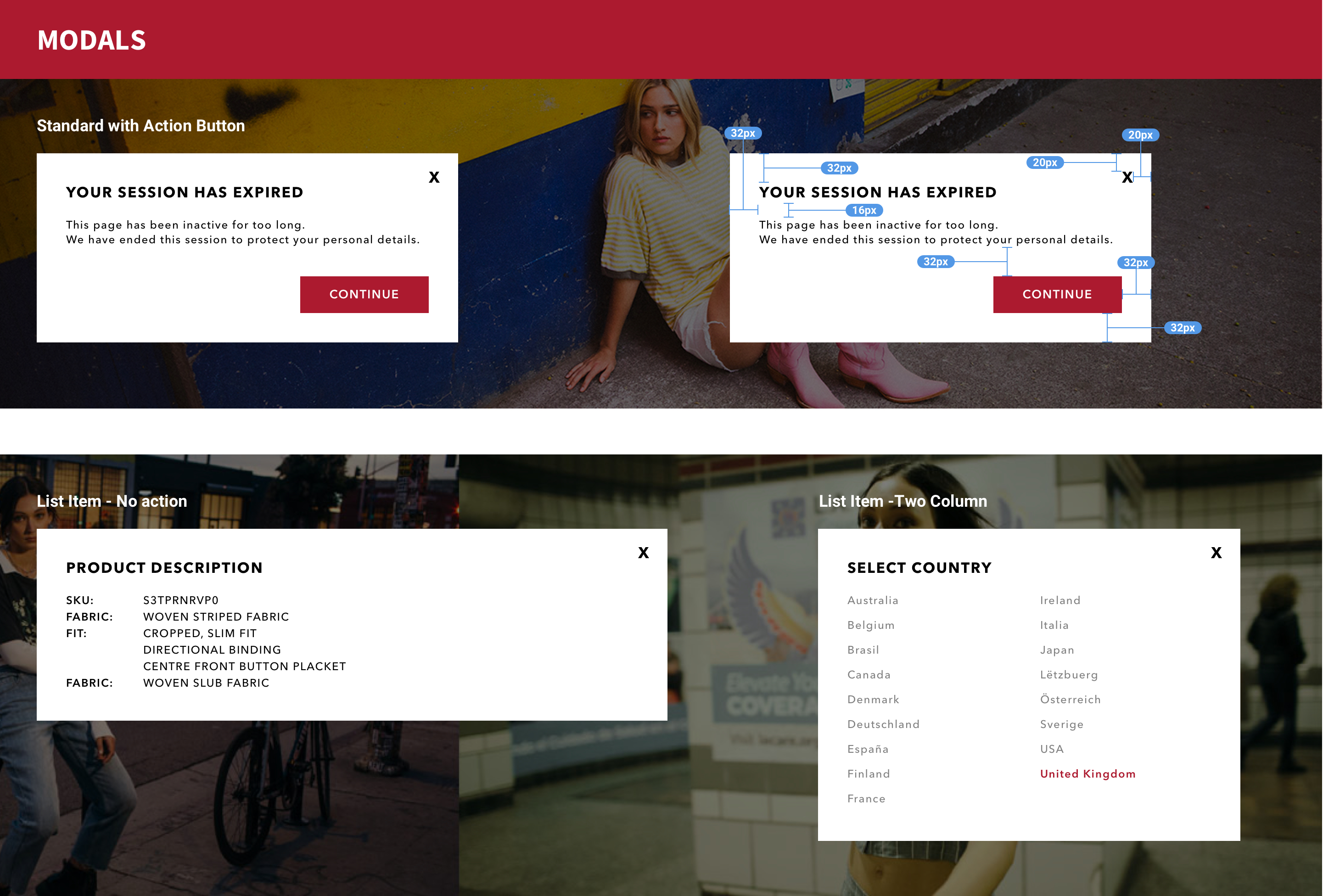
Modals
These would always be placed on a darkened overlay (black at 50%) to provide contrast, always possessing the highest current z-index.
All modals must include a clear and unobstructed cross icon to close the modal. They can also be closed by simply clicking off the modal window.
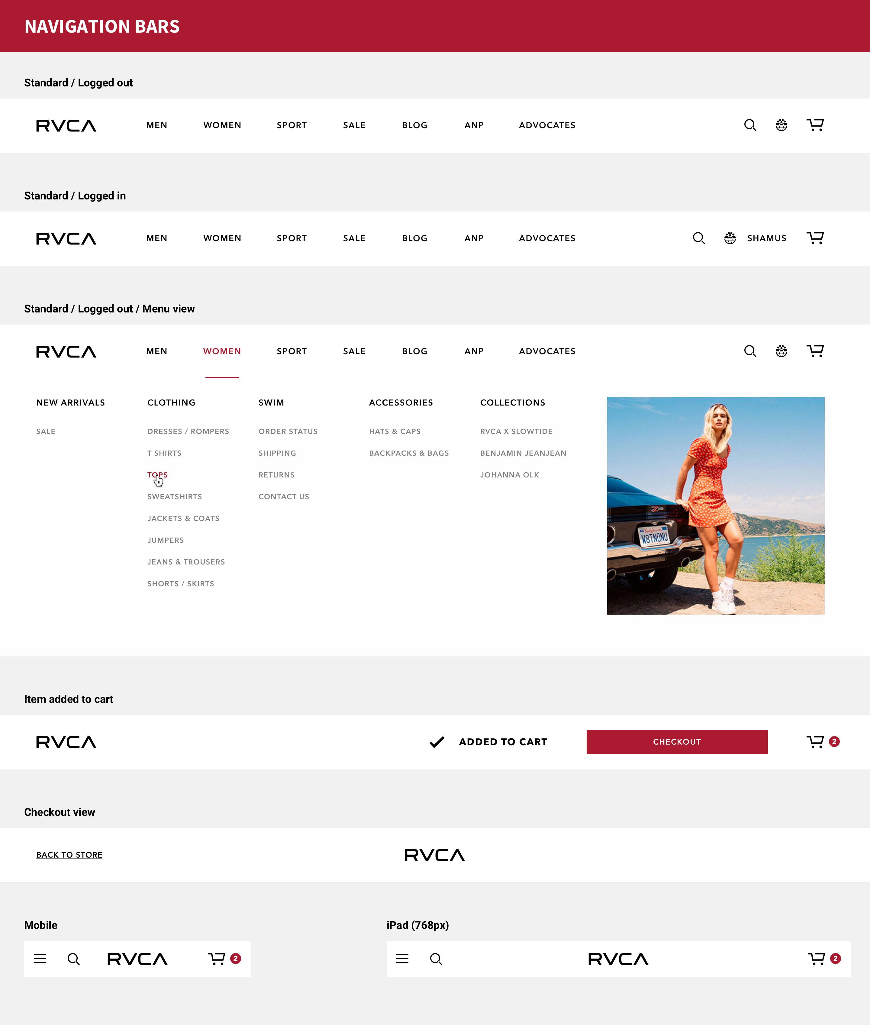
Navigation Bars
Here you'll see the varying states of the navigation bar. Logged out, logged in, item added to cart (this state only persists for a few moments - like a toast message), the majorly reduced Checkout version and mobile version.
As the site layout was kept the same, thus helping to reduce potential development time and maintain a degree of familiarity for existing users, it meant there was little need to change how the site links were displayed.
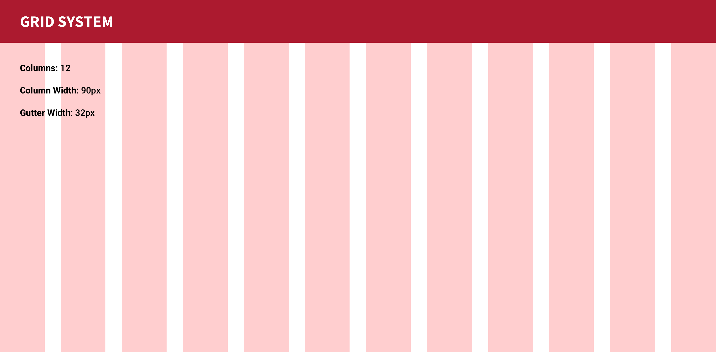
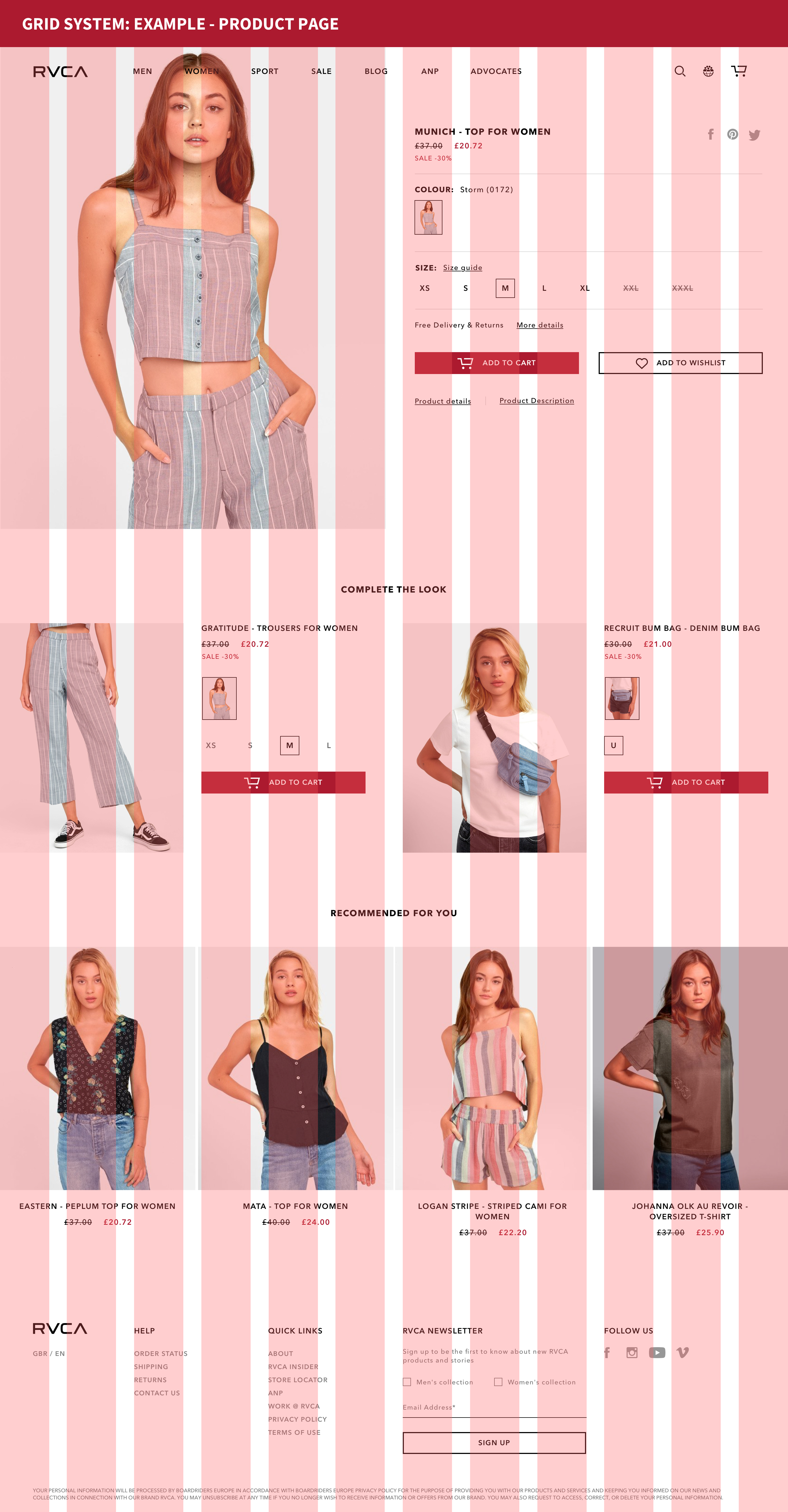
Grid System
Finally, we have the grid system outline. This was a simple, yet effective 12 column grid, 90px column width and 32px gutter.
Final Designs
Core Pages
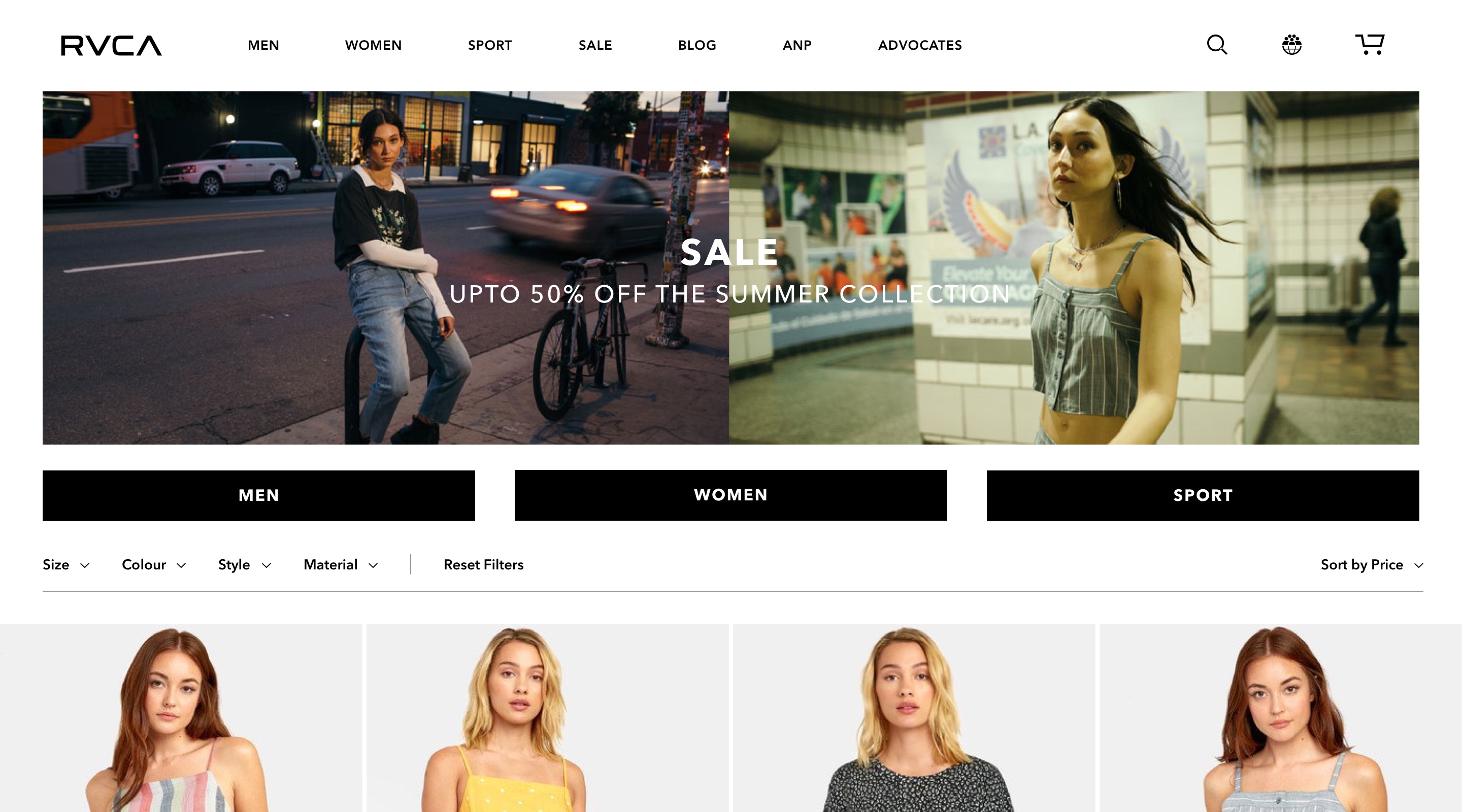
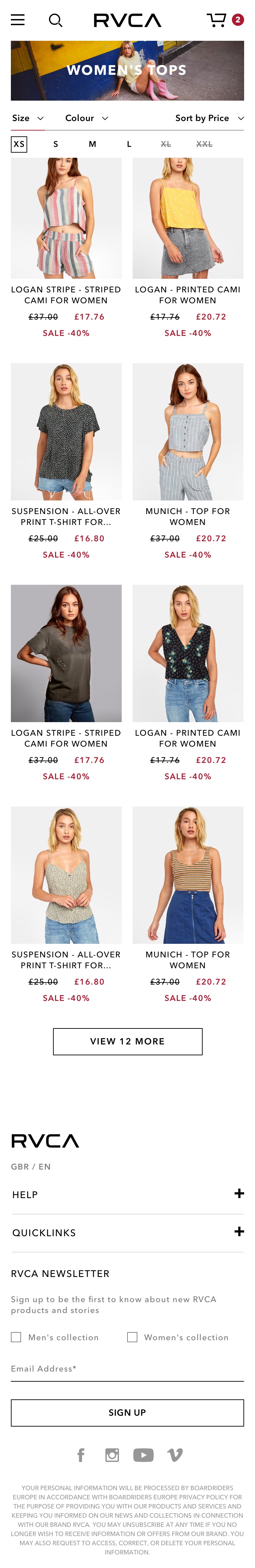
Category Page
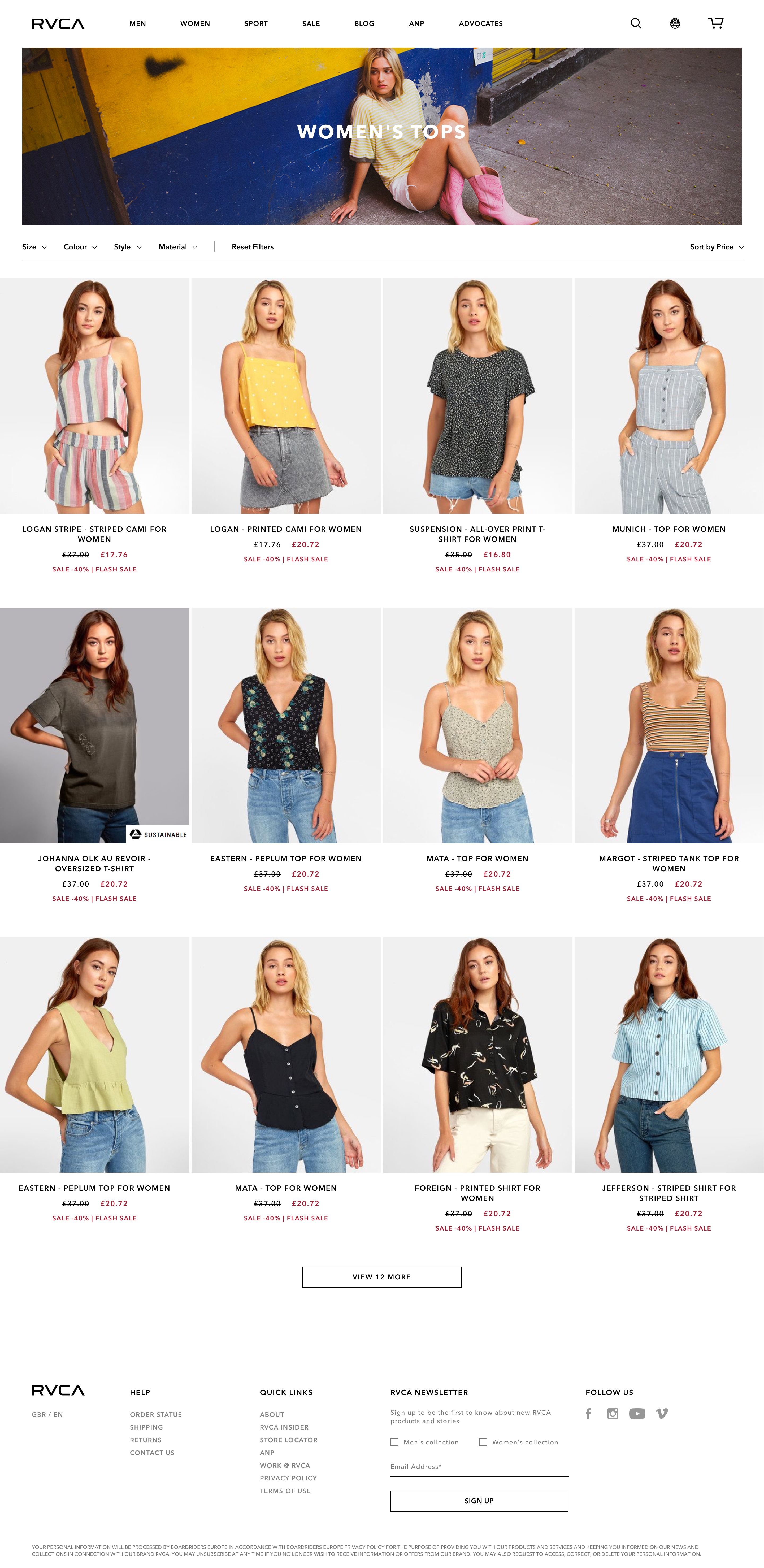
Comparing this design to the initial version of the category page, one can see there is a lot more content above the fold and each element is incredibly apparent.
By placing the filter bar above the product cards, it allowed for us to display the product cards 4 units wide, as opposed to the previous 3 wide. This placement also makes the filters easier to see, therefore easier to operate - something that was raised during our initial user tests.
The product cards are laid out 100% full-width, whereas the hero header is equipped with margins either side. This is to draw the eye to the products and allow them to stand out against potentially busy hero images. This will also mean that the maximum amount of screen-real-estate is always occupied.
The video clip below shows how the wishlist feature works. The heart icon only appears on rollover, persisting when an item has been added to the wishlist. This was intended to reduce clutter on the screen but still provide access to this feature should the user wish to use it.
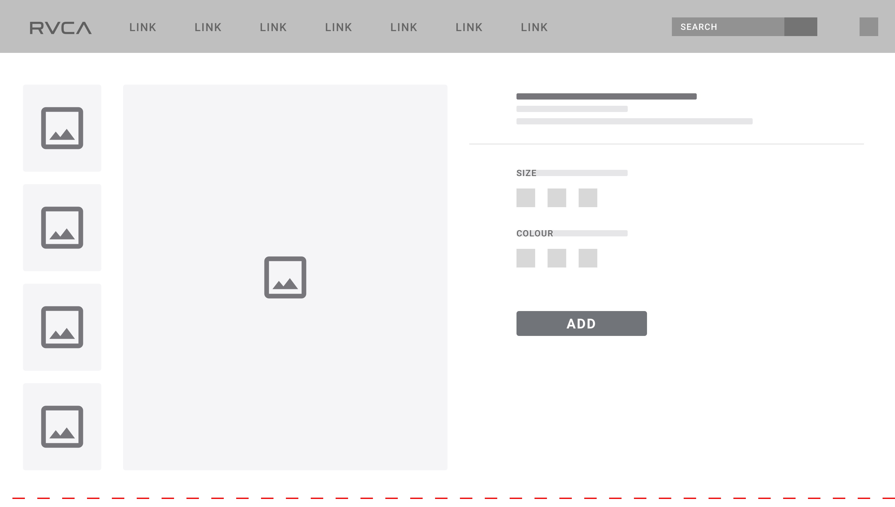
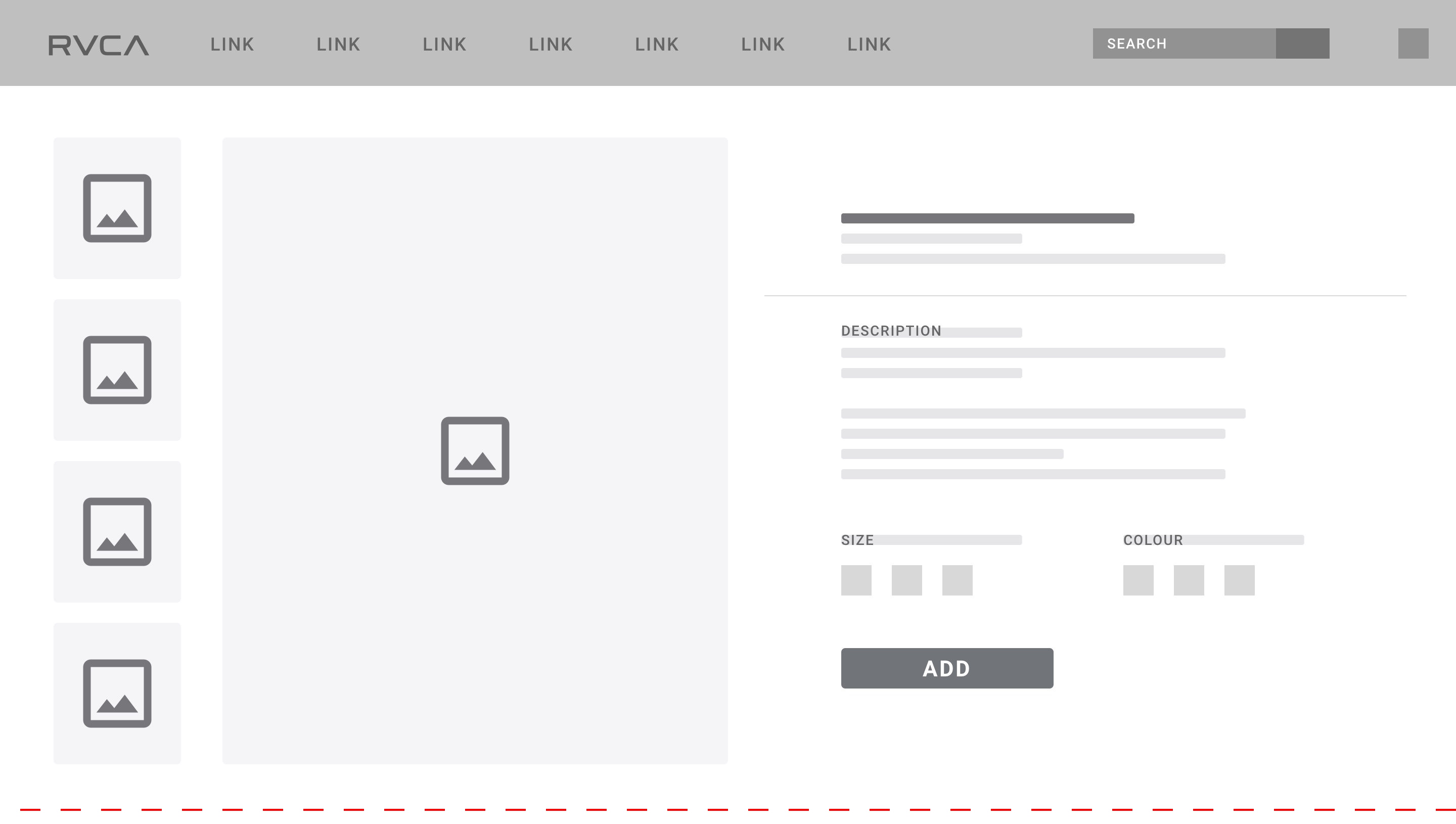
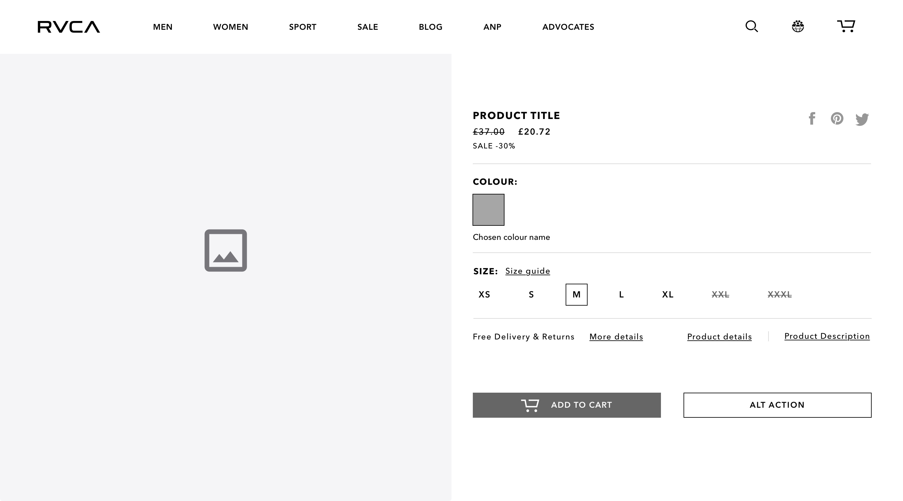
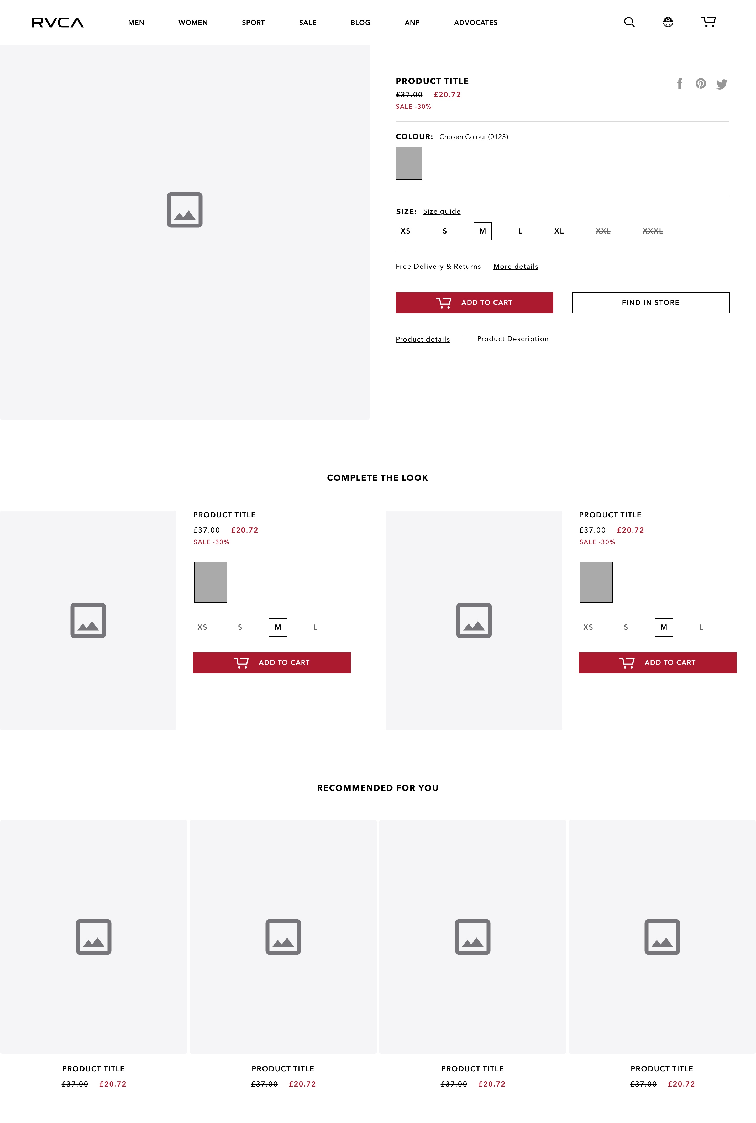
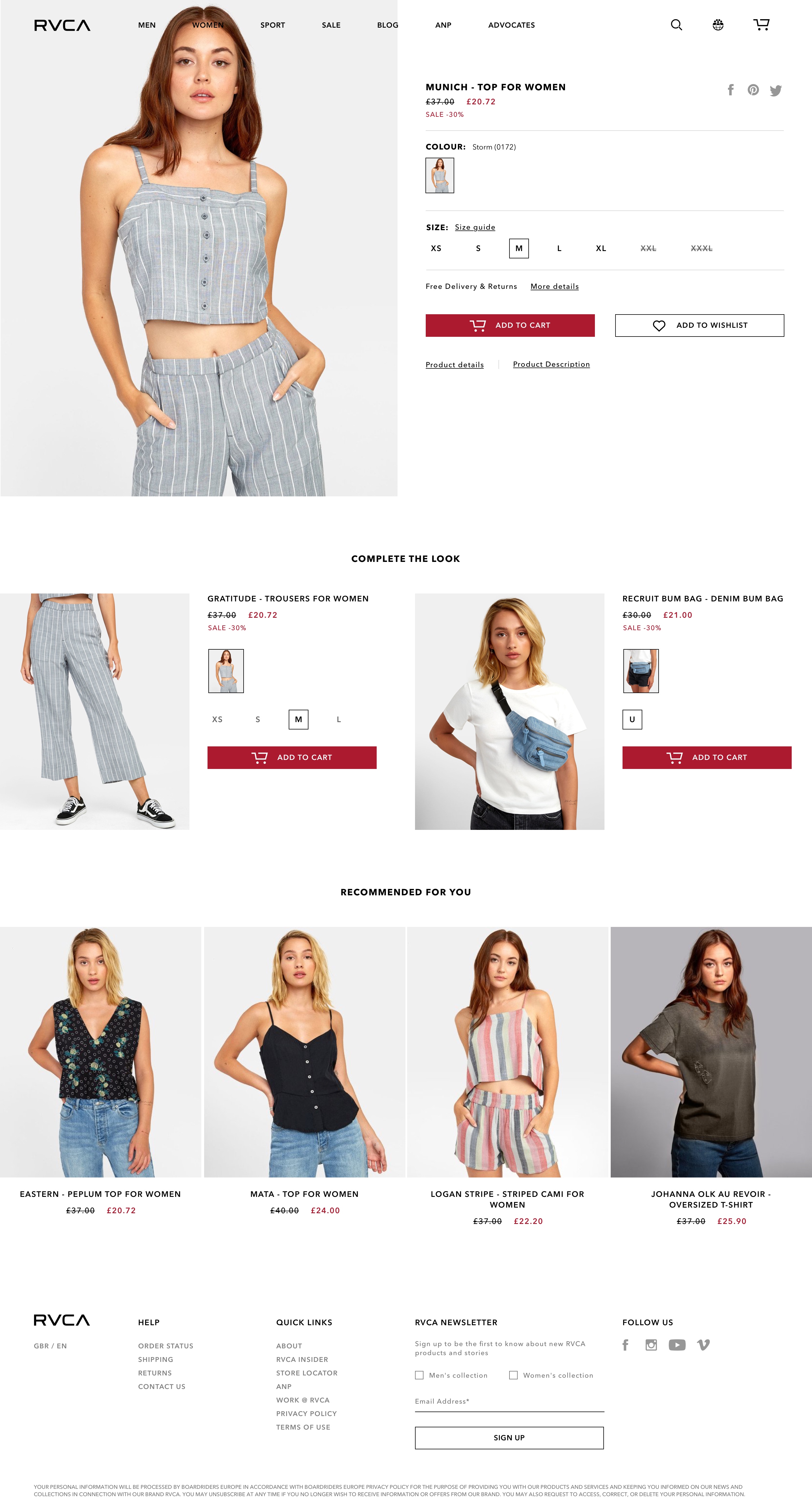
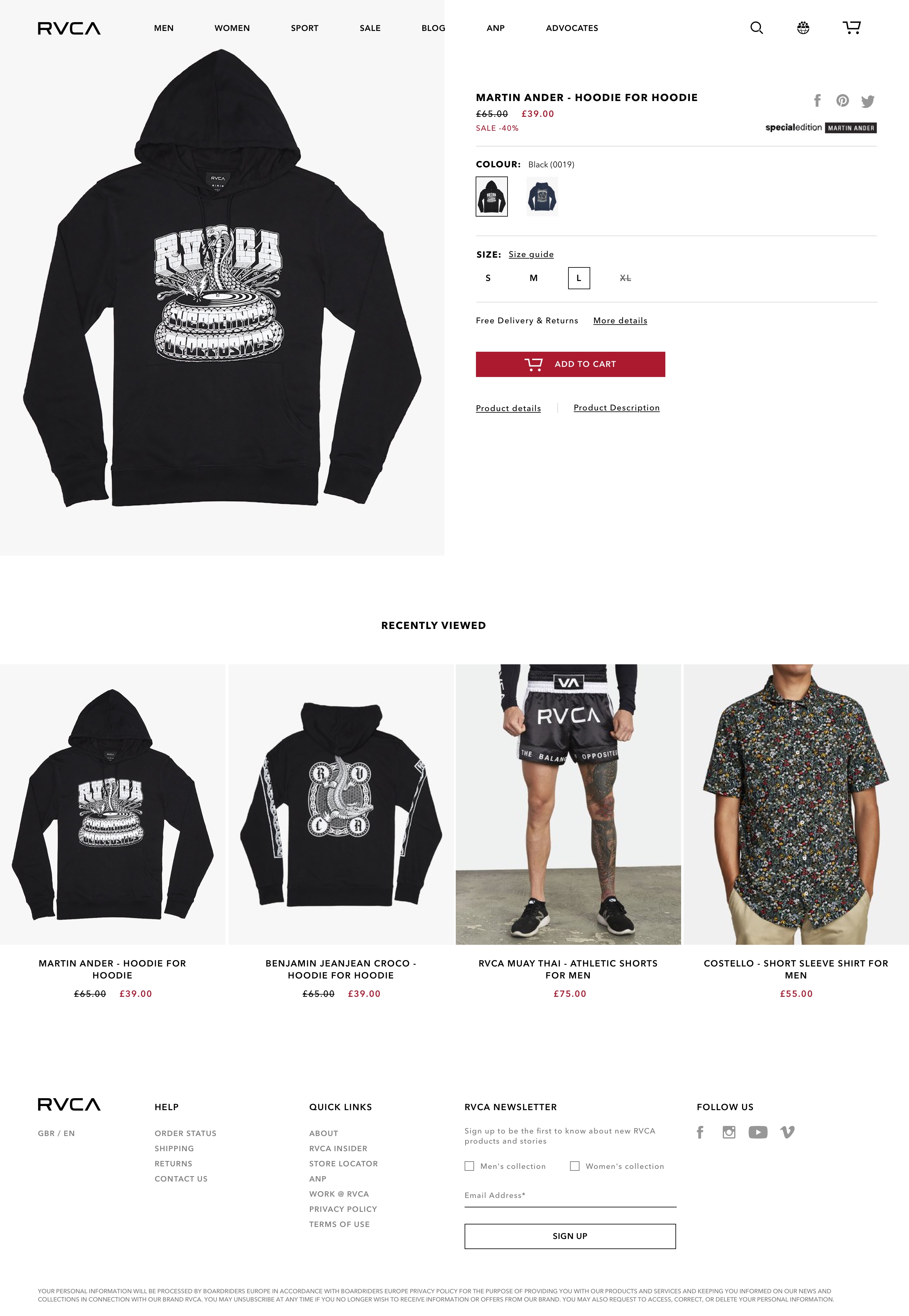
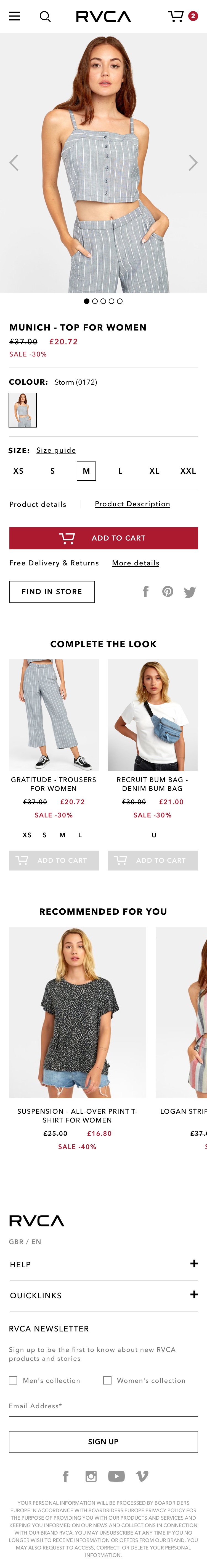
Product Page
My favourite outcome from this project was this page. As you can see from the video demonstrating how multiple images would be displayed, the user is given a full show of the product and only moved away from the option to purchase once all images have been seen.
The next section, 'Complete the Look' was created from the feedback we received earlier on regarding how some users would appreciate additional methods of assistance during their shopping journey, especially when it came to purchasing items for others. This will hopefully lead to increased AOVs and a more positive experience for the customer.
Following on from that section, we added the 'Recommended for you' unit, providing yet another pathway for the user to be exposed to more products that they could potentially desire. In situations where no recommendations could be made, this unit would be replaced with a 'Recently Viewed' unit.
As very few of our users during testing looked at the product description and details (most content is duplicated in both sections across the site currently, which isn't great), we decided to put that content into text links. Once clicked, the product information would display in the right hand side of the page - almost like a modal. This helped free a lot of space and provide a much cleaner layout.
This is the only instance in the whole product where the navigation bar loses it's background and becomes transparent. This was to allow the product image to take full command of the page and really stand out, occupying as much space as possible on the screen. Once the images had all been displayed, the header would immediately regain it's solid white background as illustrated in the video.
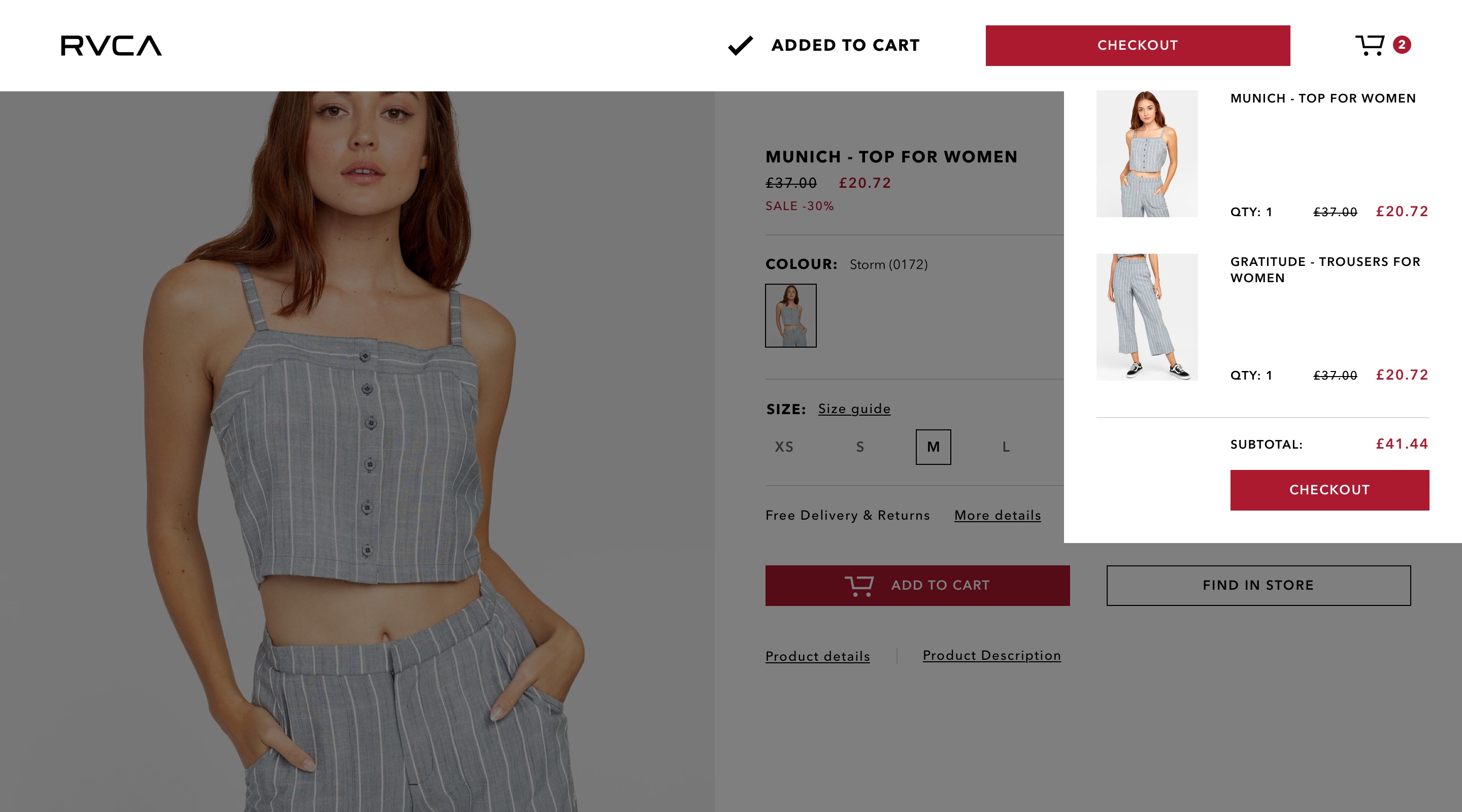
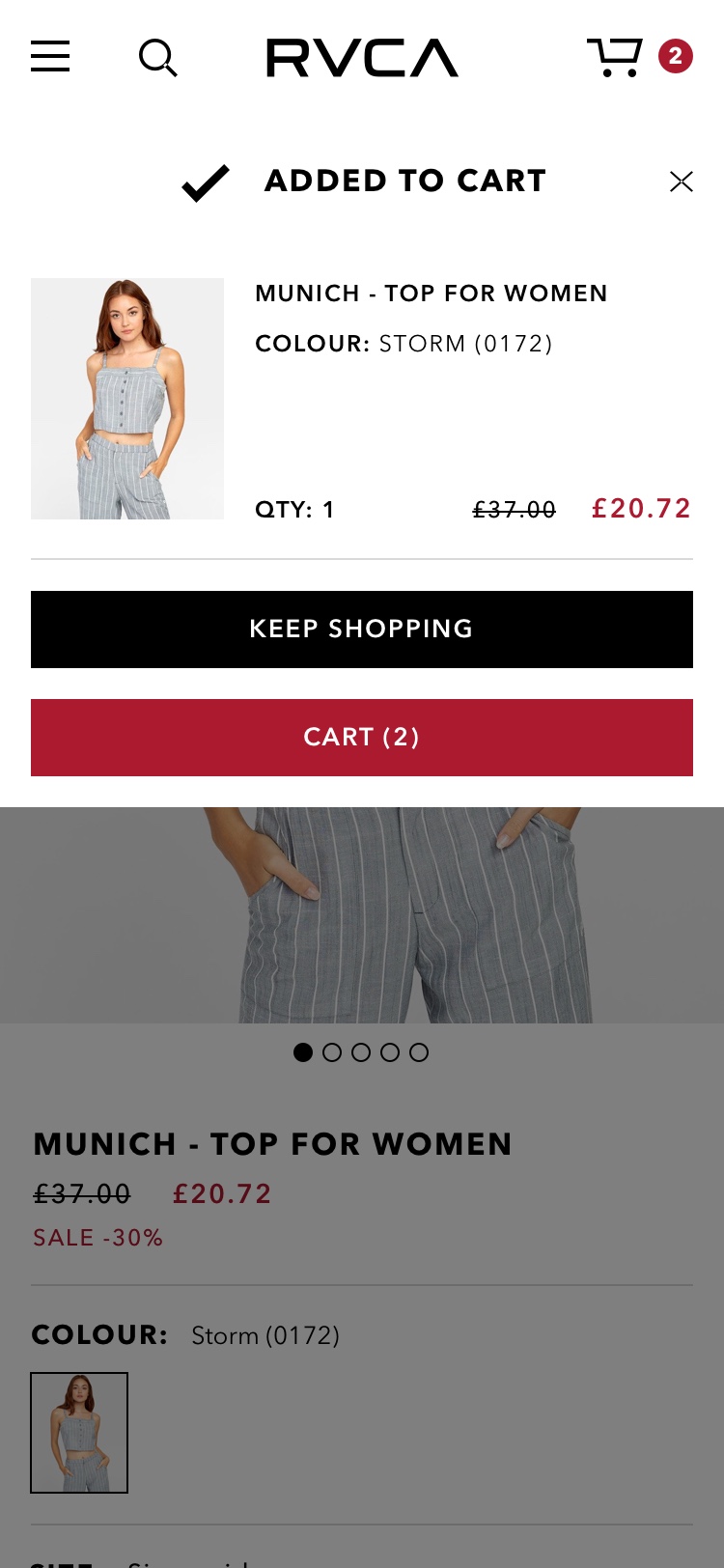
Added to Cart
Once a product is added to the cart, the navigation bar briefly changes to communicate this action and provide a route to checkout.
Everything below the navbar (in terms of Z-index) would be covered with the same overlay as the modals. This is to bring focus onto the notification of a product being successfully added to one's cart. A mini version of the cart is also displayed on screen, clarifying the user's decision and updating them on the current cart contents and total price.
Checkout Process
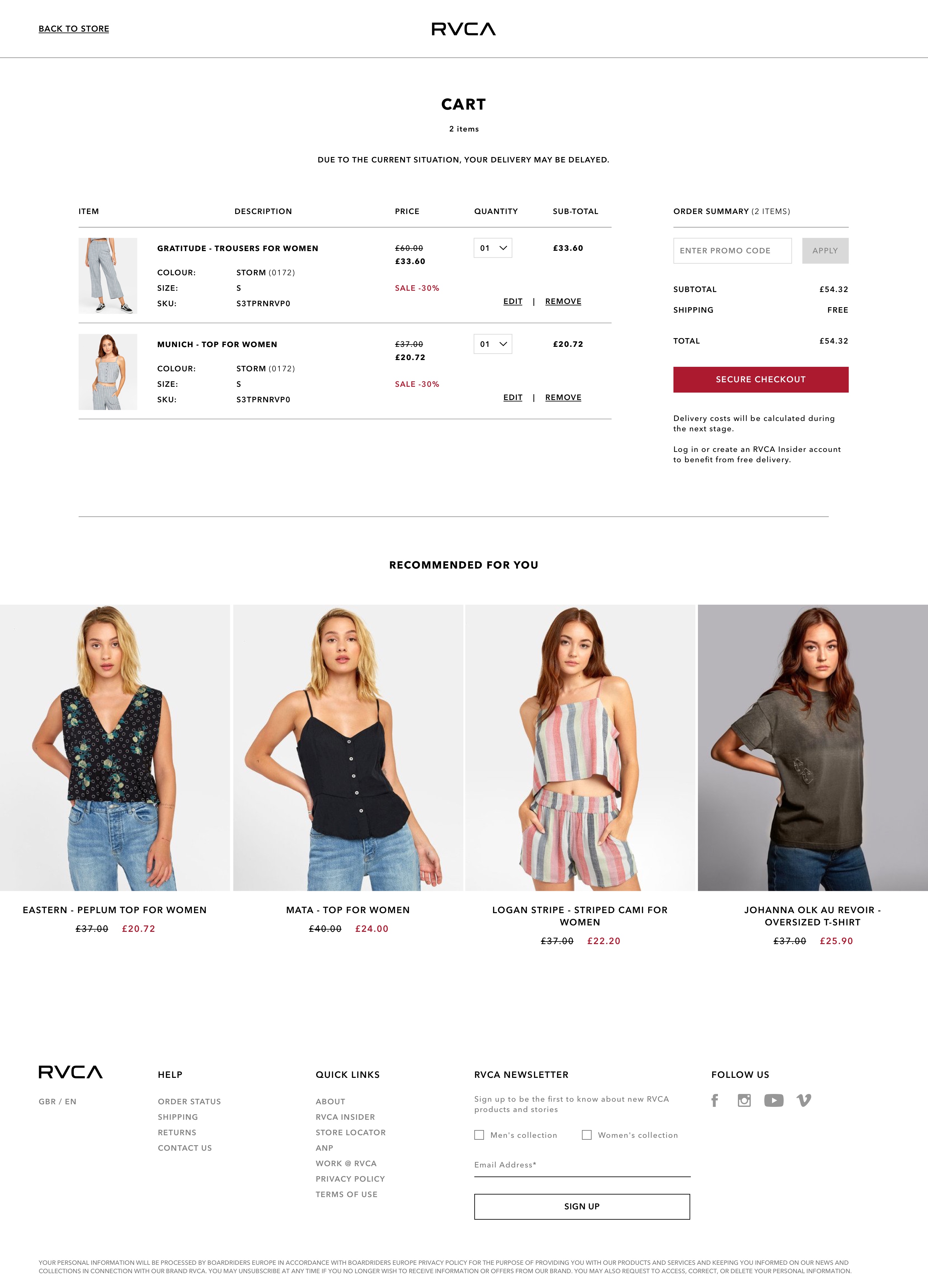
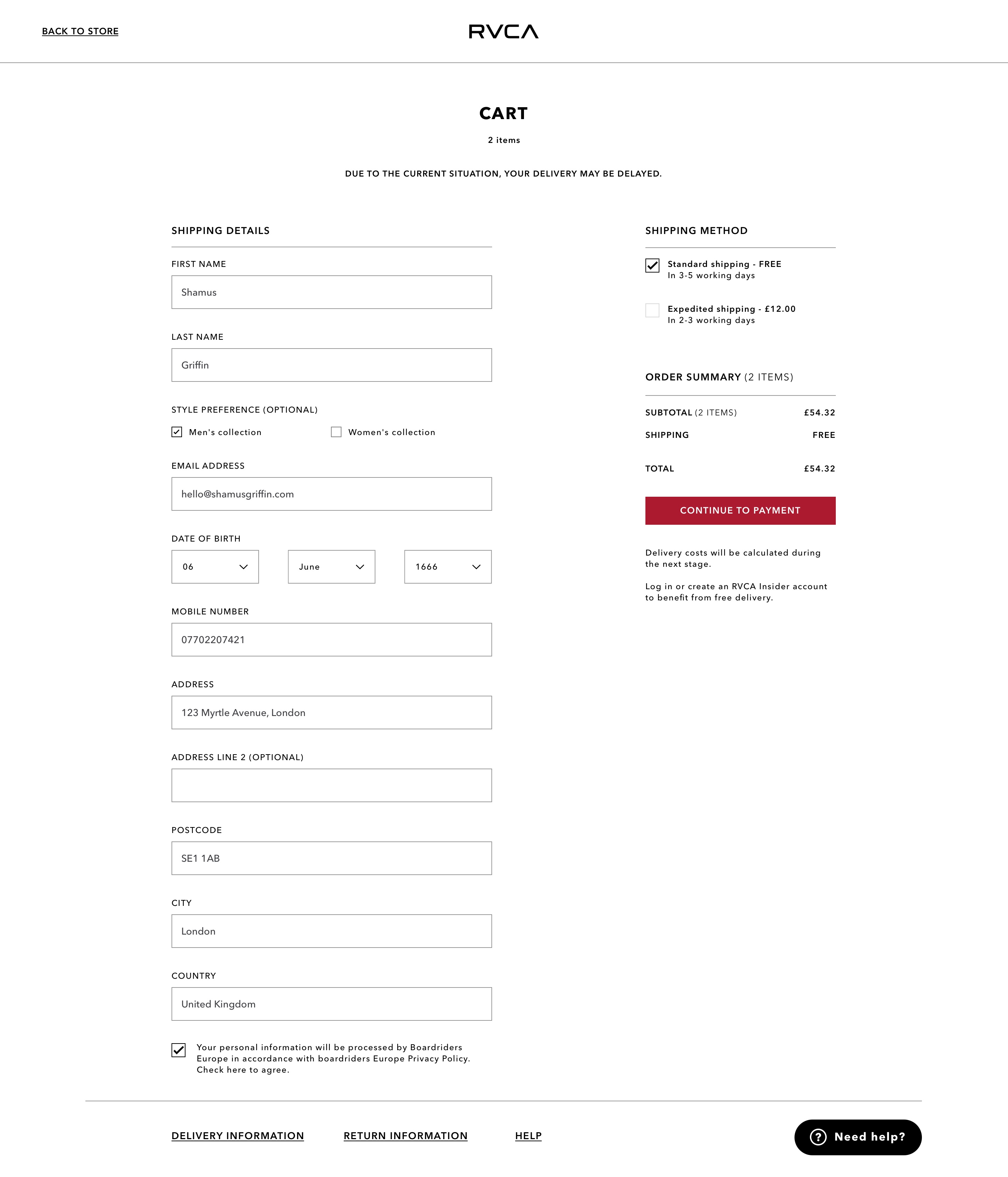
Cart
As this page is obviously quite integral to the business, we decided to make it full width, communicating the most amount of information possible, all viewable at a glance and with a simple scan of the page. Laying it out in a tabular fashion aids in this dramatically.
To reduce cart abandonment, the header has changed to it's reduced version, losing all site links other than the option to return to the store. We discussed removing that option also as the default browser 'back button' exists, but I find such tactics to be cheap and feel that they erode the user's trust - nothing quite like seemingly being trapped on a page.
Users are also offered another look at recommended items as a last-chance attempt to increase AOV.
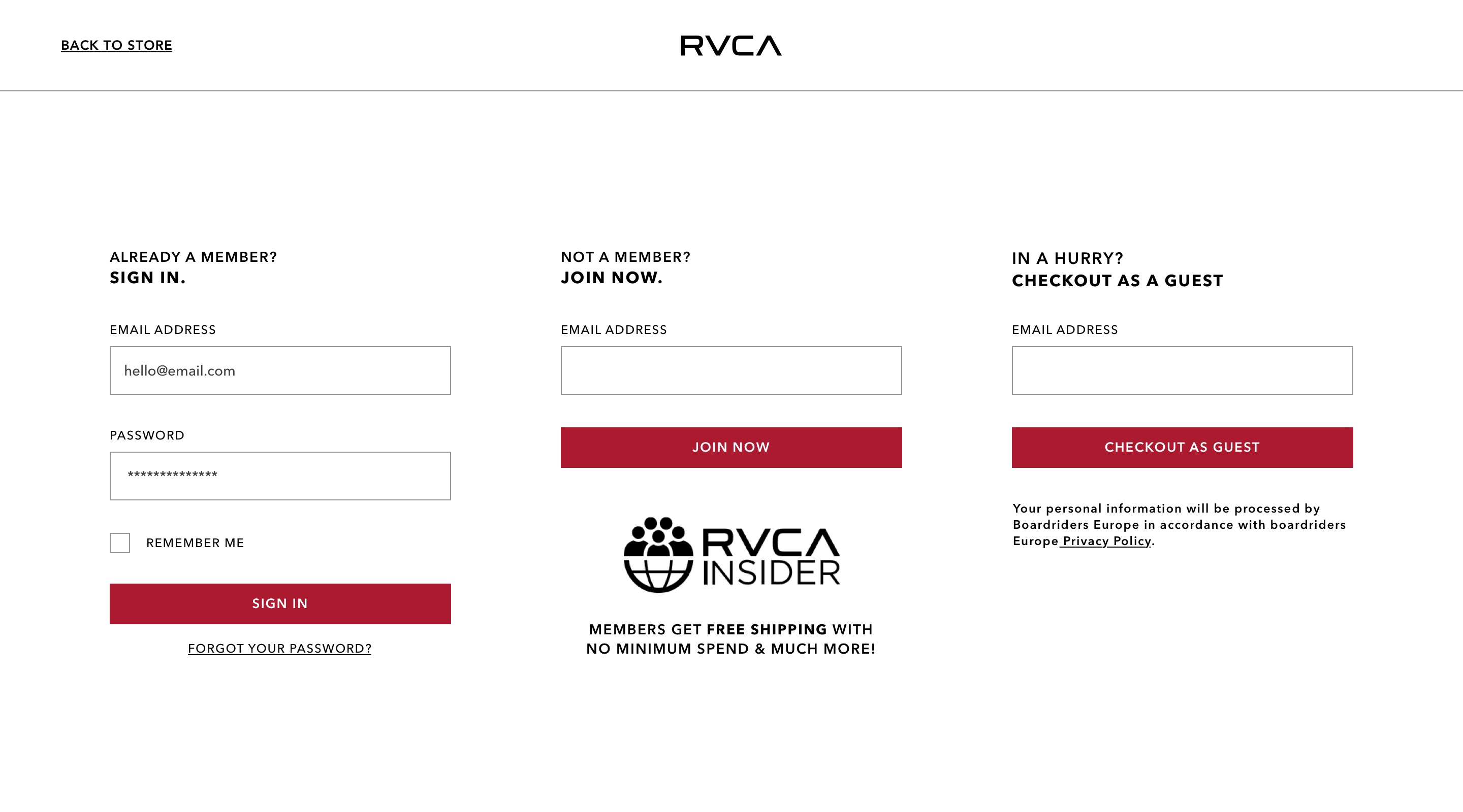
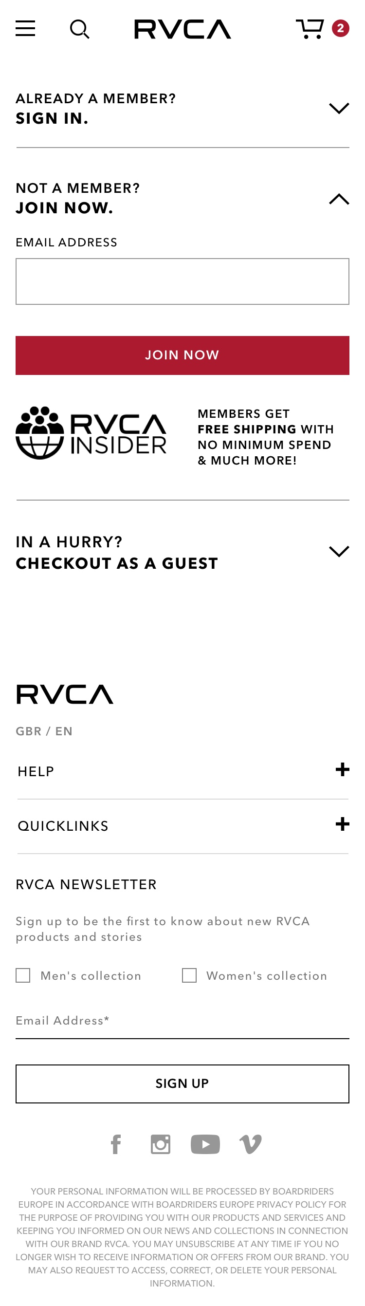
Sign In / Registration
As there are three possible routes for this journey, three different doorways were displayed. The typographic layout here in the titles of each 'doorway' help the user know where they're headed at a glance. The boldness of the action conveys the destination.
By choosing to not include a password field for two of the options, it helps those who are already members know immediately where to go in order to proceed.
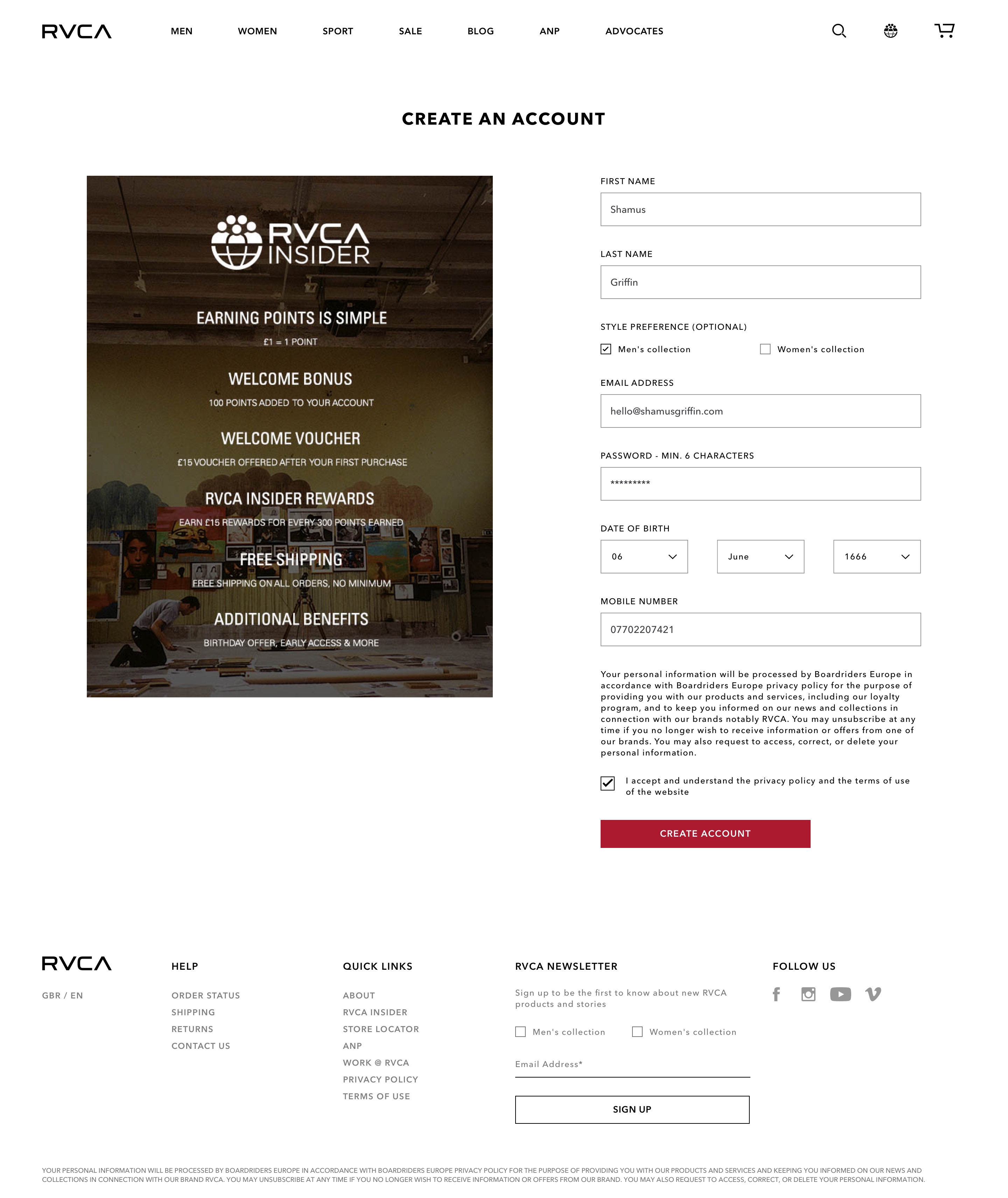
Placing the RVCA Insider image below the JOIN NOW section acts as a subtle push for new user registration, as opposed to checking out as a guest; something that yields no benefits for the customer other than saving time.
Account Creation
RVCA always welcomes new user registrations and encourages all customers to do so with it's RVCA Insider scheme. Here we included the RVCA Insider scheme post alongside the registration form, asking only for the minimum amount of information (other than clothing preference) to create an account as quickly and as easily as possible.
Shipping & Order Details
If the user was signed in, most of this page would be auto-filled allowing for a much quicker and smoother checkout. Data showed a much lower rate of cart abandonment with registered accounts, plus reminders can be sent to those who've abandoned their cart - providing another chance at completing a transaction.
Form layout is very similar to all other form related items that have come before this section. Only 'optional' fields have been given additional label information (as opposed to adding '*required' after every field).
The shipping method and order summary (sub-total, grand total etc) are positioned to the right and would follow the user down the page.
Other Pages
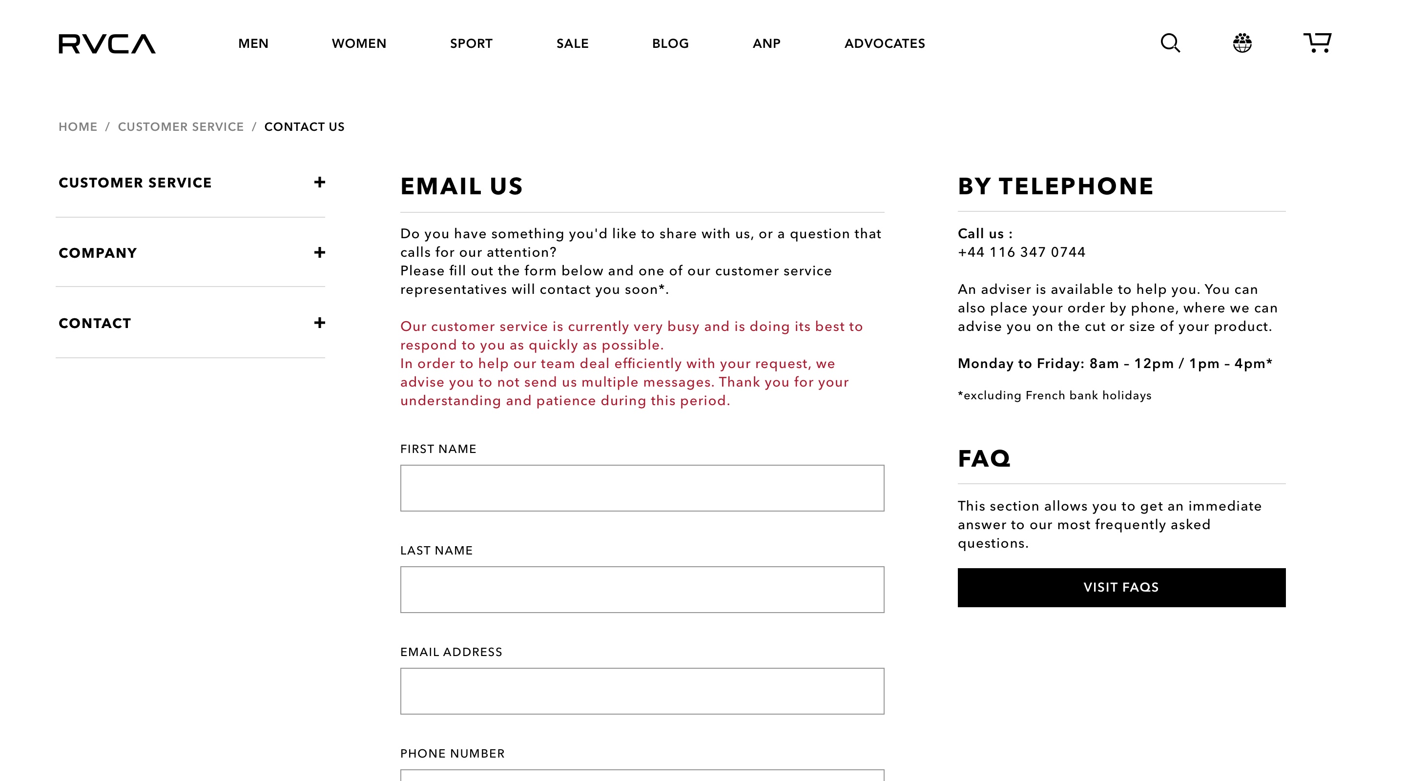
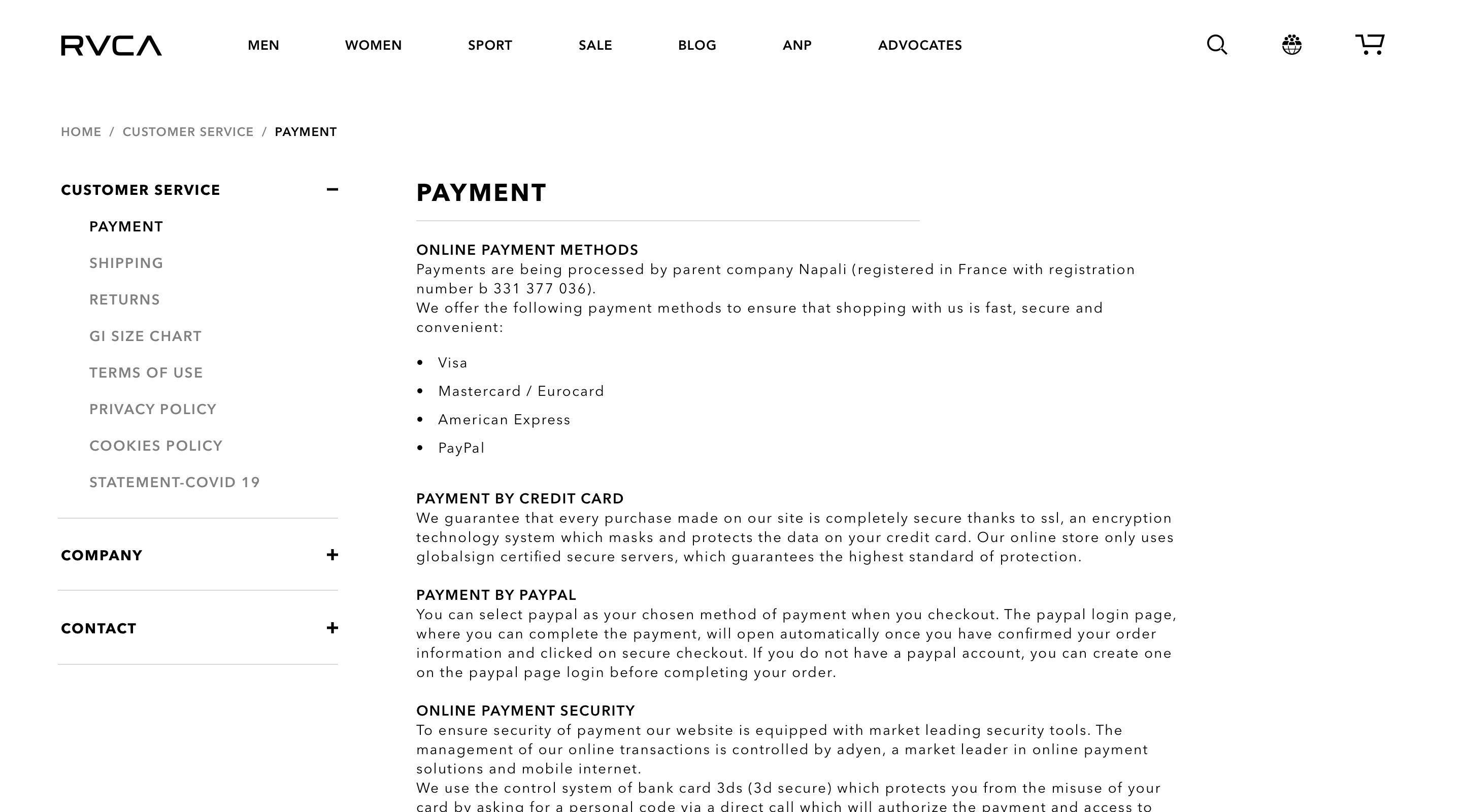
Customer Service
This is one of the few areas on the site that is mainly text-based. Customers would usually only find themselves here when they had a question that needed answering, so ease of use and navigation was essential, which is why this is one of the only sections across the site that now uses a sidebar for navigation.
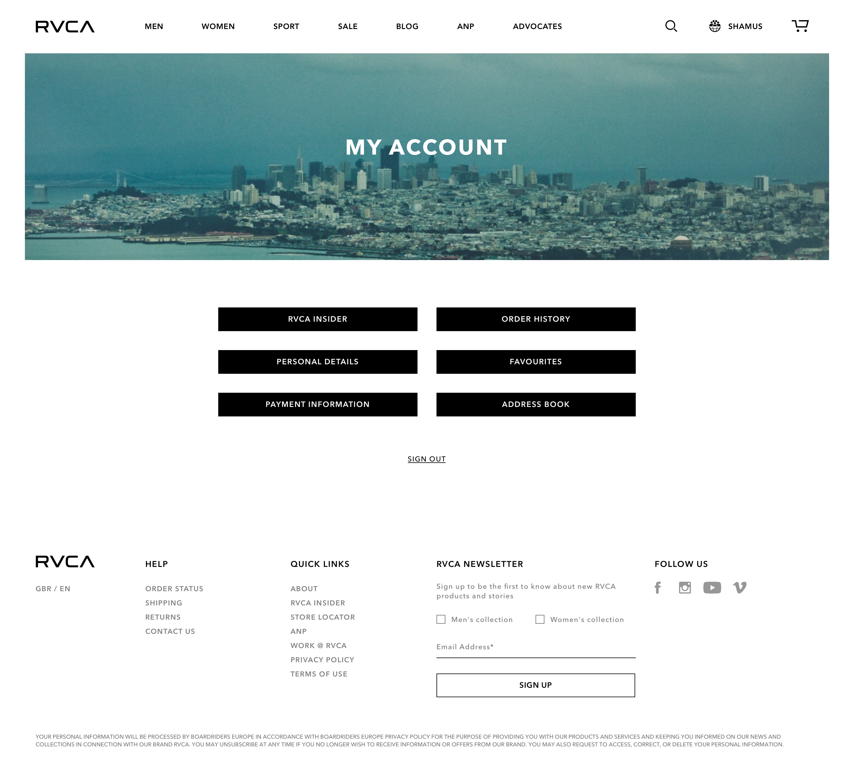
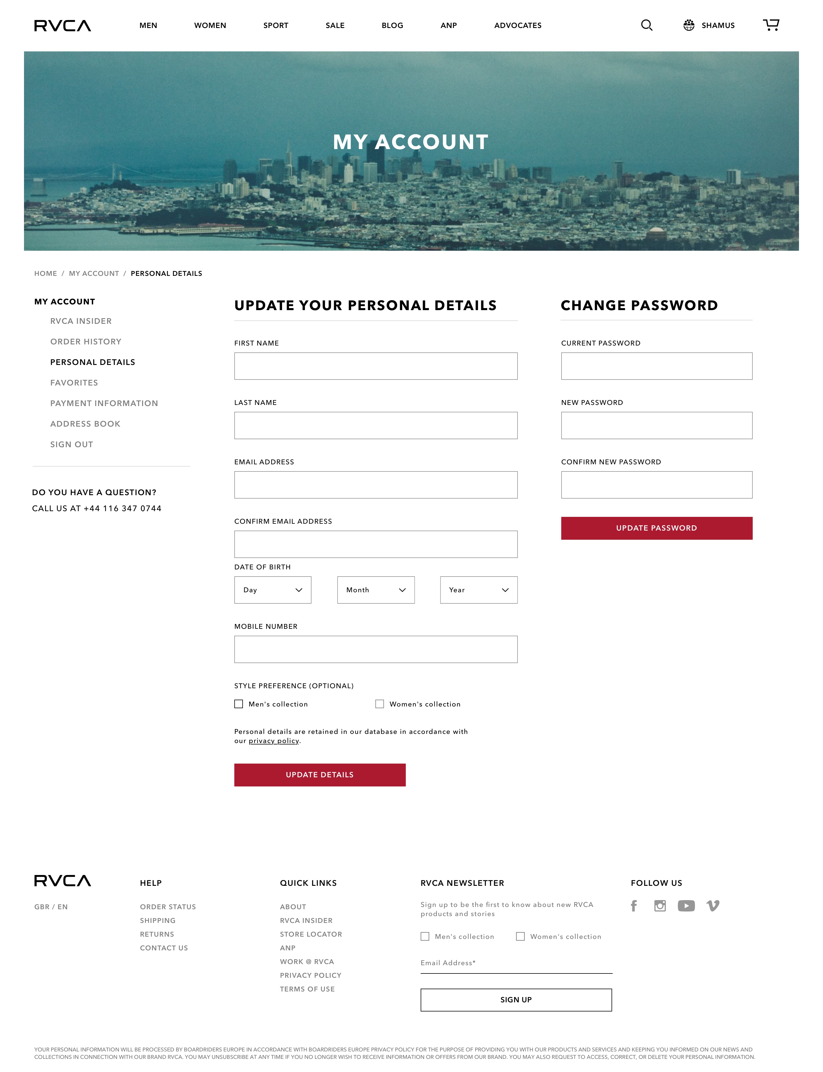
Account Management
Much like the Customer Service section, users would most likely only find themselves here when they had a task to complete ie: changing their password, adding a new delivery address, checking the status of an order etc. Making each section link as clear as possible without additional information / stimuli would aid in helping the customer complete their task as quickly and easily as possible.
Bonus Views
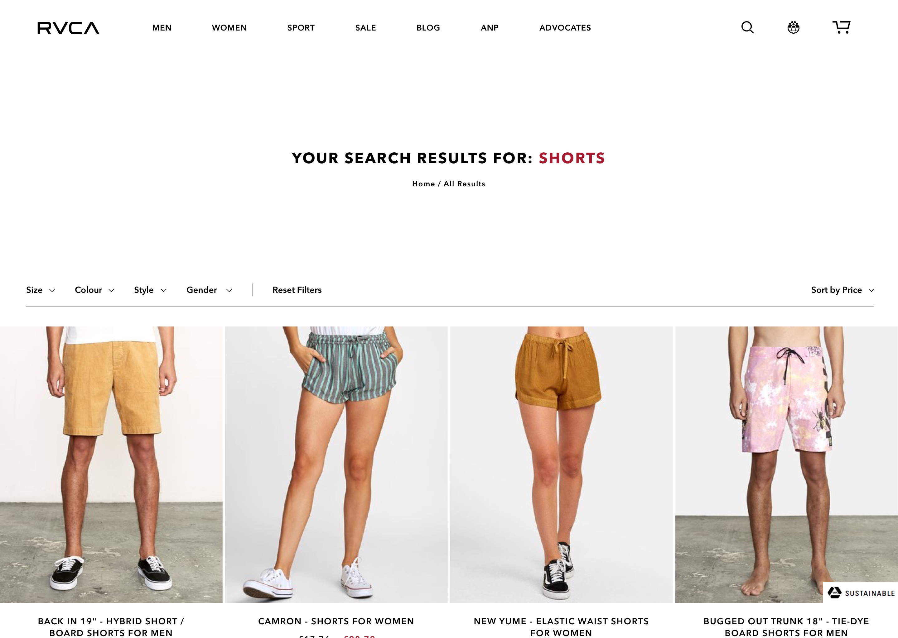
These pages are similar to those that have come before them. The Sale page adds a new row of buttons for easier navigation and the search results page uses the same layout as standard category pages but without the header hero image, defaulting to a text-based display.
Responsive Designs
Mobile Versions
Here you'll see how the core page designs work on a mobile device. Notably changes are on the product page - the product images are now in a horizontal slider as the desktop method of display would not work well on a smaller device.
Congratulations
You've made it to the end of this case study.
This project was a great exercise in optimisation and exploration into how small changes can have a big impact.
Overall, I'm very happy with the way it looks and performs, as was the client. At the time of writing this, a few more amendments to the project were being made but generally the majority of the project has remained as shown here. Initial tests and user feedback have been positive but a live test with real customers has yet to be enacted.
All designs were created in Sketch by myself over the course of several weeks. Thanks for reading and get in touch with me if you'd like to discuss future collaborations together.